The pistachio color, pleasant to the eye, is fundamental to many classical styles: English, Italian, Gregorian, Biedermeier, Empire. This is one of the most complimentary, unobtrusive shades of green. It can be used with equal success both for decorating a living room, nursery, bedroom, and for arranging a bathroom, hallway, loggia.
Pistachio color in the interior is an excellent background for natural wood. Accessories of a light green hue, bright or muted, are often used today to create Victorian, Nordic, and colonial styles. The combination of pistachio color with shades of golden-green, white and neutral palette can be successfully used to create high-tech, pop art decorations.
What colors does it go with?
The pistachio tone is optimally complementary with green and red-brown tones, and also with beige, white, and yellow decoration colors. When using this shade of green, combinations with blue, purple, and pink look bright, even provocative.
The harmony of muted green, gray-brown, and beige allows you to create amazing interiors with the effect of age, dustiness, and historicism. Golden-green colors for the bathroom are good, combined with amber, plum, and cherry.
The delicate pistachio-golden tone can be used to decorate any room. In this case, the walls and ceiling can be painted in different colors. You just have to remember that pistachio somewhat pollutes and darkens cool light shades. This is especially noticeable on cardinal white.
The ideal combination of pistachio color with other colors can be found using real palettes of photographs you like from glossy magazines and the Internet.
Combination of pistachio color with others
| Popular colors | Interior style | A comment |
| White, beige | Classic, Eco, Loft | Both bright and pale tones of pistachio are suitable for these shades. |
| Grey | High-tech, Modern, Loft | Focus on shiny surfaces and textured textures |
| Brown | Classic, Eco, Provence | Natural combination, try to choose light shades of pistachio |
| Yellow orange | Mediterranean, Country, Oriental | If you are using a dark shade of pistachio, set it off with bright accents |
| Turquoise, blue, aquamarine | Mediterranean, Moroccan, Maritime | Pistachio goes well with most marine-themed colors |
| Peach | Classic, Provence, Country | Contrasting inserts and moldings will help differentiate surfaces |
| Fuchsia | Pop Art, Modern, Art Deco | A very bright and stylish combination. Try to let the pistachio color dominate, then the interior will be less flashy |
| NOT RECOMMENDED TO COMBINE | ||
| Pale blue | Against its background, pistachio will seem dirty | |
| Swamp green | Brings a mood of gloom and gloom to the room | |
| Bright green | The delicate pistachio color will simply get lost against its background. | |
Important! Be careful with very dark tones. Be sure to use a third shade, otherwise the interior will be gloomy and oppressive.
Natural materials
Lovers of naturalness highly value muted green interior backgrounds. They are ideal for placing:
- wooden, bamboo panels;
- stone;
- leather, fur;
- jute, rattan, cork coverings;
- reed, reed fabric.
Olive and pistachio colors perfectly complement natural wallpapers, plasters, sisal, siagrass, and coconut fiber coatings. Combinations of walls painted in a golden-green shade and floral wallpaper made from arrowroot, nettle, and golden flower look beautiful.
To decorate a bathroom with natural materials, use pistachio-golden or olive-colored ceramic tiles. Against its background, bathtubs, sinks, and functional furniture made of oak, teak, and cypress wood are placed.
In the kitchen you can successfully “play” with white. Against the background of a golden-green hue, it will look aged. If you use brown or gray natural cladding, as well as furniture and accessories decorated in Provence style, you will get a charming country corner.
Features of pistachio textiles
Textile decor is designed to create additional notes of cheerful coziness and maximum comfort, which can be seen in numerous photos of the pistachio bedroom and choose the option you like.
This color can be turned on:
- In drapes and curtains;
- Bedspreads or blankets;
- Upholstery of upholstered furniture;
- Carpets and other floor products;
- Small decorative pillows, etc.
Thanks to such simple techniques in both classical and modern styles, it is possible to fit them as harmoniously as possible into almost any design.
Textiles can be chosen plain or with prints depending on the main background. If several shades were used in the design, it is plain fabric products that will give the decor “completeness” and sophistication.
And, conversely, against the background of walls painted or pasted in the same tone, products with fancy ornaments and interesting patterns will look much better. Such “additives” will eliminate excessive severity and even facelessness of the room.
Properly selected textile decor will help visually adjust any area and eliminate general discomfort.
Pistachio tone is perfect for both natural and artificial materials, highlighting all the advantages of wood, textiles, metal, glass or polymer. Thanks to the great freedom of choice, there are many opportunities to create an interior to suit your tastes, turning the bedroom into your favorite “little world” for complete relaxation.
Such different walls
People began to use paints in emerald and light green shades for interior decoration quite a long time ago. Among them were both absolutely harmless specimens and deadly ones, more than half consisting of arsenic.
Today, having chosen a golden-green tone, the walls of the room can be decorated using:
- textile, paper, liquid, vinyl, non-woven or glass wallpaper;
- alkyd, oil, water-dispersion paints;
- stone, wood, bamboo panels;
- coverings made of reed, reed, rattan, jute, cork.
It is better to use pistachio-colored wallpaper in plain colors or decorated with white, yellow-golden patterns. For the kitchen and living room, it is permissible to use photo wallpaper with a suitable color palette.
Contrary to the standard idea that pistachio wallpaper is unacceptable in the bathroom, like any other, however, their washable non-woven samples are actively used to cover rooms with high humidity in many American and European homes.
Pistachio floor
When decorating floor coverings, this color is used much less frequently than when creating walls.
This possibility should be considered if:
- There is a need for a stylish and harmonious background;
- It is planned to create an original setting;
- In this way add an additional atmosphere of comfort and warmth.
Such a solution will undoubtedly be effective, guaranteeing an interesting and extraordinary look for the bedroom.
Furniture and textiles
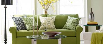
Sofas, armchairs and chairs in a light green shade look restrained and strict. The feeling of respectability increases many times over if pistachio-colored items are placed in large-format rooms.
Furniture for the kitchen and living room in Baroque and Empire style looks great. The combination of strict and patterned wooden legs with soft backs and seats in a rich golden-green shade fits perfectly into rooms with any texture or color of the walls.
Pompous details of classic curtain decor, such as lambrequins, cascades, jabots, molds, ties, swags, are magnificent in all shades of muted green. Contrasting shades are usually used to decorate the edges. You can experiment with white, dark brown, beige.
So what does pistachio color go with? Often prints and shapes have a much greater influence in shaping style than ideal color combinations.
Interior style and pistachio color
The natural warm shade consists of yellow and green tones. The dynamic range has many intensity options - from airy light to almost brown. The universal color sounds original in different design directions.
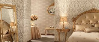
Classical
In the interior of the room, pistachio decoration adds a touch of luxury. In a classic space, color is used in wallpaper, complemented by gold patterns. The tone should accompany, not dominate. If the background of the room is neutral (white, gray, beige), then the shade can be used in:
- textiles;
- furniture upholstery;
- decor.
Minimalism
Pistachio-colored living rooms or kitchens do not look as laconic and restrained as white options. The natural palette will become the backdrop for interior items in a minimalist direction.
The natural tone looks light, so there is no need to overload the room with dark details.
High tech
Chrome and plastic elements in the design of the space are combined with shades of pistachio. A single bright accent is performed in a warm palette. Natural colors are used to decorate cabinet fronts, picture frames or furniture upholstery. The tone can be used in ceiling lights and bedside lamps.
Eco style
Natural materials and colors are used to decorate the premises. Pistachio fits harmoniously into the space and helps reveal the beauty of neighboring flowers. The tone emphasizes the texture of wood and stone, fabric and iron.
A transparent shade on the walls will help visually expand a small room.
Provence
Pistachio color in the interior of a kitchen, living room or bedroom naturally combines with delicate tones of blue, pink and lavender. The rooms look beautiful with aged white furniture and wicker chairs. Neutral yellow-green in a room visually adds light.
Mediterranean
The rustic style prefers bright, rich colors - blue, orange and red. A pistachio background will emphasize the elegance of intense shades and demonstrate the benefits of space. Variants of muted yellow-green are used as patterns on wallpaper and in decor.
Contemporary
The style prefers the spontaneous juxtaposition of objects from different sets, rough surfaces and varnished parts. To decorate walls, designers often use light shades of yellow-green. Rough finishes (stone, wood) look luxurious against the background of delicate natural colors.
If the interior is made in a neutral color, then noticeable accents are needed. Pistachio will help highlight the beauty of the natural texture and become a rich detail in the room. Indoors, the shade can be found in:
- curtains (blinds);
- central chandelier;
- furniture upholstery.
Noble color in the kitchen
The color scheme of the dining room and kitchen should be conducive to eating and create a positive attitude.
What color goes with pistachio in a large kitchen? Optimal companions:
- white, dirty pink, purple, chocolate;
- salmon, turquoise;
- ashy, light green.
What colors go with pistachio in a small kitchen? The best companions for this shade of green are:
- beige, gray;
- orange, yellow;
- black, fuchsia.
The walls of the rooms for cooking and eating can be decorated in white, simply filling them with pistachio furniture, textiles, and accessories. The simpler and more modern the kitchen surfaces, the more dramatic their color design should be.
It should be remembered that the golden-green tone loves decorations like cornices, beams, carved panels, and other patterned furnishings. This is an ideal solution for a classic kitchen interior.
Pistachio color in room interior design
The lightness and ease of pistachio color allows you to harmoniously decorate the environment in rooms for various purposes. With the help of natural shades you can enliven the interior, add originality and sophisticated style to it.
Living room
For a room where the whole family gathers and receives guests, an unobtrusive, calm pistachio shade is ideal. Romantic people can decorate the living room in Provence style. In this case, it would be appropriate to decorate the walls in light colors with floating floral motifs in a yellow or golden palette. Fancy patterns on the carpet, furniture upholstery, sofa and curtains look beautiful.
The walls of the living room can be painted in pastel colors, and the interior can be enlivened with the help of pistachio furniture attributes. Bright, creative people will feel comfortable in a room where pistachio, white and orange shades predominate.
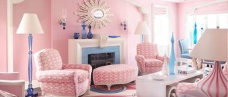
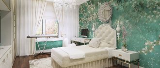
Bedroom
For a room where people are forgotten in the sweet embrace of Morpheus, you need to choose calm shades. Furniture and decor must be of the same design. A light pistachio bedroom in a classic style looks elegant.
In minimalism, accents on bright pistachio pillows, lamps, vases and other accessories will help breathe life into the rigor of the design. It is recommended that the main background be done in gray in various tones.
Children's
The color of pistachio is perfect for a children's room, it brings positivity into it and pleases the eyes of little ones. You can use bold solutions and combine pistachio with turquoise, orange, and light blue.
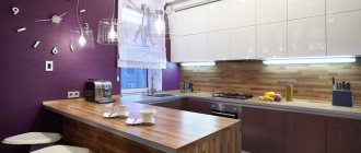
Kitchen
Shades of green combine perfectly with natural materials, so if the kitchen design contains wood, stone, or bamboo, then you can safely decorate the walls, kitchen units, or tables in pistachio color.
The real tenderness of spring will be presented by a room decorated in white tones, where a bright accent is a pistachio apron and the opposite wall with a floral pattern.
Bath
The color of pistachio goes well in the bathroom with exotic crimson or pink patterns “crawling” along the walls and spotlights. The alternation of pistachio and orange tiles looks unusual and bright.
Hallway
The first impression is formed from the hallway, so it is very good to choose the “welcome” color of pistachio as the main background. Warm pastel colors are better, and to make surfaces last longer, you should buy vinyl or non-woven wallpaper.
Pistachio color is the ideal solution for creating a fashionable interior in any room. It is always pleasant to be in rooms with the presence of elements of a similar palette, and the right combination with other colors allows you to achieve special harmony in the design.
Bedroom
Today, using light green shades to decorate a bedroom is considered good form. They have a calming effect and help you fall asleep quickly. Pistachio color in the bedroom is usually combined with white, beige, black, and sometimes shades of dark chocolate are added.
The monochrome walls of the bedroom are diluted with patterned headboards in cardinal colors and non-woven frescoes.
Floral prints on the walls imply the presence of decor in the form of rosettes, friezes, pilasters. To add a refined touch of antiquity, figurines and table lamps with ceramic legs would be useful.
An excellent companion for golden-green bedroom walls is photo wallpaper with macro photography of plants.
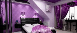
The combination of pistachio and purple in the bedroom interior is considered classic. These colors can be used to paint not only walls and ceilings, but also to tint furniture, floors, and decorative items.
Pistachio interior style
Green color in any form is already a practical success in any interior,
because it gives freshness and brings freedom to space. Therefore, pistachio can be used in most styles. How does it interact with their characteristics?
How to use in the living room
The purpose of a living room is to be a beautiful, functional place for entertaining guests and to promote not only rest and relaxation, but also active activities.
Light green walls successfully set off wrought iron furniture and accessories, including chandeliers and floor lamps. Combined with cheerful orange, pistachio-golden color does not require any frills at all. This is an ideal combination for a minimalist, and most importantly - inexpensive designer environment.
Pistachio color in a classic living room is usually combined with white, emerald, beige, and brown. The same color in a high-tech or fusion living room setting can successfully “play along” with even bright and self-sufficient shades of turquoise, coral, and indigo.
A pistachio sofa in the living room is truly flawless when it has:
- legs of cardinal colors;
- unusual shape of the back;
- classically shaped armrests;
- upholstery using the Capiton technique.
Features of color and influence on the psyche
Pistachio color has a positive effect on the human central nervous system and has a calming and relaxing effect. This delicate green shade in muted varieties gives a joyful feeling of cleanliness, freshness and light, so it is ideal for interior decoration in homes where people live who experience constant nervous tension. Bright, rich shades will charge you with energy throughout the day and are especially appropriate in the design of a kitchen or dining room for calm, balanced residents.
Designers love to use pistachio tones due to their universal properties. The color does not change even under different lighting, and the surface completely retains its shade. Used in finishing materials, textile parts, decoration, furniture.
On vertical surfaces, the light green shade of pistachio is pleasing to the eye, and individual small details with this color on furniture, curtains or sofa cushions create a bright accent and give the room a luxurious look.
In the children's room
To decorate a nursery, it is allowed to use the most flashy, most cheerful shades of the color spectrum. However, it should be remembered that a room that is too bright will irritate and tire the child.
What color goes with pistachio in a nursery? Optimal companions:
- pink, beige;
- yellow, white;
- purple, black;
- gray, crimson.
Near the walls of a children's room in a light green shade, you can install furniture with facades in the indicated shades. Volumetric interior decals and stickers will help you get away from boredom.
A pattern of wide multi-colored stripes looks very cute, even extravagant, on the walls of a nursery. The main tone for girls, in addition to pistachio, can be pink. For boys, it is better to alternate wide light green stripes with black ones.
Scientists have proven that the tones of the green spectrum have a calming effect on babies, normalize breathing and heartbeat parameters, and improve vision.
Shades of pistachio
Modern technologies make it possible to obtain several varieties of pistachio color. These include:
- Light green;
- Greenish brown.
The advantages of this tone include the following characteristics:
- Pairs perfectly with any color;
- Create a peaceful atmosphere in the living space. According to Feng Shui, it is associated with personal growth and progress. It does not contain any aggressiveness or intrusiveness;
- Has a calming effect on the psycho-emotional state;
- Does not have any effect on neighboring tones and shades;
- Does not reduce living space.
Interior decor
If finishing materials and furniture create the mood, then decorative items make the room truly stylish.
In domestic interior decor stores, the easiest way to find these items is in golden-green color:
- creative clocks, mirrors;
- different-sized panels for photographs;
- caskets, baskets, boxes;
- vases, bottles;
- flower stands, flowerpots;
- figurines, candlesticks;
- aroma lamps;
- pillows, bolsters;
- pedestals, racks, consoles;
- fireplace portals, boxes.
Things will be worse with the search for bookends and mannequins. You will have to take these untinted and paint them yourself.
Today, the most fashionable pistachio-colored interior decor is considered to be huge Cameroonian hats made of dyed feathers and the so-called solar mirrors. If you have the opportunity to spend a lot of money, the best interior decoration in green tones can be dishes made of onyx or jade. A handmade golden-green stained glass screen will bring special beauty to any living space.
Interesting examples
Furniture and textiles
In light green, upholstered furniture looks restrained and respectable. This feeling is enhanced many times over if it is placed in rooms with large footage.
Pistachio furniture in the kitchen and living room in the Baroque and Empire style looks amazingly beautiful and presentable. Curved wooden legs under upholstered seats and backrests, upholstered in a deep golden olive hue, are just perfect to complement these types of interiors.
Pompous elements of classic textile window decoration in the form of lambrequins and cascades look great in any interior shade of pale green.
Contrasting colors are traditionally used in edging. A successful edging is made from white, dark chocolate, cappuccino, or beige material.
And if the decoration and furniture create the desired atmosphere and mood, then details such as decor add individuality and emphasize the style. In stores specializing in interior decor, it is easy to find interesting items in shades of green with a golden tint.
These can be unusual panels, wall clocks, mirrors with rich frames, carved boxes, twisted baskets, boxes, flowerpots, stands for flower pots, carved consoles.
Things are a little more complicated with book stands and mannequins in the desired shade of green. Most often you have to tint them yourself. The latest trend in fashionable interior design is huge Cameroonian feather hats and so-called sun mirrors. But if you are not ready for such an extravagant decision, then it is better to spend money on dishes made of natural onyx or jade.
A screen with stained glass windows in golden green color will fit especially chic into any living space.
Classic in the interior
The use of pistachio is duplicated in other items - textiles, decorative elements, furniture. Green with a touch of gold is allowed to decorate an accent wall to visually expand the boundaries of the room.
Bright colors
Pistachio color serves as a winning background for sunny orange, berry red and deep pink.
At the same time, to create such an interior there is an unshakable rule: no more than three catchy colors for one room. Otherwise, your gaze will quickly get tired.
You need to carefully select accents in shades, taking into account their “consonance” with each other.
Light contrast
The color “pistachio” in the company of gray, chocolate, light blue and other neutral tones will be contrasting, but not intrusive. It is acceptable to use several shades: for example, light green and green with a brown tint - they are not similar, but compatible.
If you want to enhance the contrast, you should play with textures, attract attention with convex textures and intricate shapes.
It is extremely rare for rooms to be decorated exclusively in pistachio tones.
The merging of surfaces does not allow for contrasts. Such an interior looks boring and tense without decorative details of companion flowers.
What doesn't go with
No matter what anyone says, the golden-green shade does not go well with bright red, blue, and pale blue. Taken together, they give a clear sense of dissonance, and under certain circumstances can cause madness. The pistachio color “withstands” the texture and color of unstained pine wood also poorly.
Gray-blue does not suit a light green shade. This combination looks too sloppy, dirty, even poor.
Colors such as coral, ultramarine, turquoise can be used in combination with golden green only to create fusion and pop art interior styles.
Interior styles: kitsch, boho, ethnic can more or less successfully bring together non-complimentary shades in one room. However, only creative individuals “get along” normally in them. You shouldn’t try experiments that are obviously unsuccessful.
Shades
The color of pistachio in the interior is a harmonious background for natural wood.
Today, designers actively use various accessories in soft green shades of varying degrees of saturation in the design of different styles.
Pistachio is successfully used in the formation of Victorian and colonial styles. And in combination with the color of golden green and white, it can be successfully used in high-tech or pop art style rooms.
Combination of shades
Typically, designers do not limit themselves only to pistachio tones when decorating the interior. Avoid merging surfaces and use different colors.
White
The universal white color can soften the richness of the tone and bring into the room a calm, pleasant atmosphere filled with homely warmth. For small rooms it is important to use pistachio furniture and white trim.
Grey
This color brings prestige in a classic style. Light gray in combination with pistachio elements will give a mysterious atmosphere, and thick, rich gray will add contrast and depth.
Black
The composition is not suitable for all rooms, as it looks bold, even a little aggressive. Black tiles or a sink in a pistachio kitchen will add rigor and originality to the design.
Orange
The gamma with cheerful “orange notes” will give the room a cozy and warm, cheerful atmosphere. The color of pistachio in this case serves to mute the bright orange.
Brown
Finishing materials made of wood in brown shades in combination with pistachio naturalness will emphasize the fusion with nature. Brown upholstered furniture looks good against the background of pistachio walls and floors.
Violet
Compositions of violet, lilac and pistachio add uniqueness to the interior. Such a memorable design seems to “breathe” with pleasant coolness and envelops you in a mysterious atmosphere.
Turquoise
The color of turquoise gives the room uniqueness, unusualness and refreshes even the most dull interior. The success of the combination lies in the harmony between the cold notes of pistachio and turquoise.
Pink
These two colors make it possible to achieve excellent results in interior design. It is best to use pastel colors in furniture and decor.
Not recommended combinations
Calm pistachio will be lost against the background of bright green. A duet with a marsh color will make the room gloomy and gloomy. In a dark room with pale blue walls, the delicate shade looks dull and dirty. Designers do not recommend combinations with acidic and poisonous tones.
Psychologists about color
Psychologists characterize this shade of green as a symbol of calm, stability, security, and abundance. Nevertheless, in dissonant interior combinations, it can make a person suspicious and anxious, make him yearn, doubt, and be lazy.
Pure pistachio color relieves irritation and anger, muffles all negative emotions, and even puts you to sleep. Adults and children, when they enter a room with golden-green walls, become more open and friendly.
Scientific research has confirmed that all shades of green can actively change the nature of higher nervous activity. In turn, this has a positive effect on the following subsystems of the human body:
- cardiovascular;
- lymphatic;
- respiratory;
- immune.
According to psychologists, the best way to choose colors for interior design is to create an “impenetrable” zone of relaxation, comfort and positivity.