Luxurious and mature are suitable adjectives for an interior decorated in burgundy. The task of implementing an interior in this color is not easy and at the same time interesting. It can be used for living room, kitchen, bedroom or office. It wouldn’t hurt to study successful combinations and rules for using burgundy colors in different rooms. Decorating in burgundy will give you moments of amazement from the successful finds of color combinations.
Bordeaux in the interior - the choice of strong personalities
The burgundy color is for strong-willed and thoughtful people who know the value of words and take theirs from life. It is not surprising that the wine color in the interior looks stable and deep - you want to look at it for a long time.
Burgundy is made from a mixture of blue and red, and for a warmer shade you need to add yellow. Thus, the burgundy palette has many of the qualities of the red palette, but it is calmer and less provocative. It is ideal for mature and stable people; it improves tone and concentration well, without producing the effect of overstimulation. This range is much softer and more delicate than purple, which is also a mixture of red and blue, but in a different proportion.
This is not a suitable color for ultra-modern modern and avant-garde styles, but ideal for classic and baroque. Elements of burgundy color can be present in country styles for the kitchen, as well as in the living room, decorated in minimalism or hi-tech.
If you choose this unique color, you will get a luxurious and representative interior. You just need to choose the right shade of burgundy, combine it with suitable colors and choose accessories. From a wide palette from raspberry to dark wine, you can create an interesting design for the living room, kitchen and bedroom.
Related article: Terracotta color to create harmony in the home
Color Features
The burgundy shade appeared as a result of the fusion of red and brown, which means it has the qualities of these colors. Red gave him its brightness, impulsiveness and some impudence, and the influence of brown slightly cooled the ardor, adding calmness and depth. Different proportions of color mixing, as well as inclusions of other shades, divided the Bordeaux palette into many tones: ruby, wine, Marsala, burgundy, sangria, cherry, etc.
Most shades of burgundy were given their names by varieties of elite wines from France, Spain and Italy, apparently, this causes strong associations with sophistication and wealth. Within the walls of a burgundy-colored room, you don’t want to do everyday household chores; you’re drawn to relaxation and rest. Therefore, the choice of this shade is typical for mature individuals with delicate taste and a craving for luxury.
Combination with other shades
Burgundy color in the interior, in addition to moderation, requires a basic understanding of which color goes best with the burgundy palette. Everything here is a little non-standard - standard approaches may not work.
Bright and rich, the wine color is interesting in itself, which means it should be in the foreground. In the background:
- White is a classic and universal companion color that makes such an interior overly elegant. A room in burgundy and white colors will look formal and solemn, which is not at all appropriate for a bedroom or kitchen.
- Light tones of beige, cream and light gray, in contrast to the company with white, the combination of these colors creates a cozy and warm atmosphere. Burgundy accessories together with upholstered furniture look cute and casual.
- Black sets accents perfectly, but it must be dosed, otherwise the overweight and gloomy mood of the room cannot be avoided.
Gold has a unique effect on a burgundy interior, making it royally rich, wherever it is present - on wallpaper, furniture or curtains. Note that such interiors require large spacious rooms.
How to choose?
The golden hue is multifaceted and interesting, which is why there is quite a large selection of such wallpapers.
- The simplest option is plain glossy wallpaper. They always look very rich and bright, so it is not recommended to completely decorate the room in rich golden tones. Most often, designers advise using wallpaper only on one wall. This makes it possible to correctly place accents, and in some cases also visually lengthen the room. So, if you have a small room, then this move will be quite popular.
- Another common option is to use wallpaper decorated with golden sparkles for decoration. They are also recommended to be used in small quantities. The best option is to decorate a niche, some ledge or area next to the fireplace in this way, and not the entire room.
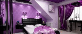
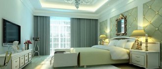
Bedroom interior
When decorating with rich wine tones, you need to know when to stop, especially for the bedroom. You don’t want to feel like you’re at a reception with the Prime Minister in your bedroom, do you? Then leave the burgundy wallpaper for the living room, and for the bedroom choose accessories of this range. You can afford rich burgundy curtains in the interior of a bedroom decorated in milky cream tones. Such curtains look very elegant together with delicate snow-white curtains made from the finest materials.
To balance the room, use some dark accents, such as mahogany in furniture details. If you add a few gold accents, the atmosphere of the bedroom will immediately acquire sublimity and nobility.
Advantages and disadvantages of burgundy
The interior, decorated in the color of ripe cherry, has both positive and negative sides. The positive ones include:
- luxurious atmosphere;
- creates comfort;
- emphasizes refined taste.
In addition to the advantages, it has a number of disadvantages:
- excessive use of burgundy creates a heavy atmosphere;
- in poor lighting the room becomes uncomfortable.
To create the perfect living room design, it is recommended to seek help from professionals; they will help make all your desires come true.
Don't be afraid to experiment when decorating your living space.
Living room interior
The living room is a room that can be decorated a little more formally than other rooms. The color burgundy in the interior of the living room will cope with this perfectly, no matter what shade you prefer. For heavily rich living rooms in Baroque and Venetian styles, you can dare to use burgundy wallpaper with gold patterns. This wallpaper looks regal, chic and sophisticated - a success guaranteed for this living room.
Related article: Graphic black and white: primary colors (+45 photos)
Keeping in mind the combination of other colors, choose the options:
- Formal living room - burgundy wallpaper with gold patterns, white ceiling and furniture, crystal chandelier.
- Muted luxury - painting the walls in a burgundy tone, the ceiling and curtains in champagne color.
But burgundy striped wallpaper looks too strict, however, it is good for an office or corridor. Burgundy color in the interior requires dazzling white dishes and carts, silver appliances and other luxury elements.
Best couple
Burgundy in the interior is used to occupying a dominant position, allowing other shades to only bask in the rays of their glory. In order not to make a mistake and choose the best company for this impressive color, you can use the following combinations tested by designers with other tones.
Burgundy and black
A gothic and gloomy combination of burgundy and black at first glance is suitable not only for the interior of a medieval castle, it may well exist in a modern apartment with certain conditions:
- all main areas of the room should be highlighted with artificial light;
- The presence of light-colored furniture and decorative elements is required;
- the ceiling should remain light;
- glossy surfaces are welcome.
Burgundy and white
This combination does not require additional recommendations; it is equally suitable for all rooms. White will allow burgundy to reveal itself in all its splendor without drawing attention to itself. In response, burgundy will gratefully emphasize the main advantages of white: purity and freshness.
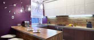
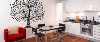
Kitchen interier
The burgundy color in the kitchen will help to play up the recently fashionable design trend - country or Provence. In such interiors, the burgundy shade goes well with an abundance of natural wood-colored furniture.
In this design, you can use the design of facades in burgundy tones, linen curtains and all kinds of accessories. Use yellow as a wall decoration, and your country kitchen will be very warm and pleasant.
For a Provence-style kitchen, use natural materials such as linen and cotton, which transform proud burgundy into a modest and pleasant shade. This amazing transformation from royal to western-rural is perfect for a spacious country-style kitchen.
Bathroom a la Bordeaux
Burgundy color in the bathroom interior is a privilege of exclusively stylish apartments. This color cannot be cheapened by low-quality plumbing fixtures. Great combination: muted burgundy tiles, a beautiful countertop sink and console with white wooden legs, a huge mirror and an olive rug. An olive shade will dilute the thickness of the colors, and if you want something extraordinary, then use a contrasting black and white duet.
For a children's room, such shades are too heavy, and therefore are not used for decoration.
The burgundy color is interesting and deep, just like the taste of aged wine; in the same way, too much of them will lead to a headache. Moderate use of burgundy along with light neutral tones will create a beautiful and stylish design for any room. For connoisseurs of luxurious rooms in the Baroque style, royal wallpaper in burgundy colors is suitable. Decorating in burgundy color will force you to work hard to select successful combinations, but the resulting result will be beautiful.
Related article: Cool blue color for every room
Burgundy wallpaper and color combinations in the interior (3 videos)
What burgundy looks like in the interior (42 photos)
Types of wallpaper for brickwork
Modern wallpapers differ in material, density, thickness, texture, and moisture resistance. If you choose the right series, it will live for years even in the bathroom or kitchen.
Paper wallpaper
This is the simplest option: the design is simply applied to thick paper. They can be one- or two-layer. For elite series, hand printing is used.
Fading is prevented by special impregnations. Some types of paper wallpaper are suitable for painting. A separate category includes textured, embossed and corrugated series.
The main advantages are low price, variety, breathability. Disadvantages: low strength and sensitivity to moisture.
Non-woven wallpaper
Non-woven fabric is a mixture of polyester and cellulose. It originated in Germany and was used in sewing workshops for a long time.
Semi-synthetic interlining is stronger and denser. It insulates well from noise, does not deform when drying, and is easy to stick. It is enough to coat the wall with glue, but the canvas is no longer necessary.
Non-woven wallpaper can be repainted. They are environmentally friendly and can be easily removed from the wall during repairs. But they require careful surface preparation and cannot be washed.
Vinyl wallpapers
Vinyl is the most durable. This is a two-layer material made of paper and non-woven fabric with PVC coating. Therefore, it is difficult to stain or damage and easy to wash.
Vinyl can be textured, so it can imitate masonry almost perfectly. It is resistant to ultraviolet radiation, hides uneven surfaces, and is not afraid of chemicals.
The main disadvantages are the high cost and toxic substances that vinyl wallpaper releases in the event of a fire.