One of the most successful solutions for interior design, even despite the stereotypes that such rooms are appropriate only for women and girls of all ages, vanilla blondes and sweet lovers. Due to this strong opinion, most people try to avoid using pink tones for fear of showing frivolity and immaturity.
Throwing these thoughts aside, imposed by fashion magazines and advertising brochures, you will see the entire breadth of the spectrum, from the pale pink to rich, bright tones, and there is no need to talk about the possibility of their successful combinations. Freshness, positivity, sophistication, elegance - these are some of the many properties conveyed to the room by an interior in pink tones.
Ideas from the designer
Color therapy has long adopted it as it has been proven that it has a positive effect on the internal state. If a person contemplates a pale pink palette for quite a long time, then his depression and fatigue will go away.
For many, pink symbolizes love, romance and kindness. A person contemplating this color awakens dreaminess and carelessness. If someone thinks that this world is quite rough and cruel, then he simply needs to add pink to his interior.
- Pink does not easily harmonize with flowers and its use in conjunction with another color is quite difficult.
- Many colors simply do not suit him and therefore the combination of pink with other colors in the interior sometimes becomes difficult.
Pastel colors work well for pink, and it looks good in gray shades.
Some shades still make an exception, these are faded emerald and gray-blue tones. Anyone who has decided to add this color scheme to their home needs to know what color pink will be combined with in the interior.
Color difference in brightness
All pink accessories stand out perfectly against the pastel background, create the necessary contrast, but at the same time do not create an “eye-catching” effect and fit into the interior much softer than in the previous photo. If you have one color (pink or blue) as a base color and another as an accent color, it is better if they do not differ too much in brightness.
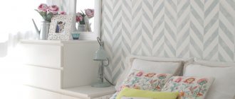
In general, the best partners for pastel colors are pastel colors, as you see in the photo on the right. Here, pastel pink and pastel light blue complement each other perfectly, creating a very light and not at all boring picture. Please note that this basic combination looks equally good on both dark and light furniture.
Pastel pink and blue are ideal for creating a relaxing, calm, but not boring interior. The photo above is a perfect example. Vanishingly light pastel colors are used here, plus turquoise and gray plus white. The interior is very bright, incredibly calm, but at the same time it does not look boring and is quite original.
Pastel pinks and blues, as in this photo, are suitable for sunny rooms if the goal is to “calm them down.”
Combination options
- White with pink. This tandem looks elegant. These two colors create a feeling of a spacious interior that is also harmonious. This combination is perfect for the bedroom, living room and kitchen.
- Beige pink. This combination looks nice, highlighting advantageous parts of the interior in the living room. It will become more comfortable and the interior more classic. This is a suitable option for an interior with a large amount of wood.
- Ash pink. One of the most suitable for the bathroom. The combination of colors will ultimately be quite complex, but visual lightness will be felt; this coloring is especially suitable for small rooms.
- Gray-pink. A universal composition suitable for all rooms. The very cool tone of gray contrasts with soft pink and creates a feeling of a strict, but modern look.
- Pink with blue. Suitable for decorating a classic bedroom. The tone of the bedroom is based on pink and complemented by blue accents.
- Dirty pink. Dirty pink color in the interior is obtained by adding a grayish stone color. With this combination, the result is a composition closer to lilac, but very cozy. A room with this decoration easily harmonizes with lilac, purple and white tones.
Combinations with white, third accent color
Pink and light blue (or blue) go well with white and are a very popular choice in Western design. It is used in modern, as in the photo on the left, and in classic (photo below left), and in country interiors (photo below right). White perfectly accents the combination and gives it a “frame”.
The interior in the photo on the left - the basic colors are blue and pink with a lilac tint, and white is the accent color. In the photo on the right - on the contrary - the base color is white, and blue and pink are accent colors. In both cases it is very impressive and harmonious.
In general, this combination of colors definitely needs a third accent color.
The interiors in the photo above look strange because the combination is not accentuated by anything. In the photo on the left, a bright blue sofa with pink pillows against a dark blue wall does not play, it disappears. In the photo on the right there is a pink sofa against the background of the same wall - the interior is blurred, the accessories are not visible.
Don't repeat these mistakes - the combination of pink and blue should be accentuated.
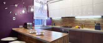
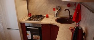
Pink in the kitchen
Pink color in the kitchen interior is quite common. It improves appetite and is conducive to soulful gatherings over a cup of tea. This design will charge you with cheerful energy, especially if you add orange or green colors.
- When creating a pink kitchen interior, it is possible to use zoning; you can decorate only the dining area in pink, and the work area in wood or coffee.
- It is not necessary to cover all the walls in a single color; there may well be some beautiful pattern or intricate ornaments.
- It is better to install the kitchen set in a dark crimson color.
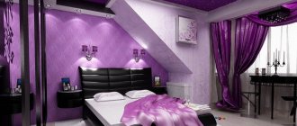
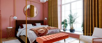
Bedroom in pink with a pink palette
Pink color in the bedroom interior is a classic. If you use muted pink tones, then this bedroom will appeal to all men, women and children without exception.
An interesting solution would be to use pink textiles and accessories.
- Photo frames and tulle can be the same pink color along with the curtains.
- The white ceiling will be nicely set off by pink wallpaper with ornaments.
It is not recommended to use gilding when decorating a bedroom in pink. It will destroy all the charm of the design idea.
Photos of the interior with the color pink clearly show how best to approach design issues in decorating rooms. The main thing is to use it harmoniously because if you overdo it, the room will look like a box of chocolates.
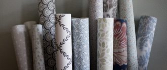
To relieve the load, you need to dilute pink with at least other shades. Pink color has many tones.
Shades of pink
- Light pink. The color is suitable for romantics and dreamers.
- Light pink. Ideal for a nursery with a newborn girl.
- Dirty pink. Gives an aristocratic feel, the color of a fading rose.
- Juicy raspberry. Very convenient for highlighting bright accents. Quite a sensual tone.
- Dark pink. It is used only in doses; if handled improperly, it can ruin the interior.
In fact, there are more than 15 types of pink tones. And you need to approach the choice of tones after studying the topic. Rooms made entirely in pink can have a depressing effect on some people. That’s why there is a need to dilute pink with other colors.
Selection of furniture and floor color
The combination of blue and pink suits furniture of any color except red.
chocolate, caramel, yellow-brown, red-brown - these most common “furniture” colors go with blue and pink
My personal favorite is the combination of blue, pink and natural tan oak, as pictured above right. The combination with golden sand color, straw color, bleached oak and milky oak (photo on the right) is also very good.
It’s the same with the floor - the same types of wood are suitable for the floor as for furniture. And pink does not go well with red varieties (Milanese walnut, anegri, cherry, pear).
Adviсe
- Pink should be chosen individually according to taste. It must be remembered that the purpose of the room affects the use of the color palette. So the children's room uses light shades and the younger the child, the lighter the shade.
- One color should not be everywhere; it should be diluted with shades, playing on the contrast of colors. But using a large number of shades will also ruin the look. You need to use 2-3 types maximum.
- A rich color will increase the space, but in a narrow room it is still preferable to use lighter shades.
When creating an interior using pink, you can plunge into childhood inspired by its shades.
At a time when the whole world was beautiful and seen through rose-colored glasses. Premises made in a similar style will add romance and help you distance yourself from pressing problems, taking your consciousness into the world of dreams and daydreams. This is an excellent choice for light, creative people.
Photos of blue room design ideas
The collection of photos shows real interiors in azure and turquoise colors. Modern ideas can be turned into reality in your own apartment if you are looking for a unique way to diversify the design of a bedroom or children's room.
A blue accent wall will help expand a narrow room.
Sometimes it is enough to buy new curtains to make the interior look new. Use interesting ideas, experiment with color and texture combinations to create a unique and fashionable interior design in your apartment.
This color is recommended for use in a well-lit room.