To choose the right wallpaper for the walls in such an interior, answer the question of what you expect from the updated design.
Harmonious shades and appropriate patterns on the walls will create both a soothing and festive atmosphere.
In addition to the aesthetic properties, pay attention to the practical characteristics of the wallpaper. Although there is no threat to the loss of quality of wall materials in the interior of the hall, it is better that they retain their original appearance for as long as possible.
Prepare for finishing work by deciding which wallpaper to choose for the room with a photo, and we, in turn, will reveal the secrets of how to make such an interior practical and cozy for everyone.
Types of wallpaper for the living room
Paper rolls, which are now easy to find on store shelves, help to improve the appearance of walls. It has long been no secret to anyone that such coatings differ in structure, palette, pattern, and production technology. And in order to create a stylish living room, you must first become familiar with the types of this segment.
Paper wallpaper
Today, the most common and economical method for decorating horizontal surfaces is in the form of paper rolls. They have a wide range of colors and availability. You don't need any professional skills to stick them on.
The advantages include low cost, environmental friendliness, large selection of colors and patterns. Cons: fading, inability to hide flaws on the walls.
Vinyl
They take second place in popularity after paper wallpaper. The coverings consist of a non-woven base and are resistant to moisture, which makes them a good material for painting.
The advantages of vinyl wallpaper include high density, resistance to humidity, long service life, sound insulation, texture, which allows you to hide the imperfections of the wall.
The downside is the unpleasant smell of plastic, which disappears over time, airtightness, and difficulty in pasting.
Velor
They are a paper sheet on which nylon fibers are located. Finishing surfaces with this material will ennoble the room.
Among the advantages, the noise-absorbing qualities of the wallpaper should be noted.
Disadvantages - the fleecy base of the texture quickly collects dust and becomes dirty. Such sheets can only be cleaned dry.
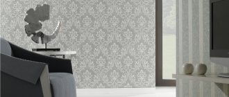
Non-woven
Non-woven fabric, which consists of cellulose fibers. It has two forms of release: regular and for painting. The wall covering, decorated with non-woven fabric, looks elegant and regal.
Good qualities include wear resistance, unchanged shape after drying, and hiding some inaccuracies.
The downside of wallpaper is sound permeability.
Acrylic
Acrylic coated paper rolls. The polymer is applied using the dot method and therefore they have a textured surface. Such wallpapers are often used in modern design.
Pros: water resistance, reasonable cost. The downside is the softness of the texture, that is, with the slightest pressure the spraying is deformed.
Textile
The design of fabric wallpaper for a living room will be a truly modern solution. A room covered with such sheets will sparkle with noble highlights in combination with silk, satin, and velvet weaves of threads.
The advantages of textile wallpaper include sound insulation and the fact that such a coating allows air to pass through well.
The downside is the high price, rapid fading and instability to moisture.
Glass wallpaper
This is a thin translucent fabric with a convex pattern, which is made using a loom. The raw material is glass threads. They are glued to the surface of the plaster with starch paste.
The material has a number of advantages compared to other wallpapers. Long service life (more than 25 years), environmental friendliness, fire safety.
Cons: small selection of textures, difficulty in dismantling, high price.
Liquid wallpaper
The material contains an acrylic solution with the addition of cellulose, sawdust, silk, cotton, and decorative elements that resemble plaster in appearance. Before use, this mixture is diluted with water.
Pros: sound insulation, hiding imperfections on the walls. The downside is low moisture resistance.
Features of combination with furniture
If there is dark furniture in the room, then you should choose a light finish. In this case, neutral or bright shades that match the surroundings are great. Light furniture is best suited to materials with different colors and textures. A great option is to play with contrast or choose wallpaper for the walls in the room with a bright and large picture.
In a room with multi-colored furniture, the emphasis is on it, so the decoration should be discreet and calm, for example, gray. This shade will be an excellent background and will emphasize the brightness and individuality of each item. As for the picture, it is best to choose products without it or with a very small pattern.
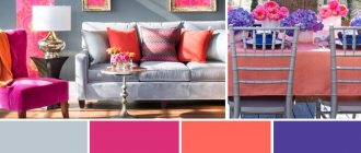
Fashionable colors in 2022
Capricious fashion makes demands on its own standards. Color range for 2022:
- In first place is the purple color. Experts have found that such colors reflect the creative thinking of a modern person. It is not neutral and when using it with other highlights it is advisable to adhere to certain knowledge.
Purple color is a dominant color, and does not look harmonious with every shade, so when using it, you should show a competent combination in interior design. For lovers of calm compositions, violet can be compared with notes of white and beige. For eccentric people, a combination with raspberry and brown is suitable. But this tandem is designed for large spaces.
But not every person likes the proposed tonality; some people want to adhere to the laws of fashion as little as possible. The designers presented a way out of this situation: make one wall the accent of the room.
- The consultants suggest green as the second leader. His collection includes more than a hundred colors with olive and marble shades. With a creative approach, you can create a unique masterpiece from the main room of the apartment.
According to the recommendations of fashion experts, when choosing the color of nature, you should give preference to muted shades; they soften the interior and make it comfortable. Greenery easily combines with beige and light tones.
- Third place was won by several colors at once. Fans of bed shades will be pleased with the design option in white and pink tones. For adherents of the classics - dark blue pigment. People with an extravagant mindset will love trendy earth colors, from chocolate to sand. Traditionalists should consider the highlights of gray.
Matching style
Selected wallpaper without a creative approach will not last long. In order for the walls to harmoniously combine with the interior, you need to adhere to a certain style. There are several types of design and each of them has pros and cons.
Classic
Suitable for conservative people, does not contain flashy elements, and is consistent in color. Its shades are beige and green. Wallpaper for this style is chosen to be plain, with a non-uniform surface and with a modest pattern.
Vintage retro
The best option for fans of adventure. This design is suitable for textile wall decoration using muted shades against the backdrop of a bright composition of sets.
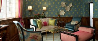
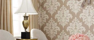
Empire style
It is often used in spacious rooms where it is possible to recreate the imperial style. It is best to choose a pattern for decoration in stripes or damask. Colors are kept in soft light tones and in strict combinations.
Victorian style
Wall decoration with fabrics or wallpaper. The design contains no more than two colors - brown with a warm highlight and red. The ornament is based on flora, fauna or geometric shapes.
Country
This style is suitable for people who follow rustic traditions. The main shades in the design are light highlights and simple patterns in the form of flowers, stripes or geometric shapes. The main thing in country music is simplicity and naturalness.
Ethnics
The style is intended for fans of the avant-garde who prefer something extraordinary. Vinyl wallpaper with bright colors and intricate patterns is suitable for the living room.
Modern
The most popular direction in which pastel colors are used with the use of abstract patterns.
Oriental decor
The style comes from the land of the rising sun (Japan). The walls are covered with silk-screen printing. The pattern is based on hieroglyphs or birds.
Loft
A destination for connoisseurs of the Middle Ages. The interior adheres to antiquity. Fiberglass wallpaper will be the best option for decorating a living room.
Wallpaper and curtains
See modern ideas on how you can harmoniously combine wallpaper with curtains. At the same time, the interior of the hall will remain stylish and beautiful.
- One tone. The color transition seems to merge together.
- Curtains one or more shades darker act as a bright accent.
- Several shades of fabric combined with combined finishing make the room interesting. This combination adds zest to the interior.
- Dark curtains + light wallpaper. The fabric of the curtains, in this case, can merge with other objects, for example, with the upholstery of a sofa, decorative elements, and furniture.
- Bright curtains + white wallpaper. An interesting combination for large living rooms. At the same time, cute prints can be placed on the curtains.
- Identical drawings. Suitable for lovers of unusual solutions.
- Curtains as a background for wallpaper with patterns. In this case, the wallpaper plays the dominant role.
Combination tricks
If you approach the design of the hall with a creative approach, you can translate an amazing idea into its interpretation. That is, it is not easy to glue rolls of the same color, but to use combination tactics, and as a result get a unique masterpiece.
This method has advantages:
- zoning of certain places in the room;
- the ability to expand the room in length and height;
- hiding errors on the bases;
- highlighting a niche or, conversely, decorating it.
When combining, it is necessary to combine everything correctly, for example, when using wallpaper strips of different shades, it is advisable to use one pattern. The main thing is to choose the right contrast of color and texture of the material.
In a room, using this method, you can achieve certain effects. For example, hide defects on the wall with a combination of two colors. This method is used in studio apartments.
If you need to separate the kitchen from the living room, then use combinations for zoning purposes.
Using pastel and dark highlights you can visually expand the space of small rooms.
It is important to consider that the wallpaper should be the same thickness, then the joint will visually merge and hide the seams between combinations of materials. In terms of texture, the main thing is to combine wallpaper and colors of the same type.
There are two combination methods: vertical and horizontal. Using the first option, a visual expansion of space is achieved.
Expert opinion
Olga Kovalenko
Since 2010 I have been engaged in interior design and architectural design.
How much it will increase depends on the number and thickness of the inserted strips.
The second type allows, thanks to smooth transitions, to combine wall coverings of different textures. Made in light colors, this living room design corresponds to the classic style.
For people with small-sized housing, 3D wallpaper will help to beat this situation. Highlighting the living room wall with this material will give the interior a cozy and chic look.
Many apartments have recesses in the wall and protruding corners. Combining wallpaper is a solution to this problem. If you highlight a niche in a light tone and place video equipment there, then the disadvantage will turn into an advantage.
Material for decoration
To choose the right wallpaper, you need to take into account a large number of criteria. This includes the material itself, color palette, designs and, importantly, compatibility with the decoration as a whole.
On various websites you can see photos of wallpaper for the living room and how you can use them to decorate the area, making it cozy and fashionable.
Tips from designers
Decorating a room is a process that should be taken seriously. And in order for the living room to please you with the final result, you should listen to the little tricks of the experts.
When choosing wallpaper, you should evaluate not only the practicality of the material, but also the tint structure.
The influence of colors on the human psyche:
- Green – promotes relaxation and does not burden visual perception.
- Blue – lowers blood pressure, suitable for phlegmatic people.
- Black – focuses attention on something.
- White is the color of peace. It is used to visually increase the area.
- Red – conducive to energy. If you have too much, you may feel a sense of anxiety.
- Violet has a depressing effect on the psyche.
- Yellow – reduces phobias and has an optimistic effect.
- Gray is a universal color that goes well with any shade.
It is not recommended to choose the following wallpaper combinations: black with yellow, blue with white, yellow with red and white with orange.
Selecting a texture
The second thing you should pay attention to when choosing a material is texture. Most often, consumers prefer smooth wallpaper, but in a small room the walls begin to appear flat. This situation can be corrected with the help of relief finishing, which improves visual perception and expands the space.
But what kind of wallpaper is better to hang in the living room: matte or glossy? The first option is suitable for large rooms, and the second - for small ones. Even a slight shine on the walls will make the room more voluminous. Experts advise not to use finishes that imitate brick or stonework, because they reduce the space.
Tips for visually changing the dimensions of a room
If the room is small, then you should choose light shades. This optical illusion will increase the space and make it appear more spacious. Photo wallpapers are not recommended for use in such rooms, as they will complicate the perception. It is advisable to choose wall coverings that are plain or textured with small ornaments.
If the living room area is large, you can give free rein to your imagination and experiment with dark colors. Warm shades from milk to chocolate are suitable for a comfortable atmosphere.
A nuance when choosing wallpaper is that the existing furniture should be combined with the selected wall coverings. For example, against the background of a bright set, the decoration of vertical lines should not be variegated. If the walls dominate, then choose a sideboard in a warm shade.
To select the correct color scheme, designers have developed auxiliary spectra and tables that allow you to correctly assemble shades for the hall and, using them, create a beautiful and unique interior.
Color solutions
The collections of famous designers are often dominated by bright, positive colors: yellow, pink, chocolate, turquoise. The priority is a complex color scheme: shades of olive and green, eggplant, sea wave. Floral and plant motifs are also very popular. However, if previously they used a small pattern with wildflowers or roses filling the entire space, then judging by the photo of 2022, the design has changed, and wallpapers began to be produced with more voluminous floral patterns. For adherents of conservative classics, light pastel-colored canvases remain relevant in the interior. Wallpaper is selected for specific household items with a similar texture. Wallpaper can also be combined with tulle, accessories and flooring.
See alsoBrick wallpaper in a modern interior
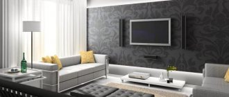
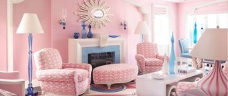
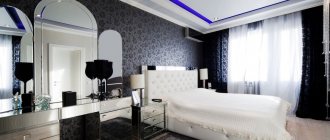
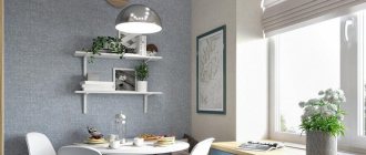
Photo examples of successful style
Below you can see samples of wallpaper for living rooms, decorated in different ways.