When decorating your home, you will inevitably face the need to correlate several colors with each other. There are several basic rules, knowing which you can easily arrange any room. The article presents a table of color combinations in the interior, as well as many useful tips and theoretical materials. In this article you will learn about:
- color circle and the principle of its construction;
- tones that are used in a particular interior style;
- how to combine them correctly in the interior;
- how to choose shades and how to combine them.
We wish you happy reading.
Color combination in the interior of the room
Table of color combinations in the interior depending on the type of room
Since color affects a person’s psycho-emotional state and biochemical processes in the body, in rooms with different purposes, the combination of shades when decorating the interior will be different.
Living room interior
You need to be especially careful when choosing a palette when decorating rooms such as a bedroom and a children's room, since they are intended for relaxation. If done incorrectly, a person will not be able to rest normally, both physically and psychologically. Below is a table of color combinations in the interior, compiled by our designers.
| Room name | Recommended color combination palette |
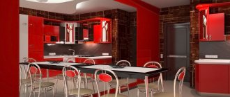
| Kitchen | Soft and calm tones: yellow and turquoise. |
| Hallway | Tones that improve mood and digestion of food: green, beige, yellow, silver, as well as their combination with red and blue. |
| Color combination in the living room interior | Neutral, soft tones, which are diluted with bright accents. |
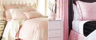
| Color combination in the bedroom interior | Pastel colors and shades of purple. Please note that the bedroom is a personal space, so there are no restrictions here, and it is decorated at the request of the owners. |
| Bathroom | Light colors with a bluish tint, as they give a feeling of freshness and cleanliness. |
What is a color wheel, what principle is used to build the palette of color combinations in the interior?
Professional designers know how to choose the right palette of color combinations in the interior, so their work looks attractive and harmonious. To do this, they use a tool called a color wheel. What is it?
It is a symbolic representation of the visible spectrum of sunlight, which represents different color options. Over the years, different theories have emerged, so there are several circles:
- RGB:
- R.Y.B.
Color wheel
In sectors of the circle, shades are placed in almost the same order as in the spectrum of visible light, and to link the extreme tones, a conditional purple hue is additionally used
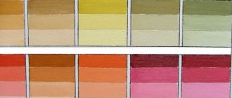
To better understand the correct compatibility, it is necessary to build a color wheel. A person distinguishes three main tones: yellow, red and blue. All others are obtained by mixing the main ones with each other, as well as the main and derivative shades. By mixing primary colors, composite colors are obtained, and the remaining empty cells are filled with third-order tones.
Color combinations in the interior - layouts for different styles
When creating a specific design, you need to take into account not only your wishes, but also know and follow certain rules. This is the only way you can properly decorate your premises and avoid serious and gross mistakes.
Before studying the layout of color combinations in the interior, we recommend paying attention to the main points of correct design:
- choice of basis;
- the right combination of warm and cold tones;
- Warm colors are used to create coziness in a large room;
- in a small room, it is better to use cold colors, this will visually enlarge the room;
- when decorating a kitchen or dining room, keep in mind that shades can both enhance and suppress appetite;
- in the bedroom, the color palette of the combination of colors in the interior should provide a comfortable rest;
- For each interior style, experts recommend using certain tones;
Combination layouts
Each style has its own color scheme for combining colors in the interior. The table below reveals all the recommended shades when decorating a room.
| Style name | Recommended shades |
| Classical | Different tones, but must be white. |
| Provence | Blue, pink, light milky. |
| Eco style | Brown and dirty green. |
| High tech | White, black and metal color. |
| Baroque | Any pastel colors. |
| Modern | Green, blue, brown-beige. |
| Minimalism | White black. |
| Pin-up | Yellow, pink. |
| Loft | Green, red, orange, blue. |
| Country | Light yellow, brown, sand. |
| Futurism | Light green, white, ultramarine, lemon yellow. |
Style features of color design
Each direction in interior design tends to use certain shades of colors.
- Classicism gravitates towards light pastel colors.
- The selection of shades for retro and pop art allows for any contrasts. The most incredible combinations are possible: pink and green, purple and orange.
- Minimalism implies a light palette using white, gray and black tones, symbolizing restraint and laconicism.
- Modern - a range of brown and golden shades with transition into each other. Combinations of cream and butter colors are also possible.
- Mediterranean style - selection of shades of green (pistachio, emerald, olive), white, blue, blue, amber and terracotta colors.
USEFUL INFORMATION: Which foam is best for plastic windows
Options for color combinations in the interior
Color plays a huge role in creating an interior; with its help you can create comfort and coziness, visually increase or decrease the space, so you need to take a responsible approach to such an issue as combination.
Complex combination
This option is considered universal. Classic shades are used, these include beige, gray and white. By combining these tones with others, you can create a classic solution that will always look modern and beautiful. In this case, you will not need to constantly change the interior of the room when buying new furniture, replacing flooring or other elements.
Complex combination
Triad or combination of 3 colors
The use of three primary colors, which always harmoniously combine with each other and can be used in equal measures. The combination of red, blue and yellow evokes a surge of emotions and cheerfulness. If they are used in their pure form, the result is a bright and rich solution. If you use halftones, the design of the room turns out to be less aggressive and more comfortable.
Triad of shades
The use of a triad helps fill the room with energy, so this solution is used to decorate the living room, sports rooms and children's rooms, but this design is not recommended in the kitchen or bedroom.
Similar combination
This option involves the use of 2-3 types of shades, which are located nearby in the color wheel. You need to choose the appropriate one in which you decided to decorate the room and select several tones in the color wheel to the right or left of it. This solution is simple and original, and choosing two or three similar colors is not difficult.
Similar combination
Separate-complementary combination
In a complementary combination, contrasting shades are used; they are located opposite each other on the color wheel. With a separate-complementary solution, instead of the color located opposite, choose the shade that is next to it. This allows you to create contrasting solutions, but they are not as intense as with a complementary combination.
Separate-complementary combination
Tetrad or combination of 4 colors
In this case, the scheme consists of a main color and there are two more that complement it, and the fourth serves as an accent color. This creates a rather interesting effect that evokes positive emotions. Basically, these colors are preferred by young people or people who are in constant motion and fast rhythm.
Notebook in the interior
Influence on the choice of cardinal directions
Any palette can manifest itself differently depending on the degree of natural light. This factor depends not only on the size of the window openings and their openness, but on the side of the world from which the room is located.
- South. Often there is not only enough sunlight, but also in excess. In order to reduce the “temperature”, it is recommended to use moderately cool shades (white, blue, turquoise, gray).
- West. During the daytime peaks, the room may be too hot and light, so there should be cool shades, such as mint (closer to blue), deep blue, gray, brown.
- East. It is recommended to give preference to pink and brown tones, which will benefit from the sunrise and compensate for its lack in the afternoon.
- North. Due to the coldness and short duration of sun hours, you need to choose warm, soft shades (beige, coffee, green, yellow). They will not only add light to the room, but also visually fill it with sun.
Before choosing the color of the walls for the living room, you need to consider the location and intensity of the lighting fixtures. If they are located around the entire perimeter of the room (in the form of LEDs or built-in lamps), the tint palette can be changed depending on the desired effect.
The magic of color or the gradient effect in the interior
Gradient in the interior is a modern solution used to decorate various living spaces. It is based on a smooth transition from dark to light tone. This method can be used when decorating various interior details.
The gradient effect helps bring freshness and excitement to the room. Typically, designers use various shades of blue, as it gives a beautiful combination of colors in the interior.
Gradient effect
Experts recommend making the transition in such a way that the darker tone is near the floor and the lighter tone is near the ceiling, this will visually enlarge the room.
Advice from professionals
3 ways to combine colors.
- Colors of a close or related type or two pastel cold types.
- "Gradient". Tones of the same color with different saturation.
- Various colors.
The boundaries between the colors are drawn.
Wall painting options:
- dividing walls horizontally;
- the use of strips when decorating walls;
- gradient coloring;
- panel inserts;
- relief selection;
- creating correct geometric shapes;
- irregular lines with complex shapes;
- the effect of color on the dimensions of a room.
Painting walls in two colors is a popular type of decoration that creates a minimalist style. Combined coloring provides peace of mind and creates original interior solutions.
We select a combination of shades for different places in the room - a table with recommendations
To create a comfortable and cozy space in a room, it is important to choose the right color schemes when decorating the ceiling, floor and walls. With the help of a competent combination, you can breathe light and air into even a small room, and make a large room warmer and more comfortable. Further in the article there is another table of color combinations in the interior, which will help you choose the design of different places in the room.
| Floor, wall and ceiling design options | Recommended Solutions |
| Contrasting combination | The walls are made of bright colors, the floor is dark, and the ceiling is light. You can visually change the size of the room, hide existing shortcomings and highlight advantages. |
| Current gradient | The ceiling is light, the walls are a little darker and the floor is dark. The transition from a dark tone to a light one allows you to create harmony; this design is suitable for any room. |
| Light and air | The walls and ceiling are light, the floor is dark. Suitable for a small room with low ceilings. |
| Opposites | The ceiling is light, the walls are dark, the floor is light and vice versa. This option can be used in rooms with low and high ceilings. |
Green palette
https://www.pinterest.ru/
A room decorated in this color scheme promotes relaxation and calm. Fuchsia, purple, black and brown colors and dark wood go well with the dark sea color.
https://www.pinterest.ru/
https://www.pinterest.ru/
https://www.pinterest.ru/
https://www.pinterest.ru/
https://www.pinterest.ru/
https://www.pinterest.ru/
https://www.pinterest.ru/
https://www.pinterest.ru/
https://www.pinterest.ru/
Psychology of color, or how it affects us?
Studies have shown that color affects a person’s mood through his subconscious. Perception is influenced by such factors as the state of health, age, social status of a person and his character.
Colors and colors
For women
Women are more sensitive to the perception of color and shades. There is no clear distinction between “male” and “female” colors, since each person is individual. Despite this, there are tones that women prefer more:
- blue, it has a calming effect and is loved by both women and men;
- green, associated with nature and the feminine, symbolizes health and tranquility;
- turquoise, this shade is one of the most favorite among women;
- purple – it is a representative of the “feminine” color, emphasizing the mystery and mystery of a woman;
- pink tones are associated with women, but this is not a preference, but a pleasant rule;
- Lilac color is also considered “feminine”, it evokes a feeling of romanticism and nostalgia.
Women and interior colors
With age, color preferences change; women love pink more, but give less preference to green than in their youth.
For men
It has been found that men perceive approximately 30% fewer shades compared to women. Often women are indignant that men cannot appreciate their efforts when choosing a color, but this is due to physiology, since for them pumpkin and peach colors may not be different from each other.
Men's perception of color
Most men prefer blue and its different shades. Some scientists believe that they symbolize it with clean water and clear skies. In addition to blue, men love green, but unlike women, they prefer cooler tones. Traditionally they like black, but most men cannot stand purple and pink.
For children
Newborn babies see everything in black and white and only after 2 months they begin to distinguish other colors. At the age of 2-5 years, they can already distinguish the entire visible spectrum.
Children are attracted to everything bright, so they love pink, red, yellow tones, such preferences persist until the age of 10, after which the child may already like the blue tone and all its shades. Girls prefer pink and purple, while boys prefer blue and its shades.
How to choose good wall paint
On each package of paint or varnish you can find a special set of numbers and letters. To begin with, what are paints and varnishes? In modern construction, these include compositions in the form of powders or liquids, which on surfaces give the film texture or color. Paint and varnish materials, or paint and varnish materials, as they are called for short, include various primer mixtures, enamels, paints, varnishes, antiseptics and putties.
Varnishes are capable of forming a transparent film; they are usually used mainly for interior work. Putties are “inseparable” from primers, because one cannot be used without the other. These materials act as a kind of basis for the future layer of paint. Their main purpose is to prepare the surface and level it. Antiseptic solutions are applied to protect the surface.
Good to know! In order to make it clear what properties a particular paint or primer has, it is customary for manufacturers to apply special markings of letters and numbers, deciphering which you can obtain information about the required product.
Decoding alphanumeric markings
| The letters represent the base: | The numbers mean the following: |
| ShL – alkaline paints and varnishes | 1 – has increased weather resistance |
| BT – bitumen | 2 – protects against the negative influence of environmental factors |
| UR – polyurethane | 3 – not afraid of moisture |
| RP – petroleum polymer | 4 – is resistant to various oil mixtures |
| KCh – rubber | 5 – not afraid of chemical influences |
| – | 6 – conducts electricity |
| – | 7 – resistance to temperature changes |
| – | 8 – used for special coatings |
Combination of colors in the interior: curtains and wallpaper, as well as furniture - how to combine?
In most cases, textiles are purchased when the room has already been renovated and furniture has been placed. In this case, when selecting the right fabrics, many difficulties arise that affect the combination of colors in the interior. Curtains and wallpaper, as well as furniture, are much easier to select at the same time.
Successful color combination
The procedure for selecting the color of furniture and textiles will be as follows:
- determine the first and second basic shades;
- wallpaper is purchased in a light shade of the first color;
- furniture in two different colors of the second option;
- curtains should be made of fabric with a pattern consisting of the first and second colors;
- the same fabric will be used for decorative pillows;
- pillows can be made from fabric in a rich first color.
Bright room
This is a conventional algorithm and each designer can develop his own, but if you are new to this business, then focus on the described technology and you will be able to correctly design your home yourself.
What colors definitely won't go together?
There can be no categorical answer to this question. Modern fashion is characterized by extravagance and creativity. If earlier the combination of green and red in the interior was considered tasteless, now this will not surprise anyone.
Harmony and disharmony, or combination of colors in the interior - table.
When creating a classic interior, experts do not recommend combining cold and warm tones, but there may be small bright inclusions. If you want to combine contrasting colors, then it is better to do it with halftones.
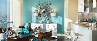
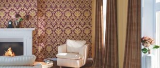
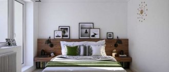
Combination of colors in the interior – 15 photos
In brown tones
In the recreation area
City apartment
Modern style
Cool blue tones
In red color
Relax zone
In a room with a fireplace
In a country house
Green shades
In the cottage
In the kitchen
In the room with photographs
Cozy atmosphere
Mediterranean style