Color for kitchen walls: selection rules and recommendations
Everyone has their own favorite colors for the kitchen, but not everyone is suitable for wall decoration. There are proven developments that are used in design practice:
- Bright colors will attract all the attention and will tire you if you spend a lot of time in the kitchen;
- Furniture that matches the color of the walls looks respectable, but a beautiful set will be lost against a related background;
- When deciding what wall color to choose for the kitchen, remember that cold colors reduce appetite, while warm colors provoke the desire to snack;
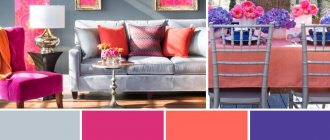
- Personal preferences do not always fit into interiors. Unlike clothes, you cannot use acidic shades or use 5-6 bright colors. The ideal “kitchen trio” involves a light background and two contrasting colors;
- In contrasting combinations, you cannot use “50 to 50”; a light shade should fill ¾ of the surfaces. Dark colors are suitable for contrast or graphic accents.
In principle, it is not so important what color to paint the walls in the kitchen; the main thing is to choose a good combination, correct the design flaws and place accents. According to the rules of Feng Shui, if you choose a cold color scheme, light shades are a priority. Textured surfaces (plaster, wallpaper, panels) look impressive only in combination with the smooth facades of cabinet furniture.
You can use a ready-made table of color combinations in the kitchen interior.
What wall color to choose for the kitchen, remember that cold colors reduce appetite, while warm colors provoke the desire to snack.
Changing the size and proportions of the kitchen by painting the walls
A few tips will help you correctly combine the shades of walls with furniture to get a certain effect:
- Light brown - using it in the apron area will add depth to the space and visually make the room longer and wider.
- White is often the dominant color in the kitchen, so it should be diluted with bright accents from textiles and accessories to rid the space of facelessness.
- Light gloss - such surfaces reflect everything around them, so tiles in milky and light beige shades for the kitchen are chosen without a pattern or with a very discreet print.
If you want to get the illusion of increasing the space of the room, materials must be selected with smooth surfaces, as well as with horizontal or vertical patterns. For example, you can tile the walls, lay out glass mosaic panels, use paint, PVC or wooden panels.
Basic combination techniques
When choosing the color of the walls for the kitchen, it is important to take into account all design elements, including metal fittings. A harmonious combination can set the emotional background of the room.
Important combination techniques when choosing kitchen colors:
- Pearl gray is suitable as a background for spectacular combinations with pink, blue, lilac, red and blue;
- The milky tone harmonizes with warm shades and is suitable for dark shades of the cold spectrum;
- The beige color of the walls in the kitchen is considered universal - any combination of colors and shades;
- Light brown, akin to beige, looks good with white, turquoise and azure complements;
- The pale pink color of the walls goes well with the gray, raspberry, chocolate and caramel colors of the facades;
- Burgundy and cognac look perfect with milky, pale blue and black and white contrast;
- A lavender kitchen in a Provencal style is combined with olive and pale blue walls;
- Peach and apricot combine nobly with cream in contrast with brown;
- Golden, yellow and lemon are combined with purple, black and granite;
- Turquoise and azure go well with crystal white furniture.
Black is an extravagant color, but as the main color of the walls it is not always suitable for a white “kitchen”. It is important to maintain color balance. The “cosmic” color of the walls is able to “absorb” space. Black gloss has a mirror property.
When choosing a dark color, consider the texture and light absorption of the surface. Glossy and matte textures are perceived differently.
The beige color of the walls in the kitchen is considered universal - any combination of colors and shades.
What types of paint are suitable for kitchen walls?
There are a lot of types of paints and their nuances, but only a few are suitable for painting kitchen walls. An important condition is that the material must not only have the desired shade, but also characteristics that allow it to be used in a room with difficult operating conditions. Let's look at the main types of paints suitable for painting kitchen walls.
Glossy surfaces will be easier to clean and more durable, which is especially important for a kitchen, but gloss will highlight the imperfections of the wall. Matte paints are less durable, and therefore more suitable for bedrooms and living rooms, but they visually align the walls of the kitchen. You can also find highly durable matte paints designed specifically for kitchens and bathrooms.
Paint for kitchen walls can have a different consistency - from thick to liquid. You should not purchase a completely liquid composition, since when using it you will have to apply not one or two layers, but more
Water-dispersion and water-emulsion
The most popular paints are water-dispersion and water-emulsion, which in turn are acrylic, latex, and silicone. Their main composition: water, color pigments and polymers. Water-based compositions are a mixture of water, coloring components and various additives. This finish is quickly and easily applied to the surface. At the time of use and further operation there is no characteristic unpleasant odor.
Features of the geo-location of the kitchen
The degree of illumination is an important nuance when deciding how to choose the color of the walls for the kitchen.
- In low light conditions, it is advisable to choose light shades of warm colors. In the northern room, it is advisable to choose yellow, lemon or orange walls. The reflection of light will enhance furniture with a glossy facade;
- The southern location will be “cooled down” a little by blue-blue or lilac colors. A modern kitchen in purple complements well with a pink or light gray background;
- Bright shades of kitchen sets are suitable for the shaded side of the house; they are compensated by light wallpaper or plaster;
- Kitchen windows facing east receive little sunlight, so a light color scheme is recommended;
- The southwest rooms are well lit in the afternoon. Direct sunlight promotes fading. It is suggested to choose pearl gray, pale lilac or beige for the walls in the kitchen;
- Mint, lettuce or pistachio are suitable for the kitchen-dining room; they are a good alternative to bright greens.
In low light conditions, it is advisable to choose light shades of warm colors.
Associative properties of color
A large adjacent room will appear “cold” in blue tones. It is advisable to dilute it with more friendly companion flowers.
Walls are the basis or background for the entire interior. Before choosing the color of the “kitchen”, it is important to clarify the preferences of all family members. Small children will not say that they don’t like it, but they will be capricious and refuse to eat if the kitchen is purple or black with a red facade.
People prone to depression should not rely on the “dreary” gray-green color scheme. It is unlikely that it will be pleasant to cook and dine there in cloudy weather.
Fans of extravagant kitchen color combinations should take into account that the black ceiling “presses”, and the white and mirror floor makes one dizzy from instability.
The diagonal pattern will “brighten up” the difference in the height of the walls. Colorful wallpaper will hide small defects.
The decor of a small kitchen should be of a small format so as not to divide the space into blocks. Crushing will make it visually even smaller. Several small paintings in a row will visually lengthen the wall.
Dark shades slightly reduce the area. Light reflections reflected from glossy facades “fill” the room with cleanliness, air and light.
The decor of a small kitchen should be of a small format so as not to divide the space into blocks.
The influence of shades on mood and well-being
Without knowing which colors are suitable for the kitchen and which are not, it is easy to make a mistake - the emotional background of the room depends on this. It is known that psychologists have noticed the relationship between color and mood.
It is not recommended to choose flashy shades, especially if you have small children. They will happily eat in a room with a yellow-green or pink-raspberry design.
The red color of the walls in the kitchen excites active children, then it is difficult to put them to bed. Blue color calms, but discourages appetite.
Children are disgusted by a black kitchen, even with mirror tiles. The situation will be corrected by decor with flowers, fruits or bright citrus slices.
The red color of the walls in the kitchen excites active children, then it is difficult to put them to bed.
Bordeaux and sea green
A bold decision: the wall is painted burgundy and covered with a hand-painted glass screen: the flowers seem to curl along the wall. In order not to make the space feel heavier, they abandoned the upper cabinets and chose lower cabinets in a light turquoise color, which adds air. Similar techniques can be applied in a city apartment.
Tempered glass on the backsplash is an alternative to the usual tiles. You can order glass with a print, transparent, mirrored, plain - there are many options.
Project author: Mila Stavitskaya. Photo: Sergey Ananyev.
Tempered glass on the backsplash is an alternative to the usual tiles. You can order glass with a print, transparent, mirrored, plain - there are many options.
Project author: Mila Stavitskaya. Photo: Sergey Ananyev.
Ideas for combining wall colors and furniture
The kitchen walls are a large format plane. Furniture determines the style and functionality of the kitchen. They must harmonize in color.
An elegant purple kitchen set has a light background:
- Gray-lilac tone;
- White;
- Pale blue;
- Fashionable color “dusty rose” (gray-pink tone).
If you have a white kitchen set, the walls can be any color. It will “get lost” against the background of white walls, so it is advisable to play up the texture of single-color surfaces. White marble countertops will look noble.
Not everyone manages to use gray tones beautifully in their design, but the color of the walls in the kitchen is in harmony with the white furniture. This is an ideal option for a high-tech kitchen. For dark facades, it is better to take the lightest tone in this range - it will be much more interesting than white walls.
If you have a white kitchen set, the walls can be any color.
What color to choose for the walls in the kitchen
According to color therapists, there are four main colors that help improve appetite:
- red;
- green
- orange;
- yellow.
This is the color that most vegetables, ripe berries and fruits are painted in. In the human subconscious, this association affects appetite receptors.
Red
The color of active and passionate natures most often sets one in a festive mood. Great for the kitchen, but too much of it in the interior can cause aggression. The most common combinations are white, beige, light gray or black. Kitchen walls painted burgundy will add spice to the kitchen. This shade of red attracts special attention. A bright tone will create a memorable interior.
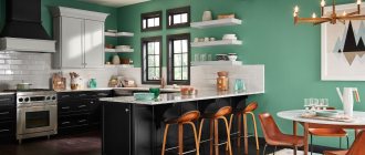
Green and dark green
Green color exudes spring mood, optimism and positive energy. Pistachio and lime tones will add more juiciness. A white set with green walls will look especially interesting. It would be appropriate to use a combination with a brown palette.
Dark green color is not recommended for use in kitchens with poor lighting. By refusing it, you can avoid a gloomy and depressing environment.
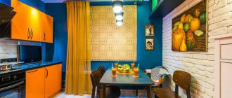
Orange
It is called the color of movement and life, so it would be most appropriate in the kitchen. Having painted the wall with it, it is not at all difficult to choose a color for the facades of the kitchen unit: it can be a dark palette of brown, black, gray and white. Designers welcome the combination of all orange shades. Among them you should choose pumpkin and amber. They bring rich, invigorating energy to the interior.
White set combined with orange walls
Yellow
You can add brightness to the room using bright yellow. Mustard and lemon shades combined with neutrals are welcome in kitchens. They bring more creativity into the interior. It creates a feeling of additional lighting. It will attract the most attention with its variety of combinations: with brown, gray, burgundy, white, soft lilac.
To the point! Even more design and combination of yellow with green, brown, black and other shades
Among those colors that help dull the appetite are the blue palette, as well as black and purple. Therefore, they try to minimize them in the kitchen.
Blue
Cool and deep blue shades will help create bright accents in the kitchen. Royal coldness gives the interior austerity. These tones are selected for kitchens that are located on the southern part. It won't be dark because of the sun's rays. A blue wall surrounded by sand, cream, brown or white kitchen furniture looks harmonious. The combination of white and blue gives calmness. Properly proportional design will allow you to create an effective design.
White
White gives additional volume, brightness and cleanliness to the room. It can be combined with many shades, such as creamy, milky or opal. The combination with white is the best complement to the volume and texture of other decorative elements.
White wallpaper on the walls
Blue
Not everyone likes extravagance in the interior. A kitchen made in a harmonious blue color creates a favorable atmosphere. Shades of blue are suitable for decorating country houses, especially near the sea.
Mint
The universal shade of green plays a secondary role. If the owners like freshness and brightness, then the walls can be painted menthol color. The natural look creates a favorable atmosphere.
White kitchen with accent wall
Olive
Thanks to natural and warm tones you can create an extraordinary interior. The combination of attractive colors will have a beneficial effect on a person’s well-being. Kitchens with walls in neutral colors create a sense of tranquility. Olive color creates a feeling of freshness. You can balance it with white. For example, it is best to choose a white set.
Decoration with white furniture and olive walls
Light green
To create a positive and cheerful atmosphere, it is recommended to use light green wall color. This background perfectly emphasizes dark and bright elements.
Grey
The combination of gray shades brings elegance. This design adds more mystery. In recent years, leading designers have been decorating kitchens in shades of gray, combining them with black or red. The facades may not be monolithic, but may be decorated with silver, mirror or translucent matte inserts.
Pink
Delicate pink tones create a calm atmosphere. These shades are chosen by those who want to make their interior more sensitive and calm.
Pink wall combined with white furniture
Beige
Suitable for any style. It is considered not a cold, not dark shade. Used mainly as the main color of the kitchen. Perfect for painting around the entire perimeter of a room, or as an accent on one of the walls.
Brown
A kitchen in coffee or chocolate shades is considered a classic option. It creates a comfortable, cozy atmosphere. You can use several shades of brown in the interior. The ideal combination of white, brown and coffee is all diluted with shiny fittings on the fronts of the cabinets.
Black
According to experts, black is an indicator of chic. To adjust the space, you can make a black and white contrast; it changes the mood and character. The kitchen design will acquire a rather original character, despite the brightness of the colors.
Violet
Wall colors in lavender and lilac shades bring sophistication to the kitchen. They are mainly chosen by romantics. Rich purple will make her more elegant. For walls, purple is chosen if the floor and furniture are lighter than it.
What color is best for the kitchen space?
White color is considered universal. It can be offered to those who have not decided what color to paint the walls in the kitchen. It is used in all styles and design concepts.
Alternative to crystal white:
- Pearl grey;
- Pearl;
- Lactic;
- Cream;
- Light beige;
- Soft lilac;
- Blurred blue.
White color has several shades - light gray, white-blue, cream (yellowish) and pearlescent. It is not recommended to use them at the same time, otherwise against a pure white background they will look like “dirty” or “old” surfaces.
Nowadays the delicate peach color of the walls in the kitchen is widely used, but it requires gold or copper fittings. The silver-gray tone goes well with the chrome details of modern furniture - an ideal solution for urban minimalism and high-tech style.
Nowadays the delicate peach color of the walls in the kitchen is widely used, but it requires gold or copper fittings.
Color solutions that visually change the size of kitchens
When deciding what color to paint the kitchen in an apartment, you cannot ignore the layout features. In most projects, the cooking area is often limited in size.
When choosing options, take into account the dimensions of the kitchen, ceiling height, daytime and evening light, and existing furniture. For a small kitchen unit you need light colors, maybe in cold colors. In a kitchen where there is a large area of walls, avoid bright colors, they are tiring. Black color “steals” part of the space.
Light warm colors visually expand a small space, for example, if it is the beige color of the walls in the kitchen. A cool palette will slightly expand the narrow layout if cabinet furniture is located along the working wall.
Vertical stripes of walls and glossy stretch fabrics will “raise” the ceiling. Horizontal stripes of contrasting colors along the perimeter will make the kitchen appear wider. Diagonal lines on tiles or colored wallpaper add more dynamism to the design.
A good mood is guaranteed in a white kitchen with a silver patina in vintage style. The option in beige and apricot tones looks impressive.
Horizontal stripes of contrasting colors along the perimeter will make the kitchen appear wider.
Choosing a color to suit the room conditions
When choosing new wall paint, the size of your kitchen is critical. For small kitchens, warm and neutral shades are the best choice. Neutral colors such as white, cream, terracotta, beige, chocolate brown and even gray make every small room feel more spacious.
And warm colors - sunny yellow, orange, red create a cozy and welcoming atmosphere. It’s better not to overdo it - as they say, “less is more.” Instead of painting your entire kitchen bright red, it would be much better to just add an accent wall or pay more attention to the details.
Various nuances in the kitchen look very stylish, but they need to be used with caution so that they do not create an overloaded atmosphere
Color combinations
There are ready-made principles for choosing the color of the walls in the kitchen, which are used by famous designers:
- Black and white version. Suitable for modern interior;
- Favorite color. It is not always possible to properly integrate it into a room. An extravagant fuchsia kitchen will be emotionally balanced by white walls and curtains;
- Monochrome kitchens are an excellent solution for those who do not like diversity. Beige, sky blue, gray-lilac, peach or cream shades look good. Pastel colors and some shades of green are suitable - mint, yellow-green, but you can choose the calm color of apple green;
- Classic duets. Win-win variations - blue and white, caramel-beige cuisine or white and dark chocolate. An emerald-colored kitchen is well complemented by pale blue walls, and a delicate lilac background will set off a plum-colored kitchen;
- Combinations from the color wheel. Use shades within the same color, opposite and adjacent combinations.
Those who want to slightly dilute the interior of a white kitchen are invited to decorate the kitchen floor and backsplash with tiles with a graphic pattern.
Monochrome kitchens are an excellent solution for those who do not like diversity.
The best color combinations
Everyone loves natural combinations, where the entire design palette is based on shades that are associated with something from living nature.
The simplest combination is a two-tone kitchen. You can experiment, not forgetting that one color should be brighter, the other muted.
Extravagant trio - white, red and black. He has the right to live when they don’t know what color is best to paint the kitchen. White is by far the best background. This option can be played up if there is a soft red for the walls and a black gloss on the façade of the set.
Four shades within one color are the designers’ recommendation. For example, a lavender-colored kitchen complemented by purple, lilac and white.
The simplest combination is a two-tone kitchen.
What colors should not be used in the kitchen interior?
Today there are no “forbidden” combinations, but some colors will not look decent if they are not played up.
- The dark green color of the walls is associated with the older generation with the Soviet period, when there were problems with paint, it is replaced with emerald or azure;
- Dark gray has several noble “stone” shades, but it is not recommended to use it as a basis;
- Orange is a pleasant color in all respects, but it is used in an “aggressive” trio with white and black;
- A kitchen in gold or silver looks ambitious; this is “Rublev bad manners”.
The dark green color of the walls is replaced with emerald or azure.
Color and human psychological perception
All existing shades of colors can be divided into:
- Warm, creating a friendly, positive atmosphere. They are suitable for dimly lit areas and literally radiate energy. These are red, pink, yellow, brick shades.
- Cold, having a calming, relaxing and peaceful effect on the psyche. Among them are fresh green, blue and gray colors.
Tip: Within each color you can achieve warmer or cooler shades. Dark options narrow the space and make it smaller. Light colors help visually expand the area. They can be combined with each other for different purposes.
Depending on your temperament, psychologists recommend which tones to choose for the kitchen:
- Sanguine people will feel comfortable in light green, yellow and orange colors. These are active people, prone to action and mobility.
- Cholerics will love red and orange cuisine.
- Melancholic people are better off choosing calm colors with white and blue colors, as well as classic brown.
- Phlegmatic people can be advised to abandon scarlet shades, which will depress them.
The nature of work and lifestyle also influence the choice of color. Violet colors are preferred by creative people, while nervous people will feel more comfortable in a beige space.
According to Feng Shui, warm and light colors are good for the kitchen. But you shouldn’t go overboard with red and orange, because the room already has a source of the element of fire - a stove. Bright, cold shades are not suitable for the same reason - due to the presence of a water tap. You need to choose colors that do not conflict with the elements.
Expert advice
To understand whether it will be cozy in a room with a particular shade of walls, it is worth hanging a sheet of colored paper of the chosen shade in front of your eyes or eating area. If it is perceived negatively, you should abandon the idea even before the walls are completely transformed. In percentage terms, it is important which color will be the main color in the room; the rest will be regarded as additions and accents.
Some shades of brown and terracotta look quite noble, others are “dirty”. They are not suitable for classic interiors, but they significantly enliven ethnic and country style.
For classic kitchens, pastels, wood shades, and duets with a white or beige background are suitable. You can select noble additions by duplicating them in furniture and textile designs.
Furniture is most often the basis of interior design. When choosing a successful trio or duet, they focus mainly on the color of the facade.
For classic kitchens, pastels, wood shades, and duets with a white or beige background are suitable.
Today there is no perfect palette - with every renovation you have to summarize new trends and previously purchased furniture. Some people like monochrome, when everything is one color. This solution in interior design has a drawback - it often looks boring and faceless, especially in gray. However, each tone has at least 4-5 shades. You can choose several advantageous combinations from them when deciding what color to paint your kitchen.