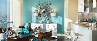
Painting walls is becoming an increasingly popular form of decoration. Factory-made wallpaper does not allow you to create an individual design in your home. And then the time comes to think about what color to paint the walls of the room? If you want to experiment with interesting combinations, try painting the walls in two colors, but remember, this is a long process that requires precise calculations and markings. But the resulting effect will justify all the difficulties. This design will be appropriate both in the kitchen and in the nursery.
Painting walls in two colors: working recommendations
Combined painting requires planning and preparatory work. First of all, you will have to puzzle yourself with the selection of harmoniously combined tones. This is possible only after you decide for yourself what kind of result you want to get:
1. Contrast effect.
2. Ombre effect.
In the first case, you will need bright colors that are noticeably different from each other, possibly diametrically opposite in spectrum. If this is your first time deciding to paint walls with two colors, use a combination of shades that are similar in intensity and color scheme.
Contrast effect
In the second option, you will need to connect consonant tones that can smoothly replace each other. It would look so good to paint the walls in two neutral colors, say gray and cream. You can choose a combination of pastel colors, combining peach with sand or turquoise with delicate mint.
Ombre painting
You should always take paint with a reserve, since it will be extremely difficult to choose an absolutely identical shade. In fact, this will only become possible if the required tone was given to the composition automatically in a specialized store. If you are going to mix colors for painting walls in two colors yourself, then it is better to have an extra reserve liter of shade than to try to mix it later.
What else you will need to do the job well is masking tape. With its help, you can protect untreated surfaces and even create a pattern.
Painting tape will help you create a design
When painting walls in combination, you need to be prepared for the fact that the color joints will not look like a neat, perfectly straight line. Without experience in painting work and possession of special skills, it will certainly not be possible to achieve an effective result. So you need to be prepared to perform additional corrective finishing work. How to correct the deficiency will be described in detail below.
How to calculate the ideal paint combination for a wall
To calculate paint consumption, measurements are taken of the surface to be painted and the surface features are taken into account.
On average, paint consumption is 1 liter per 8 square meters. meters. Window and door openings are taken into account, the areas of which are subtracted, the areas of window sills and baseboards are added to the areas of the walls. Before painting, the walls are leveled, prepared by sealing defects and treating with a primer. Painting is carried out from corners, door and window openings, baseboards with final treatment with a spray gun. Paint consumption is determined taking into account its specific consumption indicated on the packaging.
When making adjustments, the characteristics of the surface being painted are taken into account:
- color;
- texture;
- number of layers.
The basis is a plastered primer.
On wooden plastered surfaces, consumption increases by 6-10%, on metal - 13-15%, on unpainted plasterboard - 40%, on embossed wallpaper - by 70%.
The tool for applying paint is taken into account: roller, brush, spray gun. The roller and spray gun reduce consumption.
Combined wall painting: selection of partner colors
To choose a harmonious pair of shades, it is enough to have a color wheel at hand. When you approach the matter with imagination, you can get the perfect combination of color ensembles that generate impressive effects.
Today it is fashionable to mix black and white paints, cool pastel colors, gray and beige spectrum. If you look at photos of options for painting walls in two colors, you will notice such a trend in decoration as the use of related tones and tint variations from the same spectral range. In the latter case, the shades should be similar in such indicators as saturation, intensity, color temperature and please the eye with a smooth transition.
What is meant? Let's look at a specific example. Green goes well with orange, but it won’t work as a partner to peach when painting walls in two colors. In this combination it is better to replace it with an olive tone.
Harmonious combination of green and olive colors
In general, it is better to select colors using a computer. This way you will be able to more accurately imagine what the color duet will look like in reality and evaluate its relevance.
If the selected shades cannot be found in finished form, they can always be obtained by tinting. In the latter case, you need to order portions of paints for combined painting of walls with a good supply, since the second time it will be extremely difficult to exactly match the tone, and the surfaces will turn out to be unevenly painted.
When painting walls in two colors, consider color compatibility
In addition to the ratio that is pleasing to the eye, when choosing background colors, one must take into account the psychological aspect of their personal interaction and impact on a person. This is worth talking about in more detail.
Where to start gluing
When using paper sheets, the method of gluing from the window with an overlap is used. For dense materials, gluing options from the door and from the corner are suitable.
Where to start gluing overlapping sheets depends on the direction of the light. The need to level the walls determines where to start gluing the wallpaper end-to-end. If the corners in the room are uneven, you can draw a conditional line from which to begin gluing the wallpaper on the wall. The angle can be completed later.
Where to start gluing patterned fabrics depends on the complexity of joining the pattern. To test, choose an inconspicuous place. For example, an area near a window or above a door.
To correctly decorate a room with combined wallpaper, follow our tips! I wish you creative success!
In the video you can find more options for combining wallpaper:
Recommended Posts
Bedroom design with different wallpapers
Painting paper wallpaper
Which is better: wallpapering or painting the walls?
Wallpaper for painting in the interior
How to choose wallpaper for painting and paint
Non-woven wallpaper for painting
The influence of color on mood
Unpleasant feelings from the environment can arise even when simply looking at various options for painting walls in two colors in the photo. Now imagine what it would be like to be inside such a room, and even stay there for several hours? Knowledge of color psychology will help you avoid excesses. So, what does he, my beloved, prepare for us?
Blue
A representative of the cold spectrum is associated with coolness, freshness, and cleanliness. It affects the perception of space. Imagines it as spacious and filled with fresh air. The abundance of shades - from delicate blue to rich, mesmerizing sapphire depth - makes it possible to actively use blue when painting walls in combination.
Blue for combined wall painting
Its calming, relaxing, soothing effect is very necessary in the bedroom and relaxation areas. But you won’t be able to create a cozy living room with it. With his coldness, he is not at all conducive to conversation.
Orange
Spectrum of life-loving optimists. His cheerfulness gives an energetic charge of positivity and calls for activity. The interiors created with his participation are bright and warm to such an extent that they are associated with the tropics. This is what stops designers from using it as a background. But for painting walls in two colors it is more than suitable. To cool down his ardor, you should take the following shade as a partner to orange:
- blue;
- white;
- cool greens.
The first will make it calmer and add contrast to the interior. The second one will dim the brightness, but with it the orange will seem even warmer.
Beige will make orange even warmer
By and large, it is better to assign the shades of the orange spectrum, with their pronounced color intensity, to the role of local accents rather than using them as a background screensaver. Look for options in what doses to introduce orange in the photo of painting walls in two colors.
Yellow
A color with a wide shade spectrum, including deep, rich warm tones and cold, faded ones. In any case, yellow is also full of positivity and is able to fill a room with an atmosphere of happiness, even on the cloudiest day. The association with the sun gives experts the right to recommend it for use in rooms with poor natural light.
When painting walls with two colors, yellow should also not be given primacy. Its abundance can irritate or give rise to causeless anxiety. But for the decor of the kitchen and dining room, this color is very good, as it awakens the appetite.
Original gray-yellow duo
As partners with yellow, you can safely take representatives of the blue and green spectrum, as well as white. The yellow-gray duet looks interesting.
Red
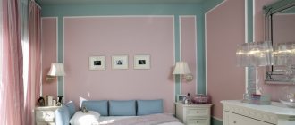
The spectrum is hyperactive, energetic, stimulating to action, but in unlimited quantities it acts stimulating, irritating and even provokes aggression. It is clear that in a combination of painting walls with two colors, red needs a calm partner. White color can extinguish the fire of passions.
Its combinations with gray and not bright blue are perceived as interesting.
White color will mute the intensity of red
To make red sound more oriental, purple or pink tones are added to it.
In the living room you can make an accent wall in red flowers. This solution will add comfort and depth to the interior.
Accent wall in red
White
He is self-sufficient and can perform solo. It is cool, fresh, clean, and clean sterile, so to avoid unwanted effects, painting the walls should be done in two colors.
White color can be used in rooms of any functionality
Decide for yourself in what proportions to correlate partners, but do not forget to take into account the stylistic interior features. Thus, in minimalism, white is given the dominant role, and in empire style - the finishing role. The neutrality of the color makes it a comfortable environment for both relaxation and work, so it can be used in rooms of any functionality.
Natural palette
Natural colors fall into this category. If the goal of combined wall painting is to create a working environment in the room and promote concentration, use beige, gray and even black in the palette. They will serve as an excellent background for bright inserts.
If you need a calm, antidepressant environment that has a calming effect and corrects your mood, you should use the green spectrum in your interior decoration.
Green color has a calming effect
When painting walls in two colors in the living room and bedroom, it is allowed to use a play of shades of green. You can combine it as you like, the main thing is to guess with the context of the atmosphere. Carefree aquamarine conveys a light casualness, while dark green conveys conservatism and business rigor.
Lighting and furniture
Often, well-chosen lighting allows you to visually mask the difference in planes. For example, when the perimeter is illuminated from the inside, a volumetric panel will successfully merge with the surrounding surfaces, and the junction of materials will become natural and logical.
In addition, the border of different textured finishes can be successfully hidden with furniture. The easiest way is to hang shelves and install an interesting rack. When connecting vertically, you can install a built-in cabinet in the problem area.
The most successful color duets
A non-standard approach to wall design will allow you to diversify the decor in the room and make the atmosphere in it more lively. A separate line today in painting walls with two colors is contrasting solutions. Creative people who are not afraid of bold ideas decide to combine the incongruous. If you want to join their caste, try the current combination of black and white. You can go further and play on the opposition of red and black or combine crimson with purple. How interesting the interior will be after painting the walls in these two colors, look at the photo.
Contrasting coloring will diversify the decor in the room
The more conservative part of the audience will be impressed by completely different combinations, characterized by calm colors.
What do designers offer in the new season?
Mix everything and everyone, but in reasonable tandems.
White color will look great paired with blue, yellow, and bright green shades.
Brown colors should be added to lilac, as well as the freshness of cream and the cheerfulness of yellow.
Painting the walls in two colors such as:
- coffee and caramel;
- milky and rich chocolate;
- cream and grey.
Stylish combination of cream and gray
Rooms with such walls are especially warm and cozy.
A mix of beige and rich turquoise will create a bright atmosphere with a claim to originality.
Mix of beige and juicy turquoise
When painting walls in two colors, you can combine the yellow, orange and red spectrum. It will turn out fun and lively, just what you need for a game room.
Complex purple also did not stand aside. Its depressiveness is perfectly softened by shades of beige.
The depressiveness of purple is perfectly softened by beige
Other types of finishes
Patchwork design
This method of designing two types of coatings gives a wide field for imagination. You can cut the canvas into pieces of the required length and stick them on randomly or in an orderly manner, end-to-end or overlapping. A wall decorated like a chessboard looks original. See how it looks in the photo.
Inserts of cloths of different sizes
Gluing of inserts cut from thick canvases is most often carried out after the completion of the primary finishing (pasting or painting the walls). At the same time, it is important to maintain proportions and correctly fit them into the overall design. To diversify the style, use inserts in two or three color variations. How they look in the interior is shown in the photo.
Technologies for painting walls in two colors
Designers know a dozen ways to make the walls of a room colorful using paints of two shades.
Colored horizontal lines
In the standard version, such division of walls when painted is perceived as decor with panels. The shade border line runs at a height of 1/3 from the floor, which is important for classic and new-fangled stylistic interiors.
But look at the photo of the combined painting of the walls in two colors. You will see that this is far from the only possible solution. The border can be moved to the middle or even pushed under the ceiling. Moldings are used for its decorative design.
Original painting of walls in two colors
If you want to tinker, a striped print may appear on the wall surface. To implement the idea, specific skills and great care will be required. The process is labor-intensive, but satisfying with the results.
Striped print on the wall
Colored inserts
Painting walls in two colors using this technology also imitates panels, but vertical ones. It looks truly luxurious, so the technique is often implemented in glamorous Baroque-type interiors.
Vertical painting imitating panels
Accent wall
A technique of combined wall decor that is very popular these days. The idea is simple to implement, but at the same time allows you to get a creative interior.
The idea of painting walls in two colors is as follows: three of the four surfaces in the room are decorated with one pastel or neutral shade of color, and the fourth stands out against their background with a bright contrast in the living room and kitchen or a calmer, but different tone from the background in the bedroom.
Painting walls in two colors will help you get a creative interior
By using the technology in a slightly different aspect, you can get rid of the flatness of wall surfaces, which will also add creativity to the decor and present the interior from a completely new perspective. For this purpose, only part of the walls receives combined painting. A wide vertical stripe of a different color from the background will appear at the joints of the walls or in their center. This technique is good when you need to hide the shortcomings of the layout or, on the contrary, highlight some of its advantages.
Contrasting painting will eliminate the flatness of wall surfaces
Color accent often serves the purpose of zoning. With its help, areas for relaxation or eating are highlighted, attention is focused on the arch or fireplace, niches and partitions. As the photos show, painting walls in two colors is attractive not only for the decor of living space. The reception is also relevant for corridors with bathrooms. In the first case, in this simple way they get rid of the monotony of the situation, in the second, they allocate a shower or washbasin area.
Highlighting a recreation area using a contrasting color
Combinations of complex shapes
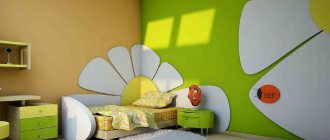
In this case, we will talk about the appearance of repeating figures against the general background of the walls. These can be scatterings of squares or bundles of triangles. The idea is good for decorating children's rooms, kitchens, and bedrooms, decorated in a vintage spirit.
This technique of painting walls in two colors is difficult to implement. To apply an ornamental geometric pattern on the surface, somewhat similar to the pattern on a sweater, you will have to work hard.
An example of applying a graphic pattern to a wall
The process will be step by step. First of all, you will have to paint the walls a base color. The next step will be marking the location of future ornamental elements. This is done on a well-dried surface. Painting tape is glued over the resulting lines, after which the delimited area will need to be painted over with the selected shade. You can search for unconventional options for painting a wall in two colors on the Internet.
Sometimes patterns are complemented by gradient transitions or the decorative finish is enhanced by frames made of molding. The latter are glued strictly along the contours of the figures.
A polka dot wall will make a great impression. The latter can be located on the surface in any order or drawn according to some pattern.
It is not necessary to make peas of the same diameter. Here it is quite acceptable to play on a variety of forms. What you should strictly adhere to is the contrast in painting the walls in two colors. The decor should be bright, clearly visible, not merging or spreading across the base layer.
A polka dot wall will make a great impression
Pea walls will decorate a nursery or kitchen, interpreted in a retro style.
In principle, you can draw whatever you want on the wall. Fantasy patterns, linear ornaments that repeat the shapes of furniture, and drawings with a meaningful plot are also suitable. But if in the first versions it is permissible to use a stencil to implement ideas, then in the latter, painting the walls in two colors will have to be done live, that is, to show your artistic talent. Aren't you scared by the prospect? Then consider that an exclusive interior is already in your pocket.
Linear ornament on the wall
Color gradation
The secret of this technology is that when decorating a room, the walls are painted not with two colors, but with a tint palette of one. Different tone saturations, smoothly transitioning into each other, give the required color gradient.
Gradient wall painting
Usually four shades are used in the work, the most delicate of which greets you in the hallway. As you move deeper into the house, the color saturation increases. The interior solution looks exciting, so don’t rush to dismiss it, but rather look at how impressive such a combined wall painting is in the photo. Surely what you see will inspire you.
Gradient paint looks exciting
How to properly hang different types of wallpaper
- The first stage involves cleaning the space from debris, dust, and eliminating large defects with a special solution.
- Then the surface is primed with wallpaper glue.
- We are making a diagram according to which we will begin gluing the first roll.
- Lubricate a separate strip of wallpaper with glue and wait 3-5 minutes.
- We glue the canvases to the wall, smooth them with a rag, you can use a roller to remove bubbles.
When combining horizontally, a decorative threshold is used, which is glued to the wall. It is necessary to leave a gap of 0.5-1 cm between the canvases.
To prevent joints from forming on the canvases, the room should not be subject to drafts during drying. See how the combination of wallpaper in a room looks in the photo.
Border design
Even masters are not always able to clearly draw the boundaries between two colors. But this is not a reason to be upset and refuse the wall decoration option you like. Wooden slats, moldings, stone borders, and mosaic masonry will help hide the unprofessional hand that performed the combined painting of the walls. Additional decor will not only not spoil the impression, it will become the highlight of the interior.
For an even transition between colors, use moldings
In general, who said that the junction of shades should be even? It is quite possible to make it arched, wavy, zigzag - in general, the way the author of the project wanted it to be.
Zigzag transition between colors
Decorative sides
Typically, such sides are used to decorate walls with 3-D panels along the entire perimeter or along the sides. The sides are matched to the color of the main coating, but can also be contrasting.
Such elements are well suited for joining panels with other materials. The junction will look more aesthetically pleasing and neat. There are sides of different widths on sale, and the widest of them can serve as independent interior decor.
Edge for table top
Photo gallery – painting walls in two colors
Possibility of combination with other materials
In fact, wallpaper is a universal material for home renovations. Can combine various materials with wallpaper. Let's take a look at the basic material options:
- Paint – wallpaper goes well with painted walls. If this proposal does not suit you, you can use wallpaper specifically for painting.
- Decorative stone - stone is usually combined in corners or on some accent walls. This type of combination is popular in hallways and living rooms.
- Brick is a material used to create a more brutal interior. The color scheme is selected exclusively to suit your room interior.
- Panel - this element of wall decoration goes well with wallpaper. Panels are used to create classic and modern styles.
- Plaster – since ancient times, the first layer of repair was plaster, but nowadays it has become a decorative element.
- Tiles - this material is used mainly in bathrooms to protect wallpaper from moisture. Wet areas are tiled, and the rest of the wall is covered with wallpaper.
Some rules for combining
Even those who have not yet figured out in practice how to combine two types of wallpaper may not worry about the final result of their design, since knowledge of the basic rules of combination will help you highlight the positive aspects of the interior.
Tip: the selection of wallpaper in two colors must be carried out with one important condition: the materials you choose must have common features. It is not at all necessary that it be the same composition of materials or the size of the canvas. It is much more important to maintain consistency in shades, textures or themes of the drawing.
Quite often, an interior with two wallpapers looks contradictory due to the inconsistency in the style of such materials . For example, wallpaper with classic patterns will not look harmonious next to modern 3-D photo wallpaper. The unity of styles should be manifested both in the materials themselves and in the harmony of the combination of colors of wallpaper and furniture for your room, therefore the decoration and design of two-color wallpaper is carried out after the purchase of furniture and accessories.
A design of wallpaper of two colors does not necessarily have to include only monochromatic coverings. That is why it is important to maintain the harmony of the patterns on the canvases that you paste next to each other. For example, combining wallpaper with flowers and wallpaper with large geometric shapes will create an aesthetic imbalance.
Advice: to prepare for the process of creating such combinations, discuss your idea with specialists or look at photos of combining wallpaper of two colors with ornaments and thematic designs.
Properly combined wallpaper is the key to creating a spectacular and stylish design , as well as the ability to correct the shortcomings of your interior. Let's see what effects are possible when wallpapering two colors in the interior of one room.
Why do streaks remain after a brush or roller?
This phenomenon looks like non-disappearing vertical or horizontal marks from a roller or brush that remain after applying the overlapping paint composition. The appearance in some areas of places with a darker or richer tone is due to several reasons:
- at the time of applying the paint and varnish material, a high temperature was maintained inside the room, and a lower temperature was maintained to dry the coating;
- a layer of primer was not applied to the wall before painting or was applied incorrectly; the paint was applied to a raw base;
- It was not possible to preserve the “wet edge” during painting, and in some places the composition was covered with a large number of layers.
Dealing with this problem is more difficult than preventing it, so it is better to take the surface preparation responsibly and adhere to the technique of working with paint.