Many wallpaper manufacturers have made it easier to choose the right shades by pre-combining wallpapers of similar style into identical collections. In addition, there are a number of auxiliary spectra and tables that allow you to quickly and easily select colors that are combined with each other.
It is important to understand that all modern wallpaper colors can be perceived differently depending on the characteristics of individual rooms.
But if your goal is to create an original design, creating accents through unusual but effective color combinations, you will have to choose the palette to decorate the room yourself.
Main criteria for choosing colors
Light wallpaper helps expand the space. Dark colors, on the contrary, hide volumes, so it is not recommended to use dark colors for small rooms.
To avoid making a mistake in your choice, you need to consider:
- Total area of the room;
- Light intensity;
- Features of furniture and style;
- Room layout;
- Psychological influence of color.
How to choose wallpaper color based on lighting? It is very important to consider which side the windows face. If it is south facing, then it is recommended to choose cooler shades, and if the windows face north, it is better to rely on warm colors. This way you can harmonize the situation.
Another important factor is the smooth surface of the walls. If the wall has minor defects, then a light, unobtrusive print or diagonal pattern will help hide the imperfections. On completely smooth walls you can use plain wallpaper.
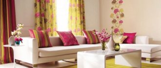
Looking at photos of wallpaper in two colors, many want to use this fashion trend. Here you need to take into account that there are shades that absolutely do not combine with each other.
For example, you cannot combine green and red in one room. Bright colors are diluted with calmer and neutral ones: gray, beige, white. Shades of the same color look very harmonious side by side. For example, green next to light turquoise breaks up much better.
Combination of patterns
When decorating a bedroom, you should know which patterns go well with each other and which are more likely to clash. So, among the best options, the following can be noted:
- checkered and graphics;
- wallpaper without a pattern in combination with polka dots;
- plain canvases along with photo wallpaper;
- floral motifs adjacent to stripes;
- floral patterns combined with small dots located at a great distance from each other;
- stripes and pastorals;
- polka dots combined with a pattern called ikat;
- monograms and medallions that combine with stripes.
The influence of color on the psyche
Experts know that colors can influence a person’s emotional state.
Therefore, when choosing wallpaper you need to take this effect into account:
- Green color creates a calm environment and helps you relax;
- Orange and red invigorate and have a tonic effect;
- Creative people often prefer gray wallpaper: it is so neutral that it does not distract attention and allows you to get in the mood for work;
- Shades of yellow lift your spirits, charge you with energy and stimulate activity;
- Designers advise using black in small quantities: if you overdo it with this color, it can cause depression;
- Shades of blue help to concentrate and improve attention; this is an excellent option for decorating a work space.
Commitment to Feng Shui
For those people who believe in Eastern teachings and are interested in the philosophy of Feng Shui, the following information will be useful.
According to this philosophy, there are several elements, and when arranging a room, you need to separate these elements.
Wood cannot collide with metal, fire cannot collide with water. Each of the elements has its own direction and its own set of shades.
- Choosing a family direction involves using red and green.
- Black and blue shades are favorable for a career.
It is also important to consider in which sector of the apartment the living room is located.
Finding a room in the northern sector obliges you to adhere to the element of Water. Then the wallpaper should be blue or black. It is important to choose warm shades of blue or black. Dark shades will make a gloomy room even gloomier. Neutral white is acceptable.
Black is favorable for career
There are different rules for rooms in the western sectors. Yellow, gold, and gray shades are welcome here. For the north and southeast, you need to use terracotta and orange, as these are the colors of the Earth.
For eastern rooms you need to use green ones. This is the element of wood. For rooms located in the south you need to use everything that resembles the color of Fire. These are red, orange, purple. But philosophy does not prohibit the use of a green tint for wall decoration.
Green – element of wood
There are not many options for the living room in the center of the apartment - these are shades of red and brown.
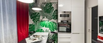
Wallpaper for the kitchen
The main points that you need to pay attention to when decorating a kitchen are the size of the windows, their number, and the dimensions of the room. If little light enters the room, you should not use dark and cold shades. In this case, you can create coziness using warm beige, milky, yellowish tones.
Yellow and orange shades lift your spirits and improve your appetite.
The same recommendations apply to finishing a small kitchen. Colorful wallpaper with flowers will not work in this case either: in a small space, bright colors will only irritate. Therefore, the best solution is plain wallpaper.
Popular options
Today it has become popular to decorate the interior with bright colors.:
- Green and all its shades fit well into any interior style or purpose of rooms, especially in those rooms where people are engaged in mental work.
- Blue and its combinations - the sea and relaxation are associated with it, so blue tones will be good in the bedroom.
- Red wallpaper is a bold decision. When choosing them, remember: too bright colors begin to irritate over time, so it is better to choose more muted shades of red.
But still, classics always remain in fashion. Do you have any doubts that in a couple of years you will get bored with bright walls or go out of fashion? Then it’s better to hang wallpaper in warm colors. They won't become obsolete.
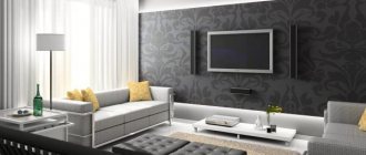
Living room decoration
The interior of the main room in the house is usually thought out to the smallest detail. Here, the choice of wallpaper will largely depend on the color and arrangement of the furniture. In addition, style features and lighting levels are taken into account.
What wallpaper color is suitable for a modern interior? If the room is furnished with dark furniture, then the walls can be decorated in light colors. Olive and light beige colors are suitable.
You can use discreet floral prints. Wall decoration should be harmoniously combined with the color of curtains and furniture upholstery.
- Depending on the total area of the living room and its illumination, choose darker or lighter colors.
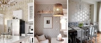
- The beige and cream palette is universal; it allows for any color combinations and goes well with the texture of natural materials.
Gray makes the interior more sophisticated and stylish - it has recently become a favorite of designers. Traditionally, most people prefer soft pastel colors using a light palette. This helps create a peaceful, calm atmosphere.
Design Tips
5 tips for those who are renovating their apartment:
- For a children's room you need to choose delicate pastel colors. It can be soft pink for a girl and blue for a boy.
- For the kitchen, a combination of bright colors and muted colors is optimal. For example, if the cabinets are red, then it is advisable to make the walls plain and discreet.
- The color of the floor in the room should not blend in with the wallpaper (how to choose wallpaper to match laminate flooring?).
- If furniture was purchased first, then the wallpaper will be matched to it. For a luxurious set, it is advisable to choose monochromatic, soothing shades - beige, chocolate, burgundy.
- For light-colored furniture, bright or patterned wallpaper looks better. Otherwise the room will be too faded.
When choosing the coloring and tone of the wallpaper, you need to be guided by the general rules and your wishes. After all, you will live in the house, and all the rooms should please the eye. Therefore, decorate the premises the way you like.
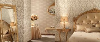
Wallpaper for the bedroom
Here the options can be very different, depending on the imagination of the designers and the design style.
All sorts of shades of green and blue are suitable: they are very calming and relaxing. These colors can be combined with yellow, white or beige.
- Blue color calls for relaxation and deep rest. But, if the room is small or the windows face north, you should not use blue and purple shades.
- White is ideal for a small bedroom. Thanks to this design, it is possible to create an airy, light space in which it is very comfortable to relax.
To highlight one of the walls, making it an accent wall, you can use wallpaper in two colors.
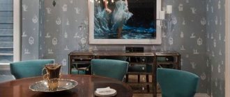
Color solutions for the dining area
The dining area, in contrast to the working kitchen section, is decorated with wallpaper. Color solutions mean highlighting one of the walls using a stencil design, intricate ornament or mosaic pattern.
For small rooms, use the lightest colors possible, which allow you to visually expand the room.
Optimally selected colors will help you create a beautiful and stylish interior in your apartment.
White wallpaper
If we talk about a universal color that fits organically into any design, then it is, of course, white. It traditionally symbolizes purity and freshness.
In addition, white visually expands the room, pushing the boundaries of the walls. It has a number of advantages, which is why it has long been loved by designers.
To prevent this design from causing “Hospital” associations, the decor is diluted with bright accents: Photographs, paintings in interesting frames, multi-colored panels.
A white room, be it a bedroom or a living room, always looks luxurious. However, here it is necessary to maintain exemplary order, because chaos and dirt are not compatible with the color white.
Pastel shades
To create a romantic atmosphere in the bedroom, you can use delicate shades of blue, mint, lavender or pink. A soft, enveloping atmosphere in the bedroom will be supported by suitable accessories and lighting.
To create a unique interior, it is recommended to use designer items: original paintings, lamps, vases and floor lamps.