Photo: ideas.homechart.ru To beautifully decorate the interior, you need to think through a harmonious combination of the colors of the walls and furniture. Such an important detail can fill a room with light, visually expand, narrow or lengthen the space, create a cozy atmosphere, and place the necessary accents. Following simple rules and tips on how to choose wallpaper for furniture will make your design truly unique and unique!
Why do you need to choose a color?
Color styling is an important section of modern design. The functions performed by the color composition in the apartment are very diverse:
A combination of shades can either help with the visual expansion of space or aggravate the problem. For this reason, this issue should be approached carefully.
The color scheme affects a person’s psychological mood. A number of scientific works have proven the dependence of a person’s mood, performance and vigor on the color interior of the room.
Eye fatigue during a working day directly depends on the chosen shade. Since wallpaper takes up the largest area in terms of color, the choice of canvas should be conscious and practical for the owner.
Using combinations of wallpaper, you can zoning a room into several functional sections.
Not the last step is the question of room design. An irrational combination of colors is the basis of bad taste.
The second aspect that you should pay attention to is the selection of furniture
Furniture with soft and lush upholstery, leather furniture, furniture with many inclusions of other materials (for example, wooden handles, mirror surfaces, and so on). There are a great many options to choose from, but the result is the same: the color of the furniture should be combined with the color of the wallpaper. This simple and unpretentious formula will allow you to achieve that very desired effect of harmony within the walls of your own home. It will also allow you to slightly simplify the already difficult task of choosing furniture for the interior.
In fact, there are not many plots for the development of events:
- You can independently select each element of furniture, combining armchairs, sofas, wardrobes and chests of drawers solely at your discretion.
- You can also turn to ready-made design solutions that offer you complete sets of furniture made in the same style and design. This will save a lot of time and help you not to rack your brains with choosing colors and patterns for each individual element.
- The third, and perhaps the most controversial option, is to resort to a personal furniture design style. The ambiguity of this approach lies in the fact that the price-quality ratio is not always balanced in a given situation. Moreover, by leaving the fate of your future furniture to the will of the designer, you are thereby playing a kind of “Russian roulette”, the result of which may be an unsuccessful decision, far from your personal vision.
If you want to create a design solution yourself, you will need a lot of time, patience, effort and money to create your own project (which may also be a failure).
But still, it’s not for nothing that people say: those who don’t take risks don’t drink champagne! Therefore, sometimes it is better to take everything into your own hands and do it the way you want. Fortune favors the brave!
The third aspect, without which the previous two steps cannot be completed, is the combination of furniture and wallpaper to achieve your goal. Remember how at the very beginning we asked you to ask yourself questions about the end goal of your entire home design? So now, based on these answers, try to understand what you would like to see in each individual part of the apartment and why.
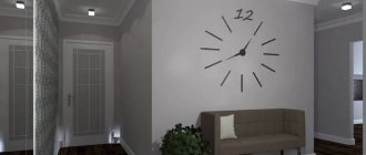
Bathroom, kitchen, hallway, bedroom, living room, children's room - there are so many independent, separate rooms in your apartment, each of which can simultaneously combine with each other and have its own style and atmosphere! This is exactly what you should start from when choosing furniture and wallpaper both for the entire apartment as a whole and for each “corner” of it in particular. This is the only way you can fully unleash the potential of your own home, turning it into the most important place in the whole world!
Now that you know enough to understand the importance of choosing the right wallpaper and furniture, we would like to show you with examples what options for their combinations in the interior may be interesting and useful to you.
Factors influencing color choice
Designers or their practical advice can help with the optimal choice of shade for wallpaper.
There are a number of factors that should be taken into account when choosing a color composition:
Purpose of the room. The shades and colors for the dining area will be very different from the colors for the living room.
The degree of natural or artificial illumination. This factor is important in practice. For example, dazzling white wallpaper in a room with three wide windows is a completely impractical design approach.
Note!
- Wallpaper glue - 155 photos of the best compositions. Review of manufacturers and the best glue brands
- Wallpaper from Leroy Merlin: 180 photo examples and video master class on the use of different types of wallpaper
- Wallpaper for the kitchen - types, types, designs and expert advice on choosing a design (165 photos + video)
The area of a specific room. It has long been known that the shade of wallpaper is used for the visual effect of expanding or narrowing space.
Interior style chosen by the apartment owner. Wallpaper and its design must be original in combination with the chosen design direction.
Color design of furniture, floors, ceilings and auxiliary accessories. The optimal combination of wallpaper color with the shade of the upholstery of the sofa, the façade of the furniture or stretch ceiling will create a unique style in the room.
It is also worth considering the owner’s personal preferences regarding the color scheme in the room.
Combination methods
Combination with vertical stripes
With the help of striped wallpaper you can visually increase the height of the ceilings. The frequency and width of the bands depends on personal preference. When purchasing material, your choice should be on rolls of the same size and, if possible, from the same collection. In this case, the finished version will look like a solid composition. The color palette can consist of two close to each other or contrasting colors.
In the photo, one of the kitchen walls is decorated with striped wallpaper.
Combining horizontally
Horizontal patterns and stripes can “pull apart” the walls and make the room wider. This finishing option is suitable for rooms with high ceilings; in a compact room, a feeling of a low ceiling may appear.
Another way to combine is to divide the wall into two parts horizontally, with the top half usually in a lighter color than the bottom. Often the lower part is made of wall panels.
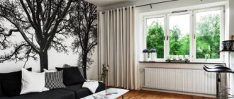
Accent wall
Most often, the accent wall is the one that the eye falls on when entering the room. A bright shade or three-dimensional image will “pull up” the wall; with this technique you can bring a long narrow room a little closer to the shape of a square. Depending on the stylistic direction, the main color may be similar in tone to the accent wall or radically different.
In the photo, the accent wall in the bedroom is decorated with pink photo wallpaper with flowers.
Plain and plain
Different shades of the same color will help to zone the space and create a play of shadows. For example, part of the bedroom is finished in a light gray shade, and the sleeping area is finished in a deep, rich color.
Pattern or ornament and plain
One of the most common finishing methods is the combination method. Floral patterns or ornaments can resonate with the style of the interior. The pattern is applied with a stencil, sticker or wallpaper. Today you can often find collections in stores that present monochromatic options and those with a pattern applied to the same base.
Pattern and Pattern
Completely different patterns can exist harmoniously in one room, but they should be united by a common note. This could be common motifs, elements or color.
Combining photo wallpaper with wallpaper
Photo wallpaper can significantly increase the space of a room. Perspective photo wallpaper, such as a road or a tall waterfall, will elongate the room and make it wider.
The photo shows a promising photo wallpaper (a receding pier), which helps to visually increase the height of a small bedroom.
Considering that photo wallpapers themselves have a voluminous and colorful image, it is worth combining them with a calmer tone so as not to overload the room.
Focus point
In order to highlight any area, for example a fireplace or TV, use background wallpaper. Part of the wall may have a solid color that differs from the main shade or have an unusual pattern.
Decorative decorations
An unusual picture is formed by elements framed in frames and moldings. Against the background of a calm shade of wallpaper, there may be inserts with ornate patterns. This combination is suitable for an interior in a classic style.
In the photo in the living room in the classic style, the wallpaper is decorated using moldings.
Patchwork technique
Patchwork technique is suitable for decorating a nursery or bedroom. The point is to combine an overall picture from patches of different wallpapers. When gluing, it is necessary to maintain an even seam.
Allocation of niches
An interesting solution would be to highlight the niches in the wall with a different color. The recesses can be made a couple of shades darker. When decorating a niche with textured wallpaper or panels, lighting looks good; the relief will cast interior shadows.
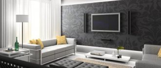
Combining wallpaper with different textures
The combination of different textures looks harmonious in almost any room in the apartment. In small rooms, wallpaper with a shiny surface will increase the space due to its reflective properties. In addition, they look interesting in contrast with the matte canvas.
Room zoning
You can divide a room into zones in several ways, one of them is by dividing it with color and texture. The kitchen, combined with the living room, will be separated by wallpaper of the same texture, but in different shades of the same spectrum. A good option would be structural wallpaper for painting.
The photo shows two types of wallpaper with a floral and checkered print.
Combination with brick wallpaper
Brickwork is most often associated with the loft style. In a small apartment, it is possible to replace natural material with imitation wallpaper. Red brick wallpaper goes well with matte gray or white material. White brick looks harmonious with light walls.
Harmonious color combination
It is not at all necessary to know all the compatible shades - it is enough to understand the principle of color combination. There are tones that are called neutral. These colors go well with all other tones:
- All shades of white. White wallpaper is most often used in combination with black inserts or as an independent tone for a classic design style.
- Beige tone (all colors of beige paints).
- Gray tone. Gray wallpaper allows you to create a neutral background for additional decorative finishing.
- Brown shades. This background is warm and goes well with all representatives of cold tones.
Another situation arises when the interior already has certain colors, and it is necessary to choose the optimal tone for them:
- Green wallpaper will go well with natural shades of furniture (sand, brown or pale yellow).
- It is better to choose blue and purple tones of wallpaper for a yellow or white interior. Such combinations will not have a negative impact on a person’s psychological mood and will not hurt the eyes with bright contrasts.
One way to zone a room is to use wallpaper of two colors, the border between which represents the dividing line.
Note!
- Types of wallpaper: features, pros and cons of wallpaper types. Classification by texture, number of layers, drawing (photo + video)
Wallpaper for the apartment - TOP-150 photos and videos of wallpaper design options for the apartment. Variety of materials, textures, colors and wallpaper patterns
- Wallpaper for the bedroom: TOP 140 photos and video reviews of bedroom designs with wallpaper. Suitable styles, colors and patterns of wallpaper for the bedroom, choice of materials
To create a similar layout and not cause a sharp contrast, you can use wallpaper that differs from each other by 2-3 tones.
Adding stone to wallpaper
Previously, stone was used only for finishing the facades of houses. But recently it has become popular indoors. It's all about its durability, environmental friendliness and beauty.
Thanks to the combination of wallpaper and stone, a real oxymoron is created in the interior. But this is only in theory not possible. In practice, decorative stone is quite suitable together with wallpaper.
But for the most part, imitation stone is used. It’s easier to work with and install, for example, on corners in the hallway. This option immediately creates chic for any apartment. But how to combine with wallpaper:
- Usually wallpaper is the basis, and stone is the accent;
- You can lay out a circle or a pattern with a stone and cover the rest with wallpaper;
- Stone can be used to create a charming frame horizontally and diagonally on the wall.
In other words, the stone has many possibilities. It is important to remember that such material in any case makes the room richer.
Let's combine brick and wallpaper
Usually the combination of brick and wallpaper in the interior is not created in the literal sense. The wallpaper just has a brick pattern. But this option looks no worse than the real material, since every element and shadow stands out perfectly and creates the effect of a real presence. Many people do not immediately understand what is going on here and perceive the coating as real material.
But based on the loft style, it actually uses a real brick wall indoors and wallpaper as an accent. This design option appeared in America from the time of industrial development. It was used in US factories.
Nowadays, this option combines well with minimalism and industrial style, but in essence it is a typical loft based on the emphasis on blurring the wallpaper on the adjacent wall.
Sometimes the brick remains rough and unpainted in its original form. But in most cases it is covered with red shades or white. Accordingly, the contract color of the wallpaper is used on other walls, brick is often the only one. This option has recently become characteristic even of Scandinavian design.
Thanks to the brick wall, the effect of undisguised naturalness is created. Such a room comes to life and demonstrates an artificially created shelter for humans. Many people like this atmosphere of realism without decorations and the addition of various illusions.
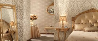
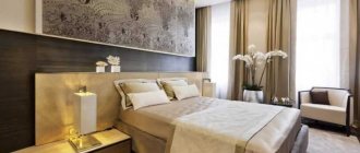
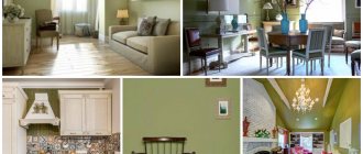
Color scheme for the bedroom
For a bedroom, the optimal solution would be wallpaper in a neutral color:
- White tones.
- Beige tones.
- Wallpaper with small flowers on a natural background.
Natural shades create a calm mood, positive emotions, do not irritate the eyes, and do not cause fatigue.
As an original idea, you can highlight one of the walls with a rich color, for example, in the form of a large flower or a painting.
Color composition for children's
For a children's room, it is not advisable to use bright and toxic shades, which irritate and distract the child from doing homework, quiet games and sleep.
The best solutions would be the following color combinations:
- Pale pink shades with fairy-tale characters against the background (for girls).
- Beige and sand tones of wallpaper for a boy.
- Wallpaper in two colors for a shared children's room, which also serves as room zoning.
Photos of wallpaper in two colors in various variations are presented in practical design catalogs, where you can choose a suitable interior design idea.
Nuances of human psychology
Red The correct choice influences whether a person wants to be in the room or not. Red colors are considered ideal for the living room . It will add a festive atmosphere and energy. It is difficult to stay in such a room for a long time. For rare stays in the room, a red shade is suitable. It is in no way suitable for relaxation; rather, on the contrary, color gives strength for further work.
Yellow It is advisable not to use only red ones, but to dilute them with neutral shades . Yellow is more calm . The presence of yellow will give the room an atmosphere of family comfort. This can also include a golden hue. It also gives a certain boost of energy, but the color is not as aggressive. Pale gold and corn can be included in this category.
Family atmosphere
Blue To create a calm environment, blue should be used. They act as a pressure and nerve stabilizer. Excessive use of blue in decoration will make guests feel overwhelmed. If the window faces north, then you can use a bright blue tint. It is classified as warm.
Green Greens give an association with nature. Some may associate it with spring, with leaves, with the forest. Like blue, green has a calming effect on people. A living room with greenery can be used for meditation. Depending on the location of the sides, the temperature of the green tint is selected. Although the beige shade is considered a classic, you can overdo it, and then the room will become boring. It does not give any surge of strength and does not affect mood in any way.
Combination of several green textures
Beige You can use beige as a neutral background . A fashion trend is the use of gray. All its shades are also included here. If the color of the furniture is too saturated, or the furniture takes a lot of attention, then they can be shaded with gray wallpaper. Materials with cold look organically for high-tech style rooms and industrial premises.
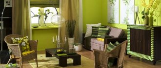
Choosing wallpaper for the living room
For this room, which is a guest area, bright colors and rich decor are preferred. The most daring decisions on color composition can be used in this room.
Furniture plays the main role in arranging the style of the living room, so the wallpaper should highlight the furniture design from the overall picture with its shades.
An excellent solution would be wallpaper in light yellow or sand tones with bright decorative patterns.
Color solutions for the dining area
The dining area, in contrast to the working kitchen section, is decorated with wallpaper. Color solutions mean highlighting one of the walls using a stencil design, intricate ornament or mosaic pattern.
For small rooms, use the lightest colors possible, which allow you to visually expand the room.
Optimally selected colors will help you create a beautiful and stylish interior in your apartment.