Repair is not an easy task, but sooner or later every person faces it. Wall decoration is one of the key elements of the future interior, so it is very important to know how to choose the right wallpaper .
If the wallpaper fits harmoniously into the interior, then the atmosphere of the home will become more homely and comfortable. A careless attitude to this issue can ruin even the best apartment design, making the room tacky or overly depressing. Today, the choice of this finishing material depends on fashion trends, the preferences of the apartment owner, his age and income. In any case, it is advisable to select different types of wallpaper for each room. You can read about what types of this finishing material are presented on the markets and how not to make a mistake with your choice here.
How to choose the right wallpaper
Nowadays, when choosing wallpaper, you need to consider:
- Financial opportunities.
- Personal wishes.
- The style of the room.
Attention! If you need to order FSF plywood in Moscow, they will be happy to help you select high-quality plywood of any size with a guarantee of quality and delivery.
You should also pay attention to the texture, the presence of a pattern, as well as the color of the wallpaper. The texture can be embossed, vinyl, velor or regular. The design can be various stripes, polka dots, floral arrangements, and abstract figures.
As for colors, there are wallpapers in light, neutral and dark tones. All of the above positions are interconnected.
Before you begin renovation work on arranging the room, you need to choose a style and decide on a color scheme.
How to choose the color of wallpaper? First of all, it is necessary to take into account the location of the windows, the lighting of the room, the resistance of paints to fading, as well as the colors of curtains and furniture.
If the window openings in the room face the north side, then it is better to choose wallpaper in warm colors, for example, yellow, orange, light beige, pink. Windows face south - use cool shades such as emerald, blue-gray, jade.
If the room is well lit by sunlight, then it would be appropriate to use wallpaper in dark colors - sapphire, terracotta, cornflower blue. In a shaded room, it is better to choose colors that have reflective properties - gold, golden yellow, orange.
Remember that wallpapers in blue and cyan shades quickly fade under the influence of the sun, and dark blue ones in shaded rooms begin to cast gray.
Light walls require light-colored furniture, and dark wallpaper requires dark furniture. If the curtains and furniture are decorated, and the walls are decorated with carpets and paintings, in this situation it is better to opt for smooth wallpaper or wallpaper with small patterns.
Speaking about a possible pattern on the wallpaper, it can have a different size, be contrasting or muted, placed often or rarely.
The abundance of large flowers visually reduces the volume of the room, while small, sparsely located flowers, on the contrary, expand the space. Also, a large floral pattern can serve as an accent for different style trends. Small ones are usually used as a neutral basis for design.
If you want furniture or any other decorative details to dominate the interior, then opt for wallpaper with a discreet, muted pattern. If your goal is the opposite, then do the opposite.
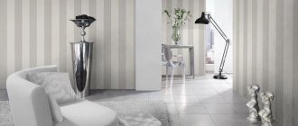
Striped wallpaper is quite common. They harmonize well with most design styles. Vertical stripes visually raise low ceilings, but at the same time reduce the area of the room. This drawback can be avoided by choosing wallpaper with wide stripes or stripes with blurred boundaries. This nuance can play an important role when decorating a small room.
Another variation of the wallpaper pattern are large spots. They can be arranged in an orderly, ornamental or chaotic manner. Due to the sharp appearance of stains on the wall, it is not recommended to completely decorate the room with such wallpaper. It is best to use them as accents, highlighting individual zones with them. Also, retouched spots give an interesting effect, which is expressed in the play of light and shadow.
- Health, vitamins and minerals - discover the key to better health
- Crafts ideas for girls - a review of easy crafts
- How to choose and where to buy a suitcase on wheels?
Another type of wallpaper pattern is the so-called grainy decor. It looks like small spots-drops of different tones, as if obtained using a spray bottle. This print perfectly hides and hides all the imperfections of the walls. This property allows you to use such wallpaper for rooms of a wide variety of designs.
There are also plain or smooth wallpapers. They perfectly emphasize and highlight every detail of the interior, regardless of the style in which it is designed. But they have one rather significant drawback - they need to be glued only to an immaculately flat surface, since they do not hide the imperfections of the walls.
Combination of shades of furniture and finishing materials
The selection takes place after purchasing the furniture . Wallpaper should either set off the furniture or emphasize it. They should not draw attention to themselves. This sequence is explained simply. It is easier to buy new ones than to completely change furniture. If the contrast of the furniture is dark, then you should use light ones. Warm shades such as pear, mustard, and sand are allowed.
Tone matching the furniture
This rule does not work in reverse.
Advice: White furniture does not have to be set off with dark wallpaper.
White furniture gives almost complete freedom in choice.
You can’t just use white wallpaper, otherwise it will blend into the background.
Color can be:
- purple;
- emerald;
- sapphire.
Beige shades will give the room a calm atmosphere in the room.
If there is brown or reddish furniture in the room, you should use dark ones.
Cherry furniture will be combined with:
- burgundy;
- purple;
- rich green.
This range is designed to lift your spirits.
There are recommendations on the Internet - the wallpaper can be pale. This tip is more suitable for the bedroom than the living room.
Nowadays it is fashionable to buy blue furniture. It looks stylish and not cheap. Blue doesn't get boring. The background of the room directly depends on the purpose of using the living room. Using the living room for leisure requires the use of red or yellow.
To relax you need to use wallpaper:
- beige;
- cream;
- light blue.
Peach furniture is used less often. When purchasing peach-colored items, you need to make the background in the room brighter. This is a case where a brighter background will help make the furniture stand out. Looks elegant with peach:
- grey;
- blue;
- pearl shade.
Blue never gets boring
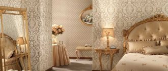
Bedroom
Any type of wallpaper would be appropriate for the bedroom. But the optimal solution would be wallpaper with silk-screen printing or vinyl coating. Speaking of colors, it is preferable to stick to a pastel palette.
White wallpaper will look great in the bedroom. Blue colors are also a good option. This color will fill the room with freshness and maintain emotional stability.
Green wallpaper was simply created for a bedroom. They have a calming, hypnotic effect. In addition, they calm you down and set you up for a good rest.
Location nuances
You should remember about the side of the living room when purchasing material . When facing east or west, it does not matter where the windows are installed. This does not apply to situations where the windows are blocked by tall trees. Then problems with room lighting may occur. Problems occur on the first floors when the window faces south or north or when trees obstruct the view of the window. Then there can be two options: when there is not enough light or when there is too much light.
Bright wallpaper for a room with little light
- If there is little light in the room, and the window faces north, it means that there will be very little light in the summer. Illumination comes from light reflected from the sky. Gray or blue cannot be used. These colors will match the shade of the sky in winter and summer, respectively. You cannot use pale shades or cold contrasts. You can save the room with wallpaper with bright colors.
- Too much light is also harmful. My eyes hurt and I can't concentrate on anything. Then you should use cold ones. This is a light khaki beige gray. Dark background is allowed.
You cannot add red or yellow colors to an initially bright room. The rays will be reflected from them, and the eyes will begin to get more tired. Among the neutrals, white stands out.
For rooms with good daylight
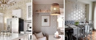
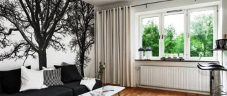
Living room
A variety of types of wallpaper are also suitable for the walls in the living room: textile, silk-screen printing, vinyl. The color palette may vary. There are no strict restrictions here.
Gray wallpaper will fit perfectly into a living room in a high-tech or minimalist style. For a classic interior, wallpaper in warm, natural shades is most suitable. Such a range will visually expand the space and also fill the room with light and air.
- Wallpaper glue - choosing the best composition for different types of wallpaper (60 photos)
Brown wallpaper in a timely interior: 80 photos of wall designs for different rooms
Red wallpaper - 55 photos of residential interior design using red
An interesting design idea is to use wallpaper in two different tones. Moreover, they can be either contrasting or differ from each other by two or three shades. The photo of wallpaper in two colors shows that such combinations allow you to achieve a very interesting result.
Nuances of choosing for the hall
For rooms, there are four factors that influence the choice of material color:
- You need to look at the orientation relative to the cardinal direction.
- Evaluate the interior style.
- Determine if the furniture is multi-colored.
- You need to stick to your taste.
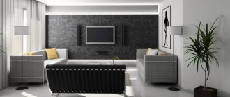
Black makes the room stylish
Sometimes living rooms are multifunctional. In the usual sense, the living room is needed for leisure. The kitchen is used for eating, and the bedroom is used for sleeping. If all of the above actions are performed in the living room, then versatility will be an important factor.
- It must be taken into account that people eat in the living room, which means that the chance of contamination increases. Children will be playing there, so they need to create a fun environment.
- Sleep will also take place there. Therefore, you can’t go too far with brightness either. You won't be able to sleep well with bright colors.
- Premises must be allocated separately. But there shouldn't be any obvious contrast. This is especially appropriate in situations where material needs to be changed in several rooms at once. After moving from a pale room to a bright one, your eyes may begin to ripple. This cannot be allowed.
Discreet and at the same time bright and stylish print
Kitchen
It is advisable to choose a warm palette for the kitchen, for example, orange, red, yellow shades. This range will increase the feeling of hunger and give a positive attitude.
For the corridor and hallway it is better to choose dark colors. Moreover, it is necessary to combine the color of the wallpaper with the rest of the walls.
Today, manufacturers offer a huge range of wallpapers in a wide variety of colors, which makes it possible to bring quite bold design ideas to life.
We hope that this article will help you choose the right wallpaper color. Just don’t forget to take into account the lighting in the room, because depending on the lighting, the color can take on one shade or another. Good luck!
For children's
There is a strict distinction here based on the child’s age, as well as his gender. In the first three years of a child’s life, the child should be surrounded by wallpaper in pastel shades. Annoying colors are not allowed. In the period from three to 6 years, a child needs vivid impressions and emotions. You can choose the brightest ones.
Bright highlight of the kitchen
There is one nuance in the images. They don't have to be very big. Large figures can frighten a child. The same applies to geometric shapes with sharp corners. The presence of a composition with these elements can cause anxiety in a child. And pastel colors won’t help here. As the child grows up, you can use quite adult shades, turning the children's room into a teenager's relaxation room.
For the little comic book lover
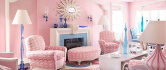
If with boys everything is approximately clear, then with girls everything is a little more complicated . They prefer colors from the warm part of the spectrum. If possible you should use:
- pink;
- peach;
- soft green;
- warm yellow wallpaper.
For boys the situation is the opposite. It is better for them to make a room with blue or gray wallpaper. A combination of yellow and green, gray and orange is welcome. You can use red and brown finishing materials.
Completely red wallpaper should not be used for a children's room. When children of different sexes live in the same room, it is important to distinguish zones. Each zone should have its own color or texture. Even if the child has become quite an adult, it is not at all necessary to decorate the room in black tones. A large amount of black can make you sad. There's no need to talk about children.
An original solution for those who like to draw
Photos of wallpaper of different colors
Did you like the article? Share

+4
conclusions
People make the same mistakes when choosing colors. Therefore, we can highlight a few simple tips that will draw a line under the article:
- When comparing two identical rooms with green and orange works, it will be the first one that seems cold. This is assuming the same lighting.
- In any room, colors have approximately the same effect. Green always acts as a calming color. Yellow gives a cheerful mood and a warm environment. The color red is an irritant for both children and adults.
- It is important to choose the lighting in the room wisely. Cool tones require strong lighting. Warm colors allow you to dim the lighting in the room.
- Uniformity in the color of the finish is allowed in one room, but not throughout the entire apartment.
- Also, strong variation in the brightness of shades is not allowed.
- All rooms must maintain a balance of brightness.
- White ones increase space, dark ones shrink. To elongate walls and ceilings, you need to use wallpaper with vertical and horizontal stripes, respectively.
Beautiful hallway
VIDEO: The most pleasant shades for your bedroom
Favorable colors for the bedroom
Choose pleasant colors and shades
Purpose of the room
Wallpaper for a room must be chosen taking into account its functional purpose. This is a very important point, since the wrong color of the material can lead to a certain imbalance. For example, the color red, a symbol of energy, should not be used in the decoration of a bedroom, which is intended for relaxation and sleep. Colors that will help you relax and bring calm should prevail here. These are mostly pastel colors.
In rooms where guests are usually received, bright colors are used. But the main thing here is not to overdo it and prevent the use of contradictory combinations.
Visually, such a design should be perceived without overload. When choosing wallpaper with a pattern, pay attention to its color. It should not blend into the main background. Especially if the picture is bright. The combination of a bright picture with the same background will bring color saturation. And this greatly affects psychological perception. You should also adhere to the chosen interior style. Combinations of white, black and red tones, with different saturations, are suitable for oriental style. European style has lighter and warmer tones. Although dark accents are not excluded. But it should not be abused.
Bright colors of wallpaper in the nursery