How to choose the right wallpaper
Nowadays, when choosing wallpaper, you need to consider:
- Financial opportunities.
- Personal wishes.
- The style of the room.
Attention! If you need to order FSF plywood in Moscow, they will be happy to help you select high-quality plywood of any size with a guarantee of quality and delivery.
You should also pay attention to the texture, the presence of a pattern, as well as the color of the wallpaper. The texture can be embossed, vinyl, velor or regular. The design can be various stripes, polka dots, floral arrangements, and abstract figures.
As for colors, there are wallpapers in light, neutral and dark tones. All of the above positions are interconnected.
Before you begin renovation work on arranging the room, you need to choose a style and decide on a color scheme.
How to choose the color of wallpaper? First of all, it is necessary to take into account the location of the windows, the lighting of the room, the resistance of paints to fading, as well as the colors of curtains and furniture.
If the window openings in the room face the north side, then it is better to choose wallpaper in warm colors, for example, yellow, orange, light beige, pink. Windows face south - use cool shades such as emerald, blue-gray, jade.
If the room is well lit by sunlight, then it would be appropriate to use wallpaper in dark colors - sapphire, terracotta, cornflower blue. In a shaded room, it is better to choose colors that have reflective properties - gold, golden yellow, orange.
Remember that wallpapers in blue and cyan shades quickly fade under the influence of the sun, and dark blue ones in shaded rooms begin to cast gray.
Light walls require light-colored furniture, and dark wallpaper requires dark furniture. If the curtains and furniture are decorated, and the walls are decorated with carpets and paintings, in this situation it is better to opt for smooth wallpaper or wallpaper with small patterns.
Speaking about a possible pattern on the wallpaper, it can have a different size, be contrasting or muted, placed often or rarely.
The abundance of large flowers visually reduces the volume of the room, while small, sparsely located flowers, on the contrary, expand the space. Also, a large floral pattern can serve as an accent for different style trends. Small ones are usually used as a neutral basis for design.
If you want furniture or any other decorative details to dominate the interior, then opt for wallpaper with a discreet, muted pattern. If your goal is the opposite, then do the opposite.
Striped wallpaper is quite common. They harmonize well with most design styles. Vertical stripes visually raise low ceilings, but at the same time reduce the area of the room. This drawback can be avoided by choosing wallpaper with wide stripes or stripes with blurred boundaries. This nuance can play an important role when decorating a small room.
Another variation of the wallpaper pattern are large spots. They can be arranged in an orderly, ornamental or chaotic manner. Due to the sharp appearance of stains on the wall, it is not recommended to completely decorate the room with such wallpaper. It is best to use them as accents, highlighting individual zones with them. Also, retouched spots give an interesting effect, which is expressed in the play of light and shadow.
- Health, vitamins and minerals - discover the key to better health
- Crafts ideas for girls - a review of easy crafts
- How to choose and where to buy a suitcase on wheels?
Another type of wallpaper pattern is the so-called grainy decor. It looks like small spots-drops of different tones, as if obtained using a spray bottle. This print perfectly hides and hides all the imperfections of the walls. This property allows you to use such wallpaper for rooms of a wide variety of designs.
There are also plain or smooth wallpapers. They perfectly emphasize and highlight every detail of the interior, regardless of the style in which it is designed. But they have one rather significant drawback - they need to be glued only to an immaculately flat surface, since they do not hide the imperfections of the walls.
Variety of colors
What material is the wallpaper made from?:
- Paper - they are made from paper, then a design is applied to the surface, mainly using a typographic method.
- Vinyl is more durable, but expensive.
- Textile - on a fabric basis.
- Glass wallpaper - the composition includes soda, limestone, quartz sand, dolomite. Such canvases can be painted.
- Liquid - they are sold in bags. They are similar to dry plaster, which is diluted with water and then applied to the walls.
You can choose wallpaper of any color: the construction market allows you to do this. Rules for choosing shades:
- Dark-colored wallpaper will look good in a room with good lighting.
- If the room is poorly lit, then it is better to choose canvases in warm colors. If the windows face south, then buy wallpaper in cool colors.
- Recently, combinations and zoning have come into fashion. The kitchen and dining room can be separated by different wallpapers: in the dining area the walls are decorated with colorful, brightly patterned or photo wallpapers; plain wallpaper is pasted in the cooking area (read about how to choose photo wallpaper for the kitchen, living room and other rooms here).
- Another option for combinations is that in the kitchen the sink area is highlighted with wallpaper with large patterns, and the kitchen itself is covered with plain linens.
- The living room is a place where you can let your imagination run wild. Here you can combine matte and glossy, glue different shades of the same wallpaper.
Attention
When choosing compositions and color combinations, follow one rule - your eyes should not ripple from the many different shades. Make sure that the furniture also matches the color of the walls. If the furniture is classic or expensive, it is best to choose chocolate or beige wallpaper. Here you still need to adhere to the canons of the classics.
Bedroom
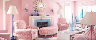
Any type of wallpaper would be appropriate for the bedroom. But the optimal solution would be wallpaper with silk-screen printing or vinyl coating. Speaking of colors, it is preferable to stick to a pastel palette.
White wallpaper will look great in the bedroom. Blue colors are also a good option. This color will fill the room with freshness and maintain emotional stability.
Green wallpaper was simply created for a bedroom. They have a calming, hypnotic effect. In addition, they calm you down and set you up for a good rest.
What do rooms decorated in warm colors look like?
Anyone who wants to feel the peace of a cozy homely atmosphere should take a closer look at tones that give a feeling of warmth. Of course, a red room is unlikely to allow you to fully relax; rather, it will give you vigor. Therefore, those who crave relaxation should select the colors of the rooms, moving away from the red color in the palette.
Yellow and orange
The color yellow is ready to share its kind, soul-warming rays. If you think through interesting combinations, you can significantly increase your performance and feel a surge of creative energy.
The bright shade drives some people crazy, while others are happy to be in such a sunny room
The colors of tangerine and orange are also sunny and summery. Orange rooms always give off a positive vibe.
Orange color can be moderate
If yellow or orange shades need to be softened and made less spectacular, then dilute the paint with white.
Beige and peach
Beige, despite its warmth in the interior, can also look like a neutral tone that has a calming and calming effect. There are options where beige solos or stands out only in detail.
In any design, beige will still play a certain role.
Peach tones are varied
Peach is chosen where both tenderness and pleasant brightness are lacking. Shades of this color can be unassuming and unobtrusive and playful.
Advice! For those who have difficulty with lack of appetite, it is good to dine in the peach kitchen.
Related article:
Beige color in the interior : photo; features of finishing walls, floors, ceilings in beige color; perception of beige shades in the interior; a combination of beige with white, pink, light green, purple, blue and brown; beige in classic, modern, Provence, country and minimalism.
Red and coffee
Red is strongly associated with something passionate, loving, hot. These are the colors of leadership, strength, and resilience. It seems that shades of red warm the room and excite the soul.
This is a romantic shade in the room
You don’t have to make the room bright red, but choose softer shades. The main thing is not to oversaturate the space with excessive brightness. Coffee colors stabilize mood, working as antidepressants.
The coffee environment is cozy, moderately elegant and positive
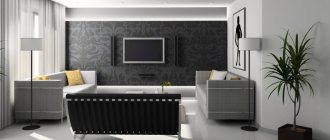
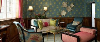
Living room
A variety of types of wallpaper are also suitable for the walls in the living room: textile, silk-screen printing, vinyl. The color palette may vary. There are no strict restrictions here.
Gray wallpaper will fit perfectly into a living room in a high-tech or minimalist style. For a classic interior, wallpaper in warm, natural shades is most suitable. Such a range will visually expand the space and also fill the room with light and air.
- Wallpaper glue - choosing the best composition for different types of wallpaper (60 photos)
Brown wallpaper in a timely interior: 80 photos of wall designs for different rooms
- Red wallpaper - 55 photos of residential interior design using red
An interesting design idea is to use wallpaper in two different tones. Moreover, they can be either contrasting or differ from each other by two or three shades. The photo of wallpaper in two colors shows that such combinations allow you to achieve a very interesting result.
Let's talk about color combinations in the interior of different rooms
Color solutions in the interior form the basis of design art: color decides everything. This also affects a person’s perception of colors, so we remember that even the slightest change in shade changes the interior.
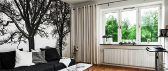
Living room and hallway
The living room is of great importance where families and friends gather. If the living room is not comfortable, then all the semantic meaning of the room is lost.
Coffee and light green shades can make the living room both brighter and calmer
Cool colors will help visually make the space wider
Warm colors change the picture
Related article:
Interior of the hall in the apartment photo. In a separate publication you can learn about the main directions of decorating a living room in an apartment with a selection of photos.
The hallway is not always spacious and bright, so here you need not to make a mistake with the choice of color.
Light in the hallway can be expressed in color
You can choose soft shades
Related article:
Design of a hallway in a private house : photos of color schemes, the most popular design styles, floor and ceiling decoration, how to choose the right furniture, lighting, convenient little things - read in the publication.
Bedroom and children's room
By its importance, the bedroom should promote rest and relaxation. Here we focus on our own color sensations: if someone is comfortable falling asleep with burgundy walls, then this is a feature of this person.
It is recommended to select pastel colors that can be diluted with some side of the spectrum
Accents, even tones and a simple solution
Related article:
Bedroom design : photo ideas for rooms of different sizes, what style to choose, subtleties of using a color palette; how to choose the right wallpaper, furniture, curtains - read the publication.
How are cool and warm colors distributed for children?
For children who are very active, it will not hurt to reduce their activity with a cool color scheme, and for those who are calm themselves, the opposite side of the spectrum will suit them.
Tenderness is not characteristic of children's hearts
Children love bright rooms
Kitchen and bathroom
The good colors in the kitchen are those that awaken your appetite and good mood.
These are pleasant tones of yellow, orange, light green
Nobody calls for choosing bright acid colors. You can simply highlight something from the furniture, or take not bright shades
The colors for the bathroom can be any; you can choose two or three shades that are pleasant for yourself and your household, placing accents
For lovers of refreshing tones
Cool green and the freshness of the bathroom go well together
Kitchen
It is advisable to choose a warm palette for the kitchen, for example, orange, red, yellow shades. This range will increase the feeling of hunger and give a positive attitude.
For the corridor and hallway it is better to choose dark colors. Moreover, it is necessary to combine the color of the wallpaper with the rest of the walls.
Today, manufacturers offer a huge range of wallpapers in a wide variety of colors, which makes it possible to bring quite bold design ideas to life.
We hope that this article will help you choose the right wallpaper color. Just don’t forget to take into account the lighting in the room, because depending on the lighting, the color can take on one shade or another. Good luck!
Is it possible to correct room imperfections with color?
Not everyone was born designers and architects, and not everyone has the opportunity to hire professionals for work. Sometimes finished housing seems uncomfortable due to design flaws, inappropriate lighting levels, or simply small space. You can correct the perception of a room using a color palette.
Cool tones can help expand the space, visually of course, but the feeling in such a room will be fundamentally different.
Gradients can help with ceiling height if darker colors are placed below
It is better to decorate small rooms in cool shades, this will make them a little freer at the level of sensations.
If you make the wall opposite the window darker, then in a small room the effect of visually expanding the space will work.
In long corridors, on the contrary, it is better to choose warm colors
Southern rooms are hotter; shades of blue paint will “cool” such a place a little. The northern room is “warmed” in the same way.
At first glance, all these intricacies with color are not easy to master. But you just have to listen to your feelings, and they themselves will intuitively tell you the right choice of color for your interior. Using the tips from HomeMyHome.ru, you can find “your” correct color for each room, and whether it will be pure or diluted with halftones, it’s up to you.
Photos of wallpaper of different colors
Did you like the article? Share

+4
Wallpaper for a children's room - interesting solutions
Wallpaper can also be successfully used in children's and teenagers' rooms. Thanks to them, you can create a fresh atmosphere in the room that makes the room suitable for the owner or represents his hobbies and interests. In the case of a children's room, wallpaper often gives the interior a coziness and special warmth that is difficult to achieve with paint.
Wallpaper for the little ones
Wallpaper in a children's room is not only a way to decorate a wall - it is more often used as a decorative accessory that complements the decor of the room and other elements that determine the mood in the room. When choosing wallpaper for a children's room , it is worth supplementing them with accessories such as:
- canopy over the crib,
- curtains
- pillows
- carpets.
By completing all these elements in one tone, you will give the interior lightness and softness, and also give a feeling of exceptional comfort.
Wallpaper for a girl's room - not only roses
Wallpaper for a girl's room does not necessarily mean expressive shades of pink. Let's make sure that the decor in the room is not obvious, because it will quickly get boring. It is much better to fill the room with atmospheric accents in the form of:
- curtains,
- lamps
- carpets,
- images.
Wallpaper for a girl's room should be neutral in color, matching the above elements. They can be pastel colors, but in the room they should be gentle and unobtrusive. If you decide on a more expressive pattern, let it be visible on only one wall. This way you will avoid the impression of clutter and overwhelming effect.
Lately, dots have become a very popular topic, which can be represented by wallpaper in a girl’s room. This is one of the patterns that is relatively easy to match with other accessories, and at the same time, it is a classic and fashionable theme.
If you want to decorate a universal room in which both a boy and a girl will live, turquoise wallpaper will be a good choice. This shade harmonizes well with many colors of accessories, so with its help it is very easy to distinguish between zones in the room - separate ones for girls and boys.
Turquoise color, in addition to its versatility, is also very pleasant to perceive. It enlivens the room, makes it cozy and positive.
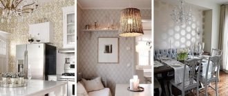
Light wallpaper for Scandinavian style
This interior style, now especially popular, is distinguished by a small set of primary colors. You can count them on your fingers: white is the leading one, as well as black (contrasting), gray and wood color.
In Scandinavia, walls are decorated with natural materials or simply painted white. However, Scandi style options allow the use of wallpaper for walls and the addition of shades. And this is a vivid illustration of the excellent decoration of rooms with light wallpaper.
Most often, when arranging a room in a Scandinavian style, they choose the following tones:
- White,
- Lactic,
- Light beige,
- Ivory,
- Bleached grey,
- Pearl,
- Powdery pink,
- Olive.
These colors are harmonious, for example, in the following combinations.
White or milky colors on walls, ceilings and furniture are a Scandi classic.
Gray smoky walls are complemented by white furniture and wooden floors.
Olive-colored wallpaper goes harmoniously with white wood furniture.
A bedroom with powder pink and light beige wallpaper on the walls, a white ceiling and a bed of the same color will look good.
Light textured wallpapers and coverings with minimalist patterns fit perfectly into the interior. Sometimes the option of using liquid wallpaper is considered for the living room. Light-colored photo wallpapers are also partially used in wall decoration (for example, with graphic patterns, images of deer, imitation of tree bark).
Subtleties of choosing light wallpaper
For a small room, light decoration is simply necessary. It visually expands the space. A photo of light mint-colored wallpaper demonstrates how the rays of the sun are reflected from the walls and the room is filled with sun.
If the room is poorly lit due to problems with electrical appliances, then light wallpaper, for example, champagne color, acting as the same light reflector, will become an additional source of lighting.
In a house with small children, light-colored flooring quickly gets dirty. But wallpaper in an expensive price category is not afraid of wet cleaning and the problem is quickly solved.
But for pet lovers, bright walls are simply a salvation. Against such a background, scratches are practically invisible.
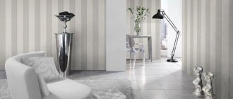
Light wallpaper for Provence style
In the decoration of the French countryside style, natural materials prevail. But wallpaper is also applicable for walls. And only pastel colors. For example, lavender colors are held in high esteem.
- Light wallpapers with floral motifs and striped coverings are also very popular.
- They can be glued individually or combined with each other.
- “Floral” wallpapers are also good in combination with plain coverings.
- Checkered wallpapers of a light palette are also used.
Light wallpapers are also good in other interior styles: for example, in a rustic country style or in one of the modern color trends (where matte “whitened” coatings in pastel shades are a priority).