What color typeface are you looking for wallpaper for:
1 Beige 2 White 3 Orange 4 Red 5 Brown or wenge 6 Green, light green 7 Black and white 8 Yellow 9 Blue, light blue 10 Violet, lilac 11 Black
When planning the interior design of a kitchen, many are guided by their preferences, room size and financial capabilities. The first thing that is planned is the shape, size and color of the furniture, and then everything else is designed for the set. Therefore, it is more convenient to choose wallpaper that matches the color of the furniture. So, let's look at what wallpaper to choose for the kitchen depending on the color of the set?
For beige headset
Beige and vanilla remain the most popular kitchen color. There are many reasons for this:
- 1 Beige color is an ideal solution for a small kitchen, as its light palette works perfectly to visually expand the space.
- 2 Beige is a neutral color and is perfect for recreating any style - from sophisticated classics to chic modern, from romantic shabby chic to textbook loft.
- 3 For those who think beige is boring, we advise you to pay attention to such shades as caramel, cappuccino, creme brulee. These delicious colors will make your kitchen not only cozy, but also especially homey.
- 4 Beige is a universal color and is not capricious in choosing a pair. On the contrary, by choosing one or another color of wallpaper for a beige set, you can charge your kitchen with a festive atmosphere, give it sophistication or create a harmony of comfort.
Wallpaper color for beige kitchen:
Beige and sand shades will create a very delicate and sophisticated interior.
Whites are a perfect match. The kitchen turns out bright and cheerful. But avoid boiling white, otherwise the interior will turn out faded and “dirty”. Beige and brown are an original combination, if only beige will dominate. It is better to choose white wallpaper with a dark pattern.
Purple or lilac - bold and bold. The interior turns out dynamic and rich. It is better to choose plain wallpaper without a pattern.
Muted red, burgundy, terracotta are a harmonious pair, provided that the decor is minimal.
Gray - the kitchen will be cozy and delicate. It is only important that both gray and beige are as light as possible.
Green - the result is an interior that is close in spirit to eco-style or country style. In such a kitchen, an abundance of indoor plants and floral patterns is appropriate.
Important: if you have a beige kitchen, avoid fluorescent, cold light. It will make the interior look dirty. The same applies to appliances - a beige refrigerator and stove against a background of beige furniture is too much. It is better to choose a metallic color technique.
How to choose wallpaper color: advice from psychologists and Feng Shui specialists
When furnishing a new home or transforming an old one, we often rely solely on our tastes and temporary moods. Although sometimes it is very useful to ask the opinions of psychologists and Feng Shui specialists. After all, how often we do not attach importance to invisible patterns, but regardless of this, they operate and control our subconscious.
The most important advice is to choose a dominant color for a specific place in the house. Experts recommend the following color zoning solutions:
- – zone of intellectual work or creativity – blue background to enhance mental activity;
- – common territory for all family members – a green background for peace;
- – rest and sleep area – pastel tone of any warm color for relaxation;
- – eating area – red-orange tones to stimulate appetite.
It remains to eliminate unwanted background colors for living spaces.
Naturally, black tops this list. Contrary to fashion trends in the domino style, we do not recommend being tempted by this squeak of fashion. From a black background, thoughts that are not bright will come to you.
Brown as a background color is also bad. There are some noble shades of brown, but a high concentration of it on the walls is undesirable, since in large quantities it causes tedious boredom.
Dark purple is only good in small doses. Don’t be surprised at the development of depressive moods in your household if, on someone’s ridiculous advice, you made purple walls in your kitchen. And it’s unlikely that it will be pleasant to sneak into your room after work through the purple corridor.
Whatever color scheme you choose, make sure that there are no more than five colors in your interior. All other color heaps are unnecessary, without a doubt. Rainbows are only good in the sky because it is bright and big! And in our limited spaces, three to five colors are enough to achieve aesthetic and psychological comfort.
Feng Shui experts say that with the help of patterns and images on wallpaper, you can not only block the path of negative energy flows, but also attract positive ones into your home. And here not everything is decided by the choice of color. Considerable meaning lies in the symbols that will be depicted on the wallpaper. Thus, images of elephants, goldfish, dragons, and phoenix birds are considered symbols of good luck and prosperity.
A fan in the decor of a living space can protect its inhabitants from all sorts of unfavorable influences. It also supports the hovering of the erotic spirit in the room, and for this reason it is most appropriate in the marital bedroom. A map or globe on the wall of a schoolchild or student’s work area contributes to fruitful learning.
Symbols on wallpaper can cause harm! Especially if you put wallpaper on the walls with hieroglyphs and signs whose meaning is unknown to you. Be sure to take an interest in the meaning inherent in the symbols of the drawings and the meaning of foreign inscriptions on the wallpaper that you like.
For white headset
White color is neutral and goes well with any other color. If you have a white set, it’s better to start from a given style. Modern furniture will look better against walls with a graphic design, stripes, unusual graffiti, photo collage or wallpaper.
You can choose bright wallpaper that imitates tiles or brickwork. For an accent wall in a modern kitchen, you can choose photo wallpaper with a 3D panorama.
Classic white furniture goes well with pastel-colored wallpaper.
The more luxurious the furniture, the more pale and unnoticeable the pattern on light-colored wallpaper should be.
For cozy white furniture in a country style, cheerful colors are suitable: floral, plant motifs or images of a rural landscape are possible.
For a Provence style kitchen with white furniture, wallpaper with images of lilies, lavender, and irises is perfect. In this case, it is advisable to choose the rest of the decor in the same shades as the flowers on the wallpaper: cream, lilac, purple, sky blue.
White furniture is a common choice for Scandinavian kitchens. To emphasize the style, you can choose blue, beige, light blue or light gray wallpaper.
For orange furniture
Orange furniture will dominate the interior - regardless of what shade of orange is chosen. This color is the emperor. And therefore the wallpaper plays the role of exclusively background.
Against the background of gray wallpaper, an orange set always looks great. The orange-gray pair is the most harmonious for the kitchen. Moreover, you can choose the steel color of household appliances.
Green wallpaper will add festiveness and lightness to the room. The main thing is that the wallpaper is plain.
White wallpaper with an orange pattern is a bright pair. This combination can be diluted with wooden inserts: for example, by choosing a wood-colored tabletop.
The main thing in such a bright combination is to create a harmonious interior and not to overdo it with a rich orange shade.
Where to place the wallpaper
The standard option is to cover all the walls of the room with wallpaper. However, there are other possibilities.
- For example, an expressive back wall is ideal for long rooms that you want to make more cozy and warm. This is not a very suitable solution for small spaces.
- But a ceiling covered with wallpaper can become a beautiful effect in the interior. Dark colors optically reduce space, so they are suitable for rooms with high ceilings.
- A more pronounced side wall optically lengthens and enlarges the room. To enhance this effect, you can highlight the stripes on this side (horizontally lengthens and vertically increases the space).
- By gluing wallpaper on opposite walls you can narrow the space.
For red furniture
Bright kitchen furniture with glossy fronts will look best in a spacious kitchen or in an apartment with a studio layout. Such furniture immediately becomes the dominant feature around which the rest of the interior is built.
A juicy red shade for the set (scarlet, carmine, red, crimson) is highly not recommended for a small kitchen. The abundance of red in a tight space leads to rapid fatigue, irritates and can even cause aggression. The optimal solution: a set of calm, muted shades of red - terracotta, burgundy, garnet, coral, cherry.
Since the red set will play the main role, it is better to choose a neutral background color for the wallpaper. White, cream, light wood, ivory, and gray wallpapers are perfect.
Red and black kitchens create a dramatic effect. Black wallpaper for a red headset is a bold decision. The kitchen turns out to be dynamic and hyperbolic. It is better to stick to modern styles.
The combination of red and black will balance white well. For example, white wallpaper with a black graphic pattern is an ideal choice for a red kitchen in a high-tech or minimalist style.
If the set is brown or wenge
The wenge-colored set looks luxurious and in itself is a real decoration of the kitchen, without much need for additional decor. Wenge-colored furniture is usually characterized by simple, laconic forms that emphasize the texture of the material.
Dark furniture will look most advantageous against a light background, and therefore it is better to choose wallpaper in pastel colors: cream, sand, milky, beige.
If the wenge color is from a warm palette (with a chocolate or burgundy tint), the wallpaper can be vanilla, muted orange, terracotta, pistachio.
The cool shade of wenge (with hints of purple or green) harmonizes with lilac or green wallpaper.
Plain wallpaper looks best. Keep the patterns to a minimum so as not to overload the interior. As a last resort, you can choose wallpaper with a faded pattern or gold embossing.
Unusual solutions
You can wallpaper a room with multi-colored wallpaper that has the same finish. One wall can be decorated with wallpaper with a pattern, the three remaining walls can be decorated with plain wallpaper, matching in color.
When decorating a room, be sure to take into account the color of the linoleum or laminate flooring, window frames, and curtains. Rules for selecting wallpaper for decorating a room are presented in the video fragment
If the room does not have cornices installed, you can not glue wallpaper to the ceiling, but use a wide border. For plain canvases, a frieze with an interesting architectural pattern is suitable. For wallpaper with a pattern, it would be correct to take a plain frieze.
Attention ! Wallpapering the panels through which heating is supplied to the room is not allowed, as this is a direct violation of safety regulations.
It’s better to simply paint them or apply a pattern on them identical to the pattern on the wallpaper, using a stencil.
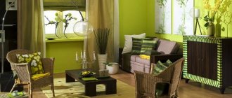
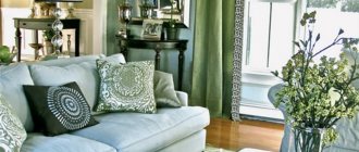
For green furniture
Green or light green is a win-win option for kitchen furniture, as the color is soothing and inviting. The “plus” of green is that it can be combined with almost any other color. The main condition: the couple must be in harmony in tone.
So, if you have furniture in warm shades of green: grassy, olive, light green, then you should choose orange, yellow, burgundy or rich beige wallpaper. A good addition to such combinations would be brown accessories or materials that imitate natural wood.
Light green furniture will become the dominant feature in the interior. It requires a neutral background, so it is better to choose plain white, milky, beige, or cream wallpaper. And the color balance will be supported by light green accessories: a border on a tablecloth, a pattern on light curtains, a lamp or dishes.
You can pair moss or olive-colored wallpaper with light green facades. But be sure to balance out the pair with pops of white. Light green furniture will look organic against a background of light, natural shades: brown, pink, blue, sand. Light green categorically does not accept proximity to lilac and violet.
Cold shades of green (with an admixture of blue, gray or cyan): mint, turquoise, pine, emerald harmonize with cold colors - blue, cobalt, steel, boiling white.
Color Features
Orange is a warm, rich color that represents a transition from yellow to red, therefore combining their characteristics. Evokes positive associations: fruits, south, autumn leaves, spices. And also fire, sun, optimism, joy, vitality. It is also associated with spiritual growth - it is not for nothing that the robes of Buddhist monks are of this particular color.
It stimulates appetite, stimulates brain function and generally has a stimulating effect on the psyche, so you need to select color combinations with orange in the interior so that it is always balanced with neutral, calm shades. You should use it with caution in the bedroom and in the children's room: in large quantities it tires and even causes anxiety.
It is also important to note that it is not suitable for all styles. Thus, red is rarely used in classic, rococo, empire and high-tech. But it feels great in modern and minimalist, country and eco interiors. Often used as an accent in the Scandinavian direction.
Instagram @brooklinteriors
Instagram @enjoy_home
Instagram @pierre.yovanovitch
Instagram @emi.home
Instagram @emi.home
Black and white set
The duet of black and white is considered a classic - strict, but impeccably elegant.
The combination of black and white facades always looks impressive, elegant and fits perfectly into the concepts of avant-garde, art deco, minimalism, and retro.
Combinations of black and white set and wallpaper color.
White wallpaper or white with black graphic design. This tandem creates a monochrome atmosphere. I felt like I was in a newsreel from the beginning of the last century. The ideal combination to create a retro style - you can add posters with graphic designs and retro accessories.
A good option for a small kitchen is to cover the accent wall with black wallpaper with a white pattern, and the rest with white wallpaper with the same black patterns.
If the facades of the furniture are glossy, then for the walls it is good to choose warm shades of white: cream, beige, milky.
Gray or “wet asphalt” colored wallpaper is appropriate in a modern interior. They go well with the metallic shine of kitchen appliances. But the interior requires bright lighting.
Blue wallpaper will dilute the interior with colors, and blue wallpaper will add softness and tenderness to the black and white kitchen. Yellow wallpaper looks good in combination with a black and white set, if yellow is more like the color of dull gold.
Pastel shades
To create a romantic atmosphere in the bedroom, you can use delicate shades of blue, mint, lavender or pink. A soft, enveloping atmosphere in the bedroom will be supported by suitable accessories and lighting.
To create a unique interior, it is recommended to use designer items: original paintings, lamps, vases and floor lamps.
For yellow furniture
Yellow color for a kitchen set is very insidious from the point of view of psychological impact.
The brighter the shade of yellow, the more sunshine and joy there will be in your kitchen. But an excess of yellow surfaces causes rapid fatigue and irritation.
Neutral shades are considered optimal - golden, sand, mustard, gray-yellow. Juicy, acidic shades of yellow are appropriate in a modern kitchen. For classics, it is better to choose muted tones. Tip: If you like several shades of yellow, always choose the lighter one.
Yellow furniture goes well with white, milky, green (any shades), blue, pink wallpaper. Golden yellow plus red is a great pair for oriental style.
Yellow and blue are a royal combination, provided that the yellow has a hint of gold. Yellow and brown are a combination taken from nature. Add green accessories to such an interior and you will get an interior close to eco-style.
For blue and light blue furniture
Depending on the combination of shades of blue and wallpaper color, you can significantly influence the visual perception of the interior. It all depends on what kind of atmosphere you want to create in your kitchen.
If you add white, light green or sky blue wallpaper to rich blue furniture, the interior will turn out cool.
Peach-colored wallpaper will help “raise the temperature.” Do you want to add cheerfulness to your blue kitchen? You can combine blue with yellow, grass green or orange. Blue furniture and red and white striped wallpaper are a bold decision that will highlight the retro style. But such decoration looks good in a spacious kitchen.
If the furniture is cornflower blue, match it with wallpaper in a sunny yellow or straw shade. This color pair is reminiscent of summer, a field of flowers, a sunny sky and is perfect for embodying a country style.
The combination of blue furniture and gray walls is an option for a spacious kitchen in a modern style. But such an interior necessarily requires bright lighting. And don’t forget about the color tonality - the same cold shades of gray go well with cold blue.
Ideas for combining wallpaper
Step #1. In relation to the previous chapter, you should think about the following:
- Which room is planned to be covered with wallpaper (living rooms, offices, children's rooms, bedrooms, corridor)?
- Who will be most present in the room?
- What style is the interior in?
- Is the room well lit by daylight or artificial light?
- What should the room ultimately look like?
Step #2: Before choosing colors and patterns, it's worth keeping these basic rules in mind:
- Walls in warm colors seem closer and visually reduce the space;
- Walls with cool shades look distant;
- Using colors you can not only make a room feel warmer or cooler, but also louder or calmer;
- It is not advisable to use more than 3 colors together in one room;
- A bright ceiling visually enlarges the room;
- Bright and original patterns may match the unobtrusive atmosphere, but they do not always evoke pleasant feelings;
- On the other hand, a neutral pattern gives plenty of space for more original furniture, decorations and accessories.
Step 3. Choose a color that will fit perfectly into the space.
For purple and lilac furniture
Purple is perhaps the most controversial color in the palette, as it combines the coldness of blue and the fieryness of red. It is usually believed that purple is not the best choice for decorating a kitchen.
But this color has so many shades that there will probably be one that you like. Choose: lilac, violet, lavender, plum, blackberry, amethyst.
Rich purple is a chameleon color. Depending on the background, it can change its tone.
Thus, purple facades against the background of red walls will appear purple, and against the background of blue wallpaper they will take on an indigo hue.
In any case, these combinations require a splash of white (to balance the contrast) and bright kitchen lighting.
Various shades of purple are combined with different colors:
- For a lilac kitchen, green, blue, light yellow, and cream wallpapers are well suited.
- Pinkish-purple facades look most advantageous against the background of emerald green or white walls.
- The combination of a purple set with white or light gray walls is a win-win option. The interior turns out rich, but not dark. You can also add black as decoration.
- The soft lilac color of the kitchen set looks especially attractive against the background of light wallpaper, especially if the facades are glossy. It is better to choose wallpaper in conservative colors: white, beige, milky, cream.
- Want to add romance? Choose wallpaper with a light background and discreet patterns of lilac and pink flowers.
For a modern style, you can choose wallpaper with white and lilac stripes. But it is better to use such bright wallpaper for an accent wall, leaving the general background of the walls light.
For black headset
Black furniture always looks luxurious. But the abundance of black surfaces can cause a depressing mood, especially if the facades of the set are made in matte shades.
Black color requires bright lighting and the most neutral background - white is best.
It is no coincidence that black and white has long become a design classic. White wallpaper and gray flooring go perfectly with the black color of the set. Add a few rich shades in the decor, and you will get a wonderful kitchen in a modern style.
Black can be combined with ash gray, smoke color or steel - steel-colored household appliances will fit well into such an interior.
Black furniture and red wallpaper are the solution for a spacious kitchen. Designers only advise avoiding flashy shades of red. Coral, burgundy, and cardinal colors are best suited. With such a palette, it is necessary to add white decor.
Lighting
Lighting is designed to draw attention to certain interior details or emphasize the advantage of a particular shade. If you don’t play with lighting, then, for example, a muted amber tone will turn into rust or dirty brick.
Key aspects pros and cons
Red color should be considered a combination with many light and dark shades.
In small rooms, red can be the main color
The orange shade can be combined with any style and direction in interior design.
You always need to take into account which side the room is on, what is the best color to combine with, and at the same time, too much red will provoke aggression.