To achieve dramatic transformations of a room, it is not necessary to carry out a comprehensive renovation. You just need to replace the main elements to make the space look different. If you install new wall coverings and choose the right combination with curtains on the windows, the interior will sparkle with new colors.
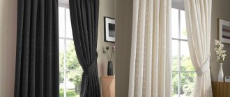
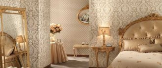
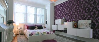
Modern apartment design with matching curtains and wallpaper
There are many options for curtains and wallpaper on the market. When choosing, you need to pay attention not only to the quality of the material and price, but also to the combination of tones used in the decoration. Often, ordinary people focus on furniture and household items, forgetting about the main thing. Curtains and wallpaper that resonate in color will cause discomfort and spoil the overall appearance of the home. Use our tips before you go shopping.
The play of colors is the simplest and most winning technique for decorating a room. Thanks to her, she manages to transform a familiar room beyond recognition. Over time, the tones of wall coverings and fabrics fade under the influence of ultraviolet radiation. Therefore, experts advise changing curtains and wallpaper at least once every 5 years. This rule works from a practical point of view and because trends in interior design change quite often.
Most people prefer to do their own repairs. Due to lack of knowledge and taste, many people combine colors incorrectly. A new finish, made arbitrarily, quickly becomes boring; on an intuitive level, a conflict of materials is felt. If you like the curtains and wallpaper, this does not mean that they will look harmonious in reality. You need to try on curtains under the wallpaper, avoiding obvious mistakes.
Apartment interior with a combination of curtains and wallpaper in design
An unusual combination of curtains and wallpaper in the interior
How to choose the right combination of colors for curtains and wallpaper in the interior?
Many are afraid of unexpected changes and prefer restraint in decorating a room, while others make the opposite mistake. Without knowing the basic rules, the owner of the premises usually acts as follows.
- Focuses on muted beige, gray and ash pink undertones in the hope that they look safer. It’s difficult to go wrong with neutral shades, but as a result, a room decorated in this palette looks standard and boring.
- Strives for bright, energetic colors. By diluting neutrality with pigmented colors, the average person does not place accents, but makes the room too colorful. A bright room is psychologically tiring and causes discomfort.
There is a fine line between courage and restraint. To combine things correctly, you don’t have to have an education or have a delicate taste. Initially, determine the degree of natural light in the room. Remember that wallpaper will look different in a dark corner than in an open area. The degree of light penetration into the room depends on the texture of the fabric. Follow these guidelines.
- For the northern half of the house, it is important to use light light shades (beige, white, pink, lilac, champagne, blue, etc.);
- The south side allows you to experiment with bright colors (orange, purple, red, burgundy, blue, etc.);
- Eastern rooms can be decorated with cool shades (gray, white, black, silver, etc.);
- On the western side, natural warm colors predominate. It is better to emphasize them with neutral beige, milky, white.
Remember that shade is not the last factor. It is important to pay attention to the texture of materials and decorative elements that overlap in creating a harmonious composition.
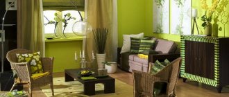
Room design with color combination of curtains and wallpaper
The combination of curtains and wallpaper in the interior
See alsoTurquoise color in the interior
Harmonious palette
Not a single shade is used alone in the design; there are always companions in the interior. Orange, with its temperature, vitality and strength, takes up a lot of space in the room, so it needs to be combined with less saturated tones. But there are different shades of this color:
- pastel tone , which is closer to yellow in its notes, often serves as a background for brighter solutions;
- the rich shade of orange is distinctive in itself, but other bright colors can quite organically coexist with it, although you need to be careful with them;
- the dark tone is associated with terracotta ceramic tiles, which are often used in retro styles.
Accordingly, the brighter the main shade of orange, the less saturated the companion should be. But, surprisingly, you can choose a combination for this tone in fairly deep tones.
Curtains of this color will match orange:
- White curtains - a classic option that can often be seen in photos of both stylized antique and modern interiors. This is a positive combination that can be both quite calm and quite energetic.
You can also choose black if the decoration contains dark surfaces. This is a strict and extravagant combination at the same time. Such a duet can be very dynamic if the design uses aerodynamic curves rather than straight lines. - An overly bright combination would be red with shades of orange. But this combination also has the right to life when implemented by an experienced designer. If only the curtains and a few accents in the kitchen work area are red - dishes, appliances, etc., then the duet will be quite harmonious. It is important not to overdo it with the fiery tone.
- An organic combination of orange and yellow. The photo shows that these are similar shades in mood that will help enliven any interior. If orange is used in wall decoration, then you can use a yellow pattern and yellow curtains. If you choose orange facades and place sunny accents, then it is better to make the curtains in orange tones with yellow trim.
- The duo of orange and all shades of blue is harmonious and positive in its mood. Interestingly, the cold spectrum of blue tones is inferior to the temperature of orange, and the interior turns out to be quite warm. You can match the orange trim with blue accessories, including curtains. If the kitchen itself is in warm colors, then the dining area can be painted blue and the curtains chosen orange. The photo shows how original and pleasing this duet is to the eye.
- A duet of orange with different shades of purple will be solemn. Calmer lavender tones will mute the energy of orange and make the interior mysterious; bright lilac tones are a combination that deserves special attention. Fuchsia curtains with matching accents in decoration or household accessories will make the interior a little reckless, but cheerful.
- An organic combination of orange with shades of green. With olive or emerald green you can get a rather strict and solemn, but positive interior, and with rich herbal or salad green it can be cheerful and conducive to communication.
- Shades of beige and brown calm the orange tones in the kitchen a little. Curtains of such neutral colors will add nobility and respectability to the design. A similar duet is often used in classic interiors.
What else to consider when choosing and combining?
Look at the color temperature of surrounding parts. It is customary to separate cold and warm colors, forming the right tandem.
You can choose curtains and wallpaper:
- in a single palette (for example, dark blue, blue and light blue);
- overlapping, complementary colors (for example, lilac, purple, pink);
- contrasting (for example, black and white, burgundy and beige).
When making purchases, start from your own preferences. If you don't like pastel pink, you shouldn't buy it because of the fashion for this color. Things that are calming and do not affect the psyche are ideal. Neutral shades promote psychological relaxation, green inspires, blue calms, and peach awakens the appetite.
It is necessary to take into account the location and purpose of the room to determine the most advantageous option. There is no consensus on the ideal design. Designers believe that the best option is to have 70% basic tones, 20% contrasting and 10% accessories that dilute the atmosphere.
Modern apartment design with matching curtains and wallpaper
Apartment interior with a combination of curtains and wallpaper in design
An unusual combination of curtains and wallpaper in the interior
See also: Color combination in the interior
Basic principles of combination
When choosing curtains, wallpaper or furniture upholstery for any of the rooms (in the nursery, kitchen or living room), experts apply two basic principles for the juxtaposition of shades:
- Contrasting. Opposite colors intertwine here. At the same time, they look beautiful in pairs, like black and white, red and black, blue and white, yellow and green.
- Similar colors. Here colors of the same scale are collected, but in different tones. Some color will be more intense than its neighbors.
Interesting: Fashionable apartment interior 2019-2020
Principles for selecting curtains
In their classic application, curtains act as protection from penetrating direct sunlight. Depending on the intensity, choose more or less dense fabric. The decorative function of curtains can hardly be overestimated. They give the image completeness and elegance. Textile parts should be selected according to the following principles.
| 1). Depending on the interior style | For minimalism, the absence of patterns and flashy textures is preferable, but for Provence, on the contrary, a pattern that matches the texture of the wallpaper is welcome. |
| 2). Pushing off furniture | Heavy classic household items should be visually lightened with curtains, which make the room brighter. |
| 3). Highlight the wallpaper and leave the curtains neutral | A protruding pattern on the covering will look brighter in combination with delicate beige curtains. |
| 4). Emphasize color with curtains | Faded and neutral wallpaper will be an excellent backdrop for richly colored curtains. |
The texture of the products must correspond to the purpose of the room. For example, the kitchen needs minimalist functional curtains, while the bedroom needs heavy curtains with decorative trim.
Room design with color combination of curtains and wallpaper
The combination of curtains and wallpaper in the interior
See alsoFlowers in the interior
Fashionable wallpaper - original curtains
Today, manufacturers of finishing materials offer a huge range of non-traditional wallpapers with original textures, for which it is necessary to select a suitable original version of the curtains. At the peak of popularity:
- large drawings,
- contrasting ornaments,
- decoration with rhinestones and shiny elements,
- patterns with a touch of antiquity,
- abstraction,
- embossed wallpaper.
No less popular are wallpapers on fabrics (non-woven fabric, linen, cotton), which require curtains of a special texture, and wallpaper with imitation wood, plaster, stone, leather. A simple rule is applied to them: for massive wallpaper - heavy curtains, for light ones - flying curtains. Wallpaper in the form of Venetian plaster will look harmonious with heavy moire silk curtains. For contrast, you can use wallpaper and curtains of the same color, but different textures.
For walls with abstraction or contrasting patterns, hang smooth, plain curtains in a primary color. With fabric wallpaper, fabrics are often offered for sewing curtains and textile accessories, which have already been worked on by professionals. Curtains two or three shades lighter are suitable for wallpaper in rich and complex shades.
When choosing curtains for a room with fashionable exclusive wallpaper, it is recommended to rely on the opinion of a professional designer and your own taste. After all, comfort and coziness do not depend on fashion.
When planning the interior of a room, it is necessary to take into account many details, correctly combine materials and use suitable color schemes. The design of the window composition is very important: it is quite massive and catches the eye, so you need to know all the subtleties of selecting curtains for wallpaper.
The style of curtains and material should be chosen based on the design style of the room, the characteristics of the window space, as well as the personal wishes of the apartment owner. As for the color of the curtains, it needs to be selected taking into account the wallpaper.
If the furniture goes well with the interior, then the task is simplified: it is enough to sew curtains from the same materials as lampshades, upholstery and bed linen, or from fabrics similar in color and patterns. This is a win-win, but it is important to remember that the result will be a rather boring and monotonous design.
There are several basic rules for selecting curtains:
How to choose wallpaper color?
It is advisable to plan your purchases of decorative elements before starting renovations. When choosing, pay attention to the smooth transition between the tones of the curtains and the wall. Images and ornaments should not be different. It is not necessary to choose an identical pattern, the main thing is to find overlapping points in the texture of the paper and fabric. Bright walls are complemented by neutral curtains, and colorful curtains look better against an unobtrusive background. You should prioritize the combination of materials before purchasing.
See alsoCombination of gray wallpaper in the interior photo
Wallpaper and curtain style
Accessories on the windows emphasize the unified design of the room, so they should look like part of the ensemble. For fans of the classics, heavy curtains with golden frills will suit you. It is appropriate to use lambrequins and lace. For high-tech, it is important to use contrasting or plain curtains. Minimalism does not tolerate pretentious designs, and modernism will stand out against the backdrop of curtains with geometric patterns.
The floral print perfectly emphasizes the English style or Provence decor. In the bedroom, curtain motifs can echo the pattern on the bed linen. Try to avoid excesses and emphasize comfort as much as possible, and each room will become a favorite place to spend time.
Modern apartment design with matching curtains and wallpaper
Apartment interior with a combination of curtains and wallpaper in design
An unusual combination of curtains and wallpaper in the interior
See alsoTerracotta color in the interior: combination with other colors, photo
Curtains for plain wallpaper
There is an opinion that the easiest way is to match curtains to plain wallpaper, keeping everything in the same color, which is not entirely true. The wide range of fabrics intended for window compositions sometimes confuses even professional designers. It is worth considering several options for combining curtains with plain wallpaper.
- Vertical stripes increase the height of the window and emphasize the severity of the classic interior.
- Horizontal stripes visually change the size of the window;
- A large or bright print is appropriate if the background of the fabric matches the overall color of the interior, and the pattern is supported additionally by accessories (a frieze on the wall, a canopy over the bed, door curtains, sofa cushions, a bedspread).
- Geometric patterns highlight a minimalist interior and are combined with other geometric shapes.
Not the last characteristic when choosing curtains is the illumination of the room. In a room where the windows are located on the sunny side, you can safely use cool colors of dark shades (blue, purple, green). If the lighting is insufficient, it is better to give preference to warm colors (orange, red, peach, yellow) in combination with transparent curtains or tulle.
Shapes of modern curtains
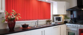
Experiments with style have led designers to different types of window decorations. In addition to traditional thick curtains and tulles, in 21st century housing it is common to use blinds (vertical and horizontal). It is better to install them in the kitchen or office. This design element has a rich palette of colors and will serve as a practical accessory.
A variety of blinds are roller blinds, roller blinds or Roman blinds. They are made of dense synthetics or textiles. In the assortment of stores you can see plain and textured materials. Oriental style roller shutters are made from bamboo or natural wood. You need to purchase window accessories according to individual measurements. It is appropriate to combine different types of curtains with blinds, providing additional protection from the sun.
Room design with color combination of curtains and wallpaper
The combination of curtains and wallpaper in the interior
See alsoBlack and white interior: features, photos
Stylistic solutions in window framing
Of course, you initially need to choose a kitchen design style, and only then begin to detail the project. But quite often a person goes the opposite way and decides what colors he wants to see this room in, and only then selects possible options for implementing his plans. Therefore, by determining the combination of shades, you can choose the optimal curtain options.
- Combinations of orange with neutral and pastel tones are suitable for strict classic interiors. Such curtains can be regular, shortened, or with lambrequins and additional decorative elements. In such styles you can choose bulky curtains.
- Modern technological projects most often include blinds or roller blinds. The photo shows that their color can be absolutely any, but it is better to avoid too dark solutions so as not to turn the kitchen into a bunker.
- Bright curtains harmonious with an orange tone, as in the photo below, are usually used in modern functional interiors. It is better to give preference to light translucent curtains, since their shade will already attract attention and visually take up space.
- Light-colored curtains with a pattern in the form of a small curtain are often used in rustic and retro interiors - in country, Provence, chalets. If the main tone is pastel, then the pattern can be combined with the main bright orange color.
A kitchen in orange tones is distinguished by a positive mood and cheerful character, which can be emphasized with well-chosen curtains that are harmonious with the main color shade.
How to choose curtain material?
When wondering which curtains will suit the room, pay attention to the type of furniture and wall coverings. A textile sofa looks great with curtains made of the same thick textile. In order not to burden the window with curtains, you can dilute the picture with weightless white tulle without patterns. It is appropriate to emphasize Japanese motifs in the interior with bamboo roller shutters.
Many, striving for minimalism, cover the entire window opening with blinds and do not hide radiators or radiators. When choosing fabric, focus on quality. You can determine good material by touch. Expensive fabric fits well and flows, adding a special shine to the bedroom. Depending on the type of curtain, different installation models are used.
Modern apartment design with matching curtains and wallpaper
Apartment interior with a combination of curtains and wallpaper in design
An unusual combination of curtains and wallpaper in the interior
See alsoFuturism in the interior: secrets, accents, layout
Curtains: the best options for harmony
When you have already decided on the shade of the wallpaper, all that remains is to finish the design - and choose the right textiles. Which curtains are best to hang for orange wallpaper and what combination of colors of wallpaper and curtains will look most advantageous in the interior of home rooms?
To provide a cozy feel to the bright color scheme, curtains should be chosen based on their effect on the lighting in the room. It is better if they are light and airy fabrics .
Thick materials can also be used as curtains, but they should not form accents. In general, it is better not to use bright colors in the window area in such interiors. It is advisable to design massive curtains made of opaque textiles in delicate white, beige, and pinkish tones.
The color of the curtains can repeat the shade present in the patterns.
Light and light curtains with orange wallpaper will always look perfect : they harmonize with furniture of any style and color, do not cause discomfort and do not affect the perception of the space of the room.
If you want to attract maximum attention to the window area, opt for dark curtains, but ensure that there are other light accents in the interior that balance the bright design.
Orange wall coverings are always bright, stylish and interesting, and in your home interior they will become the main source of cheerfulness and inspiration. There is no need to doubt the wide possibilities of these colors: it is better to see in practice their powerful impact.
If the room is decorated in beige color
A typical mistake is to purchase curtains to match the pastel wallpaper. Such a neutral palette will completely simplify the interior. Use beige coverings as a background and place contrasting bright curtains on it. In this case, drawings, ornaments and accessories would be appropriate. It is recommended to select curtains based on color temperature. Light beige looks good with thick white, burgundy, brown, and gray colors. It can be combined with red and orange, as well as all shades of wheat yellow.
Room design with color combination of curtains and wallpaper
The combination of curtains and wallpaper in the interior
See alsoIs modern design possible in a two-room apartment in Khrushchev?
General rules for choosing curtains for the interior
Curtains play a big role in the interior. Their goal is practicality and creation of comfort. With the help of correctly selected curtains, you can visually raise the height of the walls, make the room lighter and more spacious, and correct some of the apartment’s shortcomings. You should take into account the color of furniture, wallpaper, the location of windows relative to the cardinal directions, artificial lighting, etc. So, how to select curtains for the interior:
1 Dark furniture. It plays in contrast with the light interior. Lighting is also important. Dark furniture in a room with insufficient light will look gloomy. Therefore, designers dilute the dark shades of furniture with light textiles or wallpaper. If your goal is not to highlight the window opening, then hang white curtains that will seem to merge with the window, becoming its continuation. The room will be much brighter. However, curtains in dark shades are also quite acceptable - provided that there is not a lot of furniture in the room or it is located in a small “island” in the center of the room or against the wall. It is not necessary to choose curtains to match the furniture. A difference of several shades (lighter or darker) is not so important. The color itself doesn't really matter either. The main thing is that everything should be kept in the same color scheme and be in harmony with each other.
2 Light furniture. Light-colored furniture visually increases the space of the room. Here the color of the curtains does not play a special role; almost any color will do. The main thing is to follow the principle of combining warm and cold shades. Then the room will look harmonious. However, some interiors look quite cozy, combining contrasting colors (such as orange with blue, pink with gray, yellow with olive, etc.).
3 Curtains in the color of the furniture. In some interiors, furniture and curtains have exactly the same color and tone. Some even manage to find wallpaper with this design. This is a common mistake. The same pattern should not be repeated on curtains, wallpaper and furniture. It may well be identical on upholstered furniture and curtains. The main thing is to dilute the textiles with a different color and place accents, for example, using sofa cushions in a contrasting color or more muted tones. It is important not to overdo it in this matter, so that the room does not feel overloaded with one color.
4 Striped wallpaper. According to the designers, wallpaper with vertical stripes visually raises the ceiling level and is itself a bright accent in the interior. Therefore, plain curtains that either harmonize or contrast with the color of the wallpaper are suitable for them. If the wallpaper is of muted tones, then curtains with small flowers or geometric patterns are acceptable.5 Wallpaper with large patterns in the form of flowers, geometric shapes, monograms and other patterns. Any plain curtains will suit this wallpaper, but repeating the pattern on them is also quite possible. The only rule: the drawing must differ in size (be smaller or larger). Remember about a sense of proportion. If the pattern is completely repeated, then the background should be different.
If the room is decorated in yellow tones
Warm yellow looks advantageous in combination with light blue and light blue. Warm undertones of yellow look ideal in a composition with golden burgundy, lilac, coffee, and terracotta. Basic white will add nobility and purity, and cream will complement the palette in an unobtrusive way.
Modern apartment design with matching curtains and wallpaper
Apartment interior with a combination of curtains and wallpaper in design
An unusual combination of curtains and wallpaper in the interior
See alsoFloral wallpaper in the interior: new design trends
Selection according to the purpose of the room
It is not advisable to use saturated intense colors in the decoration of a bedroom or recreation room. The dynamics are appropriate for a living room, children's room or office. Yellow, brown, orange and contrasting tones look good in the open spaces of the kitchen and dining area. Dark and light beige are used in the bedroom and hallway. The green hue inspires and calms the nervous system.
Give priority to a combination of pistachio, light green, light green and marsh colors to get an original interior. By analogy, a palette is selected for other zones. If you don't know what to choose, give preference to two or three shades of the same color. They will look expensive and correct.
Room design with color combination of curtains and wallpaper
The combination of curtains and wallpaper in the interior
How to make the right choice?
If the wallpaper is paper, light weightless curtains with transparent tulle will do. Vinyl works well with denser materials. It is worth remembering that bright colors of wallpaper and curtains are not welcome in rest rooms. It is best to choose curtains for the bedroom that match the color tone of the pattern on the wallpaper.
By combining the tones of wallpaper and curtains you can create interesting transitions or even accents. For example, burgundy curtains with a white curtain against the background of pink wall decoration look good.
Little tricks for color combinations
To understand which curtains are suitable for a particular room, you need to take into account personal preferences and build on the initial data - furniture, floor, location of the room. Use the palette to select combinations. Use it to determine which colors predominate in the space and choose a contrasting shade or tone from a homogeneous range. Don't be afraid to experiment and don't strive for "beige". Don't underestimate the benefits of accessories. They add zest and create parallels between incompatible things.
Beautiful combinations of shades
To understand in more detail which color goes harmoniously with which, let’s give the following examples:
- Gray – blue, light blue, black, brown, burgundy, marsala, orange, green, yellow.
- Black – absolutely any shade suits it. Just like the white one. Black and white are the basic colors.
- Orange – blue, green, olive, light blue, brown, beige.
- Brown – beige, white, black, grey, orange, red, warm green, blue, light blue, pink, burgundy.
- Green - pink, blue, light blue, orange, gray, white, black, crimson, red.
Such combinations look very interesting indoors. But before you combine colors with each other, read the recommendations of the experts below.
Adjusting the size of the room
You can choose curtains according to the proportions of the room. A hidden cornice with flowing tulle on the floor will visually lengthen the room and raise the ceiling. By installing a cornice along the entire length of the wall, and not just on the window opening, you will expand the space. Pastel shades will add light to the house, and dark shades will “muffle” the flow of sunlight, adding coziness. You can expand the area using large patterns on the wallpaper. Following the principles of minimalism, you will rid the room of unnecessary items and make it spacious.
What are the types
There are a large number of types of orange curtains on sale. As a rule, classic long-length canvases are most often purchased, which allow you to cover not only the window opening, but also the space underneath it. However, in addition to the classic version, there are others that are no less spectacular and effective.
For example, short-length sliding curtains are optimal for a small kitchen. If you additionally choose a non-staining material, this will actually be an ideal choice.
Lifting curtains are very similar to classic blinds. The difference is that in the case of curtains, ordinary fabric is used, not plastic. The lifting is carried out by means of a small rope, which pulls the counterweight, thereby folding the canvas into neat folds at the top of the window opening.
There are also stationary curtains that can serve a purely decorative function. They are attached to the cornice in a certain position, after which they cannot be opened or closed or moved from their place.
The most uncommon option, since very rarely there is a need for a stationary canvas. A way out of this situation can be lambrequins and various kinds of belts. With their help, you can secure the curtains in a bundle in a certain place, which will allow you to slightly open the window opening.
Sliding curtains are the most popular option, ideal for any style and interior, and have a large number of variations.