Today, finishing materials in shades of delicate violet, lavender, and lilac are popular in creating interiors. Let's figure out which curtains to choose for lilac wallpaper in this case?
Light purple wall colors add a touch of freshness to rooms and create a romantic atmosphere.
How to maintain the charm of lilac wallpaper in your design?
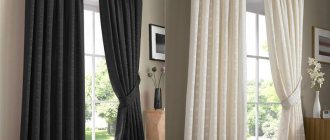
Instead of curtains - white blinds, as a continuation of the plastic window
. Try to choose the right window decor. Curtains are the best choice: they logically complete and enliven the interior. Shades of lilac wallpaper harmoniously combine with delicate curtain materials in color and texture.
What curtains to choose for lilac wallpaper?
Photo gallery
Decorating the bedroom
Combinations of lilac and yellow (green, orange) are harsh and kill comfort. It is better to dilute the palette with white - this color is an undying classic of bedrooms.
Romantic lilac in the bedroom willingly gets along with white blinds, not only with curtains
Textural contrasts work well for comfort:
5 color ideas useful in the design of sleeping rooms:
It is useful to know what style trends are current in bedroom design.
In the most spacious rooms of a house with a refined atmosphere, the following are appropriate:
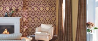
For classic living rooms with smooth wallpaper, the following are suitable: translucent fabrics, heavy curtains in delicate shades, two-layer options.
White and purple paints will add intimacy to an active modern interior while maintaining its style.
The overlay of two types of tulle, painted blue and pink, gives a “cool” interior that visually expands the walls: the decor is suitable for small rooms with windows facing south.
Other visual expansion techniques used in living room design:
Long canvases in rich purple, brown, even red shades, covered with translucent pastel muslin, are suitable for “northern” living rooms.
It is important to remember about the matching intensity of color shades - the darker the wallpaper, the brighter the curtains can be.
Feature and psychology
The lilac color is quite extravagant and therefore is most often combined with bed shades. But since it is based on 2 colors: red and blue, which are considered energetically strong, then
it can negatively affect the nervous system of a person staying in such a room. Therefore, it is better to use it in rooms where people spend the least amount of time, that is, the hallway or bathroom.
Despite this feature, it is increasingly used in the interior. Moreover, it is chosen either by young people or established mature individuals. And if you use it in a room where the windows face south, you can significantly soften the cold aura. Or choose warmer shades: mauve, purple-eggplant.
Choose curtains for lilac wallpaper, paint or plaster that are elegant, but not flashy. This is usually tone on tone for a small room, or grey, yellow, green, white, beige, blue or brown for a larger space. If little natural light enters the room, then the fabric should be light and flowing. And if there is a lot, then add thick curtains. When two or even three-layer curtains are used, one of the colors must be on the textiles, floor, ceiling or furniture.
Basic Rules
The main rule for selecting curtains to match certain wallpapers in a room is that you cannot purchase models made of fabric of a similar shade that completely matches the color of the wallpaper. So the interior of the room will become boring and tasteless
If you want to choose very similar colors for these two interior elements, then it is important to consider the rule: the color of the curtains should differ by several tones; it is better if the curtains are slightly darker than the wall coverings. But it’s still better to purchase products that will be similar in color, that is, they will combine well with each other, but not repeat each other’s shades
It is also very important to consider that pastel wallpaper colors are the most versatile, since they can be combined with absolutely any color wall coverings. Nude tones will be acceptable in both light and dark rooms
The rule for selecting colors from the same range is fundamental, but you can deviate from it when you want to get a brighter combination. In this case, you need to give preference to a contrasting design, combining completely opposite colors - the wallpaper should be darker or, on the contrary, brighter than the color of the walls.
If you want the wallpaper and curtains to match in color, it is better to purchase wall coverings of a certain color, and curtains of a completely different shade, but with a pattern similar to the color of the wallpaper.
For bright rooms, try not to purchase window decorations with discreet light patterns; they will look uninteresting. If you want to somehow liven up your room, you can hang perfectly white curtains in it, they can even have a slight pearlescent tint.
Also, some people seek to add a third shade to the interior of the room by purchasing curtains, two layers or two sections of which differ in color. This is a risky solution, but it is easy to implement. In this case, one rule must be taken into account: the third color must be chosen so that it is brighter than the other two, and at the same time it must go well with both of them. Compliance with all the above rules will help create a harmonious environment in any room.
Ornaments
The pattern on the fabric is no less important than the color of the curtains. So, for example, in a well-lit room of medium and large size, a large pattern on lilac curtains is suitable, and in a small room, on the contrary, a small one. These can be: monograms, abstractions, geometric shapes, flowers, leaves, stripes. By the way, the latter are relevant from year to year. Their location also influences; a vertically applied ornament visually raises the ceilings, and when applied horizontally, the room expands.
Geometric patterns fit into any design. With the correct geometry of the room, curtains fit well with the image of squares, rhombuses and triangles. Thereby emphasizing the stability of the situation. And you can add light romance with the help of curtains with wavy lines and floral patterns.
If you need to visually enlarge the window opening, designers recommend using wide stripes. Narrow ones give the room austerity.
Characteristic
Curtains and curtains in lilac colors are a very popular decorative element that not only looks stylish, but also has a large number of advantages. This color creates an atmosphere of magic and wonder in the room. It is often chosen by dreamy and creative people. Shades of purple can be used in apartments of various sizes. If you correctly combine color with textile material, you will end up with a stylish accessory for the room.
The beauty of lilac curtains can be made more expressive with the help of other decorative elements, such as pillows, blankets, bedspreads, etc. They will also go great with a purple carpet. When choosing a shade, do not forget about the size of the room. Thicker and darker colors can be placed in a spacious room, while for a compact bedroom it is recommended to choose light options.
Lilac in the interior of rooms
When choosing curtains, you must initially decide what type will be used (classic, Roman, roller, etc.), the amount of light in the room, the purpose of the room and the taste of the owner. And also what role they will play: just a bright accent, protective or to visually expand the space.
Living room
Curtains for lilac wallpaper in the living room should be chosen in bright pink, green or yellow colors. They will give it freshness and will look contrasting against the general background. If the room is dark and there is little sunlight, then a tulle voile, French or Roman curtain will do. They will keep out the sun's rays as much as possible. If there is too much of it, then it is recommended to hang thick curtains. If the windows in the living room are large, then a lambrequin would not be amiss.
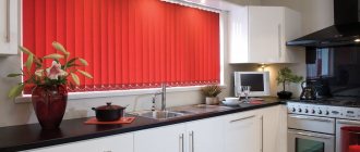
Kitchen
A bright kitchen set looks good against the background of cold lilac walls. At the same time, it can be considered the highlight of this room, since it is difficult not to pay attention to it. You can balance the color scheme by decorating the windows with light tulle in white, beige, or light green shades. Long, thick curtains are inappropriate here.
The kitchen, and not only that, looks stylish in a combination of turquoise, lilac and white/black. This option has always been considered a sign of good taste and style.
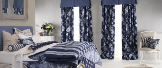
Bedroom
The atmosphere in the bedroom should be pleasant, cozy and conducive to relaxation and sleep. Therefore, for basic purple and lilac walls, white translucent curtains complemented with dense fabric are suitable. This combination is the best duet. If you want to dilute the room with bright colors, then curtains in light green, light pink, peach, olive, and bottle colors will fit into the bedroom. Especially when the room itself is quite dark.
Children's
Psychologists say that the abundance of lilac in children’s rooms is unfavorable for their mental and emotional state. As a result, they become irritable and sleep is disturbed. But if you use it in moderation, then why not. The main thing is that the shade itself is as warm as possible, and textiles on the windows can be hung in turquoise, blue, white, beige, or light green. Moreover, you can dilute the interior with patterns on the fabric; these can be stripes, flowers, or images of your favorite characters.
Balcony
This part of the apartment has a narrow but elongated shape. Therefore, to balance perception, you need to use contrast. For example, 2 walls are a rich lilac shade, and the rest are pastel colors (beige, white, gray). And the contrast can smoothly transfer to furniture.
Decorate the windows with blinds to block out excess light, day-night roller blinds or Roman blinds with a geometric pattern. The color is suitable neutral light, olive, blue, yellow, pink or dark green, light green. You can complement the interior with live indoor plants and paintings.
Hallway
Since you can rarely see windows in this room, unless it is a private house, it is necessary to maximize the space. When choosing a wall color, it is better to choose lighter shades of lilac. The idea will be complemented by a white ceiling, ideally a glossy stretch ceiling and a dark floor.
If the lilac walls are in the hallway of a private house, then it is better to use blinds, roller blinds or short curtains in white, beige or dark brown on the windows. They are not only practical, but also do not take up extra space, the same can be said about Roman blinds.
Bedroom decoration
The combination of lilac and green (as well as orange and yellow) is a bit harsh and can destroy the coziness created. For bedroom decor, it is better to use a beige palette - the tone of the eternal classics of the bedroom.
Textural contrasts will create more comfort:
The following ideas will help bring more comfort to your bedroom:
The design of a bedroom that uses:
Harmonious color combinations
Choosing the best color scheme for curtains and lilac wallpaper is a difficult task. Therefore, designers recommend using well-known techniques.
Tone on tone
A combination where the dominant color is purple or different shades of lilac is called tone on tone. It is used quite rarely, but for a small room it is a good option. Since contrasting curtains will only narrow it even more, but curtains of lavender, pale lilac, especially with translucent fabric will expand the space. As a result, the atmosphere will become light, elegant, filled with freshness.
Different shades
It all depends on the shade of the wallpaper, that is, window textiles must be taken either a tone darker or lighter. Then the color scheme will be balanced and a certain lightness will appear.
Combination with a white palette
This tandem is wonderful both in sleeping areas and in the kitchen. White curtains go well with lilac wallpaper, purple ones are perfect. You can replace white with gray, silver, light blue. They will balance the cold walls and the interior will become calm, warm and harmonious.
With contrasting colors
It all depends on the shade of the walls: cold (plum/purple), warm (purple), neutral (lavender). In the first case, the color of the wallpaper matches beige, yellow, and orange curtains. Available in coral, light green and blue. It is used in rooms where the windows are large and face south. It goes well in a classic style with gold and silver decor.
Purple is harmonious with yellow-green. As an addition, you can take peach, turquoise, raspberry, and coral curtain colors. Rich shades will add warmth to the room, especially if there is not enough light in it.
Bright yellow, emerald and beige tones of curtains go well with lavender.
Yellow
This color forms one of the most successful combinations with purple. It surprises, invigorates and charges with positive emotions. You shouldn’t choose such a “turbulent” mix for the bedroom. But in the kitchen or living room, mustard yellow curtains and upholstery of upholstered furniture or painting of facades of the same color form a wonderful composition. The lighter shades of these two colors also harmonize well with each other.
One idea: pale yellow curtains with a pattern of purple elements, combined with the same plain wallpaper for the walls.
Kinds
There is now a wide selection of curtains in stores. Therefore, people often don’t even know what to choose, and to the detriment of the interior style they buy standard classic curtains. But not all windows are best designed this way. After all, each type of curtains has pros and cons, the basic rules of application of which make it clear which curtains are suitable for a particular room.
Rolled
Curtain designs from plain to varied patterns. They provide good privacy and are convenient for a bedroom or living room with large windows. Lilac walls are combined with light pink, turquoise, sand and mustard roller blinds. When coziness is not enough, you can add translucent tulle to match the tone.
Roman
Fabric Roman blinds in light green, mint, orange, and light blue are popular in the bedroom and living room. Against the background of lilac wallpaper, they enlarge the space, giving it warmth and calm. And they allow access to sunlight.
Classic
This version of curtains is chosen for antique, classic styles. They fit well into the art deco, hi-tech, and baroque styles. But they look most impressive in rooms with high ceilings, successfully emphasizing the advantages of a large room. The lilac shade can be successfully combined with long curtains in beige, peach, gold and silver.
It is not always necessary to strictly follow the advice of designers. Sometimes it’s enough to do it the way you like and where you will feel a warm home environment and tranquility. Or, on the contrary, fantasy will play, contributing to the emergence of new ideas.
Violet
Designers do not recommend choosing curtains of the same color as the wallpaper. But for small rooms, this solution justifies itself, since the presence of contrasting colors will visually reduce the volume of the room even more.
It is not necessary to choose the same shade for walls and curtains. By playing with tones, you can achieve visual correction of the shape of the room. So, if you hang curtains of a richer shade, then the wall with the window will visually move closer to the central part of the room. This way you can “make” a rectangular room square. A similar technique is used for the opposite purpose.
The interior, the main color of which is purple, is memorable for its unusualness. By harmoniously diluting it with an additional color, including other shades if necessary, you will create a unique design for your living room, kitchen, nursery or bedroom.
Curtains for the living room
For the living room, the following curtain options would be appropriate:
Contrast is appropriate for this room of the house. Saturated walls will look harmonious with bright lemon, green, and crimson curtains. Classic gray color is also suitable, but it is better when the textiles are either dark or shiny. With such an unusual combination, it is better to complement the curtains with light tulle in a neutral color. Turquoise curtains and purple wallpaper are suitable for the interior of any room in the house, including the living room.
Which texture to choose
According to classical design rules, the texture of walls and curtains should match. It is recommended to hang heavy fabrics on the windows if the wall covering in the room is dense. With lighter materials, curtains should also be weightless.
Pale purple walls suggest the presence of cherry, lilac, turquoise, blue, violet, yellow, orange, beige, brown curtains.
Note! The same color on curtains made of different fabrics will look different. Dark purple on velvet can look like black.
Designer tips for a fashionable interior:
When choosing a fabric texture for curtains, you need to understand how the fabric will behave during use. Heavy and dense materials will not allow you to create light draperies and folds on the window, but will emphasize the sophistication of the interior. At the same time, lightweight fabrics will not prevent light from entering the room.