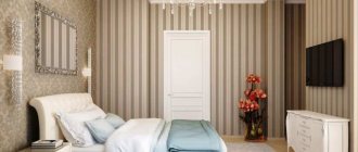
Living room wall decor Dividing the bedroom into zones Wall decoration in the kitchen
This practical approach is justified, as it allows any interior to be provided with maximum functionality, and, due to the ease of implementation, does not require effort to find ways to save free space.
We will share how to zoning rooms with wallpaper using specific examples: we will talk about the possibility of color division of the living room, bedroom, kitchen and other rooms.
There are many interesting options for combining wallpaper to achieve this result: the most stylish and effective of them can be implemented not only in modern styles, but also in classic, provincial and many other interiors, so knowing the intricacies of this universal method will not hurt you.
Basic rules for combining
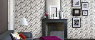
Designers usually insist on a combination of wallpapers. This allows you to give the room an original look, choose the right different textures, shades and patterns.
This finishing method has advantages:
- smoothing out the disadvantages and emphasizing the advantages of the hall;
- camouflage of a specific layout;
- delineation of areas for entertainment and recreation.
When choosing canvases, take into account the height of the ceiling, the location of windows and doors, the presence of niches and the degree of lighting.
When creating a combined design yourself, you should follow a number of rules. Before purchasing, you should decide on such nuances as:
- Type of interior (classic, high-tech, avant-garde, art deco, empire, antique).
- Basic wall color. Subsequent decor and accentuation elements are based on it.
- Type of texture: smooth, embossed or textured.
- Drawing and its size. It can be subject, floral, geometric, abstract.
- The compatibility of canvases and available accessories - curtains, furniture, decor.
In order for the combination of wallpaper to be successful, it is worth thinking through the entire interior in detail in advance. It is better to choose wall coverings after purchasing furniture and decorative items. Because the main purpose of this design is to emphasize the living room decor.
Combining different types of textures and shades will help create a unique style. The organic nature of the room depends on the correctly selected color scheme. Wallpaper combinations allow you to divide even a small room into an area for dining, playing and relaxing.
After viewing photographs of finished interiors, you can choose the appropriate option. It is also worth considering the area of the room and the height of the ceiling. Light wall colors are a good solution for a small, ill-planned room, as they visually expand the space.
Bright shades visually narrow the room, so they look good only in a living room with a large square area. But accent wallpaper in dark colors allows you to compensate for the elongated or irregular shape of the room. By gluing such a canvas on a narrow area, you can “bring it closer”, optimizing the space.
You should not place the main emphasis on the wallpaper. This design looks boring. And the combination of bright textured walls and original furniture seems unnecessary. The canvas should ideally be in harmony with the decor, creating comfort and not attracting maximum attention.
The classic option is pastel-colored wallpaper. For such a room you will need interesting furniture so that the interior does not become ordinary. If you combine two or three types of pastel-colored wallpaper in a room and place bright accents, you will be able to create an interesting and unobtrusive design.
Paired canvases should be connected according to texture or appearance. Walls with a similar pattern or the same background look harmonious in the room. Contrasting shades emphasize activity and uniqueness. The combination of photocells with a single-color coating is also relevant.
Beautiful design of combined wallpaper (photo)
When choosing the option of renovating a house by combining different wallpapers, you need to keep in mind the size of the rooms, their configuration and purpose. With the correct combination of coatings, it is possible to obtain the following results:
- visual increase in room area;
- hiding minor damage to walls;
- saturating the room with additional light;
- allocation of certain areas;
- creating an emphasis on stylistic features.
To give a unique style, it is possible to use only a few colors that are similar to each other. This range of shades can be applied using a specialized circle with a color chart.
Properly selected wallpaper will help highlight the special style of any room.
Advice! To get a multi-layer effect, the canvases are applied to each other, choosing one of them as the main one. Others in this case will be additional elements.
Selection of wallpaper by color and pattern
When choosing the shade of the walls, they start from the existing furniture and other decor (curtains, bedspreads, paintings). The color of the rolls should match the decor or be a little lighter.
Expert opinion
Olga Kovalenko
Since 2010 I have been engaged in interior design and architectural design.
Too bright colors or variegated patterns predispose to depression.
When purchasing wallpaper yourself, you should remember the batch number. It is better to buy rolls from one manufacturer. This fabric will have an equal thickness, so the joints and seams will be invisible.
How to combine colors correctly:
- Red or purple looks good with silver, emerald, blue, coffee and light brown. But you shouldn’t combine it with golden, yellow, orange and purple. It looks tacky.
- Pink goes with dark red and silver gray. You can add a little brown. Celadon, electric blue and bright red are prohibited.
- Orange can be combined with white, beige and light green. These combinations are suitable for a room with lilac or violet decor.
- Brown is combined with gold or bright blue.
- Yellow harmonizes with wooden furniture and green shades of the interior.
You can combine not only wallpapers of two colors, but also with different patterns. For example, a small room looks more spacious when combining a plain fabric with or without a pattern. Rolls with stripes, patterns or monograms allow you to highlight one of the walls.
If the hall is rectangular, you can visually expand the area with a horizontal combination of ornaments. Vertical combination allows you to “stretch out” a living room with a low ceiling.
Pastel shades with abstract or geometric patterns look great in small rooms. A large pattern reduces space.
A covering reminiscent of wood or bamboo can be combined with a floral print, narrow stripes with abstraction or a cage.
Interior combination ideas
Combining wallpaper of different types or shades is a bold technique that will help create an original design from standard trellises. A correctly selected method will positively change the geometry of space. Among the existing methods, designers identify 8 popular ideas.
Vertical stripes
The striped finish optically raises the height of the ceiling, so the technique is used in compact rooms. Vertical lines are often combined with plain canvases. A print of 2-3 colors is appropriate on an accent wall, and the rest of the space is done in muted shades.
Design technique with lines Source design-homes.ru
The uniform combination of stripes and monotony looks original. The effect of columns is created, which visually raises the ceiling. The technology has proven itself well for both large and narrow lines. Due to the alternation, vertical thin prints will not ripple in the eyes.
Popular combination methods
You can combine wallpaper to create an interesting room design in an apartment in different ways. They select canvases based on similar or contrasting shades, and combine different pasting methods to visually expand the room or improve its shape.
By related colors
The design of wallpaper for the living room depends on the ability to combine rolls in a general scheme. To do this, use 2 methods:
- A combination of two tones of the same color. For example, the classic combination of golden and brown. This wall design looks elegant and stylish.
- Combining different shades of pastel colors. Translucent, dim colors harmonize well, visually enlarge the room, giving the interior lightness.
If you need to highlight separate zones in the hall, then wallpaper 2 shades darker would be suitable for relaxation, and lighter than the base ones for eating.
By contrasting colors
Shades that are not next to each other on the color wheel, but on the opposite side, are called complementary or contrasting. These are combinations of blue and orange, green and red, purple and light yellow.
Combining such aggressive tones is acceptable when decorating a living room for young people. But it is important not to overdo it, since an unsuccessful combination depresses the psyche and causes pain in the eyes.
Bright and pastel shades look good on plasterboard or frame partitions in studio apartments, in the living room combined with the kitchen.
You need to experiment carefully, or better yet, entrust the interior to a designer. Otherwise, you can get the wrong result for a lot of money.
Combination by gluing method
There are many options for combining wallpaper using pasting methods. They can be placed on the living room walls horizontally, vertically or diagonally. It is important that the result is harmonious and that the owner likes it.
The classic design of the hall involves the following variations:
- Vertical and horizontal pasting: rolls of different textures or shades are alternated either parallel to the floor or perpendicular. The transverse layout is used for Provence style interiors, and the longitudinal layout is used to highlight individual zones.
- Inserts of contrasting colors. If the living room is decorated in a classic style, they are decorated with frames. In modern times, they are combined into an avant-garde panel or painting.
- Wall highlights. The area on which the emphasis is placed is covered with a canvas of a complementary color. This design visually aligns the shape of the living room and masks the existing shortcomings of standard-plan apartments. This technique is recommended for a small or rectangular room.
Modern wallpaper combinations for the living room: what’s trending in 2022
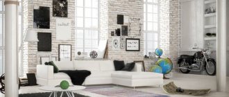
Floral walls were once popular. At the moment it is considered vulgar. Today minimalism and restraint are in fashion. This applies to the choice of style, color and combinations.
Wallpaper in the hall in the style of Minimalism
Among modern wallpaper designs for the hall, combined versions of the following types are the most popular in 2022. 3-D. At this point in the development of design, this is no longer just photo wallpaper, but a new option using modern methods of applying 3D images. They create more volume and presence.
3D wallpapers are especially popular in 2022
Plain. This look will always be popular, especially in times of popularity of minimalism. This look is also great for combining.
This look will always be popular, especially in times of popularity of minimalism.
Gradient. This is new for 2022. This option is already a combination of several colors. A smooth transition from one color to another fits on one roll.
. This is new for 2021. This option is already a combination of several colors.
Original prints. Flowers are no longer in fashion; they have been replaced by more interesting patterns. This option is suitable for neoclassical styles and unusual designs.
Original prints. This option is suitable for neoclassical styles and unusual designs.
You can combine the presented new items in any order. There are several ideas for you.
See also Photo catalog with examples of wall decoration with wallpaper in the living room
Design tips
Before purchasing wallpaper, you should decide on the interior. When choosing, take into account:
- room lighting;
- preferred color schemes;
- the desire to highlight or disguise niches or protrusions present in the room;
- existing furniture and interior items.
Expert opinion
Olga Kovalenko
Since 2010 I have been engaged in interior design and architectural design.
Usually, using the right combination of shades and textures, it is possible to create the desired design; dismantling is an extreme and expensive measure.
The color of wallpaper in building materials stores is different, and the roll you like may look slightly different in the room. This is taken into account when purchasing.
Having decided on the basic tone, they use it not only when decorating the walls, but also when selecting decorative elements - curtains, bedspreads, sofa cushions or paintings.
It is not advisable to combine fabrics with a washable and paper base, since they differ in care. Getting paper rolls wet causes them to thin and peel. As a result, partial replacement of the coating will be required. Therefore, designers and builders advise choosing wallpaper that is the same in structure.
It is necessary to take into account the effect of ultraviolet radiation when exposed to sunlight. Monograms and bright ornaments may fade or turn yellow.
A good solution for families with small children who love to draw on the walls is to decorate the play area in the hall with chalk cloth. It can be used instead of a board, and the “art” can be removed by wiping it with a damp sponge.
“Khrushchevkas”, which solved the housing problem for residents of the capital and other Russian cities, are not particularly spacious, but are still in use today. Demolition of such houses began 2 years ago in Moscow. In their living room, a classic, retro or Provence style looks organically.
What material is better to use
Today, the technological and technical process allows us to diversify the design approach to the production of wall coverings. Standard paper wallpaper for the living room is no longer relevant, despite its low cost. This is due to the short service life.
But painting, sculpting or mosaic, as well as combined options, have become fashionable and are in great demand in 2022. You can see the new products in the photo.
To understand what type of wall covering to choose for your future living room, you need to understand the materials from which they are made.
Paper covering
For a long time, such wallpapers were in demand due to their cost. Made from pure material that meets environmental standards. They are divided into two types - matte and glossy; over time, special wallpapers for the kitchen appeared that can be washed.
The only drawback of this coating is its short service life. On average, paper wallpaper lasts about 8-9 years. Next, it is necessary to replace them, and in order for them to fit properly on the surface, the wall must be perfectly flat.
Vinyl covering
The production of this type of coating differs significantly from simple paper ones. The difference is in the technological process: they take a paper base and spray polyvinyl chloride on top of it. The most common types:
- hard;
- smooth;
- with embossing.
Often, when it comes to choosing the right wallpaper for the living room, buyers choose vinyl. This choice is related to the practicality of the coating - vinyl wallpaper does not require smooth walls, and due to the weighted material, it is faster and easier to glue to the surface.
Glass wallpaper
Made from environmentally friendly materials, the composition includes fiberglass; due to its addition, the wallpaper looks luxurious and lasts a long time. Their structure resembles textile ones. Due to the use of high-quality components, glass wallpaper does not cause harm to human health.
Liquid wallpaper
The consistency of liquid wallpaper is similar to plaster. They are easy to apply to the surface and last a long time. All components included in liquid wallpaper are exclusively natural; a special acrylic solution and paint were developed for them.
Walls: a game of contrasts
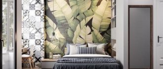
If you don’t have a lot of money allocated for renovation and dividing the room into a bedroom and a living room, you can give preference to wallpaper of different colors. Highlighting with photo wallpaper will look beautiful and original.
Photo wallpaper to accent the bed
To avoid getting into trouble, you need to consider some important points:
- for small rooms it is better to prefer a small print to a large one;
- an acceptable option is a general color scheme;
- it is desirable to organize a smooth transition of shades;
- A small pattern is preferable to a large one.
Companion wallpapers and their features
Companions are wallpapers made in the same style, but differing in several respects. For example, a common texture and color scheme, but fundamentally different designs. The more neutral series is used as a backdrop for a decorative accent.
Companion wallpapers have several advantages! They are in almost all collections of all manufacturers, so choosing them will not be difficult. This is a deliberately harmonious solution, the compatibility of which you don’t have to worry about.
This design will help to avoid excessive diversity, but also too boring interiors. Companions are especially good for zoning and visually changing space.
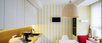
Combining wallpaper in the kitchen: 100 photo ideas
How to combine wallpaper correctly?
The combination of different wallpapers is purely a matter of taste and preference. There are not and cannot be strict requirements and criteria. But if in doubt, there are several safe recommendations:
1. The same type of pattern of different sizes; 2. One color, but with a difference of several tones; 3. Single-color wallpaper and wallpaper with a pattern on the same background; 4. Different patterns or colors on the same texture; 5. One color or pattern, but with different textures.
Zoning approaches - choosing the optimal one
Combining several zones with different functionality is a fascinating process. It is necessary to proceed from the fact that the space should not only be comfortable, but also stylish. There are several approaches for this.
Two main groups of zoning options:
Irreversible, which include serious repair and construction work with the installation of partitions, podiums, and other structures.
Irreversible designs in the interior
Reversible, the use of which is less expensive. To implement design ideas, screens, curtains, and separation by rearranging furniture are used.
Screen when dividing space
Curtains - a budget option
A simple and not very expensive way to separate a bedroom is to use curtains. For this, both thick textiles and light weightless tulle can be used. You can organize either a smooth transition between the living room and the bedroom, or an abrupt one.
One of the original and very aesthetic ways of zoning is using thread curtains. Monochrome or playing with all colors, such curtains can completely transform a room, introducing something new into it.
You can organize the fastening of curtains in various ways. For this, a rack system, a rod cornice, or the method that your imagination suggests is suitable.
Sharp separation of the bedroom from the living room
How to make curtains not look boring and uninteresting? The choice of material decides a lot. Heavy tapestry fabric will serve as reliable protection, while thin tapestry will create a feeling of lightness.
The selected fabric must withstand cleaning - washing and ironing.
The combination of materials that combine with each other looks beautiful. It can be satin and organza. It is necessary to take into account the correspondence of the curtains not only to the style of the room, but also to the curtains on the windows.
In addition to fabric curtains, the following materials can be used in the design:
- bamboo;
- beads;
- threads and other decorative elements.
Thread curtains with beads in the interior of the room