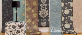
No matter how global the design project of the room is, in the end the whole point always comes down to the accent. It is color accents that are a lifeline for true lovers of minimalism. One of the most successful accents (especially in a classic interior) are olive-colored curtains.
Photo of olive curtains: the most sophisticated element of the room
We use it in design
The shades of olive curtains are always distinguished by their richness of palettes. It is precisely because of this fresh atmosphere, clearly emphasizing silence, that olive-colored curtains are most often used to emphasize the classicism of the interior. Despite this, green curtains also find their way into studios where high-tech predominates.
Olive curtains are distinguished by their paradoxical nature. That is why olive curtains play a kind of dual role in the interior - on the one hand, they bring more light into the room, on the other hand, they absorb light. The romantic atmosphere in bedrooms with curtains of these colors is beyond doubt. Despite the fact that they can be safely introduced into the interior, guided only by your own ideas, there are some unwritten rules that it is advisable to adhere to:
- The use of curtains in the living room is permissible when the room itself is spacious and bright. It is desirable that the ceilings be high and the walls painted milky, with an unobtrusive texture. The windows are wide, ideally stained glass.
- Before choosing curtains in the bedroom and using olive tones, fully decide on the lighting. It should be thought through carefully.
- Olive color isn't everything. The room should have decorative items that “support” and highlight it.
- It is desirable that the room contains textile decorative elements.
Dark rich olive tone
This is a complex color, closer to black, but deeper and more saturated. Such curtains should be combined with light curtains and inserts in light olive shades.
Moreover, the color of champagne, white ash, vanilla should predominate in the interior, and only rare decorative elements can be dark. These include pillows on the sofa and a rug on the light floor.
Let's talk about shades
The uniqueness of the palette of this color is that it contains both cold and warm shades. Cold ones contain gray pigment, which is what dominates the cold component of the color. As for warm tones, yellow predominates here.
The most optimal thing when calculating the shades of curtains is the correct selection of lighting. It is advisable that the light from the lamps does not contain a yellow or blue tone, limit yourself to white colors only.
The more white pigments there are, the stronger the intensity of the colors.
When considering the color of curtains and wondering whether it makes sense to choose something close to green, you should remember an important rule that is constantly used in interior design - the “Rule of Color Harmony.” According to this rule, you can always choose the optimal colors not only for curtains, but also for other interior items. According to this rule, the proportions of colors should be approximately as follows:
- 60% belongs to dominant colors;
- 30% belongs to additional colors;
- 10% is distributed between color accents.
Thus, 60% will belong to the main color of the wall, 30% will belong to the furniture, 10% will belong to the decorative elements.
Rules for choosing curtains
To determine the desired shade of curtains, a color wheel is used. There are 4 solutions:
- Monochrome design - the color of the curtains for the green wallpaper is selected in the same range, but lighter or darker by several steps
- Neutral combination - tones that are to the right and left of the main color are used: blue, beige, sand tones
- Contrasting combination - tones that lie opposite are suitable: red, purple, brown
- Double solution - curtains for a green room are sewn or purchased in two colors, and the selected tone is combined with white, beige, gray or black.
The atmosphere in the room becomes calm if the curtains have a color close to green on the color wheel. A bright and bold interior is achieved by using opposite tones.
Important: green curtains should not blend in with the walls, otherwise the positive greenery will begin to make you feel depressed.
You can approach the selection of suitable curtains from the perspective of the purpose of the room:
- The living room looks solemn and bright, so any contrasting textiles, as well as floral and geometric prints, would be appropriate here. Bright curtains are complemented by decorative elements in the same color scheme. Universal curtains can be combined with white pillows and a light carpet on the floor. Sapphire and beige curtains, fabrics interspersed with gold, bronze, and silver are suitable for the living room.
- Children's room - blue, pink, yellow curtains will go well with light green wallpaper. The combination looks bright, but the child will not get tired of it
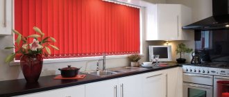
- Kitchen - the presence of all shades is acceptable with careful use of red, purple, black. If the room is large, then curtains with pink or ultramarine designs look advantageous
- Bedroom - the furnishings of this room should not overstimulate the nervous system. Curtains for green wallpaper in the bedroom can be white, beige, brown, cornflower blue, pink, or not bright yellow
We suggest you familiarize yourself with how and how to remove ketchup from white clothes: several ways to remove stains from a T-shirt, shirt, underwear . You must take into account the texture of the fabric, its combination with the decor, and the size of the room. Pale blue floral textiles are suitable for Provence and country, monochrome fits into high-tech, wood tones are appropriate for a classic style. Sand curtains will help make a small room feel more spacious.
There are rules for forming basic color combinations that allow you to create a holistic and harmonious interior. Green shades in such cases are used natural and as natural as possible.
- The combination with white is considered classic. This is one of the preferred interior design options. The resulting ensemble symbolizes grace and sophistication. In its pure form, the result is intense contrast that may seem too harsh. To soften the effect, white curtains against the background of green wallpaper should be diluted with elements of pink, brown or yellow.
- Blue curtains matched to green wallpaper have a positive effect. Shades can be pastel or rich. A smooth transition from one color to another is welcome.
- The natural combination with brown can be used in rooms of any functional purpose, even in children's bedrooms. Dark tones will give the room severity, light colors will add lightness and positivity.
- Using green with contrasting black looks uplifting. But plain black curtains are not suitable for this. It is better to use a light background for a clear black ornament.
- Green wallpaper can be set off with curtains using red. This is a bold and original solution that not everyone will like, but with the correct introduction of accessories you can get a harmonious, bright and unique decor.
Obtaining the expected effect from the combination of decorative items is directly influenced by what shades of the listed colors are used. Strong colors are very difficult to control, so it is recommended to either draw up a preliminary layout of the expected interior, or entrust the selection of tones to specialists.
In order for the perception of the design of the room to be correct, it is very important to choose suitable curtains. What options are best suited to green wallpaper? This largely depends on the shades of the wall covering. For example, many curtain options will go well with light green wallpaper: light fabrics will highlight the lightness and delicacy of the interior (see photo), and dark and heavy materials will create a kind of contrast.
Curtains for dark shades of coverings should be chosen light and light in order to prevent gloom and boredom in the interior.
If you don’t need accents in the window area, and you don’t want to create a formal design, then you can choose curtains in universal colors: beige, white or gray. In addition, the following color schemes are suitable:
- sea colors: blue, turquoise, light blue, pale purple;
- combinations of different green tones (see photo);
- bright warm colors: red, brown, orange.
Advice! The color of curtains for green coverings should be in harmony with the furniture and floor covering.
Upholstered furniture and accessories for it are selected last, after the repairs have been made and the remaining interior elements have already been selected.
Warm and bright shades make the room feel cozy and add light, while cool tones bring freshness and tranquility.
There are several classic combinations of green with others, each of them brings its own nuances of perception:
- with white – a bright and fresh combination, which is rarely used in its pure form; it is better to dilute it with splashes of calm tones;
- with brown - this solution will look very interesting, depending on the chosen shade of brown for the curtains, the walls will appear lighter or darker (see photo);
- with blue - this combination brings a sea of positivity and energy, but for it to look harmonious, you should make a smooth transition from one tone to another;
- with red - this combination looks elegant and rich, but you should be careful with the amount of red, there should not be too much of it, it would be appropriate to dilute it with another calm tone, for example sand or beige (see photo).
We suggest you familiarize yourself with Washable wallpaper for the kitchen: photos of vinyl, how to wash moisture-resistant ones, how to wash inexpensive waterproof ones, obi, wash off grease
Now you know which curtain options can be selected to match various designs with green wallpaper. With the help of some shades you can expand and refresh the room, and with the help of others, on the contrary, you can narrow and darken it. Properly selected curtains play a key role in the perception of the interior of a room. After all, if you make the wrong choice, then the entire effect of fresh renovation and harmoniously designed walls will disappear: the window and walls will be perceived separately from each other, this will violate the integrity of the interior, and it will not seem stylish and fashionable.
Hall, living room
For classic-type halls, it is customary to use particularly contrasting combinations - a muted color will be the most suitable. The curtain will create a positive and relaxing atmosphere. The combination “olive blackout curtains – chocolate furniture” is considered to be the best. Green textiles for the living room should be chosen more strictly than for the bedroom. Indeed, furniture in soft, brown tones looks especially harmonious with these elements.
With olives and lavender
Lavender blue is one of the most visually pleasing colors in a home interior. It carries notes of spring freshness, the aroma of flowering meadows, so it is organically woven into the pastel background.
Taking into account the subtleties of color, delicate and bright accents of lavender on a pastel background of kitchen curtains with olives create an unusually harmonious ensemble.
The contrasting purple color scheme with a pinkish tint in the lavender branches will not irritate the eyes, but will create an extraordinary, sensual and soft accent.
To the bedroom
A very muted olive color for curtains.
In bedrooms, it is customary to use the light-absorbing properties of olive color. By crossing this color with milky, cream and chocolate colors (this can be pillows, capes, bedspreads, upholstered furniture) there is every chance of achieving incredible results. The design of a bedroom, in which there is decor with green tones, is always saturated with light-colored decorated objects. You should not forget about tulle.
Choosing olive-colored curtains for the interior of the kitchen and bedroom (12 photos)
No matter how global the design project of the room is, in the end the whole point always comes down to the accent. It is color accents that are a lifeline for true lovers of minimalism. One of the most successful accents (especially in a classic interior) are olive-colored curtains.
Photo of olive curtains: the most sophisticated element of the room
Children's
Photo of the nursery
In children's rooms it is customary to use a green component. Small, not overly lush curtains will look great in combination with grassy shades, furniture elements containing a plentiful amount of beige, yellow, and white tones.
It is not advisable to use pink, crimson, and yellow colors together with green textiles. Otherwise, there is too much dissonance. Drawings are most suitable with polka dots and large checkered patterns.
Characteristic features of color
Olive color combines rich green and yellow pigments. This combination absorbs light well, so it is better to use this color in a large room with a fairly high ceiling.
In an ordinary city apartment, the combination of olive curtains will not look as impressive as, say, in one of the rooms of a country house.
If the owners of a small home still decide to use olive color in the interior, it is necessary to provide a sufficient amount of lighting. A chandelier in combination with several sconces will perfectly cope with this task.
When decorating a kitchen, it is worth remembering that shades of green increase appetite. They improve digestion and, in addition, promote relaxation.
To the kitchen
Tenderness and severity in one person
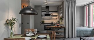
Spacious modern kitchens look great with green shades. It brings freshness and a certain “ecological friendliness” to the room. Even the most minimalist kitchen will look elegant. In the kitchen, this color goes well with those shades that are secretly included in the olive tone: caramel, lemon color, orange tint.
The colors of the curtains must be duplicated in the colors of decor, household items, and furniture. A Roman blind or a luxurious roller blind will look great in a calm, delicate kitchen.
Ripe olive
This tone is very rich, beautiful, warm. It looks great on silk, cambric and is combined with ocher, beige, and brown curtains.
It’s good to drape living rooms with such curtains. You can hang a light beige curtain and add ripe olive colored curtains to it.
Types of premises where they are used
The fresh delicacy of olive tones is most often used in:
- Country houses, cottages;
- Offices, art studios, art workshops.
- Cozy cafes and restaurants, where it is customary to use linen, silk and veil products as decoration.
- SPA, beauty salons and beauty salons.
Variegated translucent green curtains will add a “delicately expensive” effect to almost any room where there is a lot of light and the decor is tasteful.
FAQ
What are the production times for curtains?
Production time for classic curtains and photo curtains is 2-4 days. We begin making curtains within 1 day after placing your order.
Is there free delivery of curtains in #Moscow?
Yes, when ordering curtains worth over 6,000 rubles, delivery in #Moscow and most other cities will be free.
What are the guarantees for an order?
We guarantee that if you follow the washing rules, the curtains will not fade or shrink. We provide a year warranty on our products.
What materials can I order curtains from and what size?
The maximum width of one curtain is 375 cm (respectively, a set of two curtains is 750 cm), and the maximum height is up to 12 meters. Available materials: gabardine, satin, satin, blackout, voile.
Correct color scheme
Anyone who has seen a photo of olive curtains and decided to purchase the same ones for their own kitchen should think about what other changes will need to be made to the interior. One item of any shade can create disharmony in the design of the room.
A complete picture requires the use of accessories or tableware in the color of the curtains. You don't need to spend a lot of money to freshen things up.
It is enough, in addition to new curtains, to stock up on a beautiful tablecloth, a set of napkins and green plates.
Olive curtains in the bedroom interior go well with white furniture. It is advisable that the bed linen be the same color as the curtains. The green tint has a calming effect on a person, setting him up for deep sleep.
For the living room, the combination of olive curtains and snow-white tulle is especially successful. This solution allows you to create a positive atmosphere in the room. The composition will be complemented by chocolate-colored furniture.