The living room is rightfully considered the center of the apartment and house, since it is here that family and friends gather for rest and relaxation after a working day. For a good mood, relief from nervous tension and complete distraction from everyday life, the color of the walls in the living room is selected taking into account a number of rules used by professional designers around the world.
Features of choice
A correctly selected color scheme can visually make a room larger and more spacious, fill it with light, support the overall concept, and even eliminate some of the shortcomings of the room.
Criteria for color selection
- Features of lighting. Dim lighting can be corrected by using bright, light palettes that distribute light evenly and eliminate dark corners. If natural light enters the room in sufficient quantities or even in excess, preference should be given to cool, calm tones.
- Design and personal preferences. First of all, the color of the living room should be liked by its owners. In addition, if a certain style concept has already been chosen in a design project, it must be adhered to.
- Functionality requirements. The color of the finish can often act as a tool for zoning space instead of massive partitions or furniture groups.
- Living room area. A spacious room opens up more opportunities for realizing bright ideas. Here you can create a contrasting finish, or use smooth transitions. Small living rooms require the use of light colors and neat accents that will harmonize with other interior details.
Not all walls have to be painted the same tone, but there should be balance in everything. The finishing of the floor and ceiling is pre-thought out so that all surfaces fit well together.
Preparation
Before painting, it is necessary to prepare the surface. This is the most important stage, since the result depends on the quality of the preparatory work. This is especially true for the living room, where all the flaws are immediately evident.
Preparation is carried out in several stages:
- It is necessary to clean the surface of old coating, protruding pieces of cement and small irregularities.
This can be done with a wide spatula, sequentially processing each area. Attention: If there are large chips, blockages or holes on the surface, they need to be additionally plastered. - Priming the base. You will need a roller. To speed up the work, you can use a special construction sprayer.
- Lifting corners to give them visual evenness.
- Apply finishing polymer putty to the base in 2 layers. First, you need to apply the first one, wait until it dries completely, remove small bumps and irregularities with a spatula, and then proceed to apply the second layer. Read about how to putty and evenly paint walls here.
- Then you need to clean the putty surface with sandpaper (No. 150).
- Next, the surfaces are primed again, and fiberglass is glued on. The material hides any surface imperfections, protects against the appearance of microcracks, prevents the development of mold, and allows the walls to “breathe.”
- When the fiberglass has completely dried, you need to begin applying the final coating - superfinish putty (2 layers). Thanks to this material, the wall can be given a perfectly flat surface. An important condition for using superfinish putty is high-quality preparation of the base.
- The final stage is cleaning the surfaces with sandpaper No. 240. After sequentially performing all the described actions, you can begin applying paint.
Influence on the choice of cardinal directions
Any palette can manifest itself differently depending on the degree of natural light. This factor depends not only on the size of the window openings and their openness, but on the side of the world from which the room is located.
- South. Often there is not only enough sunlight, but also in excess. In order to reduce the “temperature”, it is recommended to use moderately cool shades (white, blue, turquoise, gray).
- West. During the daytime peaks, the room may be too hot and light, so there should be cool shades, such as mint (closer to blue), deep blue, gray, brown.
- East. It is recommended to give preference to pink and brown tones, which will benefit from the sunrise and compensate for its lack in the afternoon.
- North. Due to the coldness and short duration of sun hours, you need to choose warm, soft shades (beige, coffee, green, yellow). They will not only add light to the room, but also visually fill it with sun.
Before choosing the color of the walls for the living room, you need to consider the location and intensity of the lighting fixtures. If they are located around the entire perimeter of the room (in the form of LEDs or built-in lamps), the tint palette can be changed depending on the desired effect.
Feng Shui in the color scheme of the living room
The use of Eastern teachings when choosing interior colors allows you to determine the direction of vibration and energy, which will have a positive effect on a person’s mental and physical health. The teaching is based on the basic elements: Wood, Fire, Metal, Water and Earth. In this case, the finishing should be placed on smooth, even walls so that nothing interferes with the movement of positive energy.
Characteristics of Feng Shui flowers
- White. Symbolizes ideal, purity, light. For comfort and warmth, use in combination with another palette. An excellent solution is to add yellow tones.
- Red. The color of passion, activity, movement. It stimulates the appetite, but can sometimes cause attacks of aggression. When combined with gold, it attracts good luck. Red doesn't go well with black. The palette is not recommended for use by people with diseases of the nervous system.
- Orange. Combines the positive energy of yellow tones and the power of red. Conducive to a pleasant conversation in the guest room, attracts prosperity and kindness.
- Gold. Denotes respect, honor, status. Previously, only rulers could use this color in the interior. The golden palette has a positive effect and attracts money energy.
- Black. In fact, it is not considered a mourning color, but a magical color according to Chinese teachings. But many still equate it with negativity, so it is better to minimize the use of black or use it for accents.
- Blue. The main association is water. The palette has a calming effect, restores harmony, relaxes and is suitable for meditation. Blue stimulates spiritual energy and intuition.
- Green. The color of calm, peace, nature. It stimulates wealth and well-being, means life, growth, harmony with others. Pairs well with yellow and gold colors, creating the energy of success.
- Yellow. Symbolizes positive energy, success, happiness. It attracts warmth and makes the living room cozy, evokes an optimistic mood, and attracts good luck.
- Violet. It has mystical, magical properties. Suitable for creative people, symbolizes material well-being.
When choosing not one, but several wall colors in the living room interior, it is important that they indicate one direction to enhance energy. You should be guided not only by the above characteristics, but also by your own preferences in order to create a cozy interior.
Pros and cons of painting walls
Paint has advantages and disadvantages, so you need to familiarize yourself with them before starting repairs.
The advantages of painting walls include:
- Easy update. In order to update such a coating or change the design, large financial and time expenditures are not required.
- Water resistance. The painted surface can be easily washed if it gets dirty without fear of damaging the coating.
- Varied assortment. A wide selection of colors allows you to realize any ideas and dreams of your ideal interior.
Following the existing recommendations will allow you to get an attractive and harmonious living room
. Among the disadvantages:
- Difficult surface preparation. Paint will not cope with masking even small irregularities and cracks. If the walls are not properly prepared, all defects will be clearly visible. You can level the surface using plaster and putty. If you are unsure of your abilities, it is better to turn to a professional.
- Constant care. Painted walls get dirty easily, so they need to be washed frequently.
When choosing a material, you need to rely not only on personal preferences and desires, but also on the rationality of its use and the condition of the surface.
Optimal solutions
Gray background
A modern, popular palette that is suitable for both classic and loft, minimalism, and modern styles. For greater effect, it is complemented with geometric textures. Thanks to the variety of shades, it is suitable for rooms of different sizes.
Yellow scale
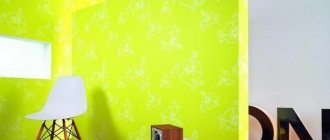
When choosing, you should pay attention only to pastel and calm shades, and not bright and flashy shades, which will negatively affect your relaxation and cause nervous tension. Sunny, warm yellow is associated with summer and comfort. In spacious rooms it can be used for all walls, in small living rooms - for interesting accents in decor, photos, etc.
Brown tones
Mainly used for classic solutions. More saturated and deeper shades are chosen for accents, coffee, chocolate, etc. for the background.
Olive shade
Well suited for Provence, Scandinavian style, country. A soft, natural, pastel shade of green is suitable for rooms of different sizes and locations. The noble tone gives coziness and comfort and goes well with other soft tones.
Light orange
Associated with rich summer colors. It is used for various interior solutions and will become the highlight of a mixed style of classic and modern. Pairs well with turquoise and gray. Looks good in dark living rooms with windows facing north. It also compensates for the lack of lighting.
Shades of beige
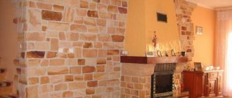
A popular, versatile, practical color that can be used to decorate any living room. The room will be warm and harmonious. For decoration, bright, rich colors, imitation brickwork, and textured plaster are used.
Shades of turquoise
The turquoise palette will give you a feeling of freshness, freedom, and spaciousness. The shades are presented both rich and deep, and pastel, fresh. It goes well with different color options without overloading the interior. Makes a cool palette softer and more appropriate. More suitable for spacious rooms, plays well as accents.
Natural shades of green
A natural, comfortable palette that symbolizes life. Various shades are used in the living room interior. Often gamma is used to zoning space. Pairs well with shades of gold, brown, and floral prints.
White background
Strict and restrained, but at the same time, a neutral color that can be used as a base for any style. Its color palette is wide and varied, and textured application will open up new facets of white. The palette visually expands the room, fills it with light and warmth, and eliminates dark corners.
Mint freshness of the interior
Above we talked about the properties, pros and cons of many colors. But we decided to separately touch upon the mint color. And that's why…
Firstly, in recent years, it has increasingly become in demand in the decoration of rooms in apartments, houses, and offices. Interiors in mint shades can be found even within the walls of the White House!
Secondly, this is an excellent alternative to the classic and already somewhat boring “run”. Mint shades go well with almost any furniture and any warm or cool tones.
Mint is a shade of green with a hint of blue. This color has other names: aquamarine, pang and mint magic. A characteristic feature of a mint interior is that it should be subdued, as if slightly “burnt out.” But bright colors have nothing to do with this style.
Painting the walls of your home in a soft mint color and its shades will add lightness and freshness to the interior. Such a room seems to be filled with tenderness, romance and summer coolness. Mint color and its various shades work best with retro or vintage styles.
Mint color works great as part of a composition. For example, you can use it to paint only one wall in a room. Thus, you will have a small island of “relaxation” in which your eyes will rest from bright colors and hard work. This is especially true if you are a programmer or an office worker who constantly works in front of a monitor.
What are the best rooms to paint mint?
Mint interior is mainly used in bedrooms, kitchens and children's rooms. Soft, pleasant, calm tones will help the residents of the house not only take a break from the gray, hard everyday life, but also lift their spirits.
A good option would be to use a mint color scheme in the baby’s room. Firstly, the nursery will be full of light. Secondly, this color is calming. Then your baby will always feel comfortable and calm.
It’s also important to make mint accents in the kitchen. Here it looks great with rich flowers. For example, orange, lemon, red.
Mint is generally quite easy to combine with other flowers. Take pink or coral shades, for example. Play with color. Experiment with chocolate and blue colors. Try turquoise with chocolate. See how mint color will look with pale pink. Or take soft yellow or chocolate. Such unusual combinations will fit perfectly into the interior of your room.
At the same time, you can purchase pieces of furniture in similar shades. This could be a wardrobe, a desk or dressing table, an armchair, a book shelf or textile items. Curtains, pillows, a bedspread, a chandelier or floor lamp will help add small details.
If you have any doubts about how to properly combine shades and apply them in practice, choose white and mint or cream with a mint tint. And the best option is pink with mint. Thus, you will get a magnificent and original interior!
Did you find this article helpful? Please share it on social networks: Don't forget to bookmark the Nedvio website. We talk about construction, renovation, and country real estate in an interesting, useful and understandable way.
Characteristic stylistic palettes
- Contemporary. Modern style allows you to use more bright colors such as blue, turquoise, emerald, lilac, etc. A combination of several contrasting colors in one room is typical.
- Scandinavian. The style is characterized by the use of beige, gray and white tones, as well as shades of blue. The color should be harmonious and maintain spaciousness.
- Classic solutions. These directions are characterized by muted, calm colors of brown, green, and blue. Only one shade is used in the interior; patterned wallpaper is used for accents.
- Loft. A modern solution for decorating a living room. Mainly cold, calm tones are used for the interior. Gray and white go well with brick. For such an “industrial” idea, you can use black.
- Country. A rustic theme is impossible without natural shades such as brown, green, soft yellow, blue, peach, olive, etc.
- Provence. The base is pastel colors such as olive, beige, lavender, etc. It has a natural, restrained palette.
The palette of each style may vary depending on the functional purpose of the color, the area of the room, and personal preferences. If, according to the design project, the implementation of non-standard tones is appropriate, there are no restrictions for bringing such an idea to life.
Types of color combinations
- Contrast. This color combination is used to implement modern interiors. You can choose the most unexpected colors if you place them correctly in the room. Use options - accent wall, geometric patterns, stained glass or panel effect, etc.
- Neutral combination. Opens up ample opportunities for the implementation of original ideas. Delicate shades are suitable for classics, for modern solutions - cooler palettes.
- Monochromy. The use of one color scheme allows not only to visually preserve the area, but also to expand it. There are many combinations, since each color can have dozens of shades. Without overloading the interior, you can zone the space.
- Two colors. The use of two different colors is acceptable for spacious rooms, but other solutions can be considered if both shades are light. It is important that the colors chosen are from one half of the spectrum. The transition is smooth, the gradient method is popular.
The use of several combinations is possible only if the living room area is 25 square meters or more. Then one of the zones can be decorated for relaxation in soothing colors, the other can be decorated for receiving guests, etc.
Incredible wall texture with a simple sponge
An old, wrinkled bathing sponge with voluminous holes is suitable for creating the texture of a paint finish. Apply a few pressure strokes with the paint-filled sponge to the dry wall. You will get an interesting effect or even a pattern.
A sponge is another tool for creating fancy patterns Source pinterest.com
Using a sponge you can decorate the entire wall. Short pressure over the entire area can be done in different colors. The main thing is to wait until the first layer dries, otherwise mixing will occur.
Decorative wall decoration using a shower sponge Source decorator-don.ru
A large sponge or water-repellent cloth can be wrapped around the roller. With the help of such a tool, unusual designs are created that resemble marble stone.
Foam rubber with large holes creates interesting textures in the form of bubbles on the wall. In this way you can paint all the partitions in the room. Use different shades.
A rag wrapped around a roller creates an unusual pattern Source freegameinfo.ru
Plain turquoise wall in the kitchen with decorative elements Source dizainkuhnibest.ru
Choosing colors for a small living room
To decorate a small living room, light, calm colors are used that will be in harmony with other interior elements. It is better to avoid patterns and prints, as they may make the room seem smaller. Decorative items and furniture are used for bright accents.
To visually enlarge the room, you need to think about a lighting scheme that will highlight the color of the walls, and also hang mirrors. If you use wallpaper or decorative plaster, they should be discreet, monochrome, without unnecessary details that could negatively affect the visualization of the space. An interesting solution could be to paint an accent wall in a different shade, if you choose the right color.
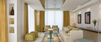
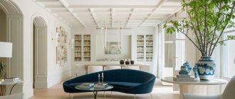
Photo gallery
Our gallery features photographs of completed projects demonstrating the correct use of color for living room walls.