Home » Decor » Wallpaper
DesignWallpaperWall Decoration
Anton Teterekov
39286 Views 1 comment
The main finishing material will set the mood of the room. Most often, this material is wallpaper. There are nuances in texture and other parameters. But the main thing is to choose the right wallpaper color in the interior. You should approach the process already prepared. Everything will be discussed in more detail later in the article.
What can influence the choice of color?
It is not customary to design all rooms in the house in the same style.
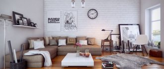
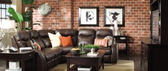
They need to be separated from each other. This is also done with finishing materials. You immediately need to figure out how the room will be used? For the living room, the normal state is a state of fun, trouble. Guests usually gather there. The apartment owner is faced with the task of creating a bright environment so that guests do not get bored.
Color options
The opposite situation is with the bedroom. In the bedroom, most of the time is spent sleeping, so there should be a calm environment. You can’t use shades in the bedroom that give a boost of energy and suppress laziness. You won't be able to relax in this situation. The issue of dimensions cannot be ignored. Finishing material plays an important role in the visual perception of space. There are techniques that increase space. There are ways to compensate for too spacious rooms. It’s just important not to confuse the shades.
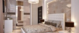
Provence style color is ideal for the bedroom
Lighting Features
The choice of color is also influenced by lighting features. When the window faces north, this leads to poor quality lighting. Poor quality natural lighting needs to be compensated. It is not enough to install lamps. You also need to choose the color of the material wisely.
Tip To avoid discomfort in a dark room with the lights off, you need to use light shades. It is advisable not to go out of style.
This color will add more light to your room.
You cannot thoughtlessly use them just because you liked their shade or pattern . Some styles are strict in this regard, for example, baroque or classic. There are fewer problems with conventional modernity, but it also has its own requirements. They affect brightness. You need to be able to combine correctly. You cannot use different shades in one composition. It is important to maintain harmony everywhere.
The color of the wallpaper should be in harmony with the furniture.
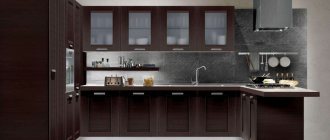
The issue of practicality cannot be avoided. Dirt on white shades is very noticeable. For a bedroom or living room this is not so important. This factor is more important for the kitchen. Ceilings and walls get dirty there much faster. The proximity of the stove, the heat from the oven, cooking, lack of free space - all this makes the walls very vulnerable.
Advice You need to choose practical materials.
This also applies to the children's room. Children may accidentally smear or write on them.
Practicality comes first in the kitchen
The location of the material is also a key factor. For one, it is better for it to be located on the wall. Others feel more at home on the ceiling. You should try on the shade in advance, even before gluing. This will help you understand the right choice.
The most popular types of wallpaper
First, let's look at all the most popular types of wallpaper, analyze their known advantages and, if any, their disadvantages.
Classic options:
- Non-woven wallpaper is considered to be one of the most successful options, which goes well with any room, because it has many advantages, such as: breathability, wear resistance, moisture resistance, in general, everything that immediately indicates the high quality of the material.
Important! The only downsides here are not such a large selection of colors and fairly high prices.
- Paper is perhaps the most famous type of wallpaper, which is widely available in a large assortment and usually has low prices. Additional advantages include their increased environmental friendliness, and disadvantages include low resistance to damage and humidity. Therefore, they usually do not last long and quickly lose their original color.
- In terms of popularity, vinyl coverings immediately follow paper ones, since they are also relatively inexpensive and are offered in an expanded assortment. Their advantages are increased wear resistance, long-term preservation of original colors and the ability to wash. The only disadvantages include almost complete airtightness, which is why they are not recommended for sleeping quarters.
Important! When choosing, it is better to follow the recommendations of experienced specialists who will help you with the interior design of your room and show you how to choose furniture to match the wallpaper.
The most modern and expensive types of wallpaper:
- Liquid wallpaper - presented in the form of packages with powder. Before use, you just need to dilute it with a small amount of water. However, this is their obvious disadvantage, since they can be washed off quite easily with the same water. But this is also their big advantage, because in case of any damage it will be enough to remove this area and simply install a new one.
Important! If you apply any protective coating to them, in the form of the same varnish, then you can simply forget about them. They will please your eyes for many years to come.
- Fiberglass is very environmentally friendly and easy to paint. They are resistant to direct sunlight and moisture. In addition, they allow air to pass through well and create additional sound insulation.
Important! Unfortunately, their range is small, but they can be repainted an unlimited number of times.
- Fabric ones are very expensive, but it should be noted that they are also very beautiful. They look like a quality sheet of fabric, creating a stylish and rich look. They are offered in a wide range, however, in order to glue them, you will need special knowledge and subsequent careful care.
Important! This wallpaper does not tolerate moisture and is afraid of dust.
- Metallized wallpaper is the most modern and not yet so popular wallpaper. The material contains colored foil, which creates a metallic effect. They can not be used in every interior. They can be used in some modernist design or in high-tech.
Important! The colors here are mostly dark, so for small rooms they can be completely excluded.
As you can see, the choice is quite large and tailored to almost any needs of potential buyers.
Nuances of choosing for the hall
For rooms, there are four factors that influence the choice of material color:
- You need to look at the orientation relative to the cardinal direction.
- Evaluate the interior style.
- Determine if the furniture is multi-colored.
- You need to stick to your taste.
Black makes the room stylish
Sometimes living rooms are multifunctional. In the usual sense, the living room is needed for leisure. The kitchen is used for eating, and the bedroom is used for sleeping. If all of the above actions are performed in the living room, then versatility will be an important factor.
- It must be taken into account that people eat in the living room, which means that the chance of contamination increases. Children will be playing there, so they need to create a fun environment.
- Sleep will also take place there. Therefore, you can’t go too far with brightness either. You won't be able to sleep well with bright colors.
- Premises must be allocated separately. But there shouldn't be any obvious contrast. This is especially appropriate in situations where material needs to be changed in several rooms at once. After moving from a pale room to a bright one, your eyes may begin to ripple. This cannot be allowed.
Discreet and at the same time bright and stylish print
How to choose wallpaper to match orange furniture
Furniture in a life-affirming orange color is most often purchased for the kitchen. An excellent solution: such a room will literally be filled with solar energy if you choose the right wallpaper for the walls.
Shades close to white will help to “smooth out” the bright sound of the furniture set. Highlight – some bright shades. Soft lilac or deep blue walls will create an extravagant and memorable alliance with an orange set. Brown or auburn will also look interesting.
Combination of shades of furniture and finishing materials
The selection takes place after purchasing the furniture . Wallpaper should either set off the furniture or emphasize it. They should not draw attention to themselves. This sequence is explained simply. It is easier to buy new ones than to completely change furniture. If the contrast of the furniture is dark, then you should use light ones. Warm shades such as pear, mustard, and sand are allowed.
Tone matching the furniture
This rule does not work in reverse.
Advice: White furniture does not have to be set off with dark wallpaper.
White furniture gives almost complete freedom in choice.
You can’t just use white wallpaper, otherwise it will blend into the background.
Color can be:
- purple;
- emerald;
- sapphire.
Beige shades will give the room a calm atmosphere in the room.
If there is brown or reddish furniture in the room, you should use dark ones.
Cherry furniture will be combined with:
- burgundy;
- purple;
- rich green.
This range is designed to lift your spirits.
There are recommendations on the Internet - the wallpaper can be pale. This tip is more suitable for the bedroom than the living room.
Nowadays it is fashionable to buy blue furniture. It looks stylish and not cheap. Blue doesn't get boring. The background of the room directly depends on the purpose of using the living room. Using the living room for leisure requires the use of red or yellow.
To relax you need to use wallpaper:
- beige;
- cream;
- light blue.
Peach furniture is used less often. When purchasing peach-colored items, you need to make the background in the room brighter. This is a case where a brighter background will help make the furniture stand out. Looks elegant with peach:
- grey;
- blue;
- pearl shade.
Blue never gets boring
Modular white living room furniture in a modern style
Living room furniture in a modern style is often made using a modular principle. This option is much more convenient. A modular living room consists of a number of items that can be combined with each other in any order and placed throughout the room.
The second important feature: most white furniture modules for the living room are designed in such a way that even when joined together, they do not form a monolithic surface. The structure obtained by combining chests of drawers, shelves and wall cabinets forms the space much more effectively.
Modular living room furniture in white gloss may include the following elements:
- shelves and wall cabinets - this furniture option is used much more often in modules. They are lighter and more elegant than full-fledged cabinets, which means they can be easily transported from place to place. And this is the main principle of a modular living room;
- chests of drawers – long rather than tall, mostly sectional;
- cabinets are usually narrow. They are, of course, less mobile, but due to the fact that they are clearly a vertical element of the interior, they do not create the impression of bulkiness;
- a TV stand or cabinet is an indispensable detail of the living room interior with white modern furniture;
- Glossy white furniture may include additional elements - a display cabinet, a bar cabinet, a TV stand .
The use of console forms gives the furniture a special chic. Chests of drawers and pencil cases mounted on the wall create a feeling of airiness. In addition, they visually increase the height of the room. The previous photo shows a living room design with white furniture.
Location nuances
You should remember about the side of the living room when purchasing material . When facing east or west, it does not matter where the windows are installed. This does not apply to situations where the windows are blocked by tall trees. Then problems with room lighting may occur. Problems occur on the first floors when the window faces south or north or when trees obstruct the view of the window. Then there can be two options: when there is not enough light or when there is too much light.
Bright wallpaper for a room with little light
- If there is little light in the room, and the window faces north, it means that there will be very little light in the summer. Illumination comes from light reflected from the sky. Gray or blue cannot be used. These colors will match the shade of the sky in winter and summer, respectively. You cannot use pale shades or cold contrasts. You can save the room with wallpaper with bright colors.
- Too much light is also harmful. My eyes hurt and I can't concentrate on anything. Then you should use cold ones. This is a light khaki beige gray. Dark background is allowed.
You cannot add red or yellow colors to an initially bright room. The rays will be reflected from them, and the eyes will begin to get more tired. Among the neutrals, white stands out.
For rooms with good daylight
What do you need to decide?
To achieve the desired result when creating an interior, you must first answer two questions:
- What kind of atmosphere in the room do you want to achieve? Perhaps you want a strict business environment for your business office, or you are choosing wallpaper for furniture in your favorite cozy living room.
- How well lit is the room? In a large number of cases, lighting plays a key role in how certain wallpapers and furniture will look. For example, in a room whose windows are blocked by lush poplar branches, dark wallpaper has every chance of looking depressing. But too much illumination in a bright room can make it empty and uncomfortable. One way or another, keep this aspect in mind when you decide on the first point.
Nuances of human psychology
Red The correct choice influences whether a person wants to be in the room or not. Red colors are considered ideal for the living room . It will add a festive atmosphere and energy. It is difficult to stay in such a room for a long time. For rare stays in the room, a red shade is suitable. It is in no way suitable for relaxation; rather, on the contrary, color gives strength for further work.
Yellow It is advisable not to use only red ones, but to dilute them with neutral shades . Yellow is more calm . The presence of yellow will give the room an atmosphere of family comfort. This can also include a golden hue. It also gives a certain boost of energy, but the color is not as aggressive. Pale gold and corn can be included in this category.
Family atmosphere
Blue To create a calm environment, blue should be used. They act as a pressure and nerve stabilizer. Excessive use of blue in decoration will make guests feel overwhelmed. If the window faces north, then you can use a bright blue tint. It is classified as warm.
Green Greens give an association with nature. Some may associate it with spring, with leaves, with the forest. Like blue, green has a calming effect on people. A living room with greenery can be used for meditation. Depending on the location of the sides, the temperature of the green tint is selected. Although the beige shade is considered a classic, you can overdo it, and then the room will become boring. It does not give any surge of strength and does not affect mood in any way.
Combination of several green textures
Beige You can use beige as a neutral background . A fashion trend is the use of gray. All its shades are also included here. If the color of the furniture is too saturated, or the furniture takes a lot of attention, then they can be shaded with gray wallpaper. Materials with cold look organically for high-tech style rooms and industrial premises.
White living room furniture in classic style
Classic white furniture in the living room is not at all uncommon. Of course, if the concept is strictly followed, white color is not possible; only very light wood is allowed. However, strict adherence to the canon has long been out of fashion.
Furniture items are made in accordance with style requirements. Strict classics are white furniture with clear geometric shapes, modestly decorated with carvings, and with excellent polishing. In Baroque and Renaissance, carving is used much more readily; facades are decorated with gilded moldings and fittings. In the Empire style, gilding is no longer allowed, but there are many carved elements.
- To obtain white color, wood is painted . Paints with very good hiding power are used, so that the wood grain is almost invisible. In the classics, facades are covered with matte or translucent varnish. In other styles, the use of shiny and glossy varnishes is allowed.
- For a living room in a classic style, furniture is selected with maximum glazing . Firstly, the combination of white wood and glass looks very impressive, and secondly, due to the shape and decorations, cabinets, chests of drawers and cabinets look somewhat bulky. The combination with glass compensates for this effect.
It is undesirable to assemble something like a wall from classical furniture. Unlike modern options with flat facades, it does not create the impression of a single surface.
Important! In a modern living room, classic furniture can be combined with white sofas of the most modern look.
Commitment to Feng Shui
For those people who believe in Eastern teachings and are interested in the philosophy of Feng Shui, the following information will be useful.
According to this philosophy, there are several elements, and when arranging a room, you need to separate these elements.
Wood cannot collide with metal, fire cannot collide with water. Each of the elements has its own direction and its own set of shades.
- Choosing a family direction involves using red and green.
- Black and blue shades are favorable for a career.
It is also important to consider in which sector of the apartment the living room is located.
Finding a room in the northern sector obliges you to adhere to the element of Water. Then the wallpaper should be blue or black. It is important to choose warm shades of blue or black. Dark shades will make a gloomy room even gloomier. Neutral white is acceptable.
Black is favorable for career
There are different rules for rooms in the western sectors. Yellow, gold, and gray shades are welcome here. For the north and southeast, you need to use terracotta and orange, as these are the colors of the Earth.
For eastern rooms you need to use green ones. This is the element of wood. For rooms located in the south you need to use everything that resembles the color of Fire. These are red, orange, purple. But philosophy does not prohibit the use of a green tint for wall decoration.
Green – element of wood
There are not many options for the living room in the center of the apartment - these are shades of red and brown.
Light wallpapers and their advantages
In the cultures of almost all nations, the color white has been a symbol of goodness and sincerity: it has always been contrasted with the black color - mysterious and mystical. It has long been proven that it affects the human psyche: white color calms, allows you to think about important things in life and relax.
In addition to these obvious benefits for humans, many others can be identified:
- Walls play an important role in creating space. White color visually expands the room. That is, if your room is not very large, then with the help of white walls and a white ceiling you can visually expand your room.
- Even if a person doesn’t have a lot of money, but he wants his home to look truly stylish, then white wallpaper is just right for him.
- Even the most unremarkable things can be made brighter by emphasizing their details with the help of light wallpaper.
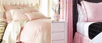
Choice for the bedroom
For the bedroom, you need to focus on the fact that the day will begin with this room. And a person’s mood depends on what color of wallpaper is used. It should be noted right away that aggressive colors are prohibited. There will be no quality sleep, and annoying ones will lead to frustration and quarrels. Too minor will also not lead to anything good, since the room should not turn a person into a lazy creature.
You should immediately consider a selection of popular shades:
Blue relaxes and calms
- Blues are often chosen because they are calming, despite their coldness. You can only use light blue, not blue. Blue is allowed only for compact rooms - it can visually expand them.
- The mood of green is perfect for the bedroom. Color gives relaxing emotions, relieves stress, and allows you to relax.
- It’s not for nothing that universal ones have such a title - they can be used everywhere. You can combine anything with white. The room will be light and open, but if there are other shades along with white. Having only white will make the room look impersonal. This is a good option for small bedrooms. It goes with most popular colors. These can be used in bedrooms with poor lighting.
- The use of yellow compensates for this deficiency. Like white, brown can be classified as a universal shade. It will never go away in reality. It has the most positive impact. In such a room you can relax.
Brown is a universal shade
Are there any conflicting colors for the bedroom?
There are several colors that can be used in the bedroom under certain circumstances. But we must immediately make a reservation – the colors are contradictory. For example, this is red wallpaper. It is the color of aggression, leadership and dominance. Leaders and easy-going people like him. The color is most often used in the living room, but it can be used in the bedroom as well. But then the red wallpaper will need to be diluted with a light finish.
Blue is cool. It definitely needs to be diluted. Otherwise, blue wallpaper will cause melancholy and depression. For small bedrooms this is prohibited.
Blue only for large rooms
Black can overwhelm its richness, so splashes of beige or white are a must. A completely black interior for a bedroom is unacceptable.
Cardinal directions for the bedroom
As for the living room, the cardinal directions play a big role in the bedroom . Especially if the apartment owner is interested in Feng Shui. If the windows face south, then there will be no problem with light. After lunch there will be too much light, so you need to absorb it:
- blue;
- purple;
- terracotta.
All of the above rules are relevant only for spacious bedrooms. There is no need to use dark ones for compact bedrooms. When the window faces north, there will be a lack of light. Then even opening the curtains will not greatly improve the situation. You will need to use wallpaper in a beige, gold or yellow shade.
Bohemian style
Color combination of wallpaper and furniture
It is customary to plan the overall range in advance, so that in practice you do not end up with a frankly unsuccessful combination of finishing materials and furniture.
- For light furniture, you need to choose materials to match. Such wallpaper can be golden, white and beige wallpaper. In rooms with large walls you can play with contrast. That is, you can use black furniture and white wallpaper and vice versa. Warm and cold shades cannot be mixed under any circumstances.
- As for dark furniture, it refers to warm furniture. Accordingly, cool shades cannot be used in wallpaper. Suitable colors are white, sand, ocher, brown. Furniture should act as a secondary material, while wallpaper will be the main element.
There are also some bold solutions to add some light color to a dull interior. You can try combining different types of wallpaper. The point is that you need to use the same pattern structure. Colors can be any. You can make a vertical or horizontal position, as well as inserts and niches.
Horizontal stripes are good for zoning a room
Horizontal stripes are used to zone the room. At the bottom of the room, dark wallpaper with a dynamic pattern is used. At the top of the room there will be calm tones. Vertical stripes can be made monochromatic. The width of the stripes can be selected to be the same as the dimensions of the bed. The material can either reach the ceiling or go beyond it. Inserts are required to highlight space. The area above the bed is often highlighted.
Advice If there is a niche in the room, then it is worth making it the same as the other walls.
Unusual solutions
Let's look at some interior styles that are used when decorating the interior of a bedroom. Neoclassicism involves creating decor in the room in the form of a raw wall at the head of the bed. The loft accent allows you to bring individuality and unusualness to the room. There is no need to create an accent wall from natural bricks; you can limit yourself to selecting photo wallpapers with a 3D effect that depict bricks. You can complement this look with plain materials in a peach or cream shade.
Modern style presupposes the dominance of light colors. A beige color scheme is suitable for minimalism, which can visually expand the space. Modern style involves using a minimum amount of furniture in the bedroom. Art Nouveau involves the use of chocolate, blueberry, tones, complemented by silver embossing and floral patterns.
For kitchen
The kitchen has exactly the same requirements for choosing wallpaper. It is necessary to take into account the degree of illumination and the size of the room. It is customary to compensate for the lack of lighting with warm colors in the wallpaper. This:
- beige;
- cream;
- yellow wallpaper.
A warm shade is not required if there is a lot of light in the room. Here you should choose neutral ones.
This is the choice:
- peach;
- wheat;
- olive wallpaper.
Muted cool shades are suitable. They will give the kitchen a cozy atmosphere.
Good tone for a large kitchen
A more aggressive red for the kitchen is considered a bold color. It can cause irritation if you overdo it with saturation. Red is the color of confident people. Feng Shui philosophy says that red light can increase appetite. If you approach the issue from this side, then red wallpaper for the kitchen will come in handy.
Advice It is best to dilute red wallpaper with black inserts or black furniture.
Cool shades are designed to soothe. But they are not suitable for the kitchen. In the kitchen, the main thing is to stimulate appetite, and blue has no effect on this process. Blue does not add coziness, but if the windows face south, they give a lot of light. Excessive lighting can be extinguished with wallpaper in blue tones. Both red and white shades look good with blue.
Print to increase appetite
There is a risk that large red inserts will disrupt the composition. Green is perceived well everywhere. This shade is suitable for the kitchen. It has a positive effect on your state of mind. This can include emerald and olive shades. Pear and pistachio are associated with natural beauty.
If green has a delicate shade, then such wallpaper can be combined with beige and yellow inserts.
This combination allows you to achieve a welcoming atmosphere. This is very important for the kitchen. Only one wall in the kitchen can be green - this will help highlight it.
Welcoming atmosphere
Design techniques
- If there are no special thoughts in your head, then you can always use white wallpaper. You can combine white and dark wallpaper. White wallpaper in compact kitchens is a classic. The snow-white furnishings make the room feel light. You can use white wallpaper as a shading background. Then you will have to focus on orange, olive or even red.
- You can solve the problem of low ceilings by installing wallpaper with vertical stripes. The color can be any. You can expand the room on the sides using wallpaper with a horizontal stripe.
Vertical stripes for low ceilings
- Too colorful ones are not suitable for the kitchen. They get bored very quickly and begin to irritate rather than delight.
- It is better to highlight one wall with a bright color, but all the walls in the room.
- If there are sufficiently large drawings, then the color should be neutral.
- If you don't have any specific ideas about color, you can choose shades of green.
- When the furniture in the room has a simple shape, and the textiles are just as simple, it is better to choose wallpaper with an ornament.
Bright furniture and bright accessories in the kitchen require a shading element. This element should be wallpaper with a light shade. In this case, patterns are not needed.
Little secrets of a beige sofa in the interior
This is a unique piece of furniture, a kind of “chameleon”. It adapts to any textures, shapes, and colors. A dim sofa goes well with pastel tones in the decoration, and a sofa in a rich, bright color goes well with the same expressive shades.
For variety, original decorative pillows are used. They can be plain or with pillowcases on which an animalistic pattern is applied. The most successful solutions will be products in dark blue, green, burgundy, brown and black, with leopard prints, zebra, tiger or giraffe. Instead of chair covers, they sometimes use artificial skins, and, of course, place nearby flowerpots with houseplants that match the style.
What else can be done to avoid the dominance of beige and to maximize its positive qualities? Add bronze, copper and gold elements, cover the walls with original wallpaper, hang beautiful Roman blinds on the windows, place a fancy-shaped floor lamp near the chair.
If we talk about the models themselves, then the classic is a formal sofa with a curved back, armrests and graceful legs, fabric upholstery with embroidery or a pattern. For modern styles, corner beige sofas or products in the shape of “U”, “C” with plain upholstery are more suitable.
PERFORMA | VIP sofas also invite you to take a closer look at the beige color scheme. It can decorate any interior, you can see this for yourself. Look at ready-made solutions in our catalog or order the production of a sofa, bed, chairs, armchairs or chest of drawers according to an individual project. Our specialists will be happy to make your dreams come true! Hurry up to place your order before the New Year!
Expert: Nadezhda Gumennaya
For children's
There is a strict distinction here based on the child’s age, as well as his gender. In the first three years of a child’s life, the child should be surrounded by wallpaper in pastel shades. Annoying colors are not allowed. In the period from three to 6 years, a child needs vivid impressions and emotions. You can choose the brightest ones.
Bright highlight of the kitchen
There is one nuance in the images. They don't have to be very big. Large figures can frighten a child. The same applies to geometric shapes with sharp corners. The presence of a composition with these elements can cause anxiety in a child. And pastel colors won’t help here. As the child grows up, you can use quite adult shades, turning the children's room into a teenager's relaxation room.
For the little comic book lover
If with boys everything is approximately clear, then with girls everything is a little more complicated . They prefer colors from the warm part of the spectrum. If possible you should use:
- pink;
- peach;
- soft green;
- warm yellow wallpaper.
For boys the situation is the opposite. It is better for them to make a room with blue or gray wallpaper. A combination of yellow and green, gray and orange is welcome. You can use red and brown finishing materials.
Completely red wallpaper should not be used for a children's room. When children of different sexes live in the same room, it is important to distinguish zones. Each zone should have its own color or texture. Even if the child has become quite an adult, it is not at all necessary to decorate the room in black tones. A large amount of black can make you sad. There's no need to talk about children.
An original solution for those who like to draw
conclusions
People make the same mistakes when choosing colors. Therefore, we can highlight a few simple tips that will draw a line under the article:
- When comparing two identical rooms with green and orange works, it will be the first one that seems cold. This is assuming the same lighting.
- In any room, colors have approximately the same effect. Green always acts as a calming color. Yellow gives a cheerful mood and a warm environment. The color red is an irritant for both children and adults.
- It is important to choose the lighting in the room wisely. Cool tones require strong lighting. Warm colors allow you to dim the lighting in the room.
- Uniformity in the color of the finish is allowed in one room, but not throughout the entire apartment.
- Also, strong variation in the brightness of shades is not allowed.
- All rooms must maintain a balance of brightness.
- White ones increase space, dark ones shrink. To elongate walls and ceilings, you need to use wallpaper with vertical and horizontal stripes, respectively.
Beautiful hallway
VIDEO: The most pleasant shades for your bedroom
Favorable colors for the bedroom
Choose pleasant colors and shades
How to choose wallpaper for burgundy furniture
Not every person has the determination to buy burgundy furniture. Here you will have to play to the end: a luxurious color requires proper treatment and a worthy frame.
White and its shades will help to slightly neutralize the overwhelming influence of burgundy color: the interior will look respectable and cozy.
But the combination of burgundy and dark is ideal for bedrooms and boudoir, creating a romantic atmosphere of true chic and comfort. The same rules apply to choosing wallpaper to match the color of cherry: you either restrain the character of the color or enhance it.