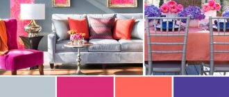
The fashion for colors in the interior changes as often as the fashion for color combinations in clothing. Moreover, it is changing dramatically. What previously seemed impossible to combine suddenly becomes a current trend that is being adopted by designers all over the world. This was the case with the combination of pink and gray colors in the interior. After all, gray color seems too gloomy and boring, and pale pink seems glamorous and even a little childish. Despite the complete opposite of these colors, they “made friends” perfectly, and their combination became very popular. The fashion for gray-pink interiors appeared in the 80s of the last century, then it was supplanted by other trends, and more recently designers remembered it again.
If you decide to take on creating the interior yourself and want to make it truly comfortable to live in, you need to understand that not all shades of gray and pink combine perfectly. It is very important not to make a mistake with your choice and correctly combine shades with each other.
How to combine pink and gray colors in the interior?
To many, the gray-pink color scheme seems too boring and dull. To avoid such sensations, it is necessary that gray does not predominate in the interior. And most importantly, objects and surfaces in pink and gray tones need to be alternated. These colors are so unique that they can act as a background to one another. If you want to highlight a gray object, such as a chair or a painting, place it against a pink wall. And if you want to draw attention to a designer floor lamp in soft coral or salmon color, place it near a wall painted in a calm gray color. To prevent the interior from being too boring, add a few complex details to it - a carpet or furniture decorated with a pattern.
But the gray-pink color scheme is not suitable for all interiors - it will look good in the living room, kitchen, and bedroom. It is better to choose more saturated colors for the kitchen, and something muted for the bedroom. To decorate the living room, designers advise using floral patterns - then it will look presentable. But it is better to refuse to decorate a nursery in this color - brighter shades are suitable for it.
There is no absolutely correct color combination. The main rule is that the chosen shades should not make you nervous or irritate you. After all, it is very important that you receive energy replenishment at home, and do not waste your energy on coping with the negative emotions that an unloved color causes.
If your room is located on the north side, it is better to use rich pink color in interior design and not overuse gray. After all, it is considered cold and makes the room even more uncomfortable. If your room is constantly flooded with sun, balance the color balance by adding cool metallics to the interior. But this is all very conditional. Don't forget that your own comfort is the only factor you should consider here.
Customers and tasks
The apartment is located in the residential quarter "Up Komendatsky" in St. Petersburg. The owners plan to rent it out for short-term rent. Prospective tenants are a young couple or a family of up to four people.
Among the tasks that designer Natalya Zakharova faced were the placement of living and sleeping areas, a separate kitchen with a dining group for four people. There should have been a pull-out sofa in the living room so that guests could sleep on it if necessary.
Who should avoid which combination?
Each of these colors has its own special magic, and to make it pleasant for you to be in the room, you need to know how they will affect the psyche.
Gray color causes despondency and apathy in a person, and it also drowns out positive emotions and reduces appetite. A person who is constantly surrounded by walls painted gray begins to feel apathetic and is constantly depressed. But this color also has advantages - it puts you in a working mood, makes you be more careful, attentive and focused.
The color pink also has a very ambiguous effect on us. On the one hand, we associate it with romance and love, but on the other hand, we know that it is chosen by naive and frivolous people. Unlike gray, pink has a positive effect on the psyche. In an interior of this color, a person calms down, relaxes and feels protected. It has a beneficial effect not only on the nervous system, but even helps improve immunity, the condition of the eyes and hearing organs. If you have a headache, spend some time in a pink room and it will feel much better.
If you want your office to always want to work, let there be a sufficient amount of gray in its interior - it will set you in a working mood. The pink and gray color scheme is ideal for rooms where you want to relax - a living room, a bathroom, a bedroom, a massage or beauty parlor. But this is not the best option for the kitchen - after all, in such an interior it is unlikely that you will be able to get rid of morning drowsiness and eat with appetite. Therefore, if there are too many reasons for sadness in your life, it is better to make your interior in a “cheerful” color scheme, choosing orange, green, turquoise. A popular design option for a nursery is a delicate pink color. It really calms the baby and gives him a feeling of security. But you need to be prepared for the fact that the child will quickly “grow out” of this interior, and the walls will have to be repainted in calmer colors.
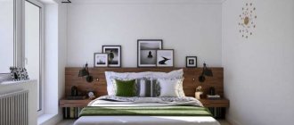
We decorate the bedroom in gray-pink colors
This color combination will be ideal for the bedroom. To make you feel comfortable in it, the gray color should predominate here, but not saturated, but calm and a little pale. Make just one wall pink and paint the other three gray. Also let the furniture, carpet, and curtains be gray.
To add charm to your interior, you can add accents with pink accessories. These can be pillows, flowerpots, frames, paintings, lamps, bedspreads. And for chic and luxury to appear, choose furniture with carved legs, wallpaper decorated with complex floral patterns. Gold will add wealth to any interior. However, this is often unnecessary. After all, the bedroom is a place where strangers rarely visit. And therefore, it is better not to use unnecessary details in the design and not to use pink in excess.
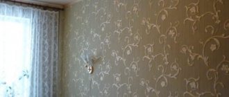
What curtains are suitable for gray wallpaper?
Next, which curtains to choose for gray wallpaper.
- Light curtains do not weigh down the space; they make it more airy.
2. Linen curtains give eco-style a natural look.
3. Make curtains to match the color of the wallpaper, an original solution for the bedroom and small living room.
4. You can choose curtains in different shades darker than the main background of the room. This solution looks presentable and elegant.
5. Harmony with fabrics will indicate the creativity and taste of the design of the apartment owners.
6. Roman blinds, due to their practicality, adapt to any style and color combination.
7. You can play with your curtains to match the color of your furniture and accessories.
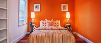
The most delicate pink children's
If you are expecting a little princess to join your family, the best gift for her will be a nursery in soft pink tones. But to prevent the room from turning out literally “sugary,” you need to use this color correctly. If you want to make the interior more calm, you can combine gray, white or peach with pink. But there should be fewer of these colors, because they act as a background. Not only the walls, but also the floor, curtains or furniture can be gray or white.
If you do not want your child to be irritated by the interior, the walls, floor and ceiling should be plain or decorated with a simple geometric pattern. Sometimes colorful wallpaper is used, but it does not always look appropriate. To make your daughter feel like a real princess here, decorate the room with pink textiles, buy a bed with carved legs and a translucent chiffon canopy, and put a soft lilac carpet on the floor. Also in the room there should be photo frames, flower pots, figurines and other interior items in pink shades.
Gray bedroom interior: combination with other colors
Gray, like black and white, is universal and timeless. Goes well with many colors. Gray can be the main shade throughout the bedroom, be the background color in a composition, as a color on the walls, or appear as accessories or furniture. A gray bedroom can be enlivened with bright pastels or rich colors. A safe solution is to change the base color to white or various shades of gray, from deep dark graphite to light gray. Gray can also be combined with light pastel colors such as powder pink, magnolia, beige, as well as more intense colors such as orange, red, yellow or lime green.
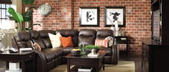
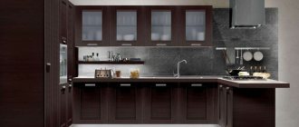
Stylish and original kitchen
For those who are not afraid of experimenting in the interior, you can try decorating the kitchen in gray and pink tones. It's bold, original and stylish. There are a lot of design options here. You can make a kitchen in a shabby style, then it will turn out very gentle and romantic. In this case, it is better to put light pink, artificially aged furniture, and hang cotton curtains in small rosettes on the windows. The walls should be light and the floor should be dark gray or brown. Vintage dishes and white appliances would look appropriate in such a kitchen.
If you love futurism or hi-tech, make your kitchen in cool colors. Metallic gray should predominate here. You can make the upper or lower facades in a calm pink color, and hang blinds on the windows. A floor laid with gray and pink tiles will look original.
A kitchen in this color scheme will not appeal to lovers of classic interiors. If you doubt that you will be comfortable in a gray-pink kitchen, it is better to abandon such an interior idea completely.
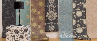
New gray wallpaper designs
The year two thousand and twenty-one pleased lovers of gray colors with wallpapers made with motifs of flowers and plants, figures and animation.
There will be enough natural color in the room if you take advantage of interesting proposals from designers regarding the design of the space with fragments from an exotic jungle or, conversely, a dear birch grove.
A riot of colors on takeoff. The interior becomes exclusive when fragments of bright colors, made with iridescence, are intricately intersected against a gray background. It feels like they were simply spilled accidentally, with chaotic harmony.
The image of any ornament on gray wallpaper also remained popular this year, only very updated with new compositional solutions.
Gray wallpaper imitating knitting makes up a unique pattern combination. This is especially typical for the Scandinavian style.
- Fabric images of all kinds and shades, skillfully decorated with characteristic features, were not left out.
- In these cases, the sophistication of the decor of textile wallpaper in a gray palette of shades is simply amazing.
- In addition, they are additionally valued for their qualities that allow you to create a cozy environment, drowning out unnecessary noise effects, and retaining heat.
Neoclassical motifs, executed on a noble gray background, are perfect in cases where you want to realize your dream. The selection of textured finishes, perfectly combined with noble gilding and plant fragments makes the room aristocratic.
Choosing the right shades
There are a huge number of interior design options, but there are still the most popular combinations of shades of these colors.
If you want your interior to be cozy and homely, combine light gray and rich pink. In this case, gray will act as a background and calm the psyche. Furniture, textiles and accessories in the interior should be a rich pink color. This combination will be an excellent option for a nursery and bedroom.
For south-facing rooms, a combination of pale pink and metallic gray is suitable. Most often it is used to decorate living rooms or kitchens by lovers of futuristic style. It is not recommended to decorate a nursery or bedroom in these shades, because not everyone will feel comfortable in such rooms.
Those who do not like bright and aggressive colors are recommended to decorate the room in light shades of gray and pink. This is considered the most successful combination and is suitable for any room. In such an interior, everyone can relax and unwind.
Gray and pink colors are a popular combination. Moreover, it is used to decorate interiors in many styles, from classic and shabby to modern and high-tech. But when choosing an interior, it is important to listen not only to the advice of designers, but also to your own feelings. After all, you and your loved ones will live in this interior, so it should not only be beautiful, but also comfortable.
Wallpaper in the bedroom - features of wall decor
Trendy gray is quickly becoming the “new fuchsia” and seems like the right choice from a design perspective. This neutral color can be combined with a huge number of not only calm shades, but also bright colors. By using serene gray wallpaper in your bedroom interior as a basis, you can create a unique atmosphere in which you will have a pleasant time and relax.
Stores and designers have long noticed the universal characteristic of color and use it in all its many shades and in all imaginable products: the only difficulty is deciding which shade to choose in the end. Online sites offer a wide selection of gray wallpaper for the bedroom and other rooms to suit every taste.