Combinations of pink are a win-win when you need to update your design, create interesting images and drawings. Offers from markets and shops are not always suitable for the intended idea. You can achieve unusual combinations yourself if you know how to get pink from paints.
Various shades of pink are very popular when decorating apartments and houses.
Characteristics and composition of pink color
Its main features:
- not part of the primary color spectrum;
- unsaturated, unlike its related red;
- combines many similar tones.
Ingredients: white and red. When mixed with others, it ranges from berry (blue based) to salmon (orange based).
Shades are divided into subgroups:
- light and warm;
- light and cold;
- medium warm;
- medium cold;
- pale;
- bright.
Simple and complex shades of pink.
Shades of pink
Pink joins a large group of shades, from pale pastels to loud purples. Different shades have different effects on the psyche and evoke different associations.
Several popular shades:
Millennial pink The most fashionable color of the generation. Its popularity began with the 2014 film The Grand Budapest Hotel. This color can be roughly described as a grapefruit shade of apricot salmon.
Flamingo The extravagant color of the bird is a child of the sunset. It is obtained by adding orange to pink.
Barbie Screaming is the iconic color of the generation of children of the 70s and 80s, a real pop culture idol.
Magenta A purple shade of hot pink, closer to violet.
Fuchsia Another popular purple shade, slightly darker than magenta, named after the flower.
Pearl pink A delicate shade symbolizing prosperity and mystery.
Getting the base pink color
Basic pink is characterized as light red. To obtain it, most standard purple and scarlet tones are used. Each of them gives a different shade, so the mixing proportions to create the base color will depend on the chosen paints.
There are 2 methods:
- Red is diluted with water. The saturation can be adjusted by adding more or less liquid.
- Mix white and red. When you change the proportions, the color becomes brighter or lighter.
Difficulties in working with color
Every artist is faced with the fact that he sometimes needs a certain shade, which can be composed of two or three colors. A professional has no problems with this. He clearly understands what to mix and with what to achieve the desired result. However, it can only use a few local colors.
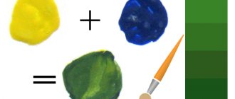
Beginners always have difficulties with this. And not everyone knows that green comes from yellow and blue, and brown from red and green. What about the color pink? How to get it in its pure form or its specific shade, because the palette of pink is very extensive. In addition, it is not always possible to achieve a pure color.
Universal rules for mixing paints to get pink
To get bright or, conversely, subdued tones, you can “play” with colors. But there are universal rules.
Selecting red
The nature of red in the color scheme will affect the final result of the work performed. For example, bright scarlet will give a natural tone, brick red – peach, blood red – fuchsia.
Choosing the Basics
You can mix paints if they belong to the same group and have a homogeneous chemical composition.
The choice of incompatible ingredients leads to uneven distribution of materials, cracks, and delamination.
For example, if watercolor and acrylic paints interact with each other, then oil cannot be mixed with other bases.
Procedure
To avoid waste of materials and not to spoil them, mixing must be done in stages:
- Prepare a spacious container so that the liquid can mix easily and freely.
- Dilute part of the base with the required amount of the selected color, stir thoroughly. Cover a sample surface with the mixture and see how the composition behaves when dried.
If you are satisfied with the trial result, you can start coloring; if not, correction should be made.
How to make fuchsia color?
In the RGB model and in the web color list, fuchsia and magenta are the same color, a mixture of red and blue in equal proportions. There are differences between the two in color printing; Typically, fuchsia has a more red hue, while magenta has a more purple hue.
Interesting materials:
Which moldings are better? What muscles do you need to pump to learn how to do pull-ups? What muscles are trained on a rowing machine? What peoples are indigenous to North America? What peoples live in Central Asia? Which wallpaper is the easiest to stick? What wallpaper is best to glue on uneven walls? What wallpaper goes with brown doors? What are the oceans in Africa? What are the main cities in New Zealand?
Features of obtaining pink from various colors
To obtain the desired shade, determine the type of paint.
Artistic
The most common options:
- Watercolor. When working with it, water acts as a clarifier. In the standard palette set you can find carmine. When diluted with liquid, the desired tone is obtained. Adjust its saturation with the amount of water.
- Gouache. Also created on a water basis. It loses some brightness once it dries, especially when blended. To enhance the effect, add more red or apply a second layer of the mixture.
- Acrylic. With its help you can adjust the desired shade. Acrylic has water-repellent properties and durability, lays uniformly on the surface, and dries quickly. It is enough to select a color to match the base and mix until you get the result.
- Oil. Such paints are more difficult to use. It is better to study their properties in advance in order to obtain a clean, rather than yellowish and dirty tint. For work it is better to use linseed oil. The working procedure is the same as with gouache. But if it becomes lighter when it dries, then the oil, on the contrary, darkens.
Shades of pink are widespread in painting.
Construction
They are used to paint facades, walls and ceilings. Glossy paints are bright and shiny, matte colors are muted and pale. To prepare them, choose a white base and a universal red color. White is poured into the container, adding dye little by little and stirring until the result is obtained. This is done using a construction mixer to avoid specks and veins.
Food colorings
White food colors are not produced; they are replaced by powdered sugar. A pleasant pink tone can be obtained by mixing it with water and red food powder. It must be added little by little due to the high concentration of the dye. As a replacement, you can use natural berry or beet juice.
Tinting acrylic paints
It is not always possible to tint paint yourself and obtain a truly high-quality result. In addition, if the area to be painted is large and there is not enough paint, it is almost impossible to repeat the shade exactly. Therefore, it is worth ordering paint tinting from professionals; this service is offered by any large hardware store.
The desired shade can be selected from the palette provided by the manufacturer, and the finished paint will have exactly the same tone. This option is more suitable for those who do not want to experiment with colors on their own; by paying a little extra, you can be sure of the result and the excellent quality of the paint!
Getting different shades
Combination shades consist of 3 or more primary colors.
By adding a few contrasting drops to the red and white mixture, you can get unexpectedly interesting results.
Dirty pink
For production, scarlet, white and gray are used.
Hot pink
Coral, cyclamen, fuchsia - all these shades are called hot pink, but there are some differences between them. By mixing rich red with white, you can get sea coral by taking a little yellow - cyclamen. A drop of lilac gives a fuchsia tint.
Rules for mixing paints to obtain different shades of pink.
Pink-peach
Warm peach is obtained if you add brick.
Pink-lilac
This cheerful tone is formed by mixing pink and blue.
Other
With the help of brown, “pink clay” is obtained. Adding blue creates a cool pink mist effect. Gray will give the base a smoky, ashen tone.
How to get different shades of pink
When mixing white and red coloring mass, you can get the usual pink color, only of different brightness.
But among creative people this color has a large number of different shades.
You can get all this by mixing the total mass with additional products of different tones.
These are the colors that are mixed in to create different shades:
- Blue – it turns out pink with a lilac tint.
- Raspberry or cherry color - for a flashy pink.
- Orange, yellow, brown - to obtain pink with a peach tint.
- Gray, black - to achieve pink with a dirty effect.
Important: it is better to add additional colors in very small parts, drop by drop, especially for dark colors. Work with black carefully, because it can easily ruin the result.
Warm and cool shades
If you look at a rose in the shade and in the light, it will have a different color.
Light greatly affects visual perception, but this is not the main thing.
The result will be a warm or cool shade - this will depend on what red color was taken at the beginning of mixing. If you take a cold one, then the final color will turn out cold and vice versa.
To get a warmer color, you can add just a little yellow or orange to the mixture.
Table for obtaining pink shades
The final result is influenced by proportions. This table shows the most common options.
| Colors | Proportions | Result |
| White and scarlet | 2:1 | Base tone |
| White, scarlet and brick | 2:1:1 | Peach |
| White, scarlet and purple | 2:1:1 | Fuchsia |
| White, scarlet and yellow | 2:1:1 | Cyclamen |
| White, scarlet and gray | 2:1:1 | Dirty tone |
| White, scarlet and blue | 2:1:1 | Lilac |
What color is dusty rose?
The shade of dusty rose is a special tone of pink with a slant towards gray or beige, although sometimes it is also called a transparent pink tone. Depending on the intensity, it can look either completely pale or saturated. But this shade in any case belongs to the nude shades that are so popular in the modern fashion industry. Dusty rose can be used both as a base and main color.
Dusty rose color combination
The shade is universal, that is, it can be combined with almost the entire color scheme. He prefers complex muted tones, but the image can be complemented with bright elements. Designers very often combine it with pink and gray. Light and dark tones deepen the color of the dusty rose, making it richer and more voluminous. Orchid, lingonberry, clover, and dark purple look beautiful in combination with it. Violet tones are also appropriate - amethyst, eggplant, grape, blackberry.
Ashes of a rose in tandem with red look expressive and contradictory. Bright red can “get along” with this tone only in muted versions. Suitable wine, Marsala, ruby, burgundy. Pale variations of orange - peach, pumpkin, brick - are also combined with dusty rose. They will add lightness to the image. Yellow and dusty rose color are a non-standard combination, but therefore interesting. Yellow with gray, blue and red undertones is appropriate: honey, champagne, gold, corn, amber.
The combination of a dusty rose with warm and cool green looks elegant. The first include pale green, marsh, and coniferous. The second ones are emerald, malachite, turquoise. The ash of a rose with shades of blue looks just as interesting. Suitable aquamarine, dove, cobalt, sapphire. Rose ash also goes well with brown, black, gray, and beige. It is better to choose a brown palette in dark, rich shades - dark chocolate, chestnut, mahogany. Neutral colors (black, gray, beige) perfectly complement the dusty rose.
Dusty rose color – who suits it?
It suits those with the “summer” color type, emphasizing their femininity and tenderness. The “autumn” and “spring” color types can also safely choose this shade. Light-skinned blondes - that's who the dusty rose suits. And brunettes with a bright appearance need to use it in doses in their image, because against their background it will seem too pale. Both young girls and mature women can choose a dusty rose.


