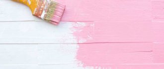
In this article we will look at ways to create turquoise color by mixing paints.
Turquoise color is very attractive, harmonious and relaxing. This color has a very good effect on a person and calms him down. Turquoise, also called aquamarine, falls somewhere between green and blue on the color wheel. It ranges from soft, light tones to richer, deeper ones.
If you need a given color, in one shade or another, but you can’t find and purchase ready-made paint, don’t be discouraged by some manipulations of mixing colors, you will achieve the desired result.
Characteristics and shades
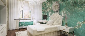
The shade of turquoise is often found in the surrounding world - the color of water, lagoons and seas, or in the sky. In the spectrum of colors, this is considered the coldest and therefore has a calming effect on the human psyche. For these purposes, turquoise is used when decorating the interior of rooms where it is necessary to create an atmosphere of peace. It is combined in clothes and with different types of appearance.
In psychology, the shade is associated with a cold and mysterious appearance, although people who prefer this color are considered friendly and open to communication. Alternative medicine uses turquoise color to strengthen immunity, calm, relieve stress and fatigue. Its shades promote harmonization, bring a person into a calm state and help manage emotions.
In eastern countries, this color is associated with the manifestation of faith and religion, and healing powers are associated with it. In European countries, turquoise is often associated with luck and luck.
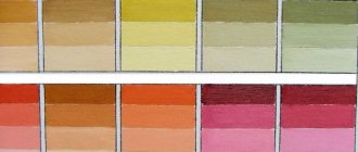
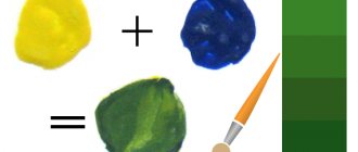
You can mix turquoise, you need to combine blue and green, but their proportions may differ depending on the desired shade. The palette of shades varies from light green with the addition of blue to pastel colors and rich brights.
Turquoise shades are divided into 3 types:
| Hue | Characteristic | Examples of tones |
| Dark | Not bright, soft color, similar to a sea wave. Primary colors are used in their pure form in large quantities, almost without diluting the color. |
|
| Light | A muted soft color is achieved by adding a small amount of white. |
|
| Bright | Rich shades. When mixing, more blue, green or yellow is added to create different tones. |
|
Getting a turquoise shade
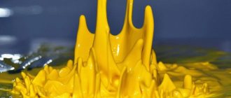
Making turquoise with your own hands is not difficult. To do this, you can use gouache, watercolor, acrylic paints, you just need to mix them in certain proportions. Since turquoise is a mixture of green with a drop of blue, these two basic tones will be required to prepare the paint.
There are no clear instructions on the number of colors. Search is a creative process where paint standards are selected individually. To work you need:
- white palette or plate;
- tassels;
- a glass of water;
- paper.
You should take a sufficient amount of greenery for work, which does not have foreign impurities, and then add blue drop by drop. follows after the introduction of each new portion of the material.
In any case, the amount of blue paint should be less than green. If a color seems right, you should try it out. To do this, make a smear on the paper - a uniform turquoise tone should remain on it.
There are various shades of turquoise - sea wave, azure, blue-green, as well as curacao, aquamarine, the color of thrush eggs and others, which are exotic to the ears of beginners. It is worth considering the process of making the most popular turquoise halftones in more detail.
Light turquoise
To create a lighter tone, you will need blue paint rather than blue. It is made using the simplest method - adding a little white to the desired degree of lightening. Then they begin to gradually introduce a blue tone into the green until a delicate turquoise tint begins to “emerge.” Also, professionals often add a drop of yellow paint to the mixture - it adds brightness and lightness to the greenery, making it light green, so the finished turquoise will be airy and very beautiful. If the finished tone does not seem delicate enough, it can be diluted with any amount of white paint until a pastel shade is obtained.
When light turquoise still needs to be “cooled,” you can add a little gray paint to the finished color scheme. That is, they mix green, blue, white and gray tones. The result is an unusual muted color, perfect for painting pictures of the sky.
Dark turquoise
Making dark tones of turquoise yourself is also easy. To do this, you should purchase cyan paint, which already has a green tint with a hint of blue (sold in an artist store). You need to put a little of this paint on the palette, then add the usual green color in small portions. The dark turquoise color is achieved by adding a small amount of greens, and thorough mixing is very important. Some specialists add a little brown to darken the tone even more; this color will be a little warmer than ordinary turquoise.
Aquamarine
Sea color is obtained in a similar way. It will require two standard colors - blue and green - in approximately equal proportions. They are mixed until smooth, then a tiny amount of white paint is added for some lightening. Depending on the amount of white, the sea green color will change from rich to paler. Professionals call marine color a mixture of blue phthalocyanine and titanium dioxide, but for the average person, ordinary (classic) gouache from a store is quite suitable.
Mixing rules
You can mix turquoise color from paints by combining green and blue shades. Depending on the desired tone, the proportion of the original color may change, and a 3rd additional color may be added to achieve a new tone.
The picture shows how to make different shades of turquoise.
When mixing paints to obtain a turquoise color, several rules are followed:
- To obtain classic turquoise, mix green and blue in a ratio of 9:1. Blue is used as the main color; green is mixed into it in portions until the desired result is obtained.
- For work, use green paint without impurities or inclusions. Blue or blue color is not added immediately, but in drops. Make sure that there is less blue than green.
- To lighten the tone, add white paint.
- To darken the tone, add black paint.
- To make the finished tone “colder”, add gray paint.
- To obtain new tones of turquoise, add yellow or cream paint in a ratio of no more than 1:6.
- To check whether the desired tone has been obtained, the finished paint mixture is applied to paper or other surface and wait until it dries until the color is fully developed (it may become lighter, paler or darker for different types of paints). Make sure that the smear is uniform. If this is not the case, the paint should be mixed well again.
You can achieve a new turquoise tone by mixing paints in different proportions. You can follow the tips in the table to get a new color. You can vary the colors as you wish.
| Hue | Paint components | Matching proportion |
| Light | blue + green + cream | 100:5:2 |
| Pastel | blue + green + white | 100:10:5 |
| Dark | cyan + green | 10:4 |
| Bright | green + blue + white | 10:5:1 |
Examples of interiors in wenge color
Wenge is a dark brown shade; its combination with turquoise can give a feeling of harmony with nature. Wenge can be combined with any shades, and is usually used on doors and furniture, helping to tone down bright accessories, making the interior more calm.
Wenge is a dark brown shade; its combination with turquoise can give a feeling of harmony with nature.
The article described how to make a turquoise color. Its use in design contributes to a calm and cheerful atmosphere, and its versatility allows it to be combined with any colors. It is suitable for any type of room.
From primary colors
Turquoise can only be mixed from complementary colors, since green and blue are derivatives of a combination of blue, yellow and white in different proportions. You can get turquoise by using ready-made colors from the palette - green and blue, or by mixing the main components of the color.
In the 2nd case, follow the instructions:
- Yellow paint is added to the blue color in portions until the green color of the desired brightness is obtained.
- Mix white and blue paint separately to get a blue color. The shade of blue is adjusted with more or less white paint.
- Green is gradually mixed into the resulting blue until the desired shade of turquoise is obtained. If necessary, add a little yellow or white to adjust the tone. White paint will make the tone lighter, yellow will add brightness.
You can mix different paints to obtain the desired shade - gouache, watercolor, acrylic, etc. Among artists and decorators, there are no clear instructions for mixing colors to obtain turquoise shades. Everyone chooses a shade individually.
Classical
You can mix turquoise color in a classic bright version from blue and a small amount of green (9:1).
Mix the paints in the following order:
- Prepare blue and green paint, paper, a container of water, brushes and a white palette or surface. When mixing a different color on a palette, the color of the mixture may appear in a different tone.
- Green paint is applied to the palette in its pure form, without impurities or inclusions.
- Add blue paint to the green paint in drops and mix the dyes well each time until smooth.
- Repeat this process until the desired tone is achieved. Make sure that there is less blue paint in proportion than green dye.
- Once you have obtained the desired tone of paint, you try it by applying a smear to the paper and wait until it dries to make sure that the tone has not changed.
Dark turquoise
Dark shades of turquoise are obtained by mixing paints in the following order:
- Blue paint is applied to a white palette or surface.
- Add green dye drop by drop and mix both colors well each time until smooth. Repeat the procedure until a gentle tone is obtained.
- If you need to lighten the shade a little or reduce the saturation, add white dye in small portions and mix well.
- Start darkening the tone. To do this, mix the resulting paint with black in small portions. Very little black is needed.
The quantities of all components may vary to vary the shades of dark turquoise.
Light turquoise
To get light turquoise shades, follow the steps:
- Green paint is added to the white palette.
- Mix blue with green dye in small portions. Each time the paints are thoroughly mixed until smooth.
- When the required tone is obtained, it is lightened with white paint. Its quantity depends on the desired tone.
- To adjust the shade, nude or cream dye can be added to the resulting dye to make the tone warmer and lighter.
Features of turquoise color
Turquoise is a shade of blue and is named after the natural mineral of the same name. Additionally, it incorporates shades of green. In the classic version, it refers to a cool color.
In nature, in addition to the element of water, it can be observed in natural stones, pigments of flowers and plants, colors of birds and animals.
Often, it is called the color of the sea wave. This is not entirely true. The latter contains significantly more green than the hero of our article, namely from 30% in the composition. As for turquoise, the green content here is up to 20%. The main color is blue.
From different types of paints
You can mix turquoise from different paints in one way, using the same initial colors. The main rule for this is to use one type of paint as a base - oil, watercolor or gouache, without mixing these types with each other.
- Select the desired type of paint.
- Prepare the necessary tools: blue and green paint, palette, brushes, container with water, paper or other surface for checking the color.
- On the palette, green and blue dye are combined in the required proportion to obtain the desired shade (from light blue to rich aqua). The original colors are used in their pure form so that green and blue are free of impurities and stains. It is desirable that these colors be as close as possible to the standard ones in the color wheel. First use blue paint and then gradually add green. They add more of one or another dye, depending on what shade they want to get.
- Additional dyes are added to obtain the desired tone. White gives the paint a soft pastel tone. Gray paint makes the tone light and muted. Yellow is added to create a bright and rich turquoise.
- Check the mixture on paper or other surface and, if necessary, make adjustments to the dye.
- Paint the desired surface with the prepared mixture.
Gouache
To obtain a turquoise color when mixing gouache, follow the steps:
- Prepare the necessary materials: brushes, a palette or surface for mixing paints, green and blue paint in a pure and free form, a container with water. If necessary, use additional dyes.
- Before starting work, the brush is dipped in water and then in paint.
- Blue and green dye are applied to the palette in the same ratio alternately. First, they are diluted with water to the consistency of sour cream, then they begin to mix thoroughly.
- Gradually add more green paint and continue mixing it until the desired shade of turquoise is obtained. The paints are mixed gradually to obtain the desired color. Initially, they take the one that should be larger in proportion. Gradually add the one that is smaller in proportion in the turquoise shade.
- If it is necessary to achieve a certain shade of turquoise, gradually mix in additional dye. The turquoise dye of water-soluble paints is lightened not only with new colors, but also by adding water.
- Apply a test stroke to paper or other surface, wait until it dries and compare the color with the mixture. After drying, the color may become darker or paler. If necessary, add the desired dye to the gouache mixture and again make a test smear to select the right shade.
- When the desired tone is achieved, paint is applied to the desired surface.
When working with gouache, take into account the features of working with this type of paint:
- when applying layers of paint, apply each one without waiting for it to dry;
- the first strokes are made vertical, the second layer is applied with horizontal strokes;
- gouache is better applied to paper with a rough surface;
- gouache is applied with soft, rounded brushes;
- dried gouache is diluted with water.
Watercolor
To obtain a turquoise color by mixing paints, it is recommended to use watercolor, especially for novice artists. These paints are easy to handle and easy to mix. Paint is sold in tubes, briquettes or ready-made palettes.
Art departments have ready-made shades of turquoise in watercolor, but if you can’t find the right tone or can’t buy it, you can mix the right color yourself from the primary colors.
To do this, follow the instructions:
- Prepare the necessary tools: a white palette or surface for mixing paints, green and blue watercolors, additional dyes, brushes and a container of water.
- Green and blue watercolor dyes are mixed on the palette. To a greater extent, take the color which tone should prevail in the final mixture. The second dye is added drop by drop gradually to adjust the accuracy of the tone.
- If necessary, additional dye is added to achieve a subtle shade or subtone. Blue or black will give a dark shade, yellow will add brightness and richness to the shade. White or gray is added to make the tone softer and lighter. Water-soluble paint can be lightened by adding water.
- When the tone is ready, apply a test stroke on the paper to make sure the mixture is homogeneous - it should be without streaks or inclusions. Wait for the smear to dry and compare the tone with the result. If necessary, adjust the mixture and make a test smear again.
- Paint the desired area with the prepared mixture.
When working with watercolors, two methods are used to obtain the desired shade when mixing paints - glaze and single-layer.
The above describes the single-layer method, when paints are mixed on a palette and applied in 1 layer to paper. With the glazing method, watercolors are mixed using an aqueous solvent directly on paper. The final result is achieved using the optical effect of color overlay.
To select the desired tone of turquoise, make sketches on a rough sheet of paper:
- Apply several strokes of blue, obtained by mixing blue paint and water. All strokes should be of the same saturation.
- After the strokes have dried, a smear made from green paint and water is applied on top. Color all the strokes, skipping one of them.
- Repeat the application of green paint, each time omitting the palest version. Do not mix colors more than 5 times to avoid contaminating the color.
- When all the sketches are completely dry, select the shade of the desired saturation.
Pencils
To achieve a turquoise hue when coloring with pencils, artists use either a ready-made pencil color or a shading method. In the second case, light shading of individual pencil colors is applied alternately to each other.
Unlike paints, it is impossible to mix the pigments of colored pencils. Therefore, they resort to optical mixing of colors by superimposing one pigment on another. Since the leads contain wax, which does not allow the colors to mix, the shading is done in a thin layer.
Depending on the order in which the color is applied, the final shade of turquoise may change - both dark ones are applied on top of light ones, and light ones are applied on top of dark ones. The strength of the shading also affects the saturation of the shade.
It is easier to achieve the desired shade when using watercolor pencils, which are easier to shade after shading and can be slightly blurred with the final application of a water layer.
The following shading patterns are used to create turquoise shades:
- A rich, bright color is obtained by applying light strokes with a green pencil, then blue and finally white in a ratio of 10:5:1.
- The mint color is achieved by shading with a blue pencil, then green in a ratio of 2:1.
- Use cross hatching, placing different colors at different angles.
- Use shading in one or any direction, applying light pressure on the pencil.
- Color mixing is achieved by applying dots. Dots are made by frequently pressing the stylus onto the paper at different distances from each other.
- The required color depth is achieved by shading density or by applying pressure to the pencil. A darker and more saturated color is obtained if you press harder on the pencil or if you divide the strokes closer to each other.
Basis
The principle of obtaining the desired color is clear; it is worth considering other ways to achieve it. Any green and blue base is acceptable: water, oil, acrylic, gouache.
There is a minor nuance in the artistic scheme: it is advisable to mix paints of the same type.
It is advisable to buy materials in specialized stores; it is quite possible to find the expected tone in finished form among a wide assortment.
Pros and cons of mixing it yourself
| Advantages of using ready-made dye | Benefits of mixing paints to create a tone |
|
|
The ability to mix turquoise color can be useful when you don’t have a ready-made dye on hand or if you need to create a unique shade for design purposes. This color is also used for other purposes, but the method of mixing colors is not always more profitable.
What colors should I mix?
What colors to mix to get beige color.
how to get green color by mixing paints. lilac and violet To get a black color close to ideal, you can go by mixing paints of the following colors:
- Red and green - the resulting tone will be close to the desired one (in fact, it turns out to be very dark, and if you look closely, it is not quite ideal).
- Blue, yellow and red - if you take these 3 primary colors, then mixing them will also allow you to get a fairly rich color scheme.
- Additional colors (brown, purple, blue) - you need to mix them in small quantities, then you will get an approximate color.
You can use any paints intended for painting or household purposes for mixing: acrylic, gouache, watercolor and oil. If there is no ready-made dye of a classic tone, then there are a lot of options on how to make black paint from others.
To obtain a pure color, you will have to work hard and select the necessary proportions, gradually adding different colors.
On the video: what colors to mix to get black.
Basic Rules for Mixing Food Colorings
When mixing food coloring, it is important to follow several rules and then the result will definitely please you.
Food pigments are divided into water-soluble and fat-soluble, which is usually indicated on the packaging. Fat-soluble paints are used for coloring chocolate, butter cream, and cocoa butter. For cream, caramel, dough products, glaze, mastic, you should choose water-soluble dyes.
The wrong type of dye will not give you the desired result, or will completely ruin the dish. You cannot mix two types of dyes with each other.
Dyes can also be divided according to the form of release: dry, liquid and gel.
- Dry food colors are usually diluted in water or vodka before being added to the dish. Can also be used as a dry pigment for coloring mastic or wafer sheets. When using dry paints, mix them diluted. That is, first dilute the main color, then gradually introduce additional colors into it. As soon as the mixture acquires the desired shade, it can be added to the dish.
- Gel dyes are the most convenient to use, since they do not need to be diluted like dry dyes, and they do not add excess moisture like liquid paints. To color cream, dough or caramel, you can mix colors directly in the dish.
- Liquid dyes have a lower density than gel dyes, mix well with each other and produce beautiful watercolor shades. They are well suited for painting on pastry surfaces and coloring biscuits. You can mix this type of paint directly in a dish.
Usage
Like all other dyes, turquoise dye can be:
- Used on a sheep to dye its wool, which can be shorn to produce 1-3 blocks of turquoise wool.
- Used on tamed wolves to paint their collar.
- Used on tamed cats to paint their collar.
- Used for dyeing/painting wool, leather armor, beds, glass, terracotta and shulker boxes.
- Combined with gunpowder to create a pyrotechnic star.
- Combined with a star to create a color changing effect.
- Used to apply a design to a flag.
- Used for painting shulkers.[ only for
] - Used to color the water in the boiler.[ only for and
]. - Combined with sand and gravel to craft cement.
- Combined with a connection to craft a balloon or chemical light source.[ only for and
].
How to make turquoise dye
Since in order to obtain turquoise dye one must take care of obtaining two other dyes, the task is thus complicated. Indeed, in this case, you cannot simply find a flower or something else and, placing it on a workbench, get what you are looking for. Although the crafting recipe involving lapis lazuli and cactus greens is really simple.
2
Make dye in Minecraft:
Lapis lazuli
1 PC.
Green dye
1 PC.
Knowing what you do with dyes can be really important. Why? Yes, because this can make buildings and structures in Minecraft beautiful and stylish, and in general significantly diversifies the possibilities.
Key uses for turquoise dye include painting blocks, coloring flags, and creating stars for fireworks. Now let's talk about this in more detail.
How to get sage color?
To create a sage shade, start by mixing white and green (whatever you have) in a 2:1 ratio. You'll end up with a candy-like hue that needs to be toned down.
Interesting materials:
Why is sleeping in socks harmful? Why can't the alcohol be 100? Why does a tire go flat on a hoverboard? Why can’t you turn on a new refrigerator right away? Why does the wearing period of eyelashes change? Why doesn't the link open? Why does the voltage stabilizer constantly click? Why did the mattress begin to creak? Why was Stalingrad renamed Volgograd? Why was the Avignon Captivity of the Popes possible?
Food coloring color mixing chart
| Example | Required Color | Base Color + Mixing Instructions |
| Turquoise | blue + green | |
| White-Blue | white + blue | |
| Wedgwood Blue | white + blue and a drop of black | |
| Royal Blue | blue + black and a drop of green | |
| Violet | red + blue | |
| Grey | white + black | |
| Gray cold | gray + blue or green | |
| Pearl Gray | white + black, a little blue | |
| Gray warm | gray + ocher or umber | |
| Medium Brown | yellow + red and blue, white for lightening, black for dark. | |
| Red-brown | red + brown | |
| Golden brown | yellow + red, blue, white; more yellow for contrast | |
| Tobacco | yellow + green + white + red | |
| Mustard | yellow + red, black and a little green | |
| Beige | gradually add white to brown until a beige color is obtained; yellow for brightness. | |
| Pink-Grey | white + a drop of red or black | |
| Gray-blue | white + light gray plus a drop of blue | |
| Green-Gray | white + light gray plus a drop of green | |
| Khaki | brown + green | |
| Gray coal | white + black | |
| Avocado | yellow + brown and black | |
| Orange | yellow + red | |
| Yellow | yellow + white for lightening, red or brown for a dark shade | |
| Lemon yellow | yellow + white, a little green | |
| Light brown | yellow + white, black, brown | |
| Pale green | yellow + blue/black for depth | |
| Grass green | yellow + blue and green | |
| Olive | green + yellow | |
| Light green | green + white/yellow | |
| Turquoise green | green + blue | |
| Bottle green | yellow + blue | |
| Coniferous | green + yellow and black | |
| Green | yellow + cyan or blue | |
| Green Olive | green + yellow | |
| Fern Green color | white + green, black | |
| Forest green color | green + black | |
| Green Coniferous | green + yellow + black | |
| Emerald green | yellow + green and white | |
| Light green | yellow + white and green | |
| Aquamarine | white + green and black | |
| Pink | white + a little red | |
| Apricot | red + ocher + white | |
| Chestnut | red + black or brown | |
| Royal Red | red + blue | |
| Royal purple | red + blue and yellow | |
| Purple | red + blue + yellow | |
| Dark purple | red + blue and black | |
| Tomato Red | red + yellow and brown | |
| Mandarin, Orange | yellow + red and brown | |
| Orange | red + yellow | |
| Gold | yellow + red or brown | |
| Reddish chestnut | red + brown and black | |
| Red Burgundy color | red + brown, black and yellow | |
| Crimson | blue + white, red and brown | |
| Plum | red + white, blue and black | |
| Dark brown | yellow + red, black and white | |
| Copper Gray | black + white and red | |
| Ocher | yellow + brown |
Adviсe
- By adding a little blue and green to white paint, you can get pale shades of turquoise.
- You can get turquoise by simply adding a little yellow paint to the blue. A ratio of 1:5 or 1:6 will give good results.
- Turquoise is considered a calm color. Use it in paintings to create a calming effect.
- The intensity of the color can be varied by changing the proportions of the paints. Start with a basic ratio of 2:1 (two parts blue to one part green) and experiment.