Required dye colors
To start working on mixing shades, you need to prepare a basic palette of colors. Acrylic paints have a dense consistency and a rich, even tone. They are easy and pleasant to work with. The basic palette of acrylic paints includes the following items:
- red;
- yellow;
- brown;
- pink;
- white;
- black;
- blue.
The white color in the acrylic palette is represented by a special shade, which is called “titanium white”.
A feature of the coloring technique is the inability to accurately predict the result. Adding an increased portion of an auxiliary color to the base makes the resulting shade more saturated, so it is almost impossible to calculate the exact proportions. The main condition for working on combining paints is to follow the basic rules and understand the principle of technological mixing.
Reference! Having 7 primary colors available, it is possible to create unique shades for decorating any surface. These rules underlie the technique of mixing acrylic paints.
Working with acrylic
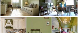
Most often, these paints are used on wood, cardboard, glass, stone, making decorative crafts. In this case, mixing colors occurs in the same way as when using gouache or oil. If the surface has been pre-primed and the paints are suitable for it, obtaining the desired shade will not be difficult. Below are examples of mixing shades with acrylic.
Acrylic paints are also used for painting on fabric (batik), but they are sold in jars of liquid consistency and are similar to printer ink. In this case, the colors are mixed according to the watercolor principle on a palette with the addition of water, rather than white. Once you understand how to use paint mixing charts, you can easily create an unlimited number of shades using watercolor, oil, or acrylic.
Source: Yandex.Direct - Read FB.ru: https://fb.ru/article/181500/tablitsyi-smeshivaniya...ie-akvarelnyih-krasok-tablitsa
Color Mixing Chart
Manufacturers of acrylic paints claim that coloring according to a special table, created taking into account the characteristics of the compositions, allows you to obtain a wide variety of shades for any type of work.
The acrylic paint mixing table is a combination of two columns that offer the user different options. The table shows the basic techniques for mixing tones.
See also
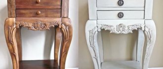
Step-by-step instructions for painting old furniture a different color with your own hands
| Shade name | Required colors |
| Light green | Mixing yellow, white, green |
| Sea wave | Connection of white, green, black |
| Avocado | Adding black and brown to yellow |
| Tangerine | Add red and brown to yellow |
| Ginger | Red mixed with black and brown |
| Burgundian | Red mixed with yellow, brown and black |
| Crimson | Mixing blue, white, red and brown |
| Plum | Mix of red, white, blue and black |
| Copper gray | Adding white and red to black |
Attention! When working with a coloring table, what matters is which color is taken as a base, and which color is gradually added.
What colors of dyes should you purchase?
Back in school, during art classes, they taught tinting lessons when they said that when you mix red and yellow you get orange, and when you mix blue and yellow you get green. It is on mixing a variety of colors that a special artistic table for obtaining additional colors is based. According to this table, to create the necessary palette it is enough to purchase acrylic dyes in 7 colors:
- red;
- pink;
- yellow;
- brown (burnt umber);
- blue;
- black;
- white (titanium white).
These paints are quite enough to obtain the desired color by mixing. It is enough to use an art table and, by mixing paints, get the desired shade of color.
How to work with a table correctly
The paints begin to be mixed, focusing on the information in the table. At the same time, technologists recommend adhering to special rules that protect against common mistakes:
- It is recommended to take the darkest or lightest tone as a basis;
- auxiliary shades are added to the base in small portions so as not to create an excess of tone;
- mixing paints must be intensive and thorough; due to superficial stirring, a situation may arise when an unexpected result occurs when painting;
- After mixing, a control smear is made, which allows you to determine what the resulting color looks like.
After drying, the paint becomes a little lighter. This is why it is necessary to do control staining. After assessing the result, the customer decides whether to add another dark tone or lighten the resulting color. It is especially important to carry out control staining when working with cold shades of the palette. These tones are able to behave differently after the finish has completely dried.
Oil paints
If you compare this material with watercolor or acrylic, then oil is more fluid. Because of this, you need to mix compositions of different colors very carefully. On the one hand, this is a drawback, but on the other hand, this feature allows you to obtain the following effects:
- If thoroughly mixed, a uniform tone will be obtained. This material is perfect for both complete painting of surfaces and partial decoration.
- If you mix partially, then different colored veins will appear on the coating.
Thanks to partial mixing of oil paint, you can achieve a unique effect
Mixing
Now about how to mix oil paints. A chart is also used to mix oil-based paint colors. It indicates the colors obtained by combining various tinting components. In addition, here you can find such an indicator as a combination of shine. If you add a little gloss to a matte base, there will be practically no result, but if you do the opposite, the shine will be slightly muted.
Mixing methods:
- Mechanical. In this case, we are talking about mixing two or more materials of different colors in one container. Color saturation is controlled by the number of compositions of bright shades. The desired color is created even before the wall or ceiling is processed.
- Color overlay. Gradual application of several strokes on top of each other.
- Optic. This is the most complex method, which is available only to specialists. It involves mixing glossy and matte bases while applying paint to the surface. You can mix paint colors only on the surface being treated, otherwise you will get a more even tone.
Peculiarities
The first method fully corresponds to the data in the table. When it comes to color application, the result is unpredictable. One of the simplest options for optical illusions is glazing: a dark tone is applied to the surface, after it dries, a little lighter paint is applied, and then a completely light one. As a result, each color will be visible through the top layers.
So there is no specific pattern. To find out which colors need to be mixed, it is not enough just to take and look at the table; it is important to constantly practice and not be afraid of experiments. This way you can create a new effect that will make the interior unique. It is also important to remember that a mixed shade is very difficult to replicate, so you should remember the proportions.
Now the question of how to mix paints correctly does not seem so difficult.
Features of working with acrylic dyes
Acrylic paints are ideal for creating color schemes. The dense consistency and rich base color allow you to create evenly expressed tones that fit well on the prepared surface. There are several features that are taken into account when working with acrylics. They include taking into account the saturation and expression of shades.
See also
The best and how to properly paint a wooden table with your own hands, technology
Light
Light shades of the color palette are obtained by adding auxiliary colors to titanium white. An example of such coloring is obtaining light pink tones, honey shades, turquoise or light green color options.
Expert opinion
Zakharova Irina Yurievna
Cleaning professional with 15 years of experience. Our best expert.
Ask a Question
Attention! Working with white is easy to control. The main condition of the process is adding color in micro portions.
Dark
When working with dark tones, the opposite rule is observed. Black is added to the base in small portions, creating a darker shade. If this results in a too dark background, then add a portion of the main paint to the mixture again.
An overdose of black color often frightens users. If an error occurs, you should wait until the control smear has completely dried and calculate how much light color needs to be added to correct the situation.
Green color
Green is not included in the main color palette. Traditional green is made by mixing blue and yellow. After thoroughly stirring the green tone, auxiliary elements begin to be added to it. When white is added, it produces a light green or jade tint. The aqua color can be achieved by adding black and white colors to green.
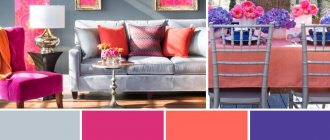
Lilac and violet
Lilac and violet colors are a special group of colors. A cool palette is obtained by combining pink and red shades with black or white. The result of coloring is interesting shades intended for painting any surfaces:
- lilac;
- eggplant;
- lavender;
- lilac color.
Orange
Orange color belongs to the category of warm shades. Orange color is obtained by combining yellow and red colors belonging to the main palette. The color intensity can be adjusted by changing the proportions of the primary colors. If you add white to the orange color, the result will be the appearance of interesting options: melon, coral, light peach.
See also
How to paint polymer clay, top 5 compositions and application rules
Earthen
The brown color in the traditional palette is called burnt umber. Using a color wheel with a base in the form of burnt umber allows you to obtain a variety of shades: from beige to wood.
The dark brown color is obtained by mixing burnt umber and a portion of black color. The beige shade, which is often used by residential decorators, is achieved by combining brown with an equal amount of titanium white.
Range
Paint mixing tables are usually presented as a matrix of rectangles or squares or as schemes of shade combinations with numerical values or percentages of each color component. The fundamental table is the spectrum . It can be depicted as a stripe or a circle. The second option turns out to be more convenient, visual and understandable. In fact, the spectrum is a schematic image of a ray of light decomposed into color components, in other words, a rainbow.
This table contains both primary and secondary colors. The more sectors in this circle, the greater the number of intermediate shades. In the picture above there are also gradations of lightness. Each ring corresponds to a specific tone. The shade of each sector is obtained by mixing neighboring colors along the ring.
As a result of mixing two colors, we get the colors: purple, orange, ocher, pink, brown, etc.
Table of mixing two colors
Fashionable colors, how to get them
Again, three pigments will be needed in the primary colors and black, which we mix:
- BROWN = BLACK + ORANGE
- OLIVE = BLACK + YELLOW
- BURGUNDY = RED + BLACK
- HEather = BLUE + RED + GREEN + WHITE
- AMARANTH = RED + BLUE + GREEN
- SALMON = YELLOW + ORANGE + RED + BLUE
As you can see from the examples above, it's all in the details, many colors are created from compositions of the same colors, and yet the shades are different.
Depending on the proportion of colors added, the color will have a different shade, which we can also change by softening the white, darkening the black or breaking up the gray, warming it up or making it cooler.
Getting the right color after familiarizing yourself with the color wheel, base and derived colors is easy. However, this is just the beginning, there are many shades of the same color on the color wheel from pastels to rich fiery, dirty and very dark.
We will obtain darker shades of the resulting color by adding a little black pigment to the finished color (this action is best done with a pipette, since black is a strong color that quickly breaks colors).
How to get additional colors
In selecting the right color, in addition to pigments, it is worth buying the right amount of white paint, to which pigments of the desired color will be added. Before you start searching for the shade of your dreams, you must create a black color from the pigments already obtained, thanks to which you can darken the shade from one to several tones.
To obtain black pigment you need to combine:
- BLUE + YELLOW + RED = BLACK
This is the stage of creating a new interior at which you should not improvise; it is much safer to rely on proven methods.
How to create a dream shadow on the wall yourself. White paint and pre-prepared black pigment come to the rescue. The final color will depend on them.
We get pastel colors by adding white paint to the finished color (white paint + prepared pigment), which in this case we apply gradually, since it should only change the shade.
We obtain colored colors by adding gray pigment (black pigment with white paint) to the finished paint.
Primary and secondary colors
Although it is sometimes difficult to imagine that all existing colors are created from only three primary colors. The following primary colors are historically determined in architecture and art:
- yellow;
- red;
- blue.
When looking for the perfect color, there are enough pigments in these three colors to conjure up any color, even the most complex one.
From the primary colors at the first stage of mixing we obtain derivative colors:
- BASE COLOR + BASE COLOR = DERIVATIVE COLOR
- RED + YELLOW = ORANGE
- RED + BLUE = PURPLE
- BLUE + YELLOW = GREEN
We call both the primary colors and the derivative colors obtained from them pure; they are rich and sharp.
If we mix primary colors with derivatives we get a broken gray color, in professional terminology the primary colors associated with derivatives are said to complement the gray color as the resulting colors are really gray and dull.
This combination should not be used to obtain a gray color, as the effect will be far from expected.