What colors of dyes should you purchase?
Back in school, during art classes, they taught tinting lessons when they said that when you mix red and yellow you get orange, and when you mix blue and yellow you get green. It is on mixing a variety of colors that a special artistic table for obtaining additional colors is based. According to this table, to create the necessary palette it is enough to purchase acrylic dyes in 7 colors:
- red;
- pink;
- yellow;
- brown (burnt umber);
- blue;
- black;
- white (titanium white).
These paints are quite enough to obtain the desired color by mixing. It is enough to use an art table and, by mixing paints, get the desired shade of color.
What you need to know about the palette?
What is a palette? This essential artist's tool is typically made of wood, plastic, ceramic, or other hard, non-porous material. Palette sizes and shapes can also vary greatly. The most popular is the oval version, made of wood and designed to be held in the artist's hand. Watercolor palettes are most often made of plastic or porcelain.
What do you need to know about this essential oil painting tool for an artist? The paint palette is probably one of the most iconic symbols. It is often taken for granted, but it is one of the most important tools for painting.
How to work with a table
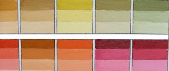
Working with the table does not present any great difficulties; it is enough to find the desired color in it, and next to it it will be indicated which paints need to be mixed to obtain the desired color. For example, you need olive-colored paint. If you look at the table, to obtain this color you need to mix yellow and green.
Everything seems to be simple. But the table does not indicate the ratios of dyes, only the names of the colors needed for mixing are given. Then what should we do? Like everyone who works with different colors of paints, you will have to develop your own color sense, which helps you choose the color in the required proportions.
Acrylic paint mixing chart
For beginners, we can advise the following:
- To create the required tone, add the tint color to the base in small portions and check the result on an unnecessary surface.
- Even if the color shade as a result of tinting seemed correct, you should not immediately take on the main drawing when remixing the paint that ended during the process. It is better to wait for the control smear to dry. When drying, the color may change slightly, and then it will be necessary to carry out additional tinting of the color mixture.
When drawing, you can use a universal table suitable for working with dyes on any basis, or you can use a diagram developed by craftsmen who prefer to work with acrylic paints. But no matter what method is used, only mixing experience will help develop the necessary color sense that helps in choosing color relationships.
Palette - what is it?
This word actually has more than one meaning. Several definitions can be given:
- This is a thin board or slab (traditionally made of wood) onto which the artist lays out colors and mixes them.
- This is the range of colors used by an artist for a particular image.
- In a figurative sense, this is a set of expressive means of the artist (writer).
Nowadays there are many types of palettes available in the market for oil painting. They are made from a variety of materials, from wood to plastic. As for shapes and sizes, this is just a matter of personal preference, since there are many options in this area as well. Both before and today, the oval wooden palette is considered the most traditional.
Features of working with acrylic dyes
Masters who prefer to work with acrylic dyes to create artistic masterpieces have developed a special mixing scheme. This scheme can be divided into parts according to the creation of the desired tones:
- light;
- dark.
By mixing different tones, it is possible to obtain the following color shades:
- green;
- lilac and violet;
- orange;
- earthen.
Enough for drawing? Well, it’s now worth considering the rules for mixing different colors to create each tone.
Light
Titanium white is used as a basis, and color is added to it in small portions. The less tinting paint is added, the lighter the shade will be. In this way you can get all the light shades of the palette.
Dark
Dark tones are created a little differently: black is added in small quantities to the main palette. In this way you can get any dark tone. You just have to be careful when adding black, otherwise you can create a dirty brown color instead of the desired dark brown color. However, even if the first result is unsuccessful, the second and subsequent ones will be much better, because experience comes with practice.
Having created the necessary tones, you can create the necessary color scheme by mixing different shades.
Green color
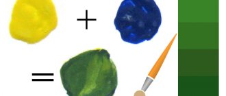
There is no green color in the palette of paints required for purchase; it will first have to be made by mixing blue and yellow, and the shade and further tinting result will depend on the initial ratio of the dye. What proportions to take can only be determined experimentally by mixing colors. It’s difficult to even describe all the options for color combinations, there are too many of them. You can find them in the artistic color chart, which should become the best friend of every artist and decorator.
Lilac and violet
These cool tones can be made from blue dye by mixing it with light pink paint (mauve) or a red tint (purple). You can add black or white to the resulting compositions to obtain a variety of shades.
Orange
If you mix red and yellow in different proportions, you can get an orange color, and its saturation will depend only on the original color ratio. If you add white to the result, you can create shades such as melon, peach or coral.
Earthen
Burnt umber, mixed with all components of the color palette, allows you to get a wide range from beige (a mixture of white and brown) to dark wood (brown and black).
Drawing techniques
So, now that all the tools and materials are prepared, it's time to start learning basic watercolor techniques.
Working with a flat brush
It is best to attach a sheet of paper to a tilted easel; this is necessary so that the paint flows freely from the top layer to the bottom and the fill is the same throughout the entire fragment.
- Draw the outlines of the drawing with a hard pencil.
- Load up the paint with a brush and paint over the design, moving from one contour to another. Start at the top and work your way down layer by layer. The lines should be smooth and straight.
- Try to slightly overlap the previous layer.
- Having completed the last line, rinse the brush, squeeze it out and pick up any remaining clumps of paint on the paper.
The work can be left to dry at an angle, and then original effects will appear on it.
Dry brush
The essence of the technique is that more coloring pigment is applied to dry paper than water. Usually they draw in this way on paper with a pronounced texture - fin or torchon. The technique perfectly conveys the structures of various materials, such as wood or fabric.
Hair color and appearance color type
Spring-type women with blue, gray and less often brown eyes and light golden skin will look great with delicate sunny shades of hair. In the palette they are between honey and sandalwood tones.
For the summer type of woman , whose skin is characteristically pale, hair is straw or light brown with ashy notes, and eyes are light brown, olive or gray, colors with cool shades, for example, platinum, golden wheat, etc., are more suitable in the new season. to silver-brown.
For autumn-type women with warm skin tones, reddish curls and bright green, dark olive and amber-brown eyes, paints in reddish tones are needed: copper and chestnut of varying intensity.
If a woman has a winter type and has white skin, dark hair, and brown, green or bright blue eyes, she does not need purple strands in her black hair. Ash-brown and bluish-red tints in the hair are suitable, which will decorate the appearance.
Fashionable tones also apply to those who are going to do highlighting or coloring. Nowadays they prefer dotted, filigree coloring with an imperceptible transition of shades.
Presence of a letter in a digital code
Some companies indicate the direction of paint color with letters and the depth of tone with numbers.
Letters correspond to colors:
- C – ashy;
- PL – platinum;
- A – intensive lightening;
- N – natural;
- E – beige;
- M – matte;
- W – brown;
- R – red;
- G – golden;
- K – copper;
- I – intensive;
- F, V – purple.
Examples of code decoding
The color indicated on the Palette paint box is “golden coffee cream”. Code – WN3. Here the letter W refers to the brown direction of the color, the letter N refers to the natural color. The golden pigment can be judged by the number 3. As a result, we are talking about a natural warm brown color.
There will be no annoying disappointments if you learn to navigate the conventional digital symbols of the palette of professional paints from any manufacturer.
Examples of decoding digital codes
For example, let's take the digital code 8.13. The box will indicate that this is a light brown beige paint.
Let's decrypt:
- the number 8 indicates a light brown natural color range;
- The number 1 indicates an ashy shade with a blue-violet pigment. Cool pigment will be 75%;
- number 3 will add a little warm golden tint, which is half as much as a cold one - 25%.
Another example: the digital code is 10.02. The box will indicate "light brown delicate color."
Let's decipher the code:
- number 10 is the tone of a light blond;
- 0 after the dot – indicates deep natural pigment;
- 2 – green pigment of the matte series. It indicates a cool shade of paint. There are no yellow or red undertones here.
Zeros after the first number and dot indicate that the paint has a deep, bright and rich natural color (for example, 1.00).
If the additional shade and subshade are indicated by the same numbers, then the pigment is concentrated. For example, in the name of the shade there are two numbers 6 - 10.66, then in the natural tone of a light blond there is a rich purple pigment.
