A variety of colors can be used to decorate rooms. When they want to get a luxurious interior that will emphasize their status, they often resort to choosing a burgundy color. But the required effect can be achieved if the paint and varnish material is selected correctly. If you need to highlight only individual details, then it is not always advisable to purchase a whole jar of a given shade; you can use a mixture of paints to make the required amount, and not waste extra money. How to get burgundy color will be discussed in the article.
Shades of burgundy - variety
Since ancient times, burgundy has been considered the imperial color; it was widely used in heraldry and symbolized strength, dominance, power, generosity and piety. Now shades of burgundy are used in the design of apartments and houses, and in creating a wardrobe. Confectioners love it, using special food colors for mixtures and creams.
When mixing paints and gouache, you can make different shades of burgundy. They can be cold and warm, light and darker, depending on the set and number of components. Here are the main burgundy tones:
- Marsala. Pastel burgundy is very fashionable in clothing and interior design. Brings nobility, grace, luxury.
- Sangria. The name comes from the wine drink of the same name (sangria - Spanish wine with pieces of fruit). It is a soft burgundy with hints of violet and lilac.
- Burgundy. This is a dark burgundy color, very rich, looking incredibly impressive.
- Carmine. This shade is red-purple, light, and is also widely used in interior design and art.
- Falun red. Another variation of dark burgundy. Paint with this name is used in Scandinavia for painting houses.
Artists also highlight other shades of burgundy - wine, garnet, ruby, maroon, burgundy rose, mahogany, berry jam, strawberry jam, red orchid.
A bit of etymology
The color “Bordeaux” gets its name from a variety of French red wine. In Slavic etymology it was called “chermny” or, more precisely, “chermny na new”, which meant the best or the best. It is no coincidence that Bordeaux is the color of triumph, nobility, rich vital energy, and passion. That is why it was often used in heraldry and clothing of emperors of all times, starting with the Romans.
In Chinese philosophy, red shades are used to expel negative energy. It is for this reason that red wedding dresses are sewn for the bride, and red eggs are presented to newborn children.
Instructions for making burgundy color
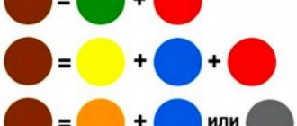
You can get burgundy by mixing colors in different ways. The classic option is a combination of red and blue shades. To avoid a purple tone in the end, you must strictly observe the proportions of the dyes. You need to take 4 portions of red color, dilute it with 1 portion of blue. Both components must be mixed thoroughly until the veins disappear. Here are the variations for obtaining such paint:
- adding a yellow color will make the tone warm, soft;
- introducing bright scarlet paint instead of red will help create a very deep burgundy shade.
Similar experiments can be carried out not only with gouache, but also with watercolors, oils, stained glass paints, tempera, and fabric or food dyes. The best blue colors to use are ultramarine, dark indigo, and Prussian blue. You need to be careful with the introduction of yellow. If you add too much of it, the color will turn out dirty, brownish. Red should predominate in burgundy, whatever shade the master requires.
There is another option for getting burgundy. To create a cool tone, you need to combine red, a little brown and a drop of black. The result is a very dark shade, which is diluted with white to obtain the desired color. Watercolors can be diluted with plain water. Also, instead of blue, some artists add dark blue to the red color scheme. This allows you to create warm burgundy tones.
Can this shade be achieved by mixing certain colors?
Many novice artists think about how to get burgundy color when mixing paints. This is quite easy to do. You need to take red, yellow and blue colors. They are basic and are present in any drawing kit. In order to get a noble shade of burgundy, you will need about three parts of a light red shade, one part of a muted blue color and just a little yellow. This will be quite enough.
Read also: How to make chipboard from sawdust with your own hands
There is another way to obtain burgundy color. To do this you need to take scarlet, brown and dark red paints. If you mix them, you can get a warm and slightly muted shade. To achieve a cooler color, just add black, dark brown or dark blue when mixing. This will eliminate the warmth, and you will end up with an aristocratic, cold burgundy.
Combination of burgundy and other colors
The combination of burgundy and black is considered classic, although in clothing or interior design such an image may seem gloomy. It is better to additionally use any pastel shade that will dilute the dark tones:
- beige;
- light gray;
- pink;
- silver;
- pearl;
- lavender;
- peach;
- olive.
Burgundy looks very interesting with gray, catchy, bright with white. In the style of an apartment or in painting, it is recommended to use burgundy and light colors equally. Burgundy and blue, gold, and silver enhance each other’s brightness, with the last two options imparting grandeur and solemnity. Unusual, effective combinations are burgundy with green or yellow, although such tones can oppress each other, you need to be careful with them.
Varieties of Bordeaux
There are different shades of burgundy, some shades have more lilac or violet, this is a soft shade. The dark burgundy color looks very impressive. The shade of carmine is delicate, often used in art, as well as to create an elegant interior. Falun burgundy is a version of a dark shade that is most often used in renovation and construction.
Maroon color is often confused with chestnut. This is also a natural shade of burgundy. It differs from the classic one in its depth and unusualness. There are varieties such as pomegranate, mahogany, wine, ruby, orchid, strawberry jam.
Bright burgundy is energetically strong, it attracts attention, gives confidence, and attracts risk. The fashion for Bordeaux is due to the fact that it personifies respectability, wealth, a high standard of living, and expensive surroundings. Allows you to stand out, stun and emphasize your high status.
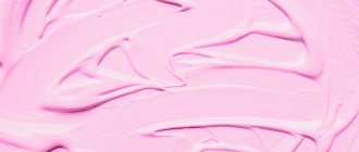
Getting pink is just as easy.
Shades of burgundy in the interior
Lush classics in apartment design are often emphasized by burgundy in combination with gold. The most expensive hotels inevitably have such a range; it is also appreciated in rich houses of the East. Also, in various styles, this color is used to emphasize certain areas. For example, wine-red curtains in combination with a light veil look good. Burgundy is also appropriate for sofa covers, furniture upholstery, and decorative pillowcases.
The color sangria is used in the design of girls' rooms. It is combined with white and light pink, used for the manufacture of furniture and textile facades. In the kitchen, burgundy is combined in the interior with coffee, white, beige, and terracotta.
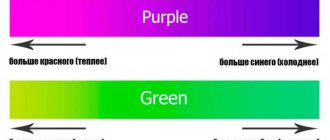
Variety of green
The original green is usually presented in all sets; if the required dye is not available, there are no problems obtaining it. Pairing yellow with blue gives the desired green background. But any direction of creativity, be it painting, interior design or another option for decorating objects, requires a wide palette of green. The basic principle of all experiments is to change the proportions of the base colors; white or black dye is used to lighten or darken the background.
- The combination of blue and yellow with a small addition of brown represents khaki. Green with a small amount of yellow forms olive.
- Traditional light green is the result of mixing green and white. Adding yellow or blue will help regulate warmth.
Attention! The quality of the starting components affects the saturation of the green color. The more intense the base tones, the brighter the blending result will be.
- A yellow-green effect can be achieved by combining yellow and blue in a 2:1 ratio. The inverse proportion will result in a blue-green tone.
- Dark green color is achieved by adding half the amount of black.
- A warm light green background is formed from a mixture of white, blue and yellow paint in a 2:1:1 ratio.
The circle demonstrates a variety of green colors. The base dye is located in the center, followed by the additional component, and then the result of mixing. The last circle is experiments of the resulting tone with the addition of white and black dye.
The next table will become an assistant when conducting experiments.
Tips and tricks
When decorating the interior, you need to immediately calculate the area that is supposed to be painted. Self-tinting should be carried out in one stage, because it will be difficult to produce a new batch of paint with exactly the same shade. It is advisable to think through the interior in advance so as not to overdo it with burgundy or make the room too dark. In branded stores, any tone can be selected from a catalog, so if in doubt, it is better to use automatic mixing of colors with the main composition. This guarantees high quality repairs in the apartment.
How to mix colors - video
Modern interior design is full of original shades. The range of finished products does not always contain the required halftone. The color mixing table will help you get the desired result at home. The information will be useful not only when renovating an apartment. Knowledge about mixing colors is useful to a wide range of people: novice painters, auto repair workers, decorators and other creative people.
Secrets and nuances of modeling from plasticine
- If you take a soft and warm piece of plasticine, it is much more convenient to work with than cold one. However, the cold one holds its shape very well. If you want to keep a figurine that your child made as a souvenir or you need to take it to kindergarten/school in the morning, then feel free to put it in the refrigerator, or better yet, directly in the freezer. In the morning you will get almost a stone figurine. You can safely take it where it should go.
- Before you start sculpting, hold the piece in your hands for a while. This way it will heat up and become much softer, i.e. It will be much easier to sculpt from it.
- If you need to attach any thin detail to the main figure, and it is already ready, do not rush to do it right away. Let it sit on clean paper for just a few minutes. It will cool down, become much harder and you won’t have to worry about it getting wrinkled while you were attaching it to the right place.
- When sculpting, it is important to remember that plasticine stains objects very quickly and very easily. But he himself gets no worse dirty. Specks of dust, lint, small pieces, etc. stick to it incredibly quickly. For this reason, it is not recommended to sculpt directly on the table (you don’t want to buy a new table or change the tabletop), but neither do tablecloths, napkins, etc. They are also not suitable for this. From them, your piece will very quickly become covered with small lint and other particles. It is best to use a smooth board made of plastic or a thick sheet of pure white paper for sculpting.
- In addition to collecting debris, it sticks very well to your hands. If you have just sculpted some figure or part from, for example, a black piece, you should not immediately start sculpting from a light color. Otherwise, it will almost immediately get a black tint. After working with any color, hands and tools must be washed well and dried thoroughly.
- It washes off hands quite poorly. Even warm water and soap are not enough to remove all traces. After washing, it is important to dry your hands and tools well to remove all traces of water. If you take plasticine with wet hands, then both it and all the crafts made from it will get wet, stop sticking to each other, and the whole figure will simply fall apart.
So, these are all the main nuances of sculpting. Now you can move on to the secrets and rules of mixing colors. On the one hand, the palette of purchased plasticine may seem sufficient. On the other hand, it is very limited. Of course, no one forbids sculpting a bright blue horse (let it be magical, fairytale-like) or a pink elephant, but quite often you need exactly the color/shade that is not in the box. It's quite easy to get it. You just need to mix the colors correctly and below is a palette of mixing rules.