The green color scheme in the interior of the house maintains an atmosphere of optimism - this is the property of this palette. Pistachio, refers to complex, composite flowers. The color of young greenery, the joyful awakening of nature, filling with life, such emotions are evoked by green colors in the house. It is pleasing to the eye and the desire to get the desired shade pushes many to experiment with coloring. How to mix paints and get the coveted pistachio color for the walls of your living room, kitchen, bedroom, in short, in those places where you most often visit? Simple and difficult at the same time. You need patience, time, inspiration and a photo of the ideal interior design for you.
Methods of mixing paints
There are several separate techniques that will help you mix paints to get the perfectly planned shade. Let's look at each of them.
- Mechanical. To implement this option for mixing paints to obtain pistachio, just take one container in which to mix several shades using a whisk or electric mixer. But for this it is advisable to use exclusively construction tools.
- Optic. This option is more complex. It is suitable for those who are well versed in the specifics of paint preparation. To check whether the shade has been chosen correctly, you need to make a smear directly on the wall and determine what needs to be added and what can be removed.
- Color overlay. To do this, you will need a separate wall, onto which the tones that are supposed to be mixed are applied separately. As a result, on the wall you can definitely understand what shade is missing in order to get pistachio.
Mixing paints is a rather responsible process, so it must be carried out in one way, otherwise defects are possible that will be visible not only during application, but also when the paint layer dries.
Pistachio living room with nice painted walls Source severdv.ru
On a note! The simplest selection option is to purchase the desired paint option and match it with the interior features.
How does pistachio combine with others?
Self-prepared pistachio looks good in the interior with other shades. Each of them creates an individual color scheme, which aims to slightly dilute the existing design.
- Pistachio plus white. This composition looks original both in kitchens and bathrooms. This combination visually expands the space well. Therefore, such a palette is ideal for small rooms.
- Pistachio and gray. An equally promising combination that can be obtained by combining one shade with another in the interior of a room. The declared palette fits perfectly into a bedroom with large panoramic windows.
- Brown and pistachio. These combinations are characterized as natural and, accordingly, are considered promising. If a similar plot of tones is observed in the interior, then it will look as realistic and natural as possible. Accordingly, it will promote mental balance.
- Yellow and pistachio. When organizing an interior using the stated shades, it is necessary that the room has sufficient area. Moreover, each of the tones must play along with the other. In other words, they try to use them not in equal proportions.
- Peach and pistachio. This is an original tandem, which is most often used to organize a living room. Thanks to the chosen combination, you can create a fresh interior with a consistent, unusual decoration, and here you can easily create an emphasis on any of the objects.
- Pistachio plus turquoise. Children's rooms, bedrooms, kitchens, and bathrooms look very original in this design. The interior design will not turn out to be banal, but, on the contrary, will emphasize modernity and a sense of taste.
Decorating a living room using pistachio and light pink paint Source postroika.biz
Painting walls with pistachio paint looks great in modern interior types Source dizainvfoto.ru
Pistachio in the interior of living rooms
The interior with a predominance of pistachio gives freshness to the room and completes the chosen stylistic solution. This option is perfect for an ecological interior style, since this type of arrangement is original and distinguished by freshness and naturalness.
This shade looks good in the kitchen, where it evokes emotions and awakens the appetite. But the interior of the premises can be designed in various variations, let’s consider them in detail.
- Light pistachio paint - this design option is more suitable for a bathroom, kitchen or bedroom in a delicate interior style. A similar palette is originally combined with brown, beige, and gray tones in the interior. The chosen palette perfectly emphasizes the modern interior style, minimalism, modernism. Looks good in classic and Provençal style.
- Pistachio wallpaper is an equally popular option for wall cladding, which is typical for use in bedrooms, living rooms, and recreation rooms. This type of finish is selected individually. If it is difficult to choose wallpaper to match the appropriate tone, then choose canvases for painting, onto which pre-diluted colors are applied.
- Pistachio colored tiles. This option is available for use in the interior of a kitchen or bathroom. The shade using the selected material turns out to be quite delicate and traditional. In addition to the main light green shade, the most successful combinations with it can be used: beige, brown, gray, white. Moreover, all these details can be used in the functional space area.
Pistachio in combination with beige in the bedroom interior Source www.pinterest.ru
We form pistachio color with our own hands
Let's answer the question of how to get a pistachio color by mixing paints in different ways. As a result, he is cheerful, peaceful and calm. It’s not for nothing that famous designers and fashion designers began to use this shade option. Let's look at how mixing is done and what basics contribute to this.
- Preparing the tones. For this we will need yellow, beige, green, gray. They will help create lightness and concentration. Lightness helps determine how much white there is in the intended hue, and contrast, in turn, helps determine how close the hue is to a gray tone.
- To start mixing, choose the standard green and yellow. Only we do not choose options that are too bright in tone: herbal, canary, light green, ocher and others.
- By mixing these two tones together, we get a fairly contrasting shade of the palette. But it will have to be toned down. To do this, add a little gray and definitely white or beige color.
- Next, it remains to adjust the number of tones that form monochrome green (pistachio). Checking the intensity of the finished tone. We make sure that the resulting color option matches the selected palette.
Mixing options depending on paint type
Painting compositions that are used in the interior can have different bases. Accordingly, mixing should be done using those tones that have an identical composition.
Oil paints
Oil-based coloring compounds are the most fluid, so when diluting them you need to be careful and not overdo it with colors. Moreover, when diluting gray green and beige, it is necessary to thoroughly mix. You may need to add more light tone. Thanks to the oil base, the tone will be more uniform and will be convenient to apply to any oil compositions.
A delicate pistachio shade that can be seen in kitchen furniture and creates an excellent accent Source mystroypro.ru
On a note! If there are streaks in the paint when mixing, there is no need to try to eliminate them. When painting various surfaces, an interesting decorative effect is obtained.
Acrylic paints
Acrylic-based paints are quite popular and effective. Such compositions look good both on walls and on pieces of furniture. Such compositions are quite easy to work with. To prepare a pistachio shade based on them, just carefully and in equal proportions mix the green and beige shade. As a result, we get an original composition with excellent water-repellent properties. To determine the color of the paint that was obtained by mixing, you need to dip the edge of the brush, and then paint a fragment of the wall or any other surface with the resulting composition.
Painting walls with pistachio paint diluted at home Source mrrestavrator.ru
Important! To get a translucent pistachio color of paint, you need to use a thinner consistency to dilute the base tone with white spirit, gasoline or a specially designed solvent. It is advisable not to do this with ordinary water. Since the coloring composition will lose its properties.
How to Get the Right Paint Color: A Step-by-Step Guide to Each Shade
In addition to the fact that we have certain paint colors, there are also a huge number of shades. And if the material can be chosen ready-made, then the palette has to be prepared separately, and often with your own hands. To obtain the desired material, you will have to mix it, and for this you need to have at least a basic understanding of how to do this, and what principles lie in obtaining the desired material.
Photo of the variety of palettes offered today
Rules for mixing paints
Each shade has its own dyes that must be combined to obtain it. Let's talk about the most fashionable and popular aspects of choosing paint colors in design, decoration and renovation today.
For example, we are interested in how to get gray paint.
It’s interesting, but even such a simple moment of a new color scheme, as it might seem at first glance, can be of two types:
- Warm . For a warm “mood” you can mix light ocher, umber or natural sienna.
- Cold . In this case, add a small amount of green or blue dye to the mixture.
The instructions for making a simple gray are to mix white and black paint in certain ratios and proportions. It all depends on whether you want a lighter gray or darker gray look in the end, but where and how to apply it is a matter of interpretation.
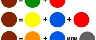
The situation is much simpler with the question of how to get black from paints. There is no longer any question of dividing into a warmer or cooler look; after all, black is presented only in one direction.
Black walls can be very original
To obtain it, it is recommended to mix three dyes: green, blue and red. The main thing is that they should be presented in equal proportions, then the black color will be obtained.
Interesting and fashionable shades
In addition to simple varieties of gray and black, there are also fashionable colors, such that can be used as a final finishing color.
Accordingly, let's talk about how to get pistachio paint color, which is used in large quantities to paint many rooms, but it looks best in the bedroom, where it creates an atmosphere of calm and comfort. To obtain it you will need to mix green, yellow and beige.
Pistachio tones in the bedroom
Advice! Here you can give pistachio shades lighter or, conversely, darker by adding white dye.
By the way, if you stay in the bedroom, olive and peach are also suitable for this room, these are the cutest varieties. Let's look at how to get olive-colored paint. Here you also cannot do without several paint and varnish proposals.
- Yellow, pure according to the color chart.
- Green with a hint of white. In this case, light green is needed, and you can get it by adding white paintwork materials to green. The amount of white dye you add will determine what you end up with.
As for how to get peach paint color, here we will clarify a simple detail. Peach is closest to orange, so we will need to use red and yellow dyes for the shade.
The perfect peach for the bedroom
Important! And then everything gets more interesting, because the peach may not be ripe! To choose this direction, you can simply add a little green dye, and if you need overripe “fruit,” you can add more red.
Shades for children's rooms
When choosing a palette for a children's room, you must follow the recommendations of psychologists.
Here the palette must perform several functions at once:
- Create a feeling of comfort.
- Calm down.
- Help develop intellectually.
From this point of view, it is necessary to know how to obtain flesh color from paints, because it may be the priority for painting a nursery.
At the same time, you can get not one, but four shades of flesh, and here’s how:
One of the nude shades for the nursery
- First you need to prepare the base, and for this you mix yellow and purple material, after which you get a rich orange.
- Now, to obtain a light shade, white is added to the base mixture.
- If you add a base mixture to white paint, you get a medium nude palette.
- By adding purple to the base color you can achieve a dark look.
Advice! The darkest of the resulting types of dye is not used for the nursery, but if you want to use it in another room, then just add a drop of black and you get the desired palette.
Unusual shades for the living room and hallway
When it comes to unusual combinations or palettes, you can always suggest how to get a coral paint color. Why unusual? There is simply no such concept and such a palette in nature. Corals have a huge variety of colors, but the most standard, due to its prevalence, has become red, which is why the coral palette is close to it.
To obtain the desired palette, just mix orange, white and red dyes. It's almost the same as getting a terracotta paint color, it all depends on the proportions that will be used.
Terracotta in an apartment can be represented by painting the walls
In principle, the selection of colors remains almost the same, and if you need to understand how to get a mustard color of paint, there can be a certain relationship between red, orange, yellow dye, which in a certain proportion with white give all kinds of shades.
In relation to the room, indeed, in the living room and hallway, these shades fit quite well and harmoniously into the general trend with furniture and flooring.
In addition, if the palette you ordered will be obtained using computer tinting, then the price will be slightly lower than if you mixed the paints yourself.
Often in the bedroom, let's return to it again, a part of the green is used, the so-called mint.
Since mint paint color can only be obtained by tinting, let’s determine its composition:
Mint room in every way
- Blue, almost any saturation.
- Yellow, not to be confused with orange only.
- White.
Here again, depending on how to distribute the proportions, the final material will turn out, lighter or darker.
Advice! The main thing that can be said in the form of advice is that the easiest way to achieve varieties is not on your own, but in a store when buying paint. Here they will explain to you how to get gray paint, for example, and mix it.
Gray reality in high-tech style
Conclusion
It is not difficult to mix dyes to obtain a specific variety. But you need to understand that when mixing yourself, you can only achieve a certain color once, and if there is not enough paint for coloring, then the second coloring will in any case give a slightly different tone.
Therefore, it is important not only to mix dyes, but also to calculate their quantity for a certain area. The video in this article will help you in some issues, both tinting and volume calculations.