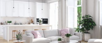
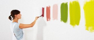
Interior designers call a paint test a paint job. It is needed to understand how a particular shade will look in the interior at different times of the day and under artificial lighting. Also, with the help of painting, you can evaluate how well the shade you like combines with other finishing materials, furniture and decor (if you already have them). In this post, we explain how to do the coloring correctly, so that you don’t overpay for mistakes in working with color later.
What are paints
These are samples of paint that demonstrate its color characteristics. They are usually made on a paper, cardboard, plasterboard or wooden surface. Samples will help you not only decide on the color tone, but also avoid surprises, because the color in the picture in the magazine can be very different from the final result on the wall.
Some companies offer customers a convenient service for preparing such samples in the form of painted sheets for an additional fee. But if you wish, you can make samples yourself by purchasing mini-jars of the paint you like in advance from a specialized store and preparing the base.
Where to get paint colors
Before you buy the entire amount of paint for repairs, it is recommended to test it, that is, paint it. Some stores selling paints and varnishes offer their customers ready-made test samples made on large cardboard sheets. True, you will have to pay for the colors.
It is better to buy paint from paint and varnish manufacturers engaged in commission trade. Such enterprises can provide trial samples free of charge. If you can’t buy or borrow paints, you can make them yourself.
Why are paints needed?
Many companies provide free ready-made fans with visual thumbnails of the color palette they produce. But the difficulty lies in the fact that it is difficult to objectively evaluate the color in a small area, because in practice it will look completely different on surfaces of impressive size. The planned color may actually turn out to be richer, lighter or, conversely, darker.
You can often come across a recommendation according to which you need to buy paint 1 tone lighter than the one you liked in the manufacturer’s catalog.
Unfortunately, the advice is not universal, because such individual factors as glare from nearby houses of bright colors, the quality of artificial lighting indoors, additional lighting, floor and ceiling decoration, adjacent furniture, textiles, as well as the amount of light penetrating can play a role. from the windows.
Why is on-site painting necessary and how is it done?
No matter how perfect the rendering of paint and varnish shade may be on the pages of a catalog or on a fan painting, its perception by a person in interior design will be different. Successful color scheme of a room also depends on external factors:
- Which sides of the world do the room’s windows face;
- natural or artificial lighting predominates in the interior;
- the presence of high-rise buildings or large trees in the immediate vicinity;
- the rest of the decoration in the room, the color of the furniture and decor.
Read more about the rules for selecting and combining colors in the articles on our blog “Interior Design”.
How to paint correctly
Expert opinions on how to properly paint come down to the following general recommendations:
- samples must be viewed only in the room for which the finish is being selected;
- It is better to do the painting at a time when the remaining materials for repair are prepared - wallpaper, tiles, flooring, etc.;
- It is advisable to have samples of not only materials, but also furniture upholstery on hand;
- if possible, you need to evaluate the color in different parts of the room, under different weather conditions, time of day and lighting;
- It is not recommended to do such testing directly on the wall, since a layer of a new color may not cover the old one, and when painting wallpaper in multiple layers, there is a risk that it will simply begin to peel off due to its too thick thickness;
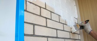
- for a textured surface (for example, a brick wall), it is better to apply paint directly to it, but first you must remove the dust and apply a primer.
It is worth focusing on the following key stages of making paints:
- Choose a color. Ideally, you need to choose several (3-5) similar shades.
- Purchase small sample jars. Each manufacturer produces samples of different volumes: from 100 ml (for designer products) to 1 liter (for simple brands).
- Make the colors on A4 or A3 paper, pre-attached to a sheet of drywall of the appropriate size. As an alternative to paper, you can choose smooth paintable wallpaper. Cover each workpiece with a special primer, and then begin applying paint. The number of layers and density can be adjusted depending on the desired brightness and richness of color. On the reverse side it will be convenient to sign which workpiece this or that paint belongs to. Each layer must be dried thoroughly. The advantage of this method is mobility: blanks can be moved around the room and placed side by side for comparison. And then you won’t have to re-plaster the walls.
- Compare results.
Factors influencing color perception
- Painting area. Red shades visually bring the wall closer, while dark shades visually raise the ceiling.
- Type of lighting. Repulsive shades may appear on a painted fragment under artificial light.
- Texture of the material. Shiny walls are easier to clean, and matte surfaces will hide roughness and minor irregularities.
- Combination with wallpaper, flooring, textiles.
The algorithm of actions is simple: before finishing the walls, you need to come to the construction site with paints and evaluate how it will look.
Concrete itself is dark, but from a psychological point of view there may be a desire to apply darker paint to it. It is optimal to take a meter-long sheet of drywall (how many shades - so many sheets), prime it with paint and only then paint it in the desired shade. It is important to take into account the number of layers recommended by the manufacturer and the time interval between paint applications.
Painting in a model from a shoe box
An original idea for recreating the layout of the room and selecting the required final color would be to use a shoebox. The idea is very simple - it should be painted in the chosen shade and evaluated under different lighting conditions. For clarity, you can cut out a “window”, with the help of which it will be easier to understand what the colors look like on each of the walls, taking into account the incidence of light rays.
Let's see how different colors combine in the interior
Very often we choose different colors for different rooms. To see the whole picture and evaluate the color scheme, print out the apartment plan in A1 format, and then paint each room in the color of your choice. This technique is a great way to visualize how different shades work with each other within the same project.
Cover photo: www.lilypebbles.co.uk
How much more expensive will paints make repairs?
The cost of such a process depends on a number of parameters, including:
- type and quality of interior paint;
- minimum volume of cans from the selected manufacturer;
- number of layers applied;
- number of shades to choose from;
- painting area.
In an effort to save money, you should not choose the cheapest paint. Successfully matching the tone with inexpensive materials is much more difficult. In addition, the coating with a more expensive imported color will be noticeably denser and of better quality; fewer layers will be required, which means lower consumption. Therefore, sometimes it is more profitable to purchase 10 liters of expensive consumables than 20 liters of budget ones.
Designer paints are often produced in small volumes of about 50-100 ml, which is usually enough for one color. But some shades have to be tinted. In this case, costs will be higher, since containers smaller than a liter are not used.
If you don't want to throw out a big can of paint and buy another one just because the wrong shade was chosen, be sure to do some pre-painting. Although such tests are not a low-cost stage of repair, with them you can be sure that the result will be exactly what is expected. For painting, you should use primed plasterboard sheets and several tones of high-quality painting material.
Wall colors - inspiration from interior design stores
Every year, paint manufacturers choose one of the shades as the most fashionable wall color for a room . If you're wondering how to paint a room to follow the latest trends, it's worth checking out the combinations prepared by paint manufacturers or interior design companies before making a decision.
The Pantone Institute has also already announced the color of 2021, choosing a classic blue hue, which is a traditional and calm color. This choice confirms a trend that has been present in the market for many years. It is a reflection of peace, security and stability, but also wisdom. It is a versatile color that is both relaxing and inspiring. For this reason, it is perfect for any type of interior.
The second leading color that has long dominated the interior design market is bottle green , announced by British paint manufacturer Graham & Brown as its Color of the Year for 2021. According to the manufacturer, the rich bottle green color is a reference to British gardens and is intended to create the illusion of bringing the green color from outside into the room.
About the paint recipe
Paintings do not always contain any one shade of paint or oil. We often mix colors to get a shade that best suits a particular interior element. When we combine different colors, we make sure to write down a recipe so that the painter who will work on the site can then repeat the desired color.
When we have done all the coloring and approved the color, we make sure to take a signature from the client on the sample that he approves this particular color, and we indicate its proportion. Next, we count the required amount of oils for the object in the jars and transfer all the information to the craftsmen on site - both the proportion and the application technology. Thus, we manage the project remotely or in person, coming to the site and giving any necessary recommendations so that the master completes the work efficiently.
This is very important for our company: we don’t just sell oil, but provide certain technology so that the master can get the best result with our material.
Do the colors of the walls in a room affect the mood?
The color of the walls usually serves a decorative function. The combination of specific shades gives the interior character , so the colors of the walls in the room acquire important symbolic value in a person’s life. In addition, they can affect the psyche, enhance positive or negative emotions, and even cause permanent mood changes.
What wall colors in a room evoke a positive mood?
Green is a color that will surprise no one. This color is associated with peace and relaxation . Dark green colors, such as bottle green, subconsciously relieve tension and stress. All shades of green, from light to dark, are suitable for both the living room and the bedroom, which should be a place of relaxation and tranquility.
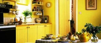
Gray color would also be a good choice , as it calms and relaxes the human body . For this reason, it can be successfully used in any home room, with the exception of the office, where yellow can be much better in inspiring and stimulating creativity. In addition, yellow revives a sense of organization and adds self-confidence.
Blue is the perfect color for a bedroom . Cool shades are good for sleep and can help with insomnia. After all, it is most often used in bathrooms, most likely due to its involuntary association with water.
Although the color blue has a positive effect on well-being, when choosing it as a color for a room, you must be careful not to overdo it with the amount and intensity because too much of it can have a depressing effect, which will be counterproductive.
Room colors to avoid
A color that should definitely be avoided in large quantities is black. Although it is versatile in itself and may be liked by many, in most cases it is better not to use it. But black lovers shouldn't give it up completely. By choosing slightly more muted tones of the walls in the room, it can be successfully used in accessories.
The second color of this type is red . Although it is associated with positive emotions such as love and passion, it can also cause great frustration . Staying in a room with such an intense hue is overwhelming and makes the human body get tired much faster than usual.
Stage 1. Sanding
To perform painting (as well as for subsequent work with wood on site), the wood must be sanded - the top layer must be removed. Even if the client says that he bought what appears to be a sanded board, in any case it must be sanded, because it is not known when and with what grain it was processed. So, in any case, we take the machine and sand the surface with 120 grit: only this will give us confidence that the board is prepared with high quality and the pores of the wood are open.
Then we carefully remove dust from the surface: we remove dust not with a damp cloth, but with a vacuum cleaner or dry rag.
Stage 2. Applying oil
Let's move on to the oil. We open the jar and thoroughly mix the contents, not just shake it! Since there is a lot of pigment (or wax, if we are talking about oils for interior work), it settles at the bottom, and we need to stir the whole mass until it has a homogeneous consistency, then the color of the paint will be correct. If the jar is small, we take any suitable stick; if it happens on site and the jar is large, then we use a construction mixer and mix everything at low speed.
We'll tell you how to apply oil to a prototype using the example of choosing a color for parquet. For example, we take parquet that has already been sanded and dust-free, and apply the products with a roller or brush. If it is tinting, then we apply it with pads made of non-woven material, which does not scratch the surface, and rub in the oil in a circular motion. If we need to cover a large area, we use machines with the same pads. For example, a 406 size circle is usually put on the Columbus machine, and the machine covers the entire area.
After application, excess oil must be removed with a rag and left to dry, usually until the next day. The manufacturer indicates a drying time of 8 hours, but sometimes this is not enough.
To make sure that the paint or the floor is dry, you need to take a rag (a white rag for a dark floor and, conversely, a dark rag for a light surface) and try to rub it in different places. If the rags are stained, it is too early to apply the finishing coat. If it is no longer painted, it means the surface has dried and you can work with finishing oil.
For example, for parquet we use Premium Hartwachsol hard wax oil. We apply it in 2 layers and always with a roller: this particular oil should never be rubbed with a rag. It is imperative to give a full wax layer and leave it to dry: usually it dries the next day, but the exact time depends on the temperature and relative humidity in the room. It is generally recommended to work with oils at +8°C and above. We applied the first layer, it dried, the second layer dried, and then applied the third layer with a roller and left to dry. For parquet oil with hard wax, complete polymerization occurs in approximately 6 days. If we have completed all the work, the next day you can already walk, but carefully, and do not bring in the furniture yet - for this you need to wait 6 days.