Turquoise is a cross between green and blue. His ability to harmoniously fit into the interior and clothing style was noticed by designers. Therefore, the presented shade has been on trend for several years. A dark turquoise shade in the interior can emphasize the individuality of the owners of the house, creating a unique design for almost any room.
Each color carries certain associative information. Therefore, when choosing dark shades of turquoise to decorate a room, it is necessary to study its properties and features. The right combination with other colors will also help make the interior harmonious and effective.
Features and effects on the psyche
The turquoise color is not only surprisingly attractive visually, but also carries a very specific message. Our distant ancestors were familiar with its power. Ancient beliefs say that the semi-precious stone attracts and preserves material well-being, and also symbolizes purity, purity and eternal love. Many Eastern cultures believed that color brought creative inspiration, independence and determination, as well as relief from many illnesses. Turquoise was primarily associated with the sensual and emotional side of human existence.
Read also: What is a parapet gas boiler
According to the Taoist practice of Feng Shui, the color turquoise embodies the ideas of wealth, attractiveness, luxury, and is also responsible for the eastern sector. By strengthening this zone with shades of turquoise, a person attracts good luck, prosperity and success. To enhance the eastern zone, it is not necessary to completely decorate the walls with this color; it is enough to simply include turquoise decorative elements in the interior. This could be: lamps, pillows, curtains, unobtrusive trinkets, a carpet, or pieces of furniture. At the same time, you can vary the shades and choose any of the options - from soft and delicate to deep and rich turquoise.
Today, turquoise is a very popular and relevant color scheme. Few people think about its mystical properties, and yet they prefer it, based on their own tastes and associations evoked by this palette. Turquoise can be called catchy and attention-grabbing, while remaining completely non-vulgar. This is a cool color, it gives off a pleasant freshness and coolness. Therefore, for most people, turquoise on a subconscious level evokes associations with sterile purity, which eliminates toxic attachments and unnecessary emotions. In general, shades of turquoise have a beneficial effect on the human psyche, relieving irritation, fatigue and stress.
Dark turquoise color matches
Dark turquoise is similar to the color of sea green. This is the least bright turquoise, it will also suit everyone, but representatives of the “summer” color type should especially take a closer look at it. Not intrusive, careful, soft, but at the same time expressive. Without focusing attention on itself, the color, first of all, presents you, highlighting your skin favorably, giving your eyes a blue-green shine or creating a contrast with brown eyes.
Dark turquoise is as versatile as turquoise.
As for jewelry, transparent stones of any blue, lilac, pink shades are suitable for dark turquoise; pearls, amber, agate, garnet, turquoise. Feel free to combine gold and silver with this color.
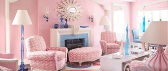
What color goes with dark turquoise? These are soft, not flashy tones. You might like combinations with coral, lilac-pink, raspberry-coral, green-yellow, light sand, chirp orange, blue-violet, lilac, light lavender, burgundy, lavender, thrush egg color, cream, light beige, silver, gold, bronze, brown.
Accessories
Decor plays a vital role in interior design. For the living room and bedroom, accessories are mandatory, and you can use 1-2 more colors for decoration. Good options for accessories would be:
- candlesticks;
- vases;
- paintings;
- figurines;
- posters;
- textile;
- carpets.
The best colors for decorating “turquoise interiors” are brown, black, silver, gold, as well as yellow, blue and green.
Combination with yellow-green shades
A dark turquoise interior can look gloomy if it is not complemented with different details and combinations. One of the winning combinations in this case will be the proximity to pistachio, olive or mustard shades. This combination gives the interior energy and cheerfulness.
It is best to use pure shades. Some designers argue about the advisability of using such colors in the interior. However, the smooth flow of dark turquoise into warm yellow-green shades pleases the eye. With the right approach, the room turns out to be spectacular, beautiful and interesting.
When combining these shades, you should avoid combining colors of the same saturation level. One of them must be dominant.
Bright combinations
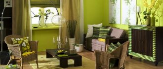
A dark turquoise kitchen or children's room will look interesting and bright in combination with warm and bright shades. Bright pink, orange, and yellow colors are good for this. Cool dark and light bright shades will make the interior interesting and lively.
In such combinations it is better to give the main role to turquoise. Orange and yellow shades should act as small accents. You can add beige or white to this interior. The combination of gold and dark turquoise looks harmonious. This is a luxurious interior worthy of the walls of a palace. However, it is important not to overdo it here. Everything should be in moderation so that the decoration of the room is done with taste.
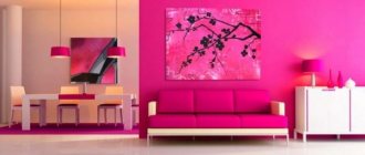
Red, pink and purple can be paired with dark turquoise. This is an advantageous combination for the kitchen. Depending on the style of the interior, all details are thought out.
Turquoise and blue
If you want to decorate a fresh interior of a living room or bedroom, you can give preference to a combination of dark turquoise with blue or blue. All shades should not be contrasting or bright. They should blend smoothly with each other. For example, if you want to set off dark turquoise curtains, a carpet, a sofa, you can place dark blue accessories against the background of such objects. This will highlight the play of shades well.
Blue or light blue should be a secondary color. They only emphasize the natural beauty of turquoise. In the living room it is allowed to use deep or bright shades. They can act as the main color for pieces of furniture and rugs. A large dark turquoise sofa looks beautiful in combination with the same curtains.
This combination will also look harmonious in a nursery. You shouldn’t decorate the entire room in these colors. It's better to leave them for accents. You can combine turquoise, blue with other bright colors. This contributes to the proper development of the child and proper rest.
Interior Design
Dark turquoise color has many advantages. It easily matches with almost all colors. Even different tones of turquoise can be combined in the same interior. This provides a wide field for the creative imagination of designers.
Dark turquoise can be used for interior decoration as the main color in combination with some other shades. With its help you can place small but rich accents. It all depends on the design style and preferences of the home owners.
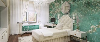
Dark turquoise color is noble and versatile. It can be found in many modern interior styles. It is used quite often to decorate a kitchen, bedroom, living room or bathroom. It doesn’t have to be a marine interior style. By using different color combinations you can create almost any type of interior.
Brown and beige
The combination of dark turquoise with brown and beige shades also looks very impressive. Do not use contrasting black or white shades. The interior in this case will be unnatural, oppressive. Smooth tints between brown, beige and dark turquoise will create an atmosphere of natural purity and freshness.
This combination looks elegant and laconic. This is expensive simplicity. There is no place for rhinestones and feathers. Turquoise itself looks like a jewel against the background of a muted design. To make the interior seem richer and more interesting, you can add simple patterns to the bedspread, curtains, and other interior elements. There shouldn't be many of them.
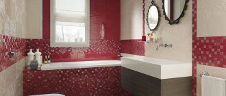
The presented combination is well suited for decorating a living room or bedroom. For the kitchen or bathroom it is better to give preference to other combinations. Beige shades will make the dark turquoise color noble and deep. When decorating in a marine style, you can combine turquoise with white and red decor.
general characteristics
Some people equate the color turquoise with either a blue or a green tint. However, this is wrong. This is an independent color that is as unique as the mineral that defines its name.
The dark turquoise color is associated with the expanse of the sea. He's very calm. Like the sea itself, turquoise shades remind a person of serenity, depth and spaciousness. This color exudes a pleasant coolness. This is a very beautiful shade. It's chill and relaxing.
Experts say that the presented color can relieve irritation and stress, restoring clarity of thought and calm. However, you should not use too many dark turquoise elements when decorating your interior. This may cause some discomfort. Therefore, it is necessary to correctly apply and combine the shade with other colors.
What colors to combine with?
A significant advantage of the turquoise color is that it harmonizes wonderfully with other shades, and together they represent very interesting and expressive combinations. Let's look at some of them!
Turquoise with white
The universal noble white color is the ideal basis for the interior. Turquoise elements should support each other, so when choosing, for example, turquoise wallpaper, add details of the same shade to the interior of the room.
The combination of white and turquoise will be a successful tandem if you want to achieve the impression of a fresh and clean room. At the same time, so that the space does not seem too cold, you can include warm colors in the interior: brown, green and yellow.
Turquoise and beige
Turquoise motifs combine perfectly with pastel tones, enveloping this spectacular and fresh color with their warmth and softness. This environment is perfect for calm and dreamy individuals.
In such an interior, it is appropriate to use shades of turquoise in small quantities. This can be a wall or individual decorative elements, while beige is suitable for finishing other walls, furniture or floors. In this case, it is important to accurately distribute the roles, because a chaotic arrangement of colors is appropriate for a combination of shades that are similar in tone. In combinations of bright and calm colors, it is necessary to use them in different parts of the space, otherwise one of them may get “lost.”
Turquoise and blue
Shades of turquoise and blue complement each other perfectly. As a rule, the canvas for such a bright combination is a calmer and unobtrusive color palette.
The leading role in this duet can be played by a more saturated blue color, while turquoise delicately shades it, or vice versa - muted blue can serve as an excellent background for bright turquoise - here it is only important to set priorities correctly and choose the right shades.
If you decide to go with these colors, it's worth considering that together they look great with white, pink, black and some shades of green. Ultimately, the space acquires deep, cold accents, which makes the interior fresh and non-trivial.
Black or brown with turquoise
The classic combination of these dark colors with bright accents always looks good. Together they create a stylish and laconic contrast in the interior.
This is a situation where expensive simplicity is emphasized by a deep monochrome tone, like the packaging of a precious stone. On the other hand, if the interior turns out to be too ascetic, it would be appropriate to dilute it with discreet decorative objects.
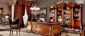
Turquoise and gold
The radiance of the ceremonial and ballrooms of the interior decoration of palaces was often created with the help of this color pair. Over time, they were replaced by hallways and living rooms, and yet the brilliant combination still remains relevant.
Golden decorations are favorably emphasized with turquoise colors, without visually concealing the area of the room or burdening the overall picture. It is noteworthy that, as in the case of the blue-turquoise color scheme, the combination of gold and turquoise looks great on a white cloth with black splashes.
Some tips
When choosing a dark turquoise color for interior decoration, you need to know several of its features. This shade should be used in spacious rooms. The room should have good daytime and evening lighting. Otherwise the room will turn out dark and gloomy. Even bright accents cannot bring cheerfulness. The sun's rays penetrate especially naturally into this interior.
In an interior with dark turquoise there should not be more than 3 shades. Otherwise, the appearance of the room will seem overloaded. Color combinations should not be of the same saturation level. Each shade should be lighter or darker. Multi-layering and smooth transitions of combinations will decorate the room and bring harmony.
Only one third of the room should be dark. Therefore, in combination with turquoise, most of the space should be given to light and neutral shades. The cold beauty of dark turquoise can become a spectacular, original interior decoration. The owners of an apartment or house must correctly discover all the possibilities of this color.
Having considered what a dark turquoise shade represents in the interior, you can create a uniquely beautiful design. Combinations with different colors provide a wide field for creative imagination and expression of the individuality of the home owners.
Bright turquoise color and combination with it
Bright turquoise is a shocking shade that glows from within. Just like coral shades, turquoise has bold tones. But for a bright life you need bright colors. Bright turquoise is a surprisingly rare and beautiful tone. He attracts the eye and carries him along. A tropical diva, a bird of paradise - this is the definition of the image he creates. But not everyone can afford it. For him, appearance should have the highest contrast. Representatives of the “winter” and “spring” color types can afford it, provided they wear bright makeup.
Jewelry for clothes of bright turquoise color should be selected from transparent stones of any blue or green shade. Avoid pale jewelry. Gold and silver, pearls, coral and turquoise will also suit you.
What colors go with turquoise? Just as bright and sonorous. Take a closer look at combinations with pink, yellow, yellow-green, pink-coral, neon green, dark blue, electric blue, aquamarine, dark pink, purple, regatta, cream, gray, silver, gold, beige-brown, old bronze
Who is it suitable for?
Turquoise has more than 100 shades. You can find out which one is right for you through practical selection. Or find out your type and color type. This will help you save money, because you will know exactly which item is suitable. And learn to emphasize your figure and appearance.
A simple test will help you identify the right color tone:
- Buy sheets of paper of different shades and saturations
- Place them under your chin and see how each of them is reflected on your face.
Ideally, the test should be performed without clothes or with bare shoulders and décolleté. If you still wear clothes, then a tone close to your skin.
As a result, you will see how a certain shade can affect your appearance: add redness to your face and freshness to your eyes. It can even shade hair and teeth. This way you will understand which colors suit you and which have no place in your wardrobe.
This test will not take much time or money. Sheets of such paper can be purchased at an art store.