With the increasing availability of the Internet and its resources, representatives of various professions began to do part of their main work not somewhere in the office, but right at home. Any successful person, be it a politician, businessman, writer, designer or architect, must have a separate room in his home - an office. This is a room that fully meets the needs of the owner and is equipped for the most comfortable and productive performance of certain activities.
Color in the interior of the office
The color design of a home office is a purely individual matter, directly depending on the taste preferences of the owner and the nature of his activities. The color design is determined not only by the characteristics of a particular interior style, but also by the psychological influence of the desired palette on a person. By choosing the right shades, you can create ideal conditions for both complex, painstaking work and creative activity.
Impact on humans
The color palette is important for a person, his psychological and physical state. Colors can inspire, excite, heal, or vice versa, they can depress, oppress and cause despondency. They can affect feelings, characteristics, and the environment in the house.
All shades have their own meaning; your mood, perception of the world and ability to work can depend on them. When properly designing the interior of workplaces, it is imperative to take into account the characteristic features of shades, their impact on a person and his performance.
What colors to choose for the office and what to rely on?
The selection of colors for office interior decoration is influenced by several factors. Let's sort them all out.
Brand book of the company
Every second customer asks that the colors from the brand book be accurately transferred into the interior. We explain that it will not be possible to use them in their pure form, since the brand book is primarily intended for printing and website design. If you include bright shades in the interior without thinking through all the details, it will be difficult not only to work productively in the room, but also to simply stay for a long time.
During the discussion, we determine in which areas of the office it is important to use corporate colors and decide how to implement them there. We muffle, dilute, make small inclusions to create not only a beautiful, but also a comfortable space.
Our task is to “make friends” between the brand book and reality.
The most revealing project from this point of view was the office project of the management company Cosmoservice. The brand book included blue and green colors, and kindness appeared in the list of values. We had an image of a soft and delicate company, so the design team developed a concept using complex shades of green and blue, natural and calming. It seemed that this was an ideal fit, but the customer did not accept the concept, citing the fact that the interior turned out to be too “calm” for his active employees. Overall, I liked everything, but I didn’t have enough energy.
This is what the first version of the concept looked like, which was not agreed upon.
We were asked to brighten up and introduce neon blue, which was used throughout the website and printed materials. This color does not exist in nature; it can only be seen on the screen.
During the process of adjustments, it turned out that if you simply “tweaked” the blue, the concept would fall apart. One inappropriate element of bright color can ruin everything; other interior details look dirty against its background. It was the same in this case - the branded blue “crushed” the rest, so we had to change the color scheme completely.
In the second version of the concept, graphics appeared on the walls and furniture, as well as “space” chairs of unusual shape. Later, the company’s brand book changed, and we developed a third option, something between the first and second.
Features of the room
It’s easy to work in a bright, spacious office—you don’t subconsciously want to overload it with bright accents. We laid down gray carpeting, installed bright poufs, and it’s already beautiful.
A space where there is little light can be used in different ways: either painted white so that the walls do not put pressure on it, or supported with dark accents.
If the future office has different windows, different decoration, or height differences, this is a problem with an asterisk. There is a lot of work here, including with color.
There are many options. There are generally accepted rules, but they can and should be broken.
Scope of the company
There are no universal solutions. What is unacceptable for some is optimal for others.
We proposed a very bold concept to Metso&Outotec, a world leader in integrated solutions and services in the mineral processing and metallurgy industries. When decorating the company's new office, they used dark colors, sharp contrasts, and rough shapes. For some other business the solutions might have been inappropriate, but in this case they were perfect.
The dominant feature of the entrance area is the reception desk made of stone. The black color emphasizes the “brutal” character of the company, and the unusual shape is associated with ore and minerals.
Finishing materials and coatings
When developing a concept, we always order paint colors, veneer samples, carpeting, etc. The palette in which the selected materials are available can also influence the choice of office color scheme.
Snow-white work area
The tones of the white spectrum are harmonious in small rooms with a lack of natural light. They help improve efficiency, increase work speed, tone you up and set you up for optimism.
With sufficient natural light, it visually increases the space. It can be used as the main tone, or it can be used as an accent as a group of furniture against the background of other colors. A mix of white with brown, green or gray looks especially harmonious.
Effect of different colors
When choosing a design for an office, you should take into account many factors and the influence of colors on a person’s visual perception. To create an overall picture, you can give the following examples of wall painting:
- Gray and its derivatives or neutral colors. Refers to calm tones. They do not irritate the eyes, but cause despondency and apathy. The gray shade of the walls in the office matches the color of the employees' clothes, so it is possible that soon everyone will fall asleep at work, and as a result, labor productivity will decrease.
- Painting the office yellow. The opinion of psychologists is twofold. Some believe that this color of the office pleases the eye, lifts the mood and increases productivity. Experts have a different opinion that in such an environment it will simply be impossible to concentrate on the task at hand. Both are scientifically substantiated and have their own evidence, but for each person, the attitude towards this color is individual and everything will depend on his perception.
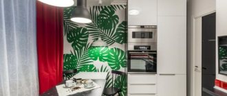
- Green. For the office, this tone is the most optimal. It does not tire you out during the working day, and therefore you can work quietly for a long time. Decorating walls with green color is soothing to the eye. When doing work that requires concentration, this is the most suitable solution. The design of the selected covering in green tones gives it a business-like appearance at the same time.
- Blue. If you paint the walls of office premises with this color, the productivity of employees will also be at a high level. If your work activity involves calculations or small details, then this solution will be optimal. It is important to choose the color blue, not blue, otherwise the perception will be the opposite.
- Brown. When choosing such a design, you should take into account that it has a depressing effect on the human psyche. But if you paint the walls, for example, in an investigator’s office, it creates a feeling of security for visitors.
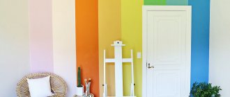
- Red. Only creatively minded workers can choose such tones. A room painted in similar tones enhances emotionality and causes aggressiveness in mentally unbalanced people. Red is invigorating and good for people whose work activity is aimed at performing physical labor. This color is strictly not recommended for use in the office of a manager involved in negotiations and concluding contracts. Such a design will only aggravate situations that arise when resolving controversial issues, causing excitement, irritation and, perhaps, conflict situations.
- Orange. Applying this tone to the walls will be ideal for receiving clients and concluding contracts. But it is recommended to use an orange tint; it is softer and does not irritate the eyes.
- Violet. It calms and helps you relax, so certain places can be painted in these tones.
- White. Painting the walls in an office in this color will make even a small room visually larger; white also gives a business-like and austere look.
- Black color in the office is used to create contrast with other tones. In general, black will only cause negative reactions from others.
Nude palette
Pastel beige tones are universal. They are calming, provide stability and security, and are the ideal base background for dotted decor in bright colors, which makes the design complete without overloading it.
Furniture in nude tones framed by snow-white wall panels gives the room a homely feel and comfort. A mix of nude and graphite with notes of turquoise will add style and special chic to the room.
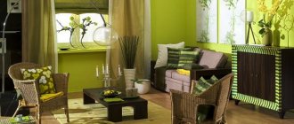
Green palette
As the main tone for decorating a study, green shades are characterized by increased productivity, neutralization of visual stress, increased creativity, enhanced creative abilities and reduced anxiety.
It gives inspiration and helps in maintaining balance and harmony. They can be harmoniously diluted with the help of dotted decor in white, wood and graphite tones. Harmonious, balanced, productivity-enhancing green tones are indispensable in the design of work areas of creative teams, at least as individual details.
Lemon shades in the decoration of work spaces
Lemon tones give an additional boost of vivacity and energy, speed up brain function, and put you in a positive mood. They need to be used carefully, because constant stimulation of the nervous system leads to overwork, and such an interior begins to depress. When choosing a shade, you should pay attention to soft, light colors, diluting them with pastels.
Such tones will be an ideal accent where you need to constantly keep yourself in good shape, where high focus and concentration are important. They can be supplemented with greenery, graphite and wood. This will dilute the tense atmosphere and allow you to distract yourself for a moment and take a breath. This is why most fast food restaurants are decorated in these colors.
Furniture selection
It has already been said above what green walls are combined with in the interior, so there are no restrictions when choosing furniture. This applies not only to color schemes, but also to materials: products can be made of wood, plastic, metal, glass and other things. Of course, it is important to maintain balance in everything.
Don't be afraid to experiment. A huge green palette allows you to choose the perfect shade for any room, so that a designer sofa, purple bathroom, chest of drawers with a floral print or a wrought-iron table look appropriate and stylish. Creating a visual design project will help you think through the details in advance and check “working” combinations.
Blue and light blue palette
A space decorated in blue tones will help increase production, improve brain function, create a trusting atmosphere, set you up for successful negotiations, and in stressful situations will help you calm down and relax. The blue tone can improve the functioning of the body after stress, evens out the pulse, reduces blood pressure and helps cope with panic attacks.
Blue spectrum tones will help increase concentration, attention and accuracy. They are able to create an atmosphere of trust and ease of communication in a team, as well as help reduce tension when disagreements arise. A relaxation room decorated in these colors will be the ideal solution.
Graphite shades
The tones of the gray spectrum symbolize neatness and minimalism. They are suitable for both the main background, furniture, and spot decoration. Aristocratic restraint and majestic calmness of color convey a spirit of solving assigned tasks and focusing on completing work. They are harmonious in combinations with tones of orange, white, and green spectrums.
General recommendations
- If you don’t want to experiment and take risks, you should give preference to natural shades that will never go out of fashion and look really light and comfortable.
- The easiest way to implement this color in decoration is painting, since wallpaper or other finishing materials do not always convey the tone that is needed.
- Green will look authentic in styles such as Scandinavian, eco, classic, country, Provence, which put comfort and unity with nature in the first place.
- To complement the “green” direction, it is recommended to use only natural materials for furniture and decor.
- The same shade will look completely different in matte and glossy versions.
The green color itself is neutral and does not require special attention. Even the brightest, acidic tones do not look too aggressive and are easily “covered” by using additional shades.
Brown work area
This palette speaks of the stability and prosperity of the owner. Brown and wood tones are timeless classics for workspaces. They promote calm and concentration on important tasks. Modern interiors combine light primary tones and expensive dark wood furniture.
Purple palette
The purple color palette has a stimulating effect on mental work and gives free rein to imagination. Suitable as an accent in the workplaces of creative people. The best solution would be to design an office in purple and lavender shades framed by snow-white and ash-gray flowers.
Design tips
When choosing the color design of your office, in addition to personal preferences and recommendations from psychologists, you should adhere to a few simple design rules:
- The more modest the size of the cabinet, the lighter the base color should be;
- For the south and east side, with a sufficient level of natural light, you should choose neutral or cool shades;
- Warm colors are preferred in cool or dimly lit rooms;
- Dark rooms will become cozier by using a light color palette;
- You should always select several additional ones to complement the main tone.