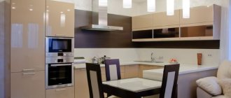
Cappuccino tones, due to their neutrality, are excellent for decorating kitchen areas. They fit perfectly into any style direction and are liked by almost everyone. Cappuccino shades make interiors soft and airy and evoke associations with a coffee drink, which makes them extremely popular.
What colors does cappuccino go with?
Cappuccino can be combined with various tones to create successful duets. Let's list the most common combinations.
Cappuccino and vanilla
The combination of vanilla and cappuccino is as close as possible to pastel yellow. The most successful combination can be obtained if you use a matte coffee shade with milk as the main tone. Such design will have a positive effect on the psyche of residents. The decor looks stylish, but unobtrusive.
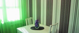
On a note! A duet of vanilla and cappuccino is an excellent solution for a small kitchen space.
The vanilla shade looks harmonious when combined with cappuccino, making the interior fresh and uplifting.
This duet is perfect for people who strive for harmony and tranquility, but do not want the kitchen interior to seem boring and monotonous.
White
The soiling of white makes it necessary to use it in the kitchen interior with caution. Finishing materials must be selected very carefully. An excellent option for decorating the kitchen area is a white upper part and a lower part made in cappuccino color.
Floor tiles, exterior cabinet doors and countertop surfaces can be done in a light coffee color scheme, with a white area at the top.
Other colors
The cappuccino shade can be combined with almost any color, for example wenge. It will unobtrusively emphasize the softness and warmth of the coffee palette.
The dark brown tone of wenge organically complements the light coffee interior palette and contributes to the correct placement of contrasting accents.
Cappuccino goes well with turquoise, mint, lilac, pistachio, pink and many other colors. If you wish, you can create a lot of successful combinations.
Finishing
The choice of finishing materials is determined by the stylistic concept. Cappuccino looks expensive and impressive on both natural and artificial surfaces. The sheen of gloss will add elegance to the color and make the decor more expensive and luxurious. In the loft, cappuccino is combined with light brick, and in classic styles with floral patterns on the walls. “Supports” the color concept of ultra-fashionable high-tech, modest minimalism, rustic simple Provence, luxurious modern, extraordinary fusion and a number of elite styles. Cappuccino is universal and can adapt to any direction. Before finishing the room, you need to decide on the color principle:
- The walls, floor and ceiling will play the role of a cappuccino background;
- The “box” of the room will be neutral, and coffee motifs will be embodied in the furniture.
Based on the chosen concept, the type of finishing materials, their color, texture, and pattern are chosen.
Walls
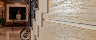
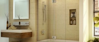
The surfaces of the walls are covered with wallpaper (with a special coating for kitchens), plastered, covered with plasterboard, tiles, plastic and wood panels. The natural color of the latter may echo the cappuccino set. PVC panels, as a rule, are chosen with a complex texture: on a coffee background, there are white inclusions. As a result, the surface seems to imitate polished stone. The apron is finished with tiles, the color of which is accent: cherry, gray, lilac, green. If it is necessary to create a background, then white and pastel shades prevail in the wall decoration. Facing the “box” in dark colors is allowed only in spacious kitchens. For simple and austere options, the walls are simply plastered, and a relief similar to shreds of milk foam is created on the accent area. Ecostyle uses cork, which not only has a pleasant shade, but also a soft-touch surface.
Kitchen-hallway: examples of combined design +50 photos
Floor
The kitchen floor is usually tiled. Large tiles of black, gray, brown colors are used. A dark floor will create the illusion of a “bottomless” coating. If laminate is chosen for finishing, then preference is given to gray, chocolate, chestnut shades. In expensive options, self-leveling flooring is used, which is not only durable, but also gives an elegant “varnished” shine. You can separately order a design that will decorate its surface. For the cappuccino kitchen, the coffee theme in the images will be relevant. In budget options, linoleum is used as flooring. Its range allows you to choose light shades that imitate wood. Linoleum is inferior in durability to other materials, but a high-quality product cannot be visually distinguished from laminate or parquet boards.
Ceiling
In “squat” kitchens, where the ceilings cannot boast of height, they are plastered or painted. Light shades prevail in the palette. If the decor and wall decoration will include coffee with milk and a couple of additional colors, then it is better to leave the top white. For multi-level plasterboard ceilings, use a combination of cappuccino shade with a neutral tone. If the “step” has a wave-like shape, then it is played out as an imitation of a milky wave that “floats” onto dark coffee. Decorate the relief surface with spotlights along the contour of the level difference boundary.
Which facade to choose: glossy or matte
In kitchen interiors designed in cappuccino color, both glossy and matte furniture are used. The advantages of glossy facades include:
- presentable appearance;
- visual expansion of spatial boundaries;
- with proper care, furniture does not become outdated;
- countertops are not afraid of contact with water and cleaning agents.
Disadvantages include the need for constant cleaning, the inability to hide scratches, and the visualization of fingerprints.
The advantages of matte facades are functionality and long service life. Scratches and dirt are invisible on their surfaces.
Disadvantages of sets with a matte finish: insufficiently presentable appearance, inability to visually expand the space.
Professional designers advise giving preference to furniture with glossy surfaces, despite the increased need for cleaning.
Different rooms of the apartment
The color of cappuccino looks especially beautiful in the kitchen. If the room is small, you should choose light furniture with dark elements. At the same time, they buy light-colored facades, and dark-colored tabletops, chairs, and lamps.
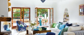
In the living room, cappuccino-colored wallpaper is matched with sofas and armchairs with brown upholstery made of leather or fabric. The ensemble is united by a coffee-colored carpet. As lamps, you should choose floor lamps and sconces. Bright lamps irritate the nervous system.
Cappuccino is especially suitable for the bedroom, as it allows a tired person to relax. It is undesirable to clutter the bedroom with many objects. A bed, bedside table and linen closet are enough.
The use of cappuccino in the office has its own characteristics. The walls can be covered with wallpaper of this color, but the upholstery of the chair, lamp, and paper folders should be bought in a bright color to activate mental activity.
Source
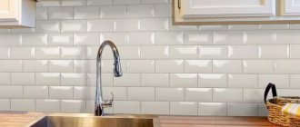
What color should I choose for an apron?
A good idea is to create a “confectionery” design on the surface of the work wall. This could be, for example, coffee beans or an image of a cup with steam rising above it.
Materials for making an apron in a cappuccino-colored kitchen can be:
- tile;
- glass;
- mosaic;
- natural or artificial stone.
Glass aprons decorated with themed photo printing are perfect for modern style and most classic styles. Usually the work wall is decorated with an image of freshly prepared coffee with a variety of spices and sweets.
Aprons that depict landscapes and reproductions of paintings also look great, especially if they are complemented by a frame in the form of relief inserts that create an imitation of brick or stone masonry.
The most popular coffee aprons are made from tiles. They look presentable, are durable and practical. Tile backsplashes fit organically into various styles.
Working surfaces made of stone (it can be either natural or artificial) also look beautiful and are durable. But they have a textured surface and caring for them is more difficult than their tiled counterparts.
Features of use in the interior
The interior is complemented with a variety of details; every item is important and serves its role. Therefore, it is worth considering not only the decoration, but also the arrangement of furniture and accessories.
The interior is complemented with a variety of details; every item is important and serves its role.
Furniture
Wooden furniture can be complemented with silver or chrome elements. Upholstery can be used on upholstered furniture; most often, the remaining parts are painted the same shade or made darker. When choosing furniture, you need to take into account the color of the flooring; it should be from a dark palette.
Wooden furniture can be complemented with silver or chrome elements.
Doors
Interior doors can be made to contrast with the walls and floor, and vice versa, adhere to their color scheme. If the doors are darker than the background, then the interior takes on a more austere look. In this case, it is important to think in advance what effect you want to achieve.
Interior doors can be made to contrast with the walls and floor, and vice versa, adhere to their color scheme.
Curtains, textiles and other decor
Bedspreads, curtains and upholstery on furniture are most often made similar to the decoration of the walls, but small accessories can be bright and eye-catching, then the design will not be boring. If lightweight textiles are chosen, the texture of the surfaces may be rough. Light curtains of beige variations will go well with cappuccino curtains. In the kitchen, you can use an addition in the form of a picture with coffee, then the effect of the coffee presence will intensify.
Bedspreads, curtains and upholstery on furniture are most often made similar to the decoration of the walls.
What color should I choose for my countertop?
The contrasting combination of a light cappuccino shade and a more saturated color of the tabletop looks great. The countertop should be much darker.
Wallpaper color
Wallpaper is a traditional way of decorating a wall surface. For the kitchen area you need to choose practical finishing materials. You can cover the walls with washable wallpaper.
Important! You can’t wallpaper your kitchen with liquid wallpaper; it will immediately swell from high humidity.
Paper, non-woven and glass wallpapers are suitable for kitchen premises. The finish can be plain, textured or with patterns. The composition of the wallpaper ornament should not contain large flowers and squares.
On a note! Coffee-colored wallpaper can be combined with stone inserts and wood panels.
Choice of curtains and lighting
To decorate small window openings, it is better to choose Roman blinds.
Another popular decoration option is a custom-made lambrequin.
Thin tulle curtains are hung on standard-sized windows and complemented with thick coffee curtains.
Choose coffee curtains whose shade is close to the color of the set and wall surfaces. The material can be either natural or artificial. When choosing fabric, consider the decorating style of the room. Curtains with a pattern are best combined with plain wall surfaces.
If patterned wallpaper is used in the design of the kitchen space, they will be ideally complemented by plain curtains.
Important! The pattern on the textiles should be selected based on the style of decorating the kitchen. It is advisable that it be invisible - this will make the interior elegant.
In the interior of a coffee kitchen, it is appropriate to use LED spotlights, chandeliers and mixed lighting.
The advantage of LED strips is that they occupy a minimum of space and effectively transform the room. A chandelier with a lampshade will fit perfectly into such an interior. The backlight can be chosen with patterns or monochrome.
In coffee tones you can decorate a kitchen in any direction - from classic to high-tech. This palette is suitable for Provence, minimalism, loft and other styles.
The use of cappuccino color in kitchen design is becoming increasingly popular. A harmonious combination of decorative elements and surface finishes will make it possible to create a unique interior that will attract all household members.
Design nuances
Often conservative people prefer coffee interiors. However, love for the classics is not the prerogative of the adult generation. Attractive colors have not gone out of fashion for many years. Designers choose soft colors because they provide a good backdrop for displaying various pieces of art. These can be paintings, sculptures, photographs.
If we are talking about a small living room, then a coffee accent will look good on one of the walls. If the bedroom is characterized by a large area, then coffee with milk can become the main color of the room. It is also possible to use shades of coffee in the office. They will soften the interior decor, allowing you to devote yourself entirely to research or educational work.
The selection of textiles will play a big role in this. Replacing curtains alone can have a significant impact on the feel of a room. If the windows face south and the wall decoration is predominantly white, then coffee curtains will protect you from the hot sun. We can safely say that the shade of coffee can elevate any space. With its help you can create comfort and an atmosphere of luxury. It is enough to acquire pompous accessories (elegant figurines, antique elements, avant-garde paintings and expensive lamps). Embroidery on textile decorative items is also welcome. These could be decorative pillows, exquisite rugs, etc. You can dilute the background with inserts of red and blue. At the same time, it is better to avoid yellow and purple, as they make the space heavier.