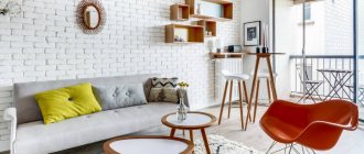
To create a cool and modern wall design in the kitchen, you first need to choose the optimal finishing material and settle on an interesting color. Or an effective combination that will maximize your design concept, highlight all the advantages of the room configuration and, at the same time, neutralize the existing disadvantages. All the nuances of choice and options, as well as fashion trends that are worth paying attention to, will be discussed in this material.
Requirements for finishing materials in the kitchen
- moisture resistance - permanent high humidity should not affect the structure of the material and change its shade;
- fire safety - implies complete resistance to fire or low flammability;
- strength and durability - constant temperature changes should not reduce the performance characteristics of the material, as well as regular thorough washing using powders and other means;
- environmental friendliness - when heated, the material should not release hazardous substances into the air;
- ease of care - you need to avoid glaze on the surface, porous textures that accumulate dust, grease and dirt and are difficult to clean.
What color to choose for the walls
The color of the kitchen affects a person’s emotional state: it not only invigorates or calms, but also promotes better appetite. Therefore, when choosing it to decorate the walls in the kitchen, you should abandon controversial and, especially, radical decisions.
To make it easier for you to navigate the characteristics of a particular color used in the design of walls in the kitchen, we have compiled a small but useful table for you.
| Color | Impact |
| Yellow | improves mood; invigorates well in the morning; works great in modern interiors |
| Blue | calms and relaxes; organically complements the Mediterranean style |
| White | creates a neutral environment; is basic and goes well with any other shade |
| Orange | creates an optimistic mood; completely removes stress; works well in modern and fusion styles |
| Green | perfectly pacifies; relieves negative emotions; goes well with classic interiors |
| Black | may cause anxiety; often used in loft and high-tech; requires a contrasting shade in pair |
| Red | energizes; widely used in contemporary art; visually reduces space |
| Grey | completely universal and neutral; brings order to the design |
Five design tips
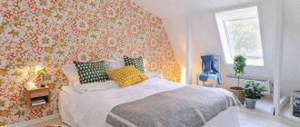
- When choosing wallpaper and furniture, try not to overload the interior; one thing should be the emphasis. Combine spectacular bright wallpaper with laconic and simple kitchen facades, but for a catchy set with an intricate design you will need a neutral, calm background.
- When choosing a color scheme, not only the shade is important, but also its belonging to the color scheme . Warm shades should be combined with the same warm color “brothers”, cold shades should be combined with cold ones.
- When combining several types of wallpaper, choose one price category . The best solution is companion wallpapers belonging to the same manufacturer’s collection.
- Wallpaper with a pattern can be used to visually adjust the area of a room . Thus, vertical stripes are suitable for low kitchens, and horizontal stripes for narrow ones. To avoid getting bored with stripes, give preference to soft colors that gradually flow into each other.
- For a kitchen facing west or north, choose warm shades - yellow, cream, grass green, light peach, orange, apricot and light brown. For southern and eastern kitchens, pale blue, light green, blue, silver, and white are suitable.
Modern finishing options
The walls in the kitchen can be covered with more than just wallpaper. There are many more ways to design them. It’s difficult to list everything in one article at once, but we’ll try.
Wallpaper
However, we’ll start with them, because wallpaper in the kitchen is a classic option for wall decoration. If you want the wallpaper you pasted to stay in the kitchen for a long time and not peel off, choose those that have a non-woven or vinyl backing. They can be washed easily. And they don’t fade at all in the sun, safely keeping the print fresh for years.
However, even the most expensive wallpaper has obvious drawbacks: they scratch easily and collect dust and grease on the textured surface. Therefore, get ready for grueling maintenance if you decide to go with this finishing option.
An alternative to conventional wallpaper for decorating walls in the kitchen is glass wallpaper and paintable wallpaper. Preparing the walls is the same as for wallpapering with regular wallpaper. The main advantage is durability, because they can be repainted up to 5-7 times, depending on the manufacturer. An undeniable advantage of fiberglass is that it can be glued in new buildings without fear of shrinkage of the walls. The slightest cracks will be hidden, but the walls will have to be leveled first, almost like before painting. To paint fiberglass in the kitchen, choose a special washable paint; the shade can be absolutely any.
Keep in mind that fiberglass absorbs paint very well, so to apply the 1st layer it is usually diluted with water 1:3. To obtain a uniform shade, you will need to apply 2-3 layers of paint.
Photo wallpaper
A real lifesaver in those moments when the kitchen seems boring, uncomfortable and completely outdated.
As a rule, thematic images are used to add variety to the environment:
- forks, spoons, cups, etc.;
- various dishes;
- fruits and vegetables;
- megacities and architectural structures, etc.
Of the minuses: they require a lot of free space to deploy a full-fledged panel. To admire the painting, it is advisable to leave the kitchen wall free, and for many this is an unaffordable luxury. In addition, photo wallpapers, alas, very often become boring.
Ceramic tile
One would like to call this material for interior decoration ideal. This is a practically indestructible coating that is not afraid of detergents with chemically active components, constant temperature changes, water or fire.
Tiles also have an amazing variety of textures and patterns. You can choose a classic monocolor, but if you wish, create a masterpiece of design art with the help of specific collections.
Tile laying methods
The method of laying the tiles depends primarily on their size, the presence or absence of decorative elements and the design that must be implemented. There are three standard installation methods:
- traditional - tiles, regardless of their size, are laid in even rows, its seams form an even grid;
- laying with an offset or “staggered” pattern resembles brickwork, when the tiles of the next row are laid so that its middle is above the seam of the previous row;
- diagonally - the main direction of laying from one corner of the plane to the other. For this method it is better to use square tiles.
Options for laying tiles
The listed laying methods can be used for both walls and floors, but when using one or another method on different planes, there are specific features. It is better when the walls and floor are tiled with tiles from the same collection, then the different planes visually become a single whole. If an unconventional method of laying tiles is chosen, then an additional 15 percent must be added to the required amount of material, which will be spent on trimming and creating the desired pattern.
Wall decoration and kitchen style
Another table will help you quickly and clearly understand which finishing material is best combined with a specific design style.
| Material | Style |
| Siding | classic design |
| MDF panels | country, provence, classic |
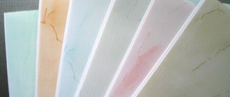
| Plastic | minimalism, scandi, provence |
| Ceramic tile | any classic, Mediterranean interiors, Provence |
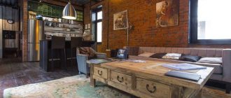
| Porcelain tiles | classic, hi-tech, contemporary, loft |
| Glass | classic, hi-tech |
| Cork | country, Provence, classic style, ethno |
| Decorative rock | loft, hi-tech |
| Brick and clinker | country, loft |
| Wallpapers and photo wallpapers | everywhere appropriate depending on the design or pattern |
| Decorative plaster | Provence, classic designs |
| Painting | scandi, minimalism, hi-tech, ethno |
How to design an apron
This zone is primarily required to be practical. Therefore, any attempts to design it must be considered through the prism of healthy pragmatics and ergonomics.
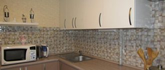
One of the key trends in recent years is segmented patchwork ceramic tiles. It enlivens the space and fits well with all modern designs.
Another current method is massive porcelain tiles measuring 60x120. Covers almost the entire area, creating a harmonious feeling of homogeneous space. The most common options are imitation marble and granite. Less commonly, slabs stylized to look like a concrete base.
The classic “hog” 10x20 and 10x30 appears less and less in interiors.
If we take a break from ceramics, then to decorate the apron you can also consider:
- threw off;
- steel panels;
- mosaic based on stone or glass;
- plastic panels with decoration.
The last option is the most affordable in terms of cost, but is only suitable when you are dealing with an electric stove.
Combination of materials
Most modern kitchens combine a cooking area and a dining area. Combining materials is a great way to take into account the load on each zone. In areas of high humidity and dirt (primarily near the sink and stove), the wallpaper will quickly fail, so it is better to use ceramic tiles for the food preparation area. Finishing the rest of the space with wallpaper is cost-effective, functional, and allows you to create a modern design. Wallpaper in the dining area will add coziness and warmth to the kitchen.
Combination allows you to use additional materials, for example, glass panels on which you can apply any photo, decorative plaster imitating various textures or wooden lining.
Wall decoration above the dining area
Forget about the calendar and paintings - there are much more interesting options for decorating the wall in the kitchen near the dining table.
For example, a wall clock with elegant decoration. What if one of your family members collects them? In this case, you can beautifully place several on the wall at once, making an original composition out of them.
A magnetic whiteboard for notes would also look appropriate when decorating a free wall in the kitchen. You can always leave new drawings or messages to family members on it, thereby creating a sincere atmosphere in the apartment.
If the kitchen is not so large and you don’t want to fill it with cabinets, there is a reason to use open shelves and racks on the wall adjacent to the dining complex. There you can place various necessary items, as well as beautiful decorations and all sorts of useful little things.
A rare, but still interesting option in the design of kitchen walls is a mirror. It reveals itself especially organically in a modest-sized space, as it creates a lasting illusion of its expansion.
Kitchen paneling with wooden paneling
This type of wall decoration emphasizes all the exceptional properties of wood. Wooden covering makes the kitchen unusually cozy, creates a favorable healthy atmosphere in it and regulates air humidity. This kitchen looks very harmonious in a country house.
Interior wall decoration with wood is not afraid of temperature changes and sunlight. If necessary, the coating can always be washed. If it is possible to line the kitchen walls with natural wood, this should be done, as you will not have to regret it later.
Design ideas in the kitchen-living room
The design of walls in a kitchen combined with a living room follows slightly different laws: to create harmony, you need to work on zoning and highlight accent areas.
In order for the walls to act as space dividers, they need to be decorated with different finishing materials. Or use different ornaments and images if the material is the same. Almost always, the division takes place on a functional basis - there are zones for cooking and eating (dining room) and relaxation (hall, living room).
A combination of painted walls and wallpaper is always a winning option.
Or ceramic wall tiles in the dining area + wallpaper or plaster in the living room.
If your interior is decorated in a classic style, try another interesting mix: decorative plaster in the dining room, MDF wall panels in the living room.
To sum it up: combinations
Having understood the materials, all that remains is to combine them correctly - taking into account the fact that any kitchen is usually divided into two zones, work and dining. The material for the working area should be as durable as possible, the material for the dining area should be simpler.
Usually combined:
- One material. Doable, in some situations even justified. Paint in different colors, complete refusal of zoning, tiles throughout the kitchen - there are a lot of options. Well suited for a small kitchen where there is simply no space to separate zones.
- Two materials. The work area is covered with one material, the rest of the kitchen with another. Often, tiles, glass, stone - resistant materials - are used over the work surface, and everything else is covered with wallpaper or painted. The result is a durable repair in which zones are clearly separated.
- Three materials. A rare combination, usually one material covers the work area, another the walls, and the third is used for a bright accent - for example, for metal panels above the stove, for mosaics above the work table. The main thing is to have a good idea of how everything will look in the end.
In fact, having a good idea of the outcome is the most important condition for creating a design. Draw on paper, or better yet, find an appropriate program and model the result in it. Will it look good? Will it be comfortable? Will it fall off over the next year?
And if you do everything right, you can enjoy your kitchen for many years. And besides, the process of choosing, combining and planning is simply fun - so why don't you give it a try?
Decor
You can play up an empty wall in the kitchen using various decorative elements. As a rule, the following areas are registered:
- various niches and projections;
- wall near the dining table;
- apron;
- wall adjacent to the entrance to the kitchen.
No one limits your imagination in wall decor. But it can be directed. To do this, we will demonstrate several successful, in our opinion, options.
For example, a composition of saucers and plates on the wall. Firstly, the kitchen theme is followed. Secondly, the elements can be placed in such a way that they will form some kind of figure and express a greater meaning. Of course, for this you need to maintain stylistic unity and adhere to the rules of symmetry.
Mirrors always look impressive. For small kitchens, this is generally a godsend: they not only play well with the lighting, but also help to visually enlarge the space. They can be compiled from small fragments into some kind of conceptual solution.
The theme will also include beautifully designed kitchen utensils. For example, wooden cutting boards. They can be artificially aged and hung on loops. They can be accompanied by rolling pins, frying pans and, in general, everything that in one way or another relates to the topic of cooking.
More options:
- slate board for messages;
- vinyl stickers;
- stylized posters;
- painting with acrylic paints;
- interior letters;
- panel organizer, etc.
What is the best way to decorate the walls?
When considering modern ideas and choosing a budget option for finishing a kitchen, it is worth paying special attention to light, aesthetic, safe plastic panels. To achieve a positive result when decorating pre-plastered smooth walls, there is no need to mount a frame.
Sheathing a structure is more difficult than gluing slats directly to the wall
A more labor-intensive process is tiling. Its advantages are a huge variety of textures, colors, shades, shapes. This allows you to divide the kitchen space into dining and work areas.
Zoning space using tiles
It is important that surfaces that take on increased loads are made of the most resistant materials. For the dining area, it is better to choose a decorative covering.
Fashion trends
If you do not follow current design trends, it will be very difficult to achieve fashionable design.
Let's try to identify the most noticeable trends in kitchen design:
- red and brown tones - especially if you need to create an accent wall;
- environmental friendliness - MDF and laminate on the wall surface;
- glass and metal - exactly on the apron, and they look organic in any style, even classic;
- antique motifs - appear in the form of decor on certain sections of the walls (columns, bas-reliefs, characteristic images and ornaments;
- greenery - use flowerpots to add more vital energy to the interior.
Fashionable colors for the kitchen (photo selection)
What is good about fashion for finishing materials is its consistency. You can safely choose exactly the shade that suits your chosen style and personal preferences. In order not to make a mistake with your purchase, you need to study the designers’ recommendations for choosing colors for the kitchen.
- If you decide to combine several colors, then you need to settle on two or three tones, one of which will prevail. This is necessary in order not to overload the design with a large variety of colors.
A successful combination of dark wood with white kitchen furniture - If the kitchen set and walls are made in the same color, then the furniture should be selected a tone or two darker.
- As a rule, experts do not recommend making the floor and ceiling in the same color and texture. This can create a volume imbalance in the room.
- It is better to decorate the countertop and apron in colors that do not match the color of the kitchen set and the rest of the furniture. contrasts allow you to place the right accents and make the space lively and interesting.
- If the furniture is predominantly of desaturated tones, then the textiles should be bright and catchy. Otherwise the design will become boring.
- If the walls are made in bright colors, but the set, on the contrary, should be of a calm color.
Bright decoration of an accent wall in an eclectic kitchen
It is possible and even necessary to combine various finishing materials in the kitchen interior
