But professional designers were able to confirm that with the correct use of a gray shade on the walls, you can emphasize the individuality and exclusivity of any room: just choose the right tone, decide on the pattern and use accessories that will highlight the advantages of the interior color scheme.
In order to learn how to properly use gray wallpaper, it is not enough to take into account the features and parameters of the interior.
Every detail in such a design should have its place, and the severity and restraint emphasized by such a shade should be balanced by more delicate or bright colors. You don't need to be a designer to turn bold ideas into reality using the most common shades.
That is why we decided to tell you how to choose the right gray wallpaper, what to look for in the interior design process, and also how to decide what color curtains will suit gray wallpaper depending on the style of your room.
Gray color in the interior
The right color is no less important than the choice of wallpaper material. You need to decide on it in advance so that after the repair is completed, the result does not disappoint.
The brilliant French painter Henri Matisse said: “The main task of color is to serve expressiveness.” In interior design, we express our essence, demonstrate our taste or lack thereof. In this article I would like to dwell in more detail on gray color, as the most fashionable, and at the same time, which has become a classic and a sign of refined taste.
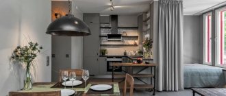
Gray color is not as simple as it might seem at first glance. Some people find it boring, but this is far from true. The photo shows how luxurious the interior can be using gray wallpaper. Gray is a real aristocrat. From dark graphite to soft pearl, it will organically fit into the design of any room. This is a favorite color of designers who consider it universal.
Shades of gray: the best options for design
Below are some current tips from interior designers on working with this range.
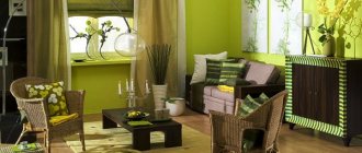
The interior is made entirely in gray tones and is complemented only by shades of living greenery
1. To visually enlarge a small space and fill it with light, choose the lightest colors with a glossy finish close to white.
Light gray color, close to white, makes this small kitchen lighter and more spacious
2. Dark colors are more suitable for large spaces or accent items, and a pronounced texture (velvet, wool, fur, textured plaster) helps to adjust the geometry of the space and hide unevenness.
The velor texture of the upholstery emphasizes the depth of the gray shade and makes the sofa an accent
3. Shades with yellowish and brownish undertones (for example, stone, clay, taupe) add warmth and coziness to small, dark rooms: this is an excellent choice for the bedroom, small living room and bathroom.
Light gray with brown undertones creates a warm atmosphere in this small nursery
4. Cool tones with a pronounced blue undertone (graphite, smoky, steel) should be chosen for spacious and well-lit rooms: due to the effect of natural shadow, these shades emphasize the volume and depth of space.
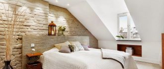
Cool gray in the interior of a large bedroom emphasizes its size and ceiling height
5. To create a trendy monochrome design in gray tones, pay special attention to the gradation of colors by saturation: the most appropriate would be a transition from a light shade on the walls to a darker and deeper one for furniture and decor.
In this monochrome gray interior, light shades are chosen for the walls and floors, and darker shades are chosen for the armchairs and decor.
In a monochrome interior, it is better to combine shades of the same temperature (either all cold or all warm): this way, any bright accents will look harmonious with the overall background, forming a holistic image of the room.
This living room features various warm shades of gray.
6. Greenish shades (gray-olive, muted khaki) have the most pronounced calming properties: this is the best choice for the bedroom and nursery.
A calming, muted shade of gray-green perfect for the bedroom
7. Pinkish and lilac-gray tones combine restraint and conciseness with softness and tenderness - an excellent solution for common spaces in a large family home (kitchen, living room, main bathroom).
A pleasant gray-lilac shade was chosen to decorate the walls of this kitchen-dining room.
8. The basic graphite and steel range can look ultra-fashionable: if you want to create the most trendy interior, pay attention to the combination of the two main shades of 2021 according to the Pantone Color Institute - background Ultimate Gray and rich yellow Illuminating.
The combination of the main colors of 2022 in the interior - Ultimate Gray and Illuminating yellow
Wallpaper selection
The wallpaper store is like a real city; you can wander between the racks endlessly. Therefore, before going to the store, you need to decide which wallpaper to choose. When choosing, you need to consider many aspects:
- room type
- Will the repairs be carried out by professionals or on their own?
- estimated cost
- durability.
The color of the furniture should be in harmony with the color of the wallpaper. Furniture should not blend into the walls; there should be at least minimal contrast.
White furniture will go well with both light gray wallpaper and dark ones; a combination of two shades will look good; gray wallpaper with bright colors or patterns will do. White, like gray, is universal.
When choosing wallpaper, there is one more thing to consider. You need to imagine what the room will look like after renovation. Based on whether the walls will be decorated with additional decor in the form of photographs, paintings, tapestries, wallpaper is selected. If there is a lot of decor, the wallpaper should be background, and vice versa.
A color scheme
In the classic version, black and gray wallpaper with smooth transitions and without elaborate designs will look very stylish and noble, but the “striped” design of the walls will make the room excessively “busy.” In combination with white, you will have to dilute this “pastel bouquet” with bright accents to avoid the effect of a sterile “hospital environment”. Gray wallpaper paired with bright colors in a small apartment can visually expand the space if used skillfully in the color scheme of the ceiling and walls. In general, the gray “station wagon” looks harmonious in almost any combination. The main thing is not to combine more than three color bases.
If you intuitively cannot find this fine line between style and bad taste, then limit yourself to two colors; it’s difficult to make a mistake here. One of the most stylish and rich combinations is gray with purple or soft lilac tones. This combination is suitable for any room: kitchen, living room, nursery, bathroom or bedroom. The only difference will be in the accents. In the bedroom they can be placed on photo wallpapers or hanging collages, in the living room on shelves and racks, and in the office on lighting fixtures and carpets.
It is important to know! If you decide to resort to gray in the design of the walls and not dilute it with other shades, then you can enliven the space with the help of photos in simple metal frames or a collage with famous reproductions.
Light colors
Gray goes with absolutely all colors. It is a blank canvas on which you can paint whatever your heart desires. Light colors of wallpaper in combination with such a base will set a calm tone for the entire room. This design is ideal for bedrooms and lounges, where the decor will not be as drab as it might seem at first glance. Gray harmonizes perfectly with light shades:
- Blue;
- Beige;
- Subtle green;
- Soft lilac;
- Deep pink;
- Pale yellow.
To give “life” to the atmosphere, just a couple of not too bright “support points” for the eye will be enough: a textured wall, an extraordinary sconce, or a rug that stands out from the “drowsy” style. It is advisable to scatter accents in the room in different planes of space.
Dark colors
With dark colors, gray will also look elegant and expensive, but do not overdo it with cold. The shine of metal, the shimmer of silver, the matteness of slate color cannot be combined only with the coldness of blue, dark green or deep burgundy. You and your household will morally simply “freeze” in a room with such wallpaper. If the color palette cannot be changed, then try to play with the materials. Velor, velvet, coarse linen in upholstery and curtains will soften the cold and give it depth. The rough texture of untreated stone, brick, and wood will help break up the gloss of “dead” colors and add life to the room. Rounded shapes and curved lines in furniture will smooth out the sharpness of the corners and add comfort to the living space, even if the overall style remains restrained.
Bright colors
The gray in the wallpaper acts as a support for the hot pink color. He supports him and does not allow him to behave aggressively in the interior. The orange and yellow colors of impulse, sun, and mood are also enhanced by the interior with gray wallpaper. If in the usual perception they are associated with youth and impulses, then in such a combination you will look at these shades with a completely different look and be surprised at how two colors can change each other. In combinations of bright shades with red, you can find new depths and discover completely unexpected facets. If gray with burgundy or carmine evokes philosophizing and evokes nostalgia, then bright red calls for action. In combination, it wouldn’t hurt to add white or black for contrast. Color novelties of past years: the color of mint, mustard and aquamarine are ennobled by gray in the wallpaper and seem to be experiencing a change from stormy youth to a period of restrained growing up.
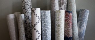
Types of modern wallpaper
- Paper
- Vinyl
- Non-woven
- Textile
- Natural wallpaper
- Photo wallpaper
- Liquid wallpaper
The type of wallpaper is selected depending on the purpose. If you are planning a light cosmetic renovation, for example, you need to freshen up your rental property, inexpensive but beautiful paper-based wallpaper will do. With this wallpaper you can transform a room in an evening.
- Any wallpaper is suitable for the bedroom and living room. The choice depends on the area of the room, the condition of the walls, how thorough the renovation is planned and other nuances. It is worth taking a closer look at multi-color vinyl, laconic non-woven plain gray wallpaper or textile gray wallpaper with a pattern - the choice is huge. The living room also uses wallpaper made from natural materials - they are durable, environmentally friendly, have excellent warmth and sound insulation.
- For a nursery, it is better to take paper ones; they are the safest from an environmental point of view, have a wide selection of colors, and are easy to re-glue.
- Vinyl or non-woven fabrics are perfect for a kitchen or studio apartment; they are abrasion-resistant and moisture-resistant. They can also be used in the hallway. In rooms with changes in temperature and humidity (balcony, bathroom), vinyl wallpaper, paintable wallpaper or liquid wallpaper are also suitable.
- Wallpaper made from natural materials and photo wallpapers are used for zoning.
There are general rules when choosing a wallpaper pattern:
Note!
Glass wallpaper - what is it? Pros and cons, types, features, characteristics, photos of design and combinations in the interior
Plain wallpaper - 150 photos of modern design. Rules for choosing and combining wallpaper in the interior: kitchen, bedroom, living room, hallway
Wallpaper framed on the wall in the interior: photos of original design and beautiful decor
- In rooms with low ceilings, you should use a vertical pattern.
- In a small room - light warm shades.
- For a large room, catchy wallpaper is suitable: a large pattern and a deep tone.
Scope and style orientation
In order to decide on the scope of application, you first need to decide in what design genre the interior will be made. The versatility of the palette makes it possible to use it in one form or another in almost all style directions. It can be either classic or, for example, Provence style, or country, Scandinavian, or loft, hi-tech, or art deco, etc. There are as many options as there are shades of this wonderful color.
Wallpaper with a pattern is suitable for a bedroom and living room in a classic style.
The most common place of application is walls. To decorate them, you can use decorative plaster, paint or wallpaper. Moreover, gray wallpaper in the interior can be of absolutely any texture, plain or with a pattern. It all depends on the purpose of the room and the chosen design.
Geometric and abstract patterns are suitable for medium to large rooms.
Styles such as urban and loft are characterized by the use of coal and anthracite for the floor and ceiling. It is even possible to make all parts of the room in gray tones; for this, a smooth transition from dark to light is used, and materials of different textures are used. For example: for the floor - natural stone, concrete or wooden laminate in dark colors (wet asphalt, coal), for the walls - plaster or wallpaper in medium tones (tin, slate, dove), and the ceiling is painted in light gray shades (zircon, Gaysborough) .
Gray wallpaper will be an excellent option for creating an accent wall in a loft-style bedroom.
Shades of gray look no less impressive in decorative elements and textiles. Furniture and curtains made in this range perfectly convey the atmosphere of practicality and laconicism of the high-tech style. And the variety of textures and patterns of gray-smoky tones in the decoration and objects filling the space will emphasize the luxury and sophistication of art deco.
Gray wallpaper can be used to decorate a wall near a fireplace or TV.
See also Gray-blue color in the interior, photo.
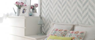
Gray wallpaper for the bedroom
The bedroom is a comfort zone where a person relaxes after a hard day, and the interior of the room should contribute to this as much as possible. Gray color for a bedroom is an ideal option. When choosing wallpaper, you need to take into account the size of the room and lighting.
It is generally accepted that warm tones give a feeling of coziness, while cold tones, on the contrary, add severity. Everything is not so clear. If you use shades of only one color temperature, there is a risk of achieving the opposite effect.
It is better to combine colors according to temperature - for example, cool gray wallpaper for walls and warm gray for textiles. The photo shows examples of such combinations. Thanks to the cool shade of the walls, a feeling of free space is created; warm curtains and bedspreads create a feeling of comfort.
Children's room and bedroom
To decorate the walls in a bedroom or children's room, it is more advisable to choose gray wallpaper in light colors. They combine well with delicate pastel shades (pink, blue, beige, etc.) and give a state of peace and tranquility. For a nursery, this is just a godsend, especially if there are hyperactive children in the family.
Gray wallpaper in the nursery in combination with light furniture and delicate pastel colors will create a stylish look.
To create a harmonious space, designers advise filling the interior with a variety of accessories and decorative items. These can be numerous bright colored pillows, vases and boxes, figurines and candlesticks, photo frames and paintings. Everything that makes our home so cozy.
It is neutral gray wallpaper, thanks to its versatility, that can become a good background and smooth out the clumsiness of a large number of objects.
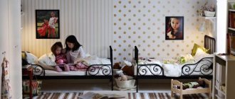
Suitable for both boys and girls' rooms.
A monochrome interior could be an interesting option for an adult bedroom. The combination of several shades, thanks to different materials and textures, will create an incredibly stylish and elegant look.
See alsoHow to choose wallpaper for the hallway and corridor photo ideas for an apartment
Gray wallpaper for the kitchen
The gray shade of wallpaper in the kitchen will be very harmoniously combined with bright flowers: fruit in a vase, decorative elements, beautiful dishes. You can change the interior endlessly: choose your own colors for different times of the year. It all depends on the imagination of the hostess. The use of paper wallpaper in the kitchen is justified if you need to make a quick budget renovation. A huge selection of different shades will make the room elegant and at the same time functional.
The disadvantage of such wallpaper is abrasion and rapid fading. Vinyl wallpaper is used most often in the kitchen. They, like paper ones, have a large selection of colors, but unlike paper ones, they are more durable and moisture resistant. Disadvantage: they don't breathe. Another type of wallpaper for the kitchen is non-woven wallpaper. This wallpaper is moisture resistant and beautiful. You can wipe them without fear of ruining them. The disadvantage is the high cost.
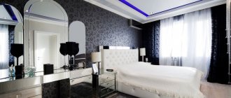
Gray wallpaper for the living room
When choosing wallpaper for the living room, you need to use general recommendations: take into account the size, degree of illumination, combination with furniture, personal preferences. Considering these aspects, choosing the right color, you can transform your space with wallpaper.
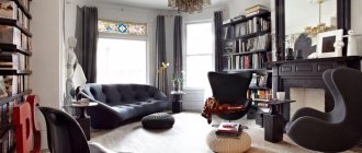
Gray is the favorite color of aristocrats, designers and stylists. Thanks to this color, an exquisite interior is created, emphasizing the impeccable taste of the owner. If the room allows, you can use the dark graphite color of the wallpaper, combining it with pearlescent gray, as seen in the photo.
The sales rating for gray wallpaper remains consistently high. One of the secrets of its popularity is its compatibility with almost all other colors. The gray color of the wallpaper is the base. You can constantly update and change the interior with the help of decor and paintings.
Gray wallpaper in the bathroom
When thinking about bathroom design, it is worth remembering practicality, because the room has its own specifics. In specialized stores there is a large selection of wallpapers, which in terms of technical characteristics are not inferior to tiles, but are several times cheaper.
And you can update a room covered with wallpaper much more often than in the case of ceramic finishing. Acceptable options: liquid, vinyl, washable wallpaper. Both combinations of gray wallpaper with colored wallpaper and the strict style of gray wallpaper will go equally well with white sanitary ware. Examples can be seen without photos
Which curtains are suitable
Modern designers recommend choosing curtains to match gray wallpaper to match the furniture upholstery, so that there is a harmonious arrangement of shades throughout the room.
For a monochromatic interior, curtains in pastel shades are suitable, and if there are colored accents in the living room, you can choose to match the walls.
Light wallpaper in the living room looks good with dark curtains, which will emphasize the fresh atmosphere of the room. You can match some decorative details to match them - for example, the same dark frames with paintings. If you want to add contrast, you can hang light curtains with dark walls. But choose slightly creamy fabrics; snow-white ones will be too bright, and the contrast here will not look beneficial.
Curtains are also an accessory, but if used incorrectly as a bright accent, you can end up with an expressive spot. Pay attention to how many colored objects are in the room, and only then make a decision.
It is not necessary to give preference to heavy curtains; you can get by with just one tulle. In this case, you can choose fabric with patterns if the walls are made in a monochromatic solution. Designed wallpaper requires quieter curtains, otherwise the living room can take on an overloaded look.
Austrian curtains, roller curtains or various types of curtains - it doesn’t matter what is chosen for gray wallpaper. The main thing is to choose a suitable shade that will only emphasize the beauty of the room.
Color of Curtains for GRAY walls, under gray wallpaper in the kitchen, living room, bedroom (10 options). A COLOR SCHEME
Curtains for gray wallpaper
The color gray has many shades that differ in warmth, degree of saturation, and tone. The gray palette is elegant and discreet. This color does not tire the eye, and at the same time, with its neutrality, it gives the room a special chic.
The property of gray wallpaper is that, depending on the intensity, it can serve as both a background and the main accent of the room. Based on these nuances, curtains are selected. The combination of warm tones with warm, cold with cold is considered a classic, that is, warm shades of curtains should be matched to warm shades of the walls. Many examples of combinations can be seen in the photo.
- Dark gray wallpaper (the color of wet asphalt, anthracite, graphite) is suitable for curtains in light or white tones.
- White and transparent tulle, bright and rich colors, and deep shades are suitable for light gray wallpaper.
When choosing wallpaper taking into account the general rules, listening to advice and taking into account recommendations, you also need to listen to your desires so that the final result pleases the eye and warms the soul.
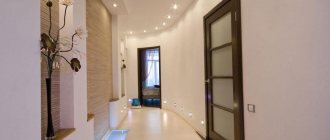
Hallway and corridor
The corridor and hallway serve as the “face” of a city apartment and a private house. These rooms are the first to stand in the way of your guests and can tell a lot about their owner. If in your own home, when planning, the hallway can be made wide and spacious, then in apartments these rooms are often small and barely cope with their functional purpose. Wallpaper in gray shades will help to “brighten” a room that a priori does not have windows and is only illuminated artificially.
You can play on this by placing a large wardrobe with mirrored doors or a narrow modern dressing table with a high mirror, in which numerous light sources will be reflected. Together with gray wallpaper, they will allow you to breathe deeply and enjoy the space in a narrow and cramped room. A cold hallway with rational use of space will immediately show that a business person lives here, who does not like to waste time and appreciates every centimeter of his apartment. Soft combinations of gray and white in wallpaper with the addition of bright shades and practical patterns will tell the guest and the delicate nature that likes to dilute “gray everyday life” with notes of optimism and vivid impressions. Eclecticism in the interior of the hallway, which is based on dark gray, will show an extraordinary person who loves slight disorder, confusion and a clutter of images.