About Grays and Neutrals from the 50 Best-Selling Paint Colors Palette
The best paint colors for walls and ceilings, according to a professional. The most purchased colors for interiors and facades in the world. The best shades of gray: from almost white to almost black. How does color change under different lighting?
When you're choosing a paint color for the interior or exterior of your home, it's a good idea to familiarize yourself with the palettes of the most popular and best-selling colors. Such palettes are formed based on the choice of both professional designers and owners of apartments and houses, and help not to drown in the ocean of thousands of available shades of paint and varnish products. This can often be a great starting point when finding the color that suits you best.
Below is a palette of 50 of the most popular and best-selling paints from the famous company Sherwin-Williams. Of these, we will highlight 12 of the most versatile and reliable gray ones and analyze them in more detail. There will be descriptions and tips on using this or that color, with explanations of why this color is more appropriate in certain places and conditions. The “pros” and “cons” of the selected colors will also be taken into account.
In this material we will rely on the extensive experience of US designer Cindy Alred. We give her our word:
Repose Gray
The number one color in the world in all companies involved in the production and sale of paints. Of course, this cannot be said with 100% certainty, but I would be very surprised if I found out that this is not the case. Repose Gray is a fantastic warm light gray that I highly recommend to my clients because it is absolute perfection when it comes to painting all the walls in a home a neutral light shade.
Pros : Versatility. This gray is especially nice because it not only looks beautiful during the day in natural light, but is also one of those rare colors that looks great at night in artificial light. When changing the color temperature of the lighting, unpleasant shades do not appear.
Cons : In rooms with lots of natural light, Repose can produce a very faint bluish-gray cast.
By the way, all the colors on the fan card where Repose Gray is located (card 244) made the bestseller list, which is not surprising because this set is simply gorgeous. These are stunning and versatile colors and you'll see some of them below.
Sea Salt
This color is almost as popular as the previous one. The vast majority in the survey named it their favorite Sherwin-Williams color. Feel free to go for it if you are looking for a calming and serene spa color.
Pros : Calmness and serenity. In the right light, Sea Salt is one of the most beautiful shades of blue-green-gray.
Cons : Has a chameleon effect and can be finicky in certain lighting (usually in areas with a lot of natural light). It is very important to do test colors first. This color looks best in rooms with little or no natural light (bathrooms, bedrooms, etc.).
Worldly Gray
This is another trustworthy warm light gray color that is quite close to Repose Gray but is a little warmer and darker. I often recommend it to clients over Repose Gray as an overall color for the entire interior if there is a lot of natural light in the room, as the former can look too white in such conditions.
Pros : In rooms with lots of natural light, Worldly Gray is ideal and versatile.
Cons : This color will appear darker in areas with little natural light, and may look a little heavier than a traditional warm light gray.
Crushed Ice
I met Crushed Ice for the first time recently when I was redecorating my living room. I chose this as a replacement for Repose Gray (our number one), which looked a little lighter than I would have liked in this space. And in the end, I just fell in love with it, so I can confidently recommend that you try this color too. It's a little lighter, a little cooler, and has a little more pigment than Repose Gray.
Pros : Crushed Ice is a stunning warm light gray that falls between light (with subtle color) and mid tone. A rare gem in the range of intermediate neutral colors.
Cons : Crushed Ice looks better in areas with moderate natural light. Not the best choice for rooms without windows.
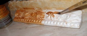
Features of painting various materials
The existing range of paints is huge. This allows you to transform a wall made of any material. But each of them has its own characteristics.
Concrete
Before applying paint, the wall is washed with a soap solution. After this, all cracks and crevices are sealed with putty.
To do this, a polyethylene sheet is glued to the wall using adhesive tape. If after 24 hours moisture appears on the sheet, the wall is treated with sealant.
Painting concrete walls is very popular and is done using different techniques.
Finally, paint sealant is applied to the painted surface. It provides tighter adhesion of materials and extends the service life of the coating.
The concrete wall must be checked for leaks.
Tree
Glossy paints give the interior an original look, while matte ones allow you to emphasize the relief of the material.
In order to allow the wood to breathe and thereby extend the life of its aesthetic appearance, it is better to choose acrylic paints. After some time, oil paints lose their original shade and become matte.
Proper painting of wooden walls can emphasize their aesthetics
Brick
It will be difficult to remove the coating from such material in the future. In addition, paint on brick lasts about 4 years.
The best choice in this case is silicone coating. The disadvantage is that it is expensive, but this paint allows air to circulate and helps hide minor defects.
Brick, as a building material, is not entirely suitable for painting
Wallpaper
When choosing paint, you need to start from the type of wallpaper. For example, latex paint is better for glass wallpaper, and water-based paint for non-woven wallpaper.
Wallpaper of any type can be painted no more than 10 times.
Wallpaper for painting
Plaster
To level the walls, use gypsum or cement plaster. For the first, acrylic or water-dispersed paint is suitable, for the second - water-based paint.
Dorian Gray
This is another fantastic neutral warm gray from the mid-tone range. I used it on my client's kitchen hood hood and it looks beautiful. Dorian Gray also works great as a neutral color for furniture.
Pros : Found on the same card (244) of the color fan as Repose Gray, but only two shades darker. A very versatile color for walls and cabinets.
Cons : Too much natural light can cause Dorian Gray to become cooler and no longer look like a warm gray.
How to use a color palette
The red color used in the interior lifts the mood and gives strength. Use it not as the main background, but as a bright element. The hue of fire creates an atmosphere of festive celebration.
Do not use red in rooms of overly active children or sensitive people. An intense shade will lead to irritability and overwork. The downside of fiery coloring is the visual reduction of space. It is better to use it in spacious rooms, but not as a background, but in the form of textiles, furniture or decor.
The yellow interior evokes joy. It invigorates, cheers, gives a feeling of comfort and warmth. Don't go overboard with the shade. Yellow walls, ceiling, and floor can put pressure on a person. Therefore, it is better to use this color as decoration or for the kitchen. The shade improves mood and stimulates appetite. But the yellow tone is not suitable for the living room and bedroom, but just right for the nursery. Children love the color of the sun, the main thing is not to overdo it.
The orange hue creates an atmosphere of celebration, fun, and fills the house with joy. Orange decorative elements are eye-catching and look best when used as pops of color. Citrus color stimulates brain activity and activates creative processes. Suitable for interior decoration in a study or children's study area, fits well into the kitchen and dining room.
A decor created in a Moroccan or Spanish style needs orange. The shade combines well with other warm colors, but does not combine well with cold ones.
Source: liveinternet.ru
Dovetail
If you want something darker than a neutral mid-tone warm gray, Dovetail is a great choice. It is well suited for interior doors and cabinets. It is unlikely to be suitable for painting all the walls in the room, but an accent wall of this color will look beautiful.
Pros : Dovetail is a win-win option when you want to add contrast to a room, but don't want to use very dark tones so as not to lose the overall lightness.
Cons : Dovetail may take on a warmer tone in rooms with artificial lighting. Although this does not harm him too much, he remains beautiful.
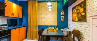
Which wall to place the TV on?
The best place to install a TV is where the screen is located at the optimal distance from the audience. For devices with a 32" diagonal, it should be placed at a distance of at least 1.5 m. For a 40" screen - 1.6-1.7 m. If the TV has a 60" diagonal, it should be installed at least 2.5 m from the sofa.
In a small living room, it is better to place the TV against a short wall at a height of 1-1.5 m. It is better if it is located opposite the window. It is worth choosing a perpendicular position of the screen to the window if there is enough space in the room and the windows are covered with thick curtains.
A TV in the most illuminated area is a good solution
Options for placing a TV against the wall in the living room:
- On the bracket. It's better to choose a stand. on hinges With it you can change the position of the screen if necessary.
- In the corner. This arrangement is optimal - you save space and get the opportunity to implement complex design ideas.
- In a niche. This solution allows you to create the impression of built-in technology. The best option is to construct a recess from plasterboard.
- In a furniture complex. Placing the TV in a special area of the rack or wall eliminates the need to think through the design of the wall next to the equipment.
To ensure that the TV fits into the design of the room, it can be installed against the background of a decorative panel
The standard option is to place the TV in a furniture wall.
See alsoTips for choosing the interior design of a walk-through living room
Drift of Mist
If you want a neutral shade with just a hint of color, I suggest using Drift of Mist. It's a very subtle color that I think is almost the perfect neutral.
Pros : Drift of Mist is one of those rare colors that solves the problem when neither white nor more saturated colors will do.
Cons : There is a very slight hint of muted yellow (very faint). This is what distinguishes it from white, softening it to neutral. And, although I don’t like the presence of yellow, I could use this color in my home.
Brown
Brown is another color that will not go out of style for a long time due to its versatility. It can fit into any interior: be it cozy Scandinavian or luxurious classic style. The classic combination - brown and white, coffee with milk - is used very often by designers in living room interiors, as it creates both a cozy and luxurious atmosphere. White color in this combination creates a background for brown shades, highlighting them favorably.
To make the brown and white palette sparkle with colors, add fresh flowers and unusual decorative elements to the interior, as shown in the photo below. Just a couple of touches - and the living room takes on a touch of nature.
amara.com
1/2
elledecor.com
2/2
Peppercorn
It's no surprise that Peppercorn from Sherwin-Williams made the bestseller list because this color is unheard of good! This cloudy taupe has tremendous depth and is perfect for an accent wall, closets, and some very small spaces.
Pros : Peppercorn is one of the most trustworthy taupes. It always looks good on walls, cabinets and accent pieces.
Cons : I can't think of a single problem with this color. He always looks great.
Iron Ore
The next example is a beautiful very dark gray with a brown undertone that has become a popular choice for finishing interior doors, cabinets and façade features. Really amazing color!
Pros : Iron Ore is a stunning deep and heavy color. It adds instant contrast to a space when used sparingly.
Cons : When using this color to decorate exterior elements, be careful: make sure that it harmonizes with the overall color of the facade, even if it is almost white. This is less true indoors, but bright sunlight outside really brings out the Iron Ore tones.
Black Fox
Another fantastic dark color from the best seller list, very similar to the previous one is Black Fox. But while Iron Ore tends to lean towards dark grey, Black Fox is more of a very dark brown.
Pros : Very rich dark, ideal accent color for walls, interior elements and facade decoration. Very versatile.
Cons : In windowless rooms under artificial light, Black Fox can have a rather warm tone but still be beautiful.
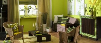
Living room style colors
Antique
Features: muted colors. Among the leading shades are brown, beige, ocher, cobalt, terracotta.
To prevent the interior from seeming flat, columns and stucco are used in the design.
Living room interior in antique style
Vanguard
Bright shades and combinations predominate. Basic beige, white and yellow colors are complemented by details in purple, red, green and blue shades.
Vanguard
Empire style
This style exudes its richness and majesty, so it is suitable only for large apartments.
The main colors are white, red, burgundy, gold.
Empire style living room interior
Art Deco
A living room in this style implies a predominance of dark tones; brightness and variegation are recommended to be avoided.
Living room interior in art deco
Art Nouveau
The dominant position is reserved for muted, natural colors - chocolate, terracotta, gray, sand.
Living room interior in art nouveau
Baroque
Because of its grandeur and splendor, this style requires the use of terracotta, dark green, brown-green, red-burgundy, purple-gold, blue-green.
Small living room in Baroque style
Biedermeier
Traditional finishing materials are used - wallpaper, paint, plaster.
A distinctive feature of the style is comfort and simplicity. The presence of pink, creamy, brown, milky, blue colors is necessary.
Living room in Biedermeier style
Victorian
The primacy of wallpaper with various ornaments. The predominant colors are pale pink, lilac, almond, gold.
Victorian style in room interior design
Constructivism
Monotony prevails. The main colors are white, light and dark gray, black, red, light green.
Bright living room in constructivist style
Classic
The walls should be matte and rough. Wallpaper should be chosen with a classic pattern.
The dominant position is occupied by light pastel colors, which are complemented by elements of white, dark brown, blue-green, blue, and pink shades.
Classic
Renaissance
You are allowed to choose any colors, but it is important to combine them correctly and ensure that there is no strong contrast or transitions. Standard shades are red, burgundy, black, brown.
Cozy Renaissance interior style in the living room
Minimalism
Involves the use of classic shades - white, black, gray, beige. It is appropriate to introduce elements of orange, red and green colors.
Minimalism
High tech
The walls are made in silver. Cold-colored stones and metal-look tiles are often used.
High tech
Country
The walls are decorated with paper wallpaper, wooden panels, and decorative plaster.
Soft colors predominate - light green, beige, lilac, milky.
Country style living room
Provence
A soft and light style that requires the use of white, cream, sand, light yellow, light blue, pale green and lavender.
Provence
Tricorn Black
Of the black colors, I most often prefer Tricorn black in my projects. First of all, because it really looks like black. And small brown-gray undertones relieve it of excessive roughness and harshness.
Pros : This is a very versatile and reliable color for both interior and exterior use. If you are in search of the best black color, you can go for this one as it is really beautiful.
Cons : I've never had a problem with this color. He won't let you down. The taupe shade complements almost any color when used as an exterior trim or accent color.
Mustard
Luxury, prosperity and independence - these are the associations that arise when we mention mustard color. Depending on the lighting, it plays in different shades: from bright yellow to dark.
This color goes well with its closest neighbors - yellow and brown. The first will add brightness and energy to the interior, while brown will add luxury and style.
For a summer mood, combine mustard and blue colors with interesting decor, this will add freshness and good mood.
decoist.com
1/3
decoist.com
2/3
elledecor.com
3/3
Mindful
I have been using Mindful Gray for many years, both on client projects and for myself. I think Mindful Gray is one of the nicest and safest warm gray colors out there and is great specifically for furniture.
Pros : An extremely versatile warm gray that looks best on cabinets and other furniture, as well as fronts. It's a little heavy to get a warm gray on your walls, but it's fine if you're looking for a warmer, mid-tone gray.
Cons : In rooms with plenty of natural light, Mindful Gray can look cold without losing its brilliance. However, if you want a warm gray that stays warm in these lighting conditions, then Mindful Gray is not the best color here.
Most of the Sherwin Williams colors featured on the most popular list are simply gorgeous. I haven't worked with many yellow/beige tones so I haven't given them any rating in this review.
And further. Before using any of the colors that I have given excellent ratings, be sure to test them in the room and lighting where they are intended. Lighting can change color dramatically and I really want you not to be disappointed!
You can learn about how light changes color in the article Warm and cool lighting in the interior. Color temperature of light.
To learn how to choose a light bulb with good color rendering, read the material Quality of lighting in the interior. Choosing the best lamps.
You can order paints in the colors you like right now on this website.
Articles about paints, color and design (opens in a new tab)
View products