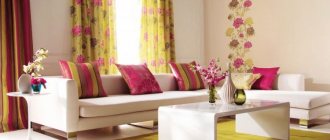
Color selection
How it will interact with the natural light in the room.
This is the main criterion when choosing the color of wallpaper for the south side. After all, when bathed in bright light, different colors are perceived differently. Suitable for a sunny room:
Dark wallpaper in rich, deep tones is well suited for brightly lit rooms.
In the photo: Vine Tree wallpaper 81/7027 from Cole & Son.
- Rich deep shades.
You shouldn’t be afraid that a dark wall will “eat up” the space, because it will always be well lit. - Muted shades.
They are preferable to pure colors, which can hurt the eye in direct sunlight. - Cool shades.
They will give you a feeling of coolness. For example, green-blue wallpaper in a room with windows facing south will remind you of a fresh sea breeze. Yellow-orange wallpaper, on the contrary, can enhance the feeling of heat and stuffiness. - The colors of the natural palette
- sand, earthy, ocher - will give a rest to the eye even in the brightest sunlight. - Gray colors
will add elegance to the interior.
Gray wallpaper will appear silver in sunlight. In any case, the room will not look dull.
Wallpaper and furniture color
Designers recommend sticking to the following color combinations.
| Furniture | Wallpaper colors | Suitable shades |
| Dark | Calm, light, without massive patterns |
|
| Brown or reddish | Dark |
|
| White | Any options | A dark tone will highlight the white elements of the interior. Beige shades - for a calm atmosphere. Also suitable:
|
| Bright |
| Bright contrasting or pastel colors |
| Multicolor | Gray with chalk patterns or plain. | |
| Blue | Bright or light | For fun companies:
For a relaxing holiday:
|
| Gray | Any | Any |
| Peach | Bright or light |
|
Ornaments
Restraint and moderation.
Wallpaper for a room on the south side should have a sparse, discreet pattern - if you really can’t resist it and wallpaper for your room is, first of all, wallpaper with a pattern and decor. Neglecting these two principles can lead to the fact that in bright light, wallpaper with too variegated patterns will begin to “ripple” and will be uncomfortable to look at.
One wall with a pattern
— it is best to place the pattern on the wall opposite the window, so it will be most illuminated and will attract attention. This can be ready-made wallpaper with an ornament, photo wallpaper or painting on wallpaper for painting - one decorated wall will be quite enough to ensure that the room does not look monotonous, and at the same time it does not dazzle the eyes of guests and residents. The remaining walls can be left plain.
- 1 of 1
On the picture:
Place colorful photo wallpapers on the wall opposite the window - this way they will literally appear in the best light. Just don’t cover all the walls in a brightly lit room with wallpaper with bright prints—one will be enough.
Pictograms
In the photo: symbols on wallpaper: 1. medium light fastness; 2. satisfactory light fastness; 3. good light fastness; 4. very good light fastness; 5. Excellent light fastness.
Blackout curtains
will also help reduce the rate of wallpaper fading, but care should be taken to ensure that they do not fade in one season. But keep in mind that in this case the fabric from which the curtains are made will fade.
Correct choice of wallpaper material.
If replacing double-glazed windows is not part of your plans for decorating a room on the sunny side, and you also don’t want to constantly shield yourself from the sun with curtains, you need to focus on the materials from which the wallpaper is made. Wallpaper made from different materials reacts differently to sunlight.
Most susceptible to burnout:
- single-layer paper wallpaper (simplex),
- coverings made of natural fibers (jute, sisal, bamboo, reed),
- oil paints, which are often used to cover linkrusta,
- posters and photo wallpapers made using inkjet printing.
Do not fade for a long time:
- duplex paper wallpaper,
- fabric wallpaper - a fabric base (silk, linen, jute, viscose), duplicated from the inside out with paper,
- fiberglass wallpaper,
- vinyl wallpapers,
- water-dispersion paints and alkyd enamels on any wallpaper for painting,
- photo wallpapers and posters made by offset printing.
- 1 of 6
On the picture:
Traces of fading are less noticeable on light-colored wallpaper with a small pattern than on wallpaper with rich colors and large patterns.
Fashionable colors in 2022
Capricious fashion makes demands on its own standards. Color range for 2022:
- In first place is the purple color. Experts have found that such colors reflect the creative thinking of a modern person. It is not neutral and when using it with other highlights it is advisable to adhere to certain knowledge.
Purple color is a dominant color, and does not look harmonious with every shade, so when using it, you should show a competent combination in interior design. For lovers of calm compositions, violet can be compared with notes of white and beige. For eccentric people, a combination with raspberry and brown is suitable. But this tandem is designed for large spaces.
But not every person likes the proposed tonality; some people want to adhere to the laws of fashion as little as possible. The designers presented a way out of this situation: make one wall the accent of the room.
- The consultants suggest green as the second leader. His collection includes more than a hundred colors with olive and marble shades. With a creative approach, you can create a unique masterpiece from the main room of the apartment.
According to the recommendations of fashion experts, when choosing the color of nature, you should give preference to muted shades; they soften the interior and make it comfortable. Greenery easily combines with beige and light tones.
- Third place was won by several colors at once. Fans of bed shades will be pleased with the design option in white and pink tones. For adherents of the classics - dark blue pigment. People with an extravagant mindset will love trendy earth colors, from chocolate to sand. Traditionalists should consider the highlights of gray.
Matching style
Selected wallpaper without a creative approach will not last long. In order for the walls to harmoniously combine with the interior, you need to adhere to a certain style. There are several types of design and each of them has pros and cons.
Classic
Suitable for conservative people, does not contain flashy elements, and is consistent in color. Its shades are beige and green. Wallpaper for this style is chosen to be plain, with a non-uniform surface and with a modest pattern.
Vintage retro
The best option for fans of adventure. This design is suitable for textile wall decoration using muted shades against the backdrop of a bright composition of sets.
Empire style
It is often used in spacious rooms where it is possible to recreate the imperial style. It is best to choose a pattern for decoration in stripes or damask. Colors are kept in soft light tones and in strict combinations.
Victorian style
Wall decoration with fabrics or wallpaper. The design contains no more than two colors - brown with a warm highlight and red. The ornament is based on flora, fauna or geometric shapes.
Country
This style is suitable for people who follow rustic traditions. The main shades in the design are light highlights and simple patterns in the form of flowers, stripes or geometric shapes. The main thing in country music is simplicity and naturalness.
Ethnics
The style is intended for fans of the avant-garde who prefer something extraordinary. Vinyl wallpaper with bright colors and intricate patterns is suitable for the living room.
Modern
The most popular direction in which pastel colors are used with the use of abstract patterns.
Oriental decor
The style comes from the land of the rising sun (Japan). The walls are covered with silk-screen printing. The pattern is based on hieroglyphs or birds.
Loft
A destination for connoisseurs of the Middle Ages. The interior adheres to antiquity. Fiberglass wallpaper will be the best option for decorating a living room.
How to choose wallpaper for the living room: basic color patterns and patterns
As noted above, wallpaper is part of the interior color scheme of the room. It is the color scheme that influences our mood, creating a certain atmosphere - calming, dynamic or, conversely, depressing. In addition to the emotional component, which directly affects mental processes, color also allows you to change the visual perception of the room - to make a small room visually larger, or, conversely, to visually reduce an overly spacious room.
The color scheme of the room should include no more than 2-3 colors, since a rich color variety tires the psyche.
The color scheme of the hall, as a rule, includes the following main color components:
- Ceiling color;
- Wall color;
- Furniture color;
- Textile color;
- Floor color.
Pay attention to modern solutions for decorating the ceiling in black. Details in our article: https://homeli.ru/remont-i-otdelka/potolok/chernyj-potolok
The color scheme of the hall can be nuanced and contrasting. A nuanced solution involves using soft, similar colors in the color scheme. But a contrast solution means a comparison of two main contrasting colors: turquoise and brown, orange and blue, etc.
The strongest contrast combination is created by yellow, red and blue colors. And the most intense contrast of light and dark is black and white.
The selection of wallpaper should, in addition to color, take into account one more nuance - the wallpaper pattern. Wallpaper patterns come in large, medium and small scale.
Selection criteria
Often, the hall is one of the largest rooms in a house or apartment, so the following wallpaper is suitable for this room:
- If the living room is very large, spacious, high and contains little furniture, then in this case it is better to use wallpaper with a large-scale pattern for the walls.
- If you need to paste wallpaper in a standard apartment of a multi-story building, then in this case, you can paste wallpaper for walls with a medium-scale pattern. But at the same time, you should not place small paintings and photographs on the walls, so that the wallpaper design does not “argue” with such decor.
- The most common type of wallpaper for the living room is wallpaper with small-scale patterns, which are perceived as a neutral element of the interior. In this case, paintings, photos, collages, etc. can be placed on the walls.
The choice of wallpaper for the hall is carried out taking into account the chosen color scheme and the richness of the room’s interior (paintings, furniture, etc.).
Combination tricks
If you approach the design of the hall with a creative approach, you can translate an amazing idea into its interpretation. That is, it is not easy to glue rolls of the same color, but to use combination tactics, and as a result get a unique masterpiece.
This method has advantages:
- zoning of certain places in the room;
- the ability to expand the room in length and height;
- hiding errors on the bases;
- highlighting a niche or, conversely, decorating it.
When combining, it is necessary to combine everything correctly, for example, when using wallpaper strips of different shades, it is advisable to use one pattern. The main thing is to choose the right contrast of color and texture of the material.
In a room, using this method, you can achieve certain effects. For example, hide defects on the wall with a combination of two colors. This method is used in studio apartments.
If you need to separate the kitchen from the living room, then use combinations for zoning purposes.
Using pastel and dark highlights you can visually expand the space of small rooms.
It is important to consider that the wallpaper should be the same thickness, then the joint will visually merge and hide the seams between combinations of materials. In terms of texture, the main thing is to combine wallpaper and colors of the same type.
There are two combination methods: vertical and horizontal. Using the first option, a visual expansion of space is achieved.
Expert opinion
Olga Kovalenko
Since 2010 I have been engaged in interior design and architectural design.
How much it will increase depends on the number and thickness of the inserted strips.
The second type allows, thanks to smooth transitions, to combine wall coverings of different textures. Made in light colors, this living room design corresponds to the classic style.
For people with small-sized housing, 3D wallpaper will help to beat this situation. Highlighting the living room wall with this material will give the interior a cozy and chic look.
Many apartments have recesses in the wall and protruding corners. Combining wallpaper is a solution to this problem. If you highlight a niche in a light tone and place video equipment there, then the disadvantage will turn into an advantage.
What kind of wallpaper should I put on the ceiling in the living room?
The ceiling of the hall, just like the walls and floor, affects the perception of the room as a whole.
There are many ideas and tips for decorating the ceiling with the most modern types of wallpaper in our next material: https://homeli.ru/remont-i-otdelka/potolok/zhidkie-oboi-na-potolok-foto-i-otzyvy
As a rule, wallpaper should be glued to the ceiling taking into account the following principles:
- Traditionally, ceiling wallpaper is chosen in light colors.
- Dark wallpaper is only acceptable if the room is very narrow and high. In addition, if there is not enough light in the room, then help brighten it - use light wallpaper materials for the ceiling that reflect the sun's rays well.
- For a sunny room in the southern regions, wallpaper with dark colors - blue, terracotta, light blue - is suitable for the ceiling - they absorb excess light.
Wallpaper for the ceiling in the hall should create comfortable lighting and complement the overall color scheme of the room.
Color solutions
The collections of famous designers are often dominated by bright, positive colors: yellow, pink, chocolate, turquoise. The priority is a complex color scheme: shades of olive and green, eggplant, sea wave. Floral and plant motifs are also very popular. However, if previously they used a small pattern with wildflowers or roses filling the entire space, then judging by the photo of 2022, the design has changed, and wallpapers began to be produced with more voluminous floral patterns. For adherents of conservative classics, light pastel-colored canvases remain relevant in the interior. Wallpaper is selected for specific household items with a similar texture. Wallpaper can also be combined with tulle, accessories and flooring.
White and pastel
A snow-white or simply bright living room will forever remain in your memory. However, when choosing wallpaper of this tone, make sure that the walls are level, since too light cladding will not only emphasize the design of the living room, but also the shortcomings of its vertical surfaces.
Living room with wallpaper with a barely noticeable structure (suitable for painting)
White or pastel canvases on the walls may have some ornamentation or flowing patterns. For example, for luxurious rooms with a classic interior, canvases with monograms depicted on them, made in the form of structural silver elements, are suitable. Such canvases will become a worthy backdrop for elegant light-colored furniture.
Black or grey-black
Which wallpaper to choose for the living room: black or gray? For example, too dark canvases for such a room are not always appropriate. Only if space allows. Stylish wallpapers with a gray or ash base and the addition of black flowers weaving upwards look original. In addition, purely black wall canvases are usually combined with other shades. For example, beige or cream.
Decorating the wall behind the TV with black wallpaper in the living room.
An alternative would be wallpaper with an original pattern or a black and white design. It could even be a photo wallpaper with a continuation. The finished look will be one large-scale print, diverging onto two adjacent walls forming an angle. Usually the background of such paintings is either light gray or white.
Brown shade
Such walls will become an original contrast for a bright interior setting. Canvases with darkened monograms and floral patterns will look advantageous on a large wall with an arch that serves as a doorway, as well as behind the sofa.
But for this shade of wallpaper there is a condition - it must be skillfully combined with other colors present in the living room. If this option is not possible, then why not lighten the wall with a lamp, a painting or any other accessory.
Purple colour
Such wallpapers should be chosen with caution, as they strongly attract attention and can cause emotional irritation. The lilac color of the wallpaper will be relevant for rooms that already have a fully thought-out interior.
Lilac wallpaper in the living room with fragments of stucco.
With such a background, you can play with colors: add a little light green or pink, make accents on pieces of furniture (in the form of capes or blankets). Remember that the lilac tone should be in harmony with the translucent tulle. This is one of the important conditions in deciding how to choose wallpaper for the living room and use it to make it cozy.
Green tone
This does not mean saturated green, but diluted: pistachio, olive, with a dash of yellow. Wallpaper can be either plain or with different patterns. For example, in order to make an accent on the wall near a large sofa, it is best to purchase a model of canvases with a pistachio base, and as an addition, let it serve as a pattern in the form of spirals or drops with a silver tint.
Living room with paper olive wallpaper with a smooth texture
Correct wall covering: creating visual depth, the illusion of raised ceilings - will play a huge role in the formation of an original and incomparable design. Remember that the green tint of the walls will require plenty of lighting. Therefore, you will need not only chandeliers, but also additional ceiling lamps, and possibly wall lamps.
What wallpaper is suitable for the hall: basic materials
Any wallpaper should look beautiful when finished, and wallpaper materials for the living room are no exception. However, the wallpaper in the living room should not only be beautiful, but also practical to care for. Of course, the living room is not a kitchen, so you can choose materials for it that are not subject to wet cleaning. However, the wallpaper in the hall must withstand cleaning with a vacuum cleaner, i.e. be mechanically strong, in addition, they must have a lasting color, especially if the room is sunny.
In addition to the above properties, the wallpaper material should:
- Hide the imperfections of the walls;
- Be safe;
- Easy to replace.
At the moment, the finishing materials market offers the following types of wallpaper: paper, vinyl, non-woven based, as well as wallpaper using textiles, silk, foil, velvet, bamboo, wood fibers, glass, etc. The range of wallpaper materials is constantly changing and expanding.
The recommendations in the following article will help you choose the right wallpaper for the ceiling of the hall: https://homeli.ru/remont-i-otdelka/potolok/oboi-dlya-potolka
Naturalness and natural materials have always been and will be in trend, so one of the most suitable wallpaper options for a living room is textile wallpaper or wallpaper made using materials such as bamboo, palm fibers, etc.
Types of wallpaper: advantages and disadvantages
One of the important criteria when choosing wallpaper is its material. Each type has its own pros and cons:
- Paper ones are a classic that never loses popularity. The oldest type of wallpaper that has not yet left the shop windows. They come in single-layer and double-layer. Double-layer ones are certainly stronger and more durable than single-layer ones. Modern production technologies make it possible to create magnificent designs and relief patterns on paper wallpaper.
Paper wallpaper can be decorated with relief patterns - Non-woven ones are a successful new product on the modern market. They are made from cellulose mixed with binders. Non-woven wallpaper is also made for painting. Such samples can be repainted up to 10 times.
Non-woven wallpaper looks great, is easy to glue and does not lose color for a long time - Vinyl. They occupy a strong position in the market. Their shortcomings are more than covered by their advantages. The basis of such wallpaper is either paper or non-woven fabric, and foam vinyl is applied on top. The surface is smooth, textured or in the form of silk-screen printing.
When buying vinyl wallpaper, you don’t have to worry about the deep relief, because they can be washed even with a cleaning agent - Fiberglass wallpaper for painting. Made from fiberglass. They come in a variety of textures and reliefs and are designed for interiors where simply painted walls would be ideal.
Fiberglass wallpaper is used to paint walls - Textiles are a guarantee of uniqueness. They add special chic and luxury to the decoration. Fibers of natural fabrics are applied to a paper or non-woven base. They come in linen, silk, and jute. Such wallpaper creates a special atmosphere of comfort, coziness and warmth of the room.
Textile wallpaper will add a special chic to the interior - Natural is the most environmentally friendly option. With the advent of fashion for eco-style and the preference for natural materials, wallpapers have appeared that meet these requirements. Bamboo, straw, reeds, cork, seaweed and other natural materials are applied to a paper or non-woven base. With this wall decoration your living room will get a truly unique look.
Natural wallpaper made of bamboo will give you a feeling of closeness to nature - Metallized or metallic - know-how in the world of wallpaper. More often, a thin layer of aluminum is applied to the non-woven base, coated with special varnishes and paints. These wallpapers have different patterns and shades, but they are all metallic gray in color.
Designs using metallic wallpaper always look interesting - Liquids are an alternative for repairs. Externally they look a little like decorative plaster. They are a liquid mixture of paper and cellulose fibers and binders. They are applied with a roller to the wall and, after drying, create the impression of a deep relief texture of uneven color. Manufacturers offer a huge number of colors and shades.
Liquid wallpaper is simply applied to the wall with a roller - Photo wallpaper. They give a unique opportunity for self-expression and imagination. With their help, unique living room designs are created. But there is one caveat. Designers and builders unanimously recommend forgetting about the old paper version of photo wallpaper, because they are of very poor quality: they fade quickly, are very difficult to glue, and are torn. So, if you are already planning to decorate the room with photo wallpapers, it is better to spend more money and buy them on a vinyl or non-woven basis, but buy a truly pleasing picture of rich colors that will remain unchanged on the wall for a long time.
Photo wallpaper is a guarantee of unique living room design
Table: pros and cons of different types of wallpaper
| Type of wallpaper | Advantages | Flaws |
| Paper |
|
|
| Non-woven |
| high price compared to paper ones (from 200 rubles per roll). |
| Vinyl |
|
|
| Glass wallpaper |
|
|
| Textile |
|
|
| Natural |
|
|
| Metallized |
|
|
| Liquid |
|
|
| Photo wallpaper |
|
|
Video: types of wallpaper
Wallpaper options for the hall
Before choosing one or another wallpaper option for the hall, you need to take into account the orientation of the room, i.e. degree of illumination of the room.
Namely:
- If the room faces the sunny side, then green or blue-gray wallpaper is suitable for the walls.
- If the sun rarely comes into the room, then wallpaper in warm yellow-green, yellow or orange colors with mother-of-pearl, gilding, mirrored, etc. is preferable, i.e. The darker the room, the lighter the wallpaper should be. In addition, in the southern regions the overall color tone should be colder, and in the north it should be warmer.
As for the size of the room, a bright but small room will seem larger if you put greenish or blue wallpaper on the walls, since cool tones seem to push the walls apart. But warm shades have the opposite effect.
The size of the room also affects the selection of wallpaper according to the pattern - large and bright patterns make the room smaller, but small patterns in soothing colors make the room larger.
Wallpaper with longitudinal stripes visually raises the ceiling, and wallpaper with transverse stripes visually pushes the walls apart.
Furnishings also have an important influence on the choice of wallpaper for the room. So, if the hall is a room with a fireplace, where there is little furniture, then we choose marbled wallpaper for it, and 1-2 color paintings will perfectly complement the interior.
In general, neutral light colors and small-scale drawings are good for the hall - this allows you to focus attention on other interior details - paintings, photos, children's drawings, etc.
Expanding space in small rooms
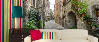
What wallpaper is suitable for a room if it is small in size? A correctly selected pattern will help to visually enlarge it. For these purposes, a perspective image is perfect: a street stretching into the distance, an alley, a shore, etc. If you need to paste photo wallpaper, then it can only occupy one wall, and preferably the longest one.
Those who prefer finishing with conventional patterns also need to choose the right material. Small pictures allow you to glue it to at least all four walls. And large images are only suitable for one of the walls, otherwise they will visually come closer and reduce the space. As for the nature of the patterns, it can be absolutely anything, since it does not affect perception.
Horizontal prints will help expand the space in a narrow room, and vertical ones in a wide room. An excellent option for a small room is to use products with geometric patterns: circles, squares, wavy lines, etc.
Mistakes when choosing wallpaper for a sunny room
There is enough light in such a room, so there is no need to use light wallpaper. It is better to use cool colors, for example, blue or green. Monochromatic options don’t look very good, but excessive variegation won’t work either. When choosing a pattern, it is better to focus on large prints rather than discreet small patterns that will be colorful and may become boring over time.
A large ornament is very suitable for a well-lit room, as it will make it appear larger and even brighter. It is unacceptable to use a large number of bright colors, as the room will seem too blurry and saturated. This, of course, will enliven and give the room brightness, but the eyes will be very tired, so it will be uncomfortable to be in it.
Attention! Under no circumstances should you glue wallpaper with a glossy surface in a room located on the south side. It is also not recommended to use those with glitter on them. This is due to the fact that the sun hitting the surface will produce glare, which will be unpleasant for the eyes.
Choosing a color for a room on the north side
In the northern room, designers suggest choosing from soft, muted, as if whitened colors. It is recommended to use chocolate tones as an accent.
Grays with blue, turquoise and blue are cold, but slightly saturated and energizing. They are successfully used from the north side - in small doses and with a warm background.
The beauty of warm, muted terracotta shades, which include red, brown and pink, are not suitable for a room on the north side. These flowers need sunlight.
You shouldn't trust warm peach, it will make you dull and boring.
Orange, a clean and rich color, adds coziness and a cheerful atmosphere. Plus a little pistachio, yellow, chocolate or white.
Sometimes two orange pillows and the same ottoman are enough.
Yellow and golden colors add sunshine when light passes through even loosely drawn yellow curtains.
An original combination when hanging white and yellow - two layers of tulle.
The bed has a yellow bedspread, sofas with yellow pillows, rugs on the floor. For those who don’t like the abundance of yellow, advice: cover the upper part of the walls, up to the ceiling, with milky white wallpaper or paint it. It is advisable to put furniture in warm brown shades and add green accents.
Red shades: poppy and rowan, coral and brick are suitable, but their saturation and brightness are too tiring. Excess red and bright coral will take away comfort and beauty.
Of the green shades, it is recommended to choose warm and rich ones. Cold greens, even bright colors, without the sun become dull and cloudy, which cannot be said about pistachio, apple green shades or the color of young greens.
Those who love a calm atmosphere in the northern room choose cream, beige and coffee-with-milk colors. Sand and light brown are also popular neutral colors. For cheerfulness, the interior is diluted with 3-4 decorative items in rich colors.
You should not mix gray into this range - it will turn a clean palette into dirty shades. To avoid a beige mixture, use chocolate, burgundy brown and dark red tones as a contrast.
There is no place for black in a dark room where the sun rarely shines. It will fade or become a cool blue or purple color.
More: Custom furniture
Of the white paints, choose a milky white color, but not pure white, and not white-blue, and not white with green, purple and gray shades. Without the sun, they look unpleasantly dirty in appearance.