Types of wallpaper
There are several basic wallpaper options. Information about their characteristics, properties and range will help you make a choice in favor of the necessary material.
Vinyl wallpapers
This is one of the most popular wall covering variations. The basis of the composition is special paper or non-woven material coated with polyvinyl chloride. The advantages of this choice include reasonable price and wide range of colors. The disadvantages are airtightness.
Non-woven wallpaper
Many experts consider them the best choice for any room. Such wallpapers are characterized by high moisture resistance, breathability and environmental friendliness. The disadvantages include a small selection of patterns and colors, which, however, is not a problem for classic, Scandinavian, minimalist and constructive styles, which are famous for their laconicism and consistency.
Liquid wallpaper
They are purchased in powder form, which is diluted with water when applied. An excellent solution for creative people. You can experiment with shades and fix the desired one with a protective varnish. This will help prevent the paint from washing off.
Paper wallpaper
Environmental friendliness, air permeability, and a reasonable price are the main positive criteria for paper wallpaper. Negative aspects include the lack of moisture resistance and rapid fading.
Fabric wallpaper
A spectacular colorful coating that will easily fit into the design of any room. The only downside can be considered the lack of moisture resistance, which is especially important for the kitchen and bathroom.
Let's combine wallpaper with photo wallpaper
After the advent of photo wallpaper, designers found a tool for visually expanding a room while maintaining comfort, charm and authentic fit into the overall style.
In the case of the correct combination of wallpaper with photo wallpaper, an effect is formed in the interior that allows you to bend the geometry of space. The room can be made softer and lighter, or its main background can be darkened to emphasize the style basis.
Choosing the color of wallpaper for furniture
The main rule for creating a bright color scheme in a room is the harmony of shades or their contrast. In the first case, the space will look light, delicate and gentle, in the second - extravagant, bright and original. We have compiled a small list of interesting tips on choosing colors for different furniture:
1. Beige, white, lemon and pistachio (light green) wallpapers are suitable for dark furniture; 2. The following colors will be ideally combined with white furniture: pink, turquoise, coffee, green, blue and yellow. Wallpaper with a golden pattern or geometric pattern can also serve as a beautiful background; 3. For furniture in black, you need to choose a burgundy, gray, beige or silver finish; 4. Gray furniture can be easily shaded with blue, green, pink, white and yellow tones; 5. The correct design for brown furniture is beige, olive and white wallpaper; 6. Suitable colors for beige furniture: green, light red, blue and white.
Do not forget also about the rule of placing accents. This means that the overall decor will look much more sophisticated if the furniture and walls do not blend together, but are not equally colorful.
For example, modest furniture will look great against the background of bright walls, and simple plain wallpaper will look great against the background of extravagant furniture.
How to choose wallpaper for the living room: 85 ideas (photos)
Current shades
This point is about current paints, according to manufacturers of paints and varnishes and companies involved in design. The table will help you navigate in choosing specific ones.
| Gamma | Shades |
| Yellow | Mustard, lemon, pastel yellowish |
| Orange | Ocher, clay, copper, grayish orange, brick |
| Red | Terracotta, burgundy, fuchsia, coral |
| Purple | Lavender, blueberry, eggplant, blackberry, dusty |
| Blue | Dusted turquoise, bleached azure, blue-green, Navi, natural blue |
| Green | Emerald, khaki, gray-green, herbaceous, mint |
We specifically do not include the basic ones in this table, since they are relevant without reference to time. Their choice, in addition to personal preferences, may be influenced by the parameters of the room itself. This is, for example, illumination (the more light, the darker the color can be). And also stylistics. So, in high-tech and loft, a cool gray palette is suitable, in modern designs - ocher, in minimalism all natural tones are relevant, and in Scandinavian - bleached ones.
8 photos
Design: Sweet Home Design studio
Design: Smart Interior Design in collaboration with Olga Louis
Design: Smart Interior Design in collaboration with Olga Louis
Design: Smart Interior Design in collaboration with Olga Louis
Instagram @arianaahmad_design
Design: FlatsDesign studio
Design: FlatsDesign studio
Design: Sveta Khabeeva
- Colors in the interior
The most fashionable colors in the interior 2021 (spoiler: there will be a lot of beige)
Secrets of choosing wallpaper for furniture
It is very important to be able to use the little tricks of specialists that will help make all your interior dreams come true. You can mention the following secrets for choosing the color/tone of wallpaper for furniture:
— Wallpaper can serve as a backdrop for beautiful furniture, but should not get lost against its background; — A surface with a motley pattern can distract from old or unremarkable furniture; — If you cannot find the desired wallpaper color in the proposed range, you should buy paintable wallpaper and create your own unique shade yourself;
— To highlight stylish furniture, you need to give preference to beige and yellow wallpaper; — Additional light sources (LED lamps) will help surfaces look more saturated or, on the contrary, muted (optional); — Light and “airy” wallpaper will skillfully remove the boundaries between furniture and space; — Furniture with gold accents looks luxurious against a background of cream or sand color, wood - against a white background, metal - against a light blue background.
Combining wallpaper in the kitchen: 100 photo ideas
Nuances of human psychology
When choosing shades, it is recommended to take into account the psychology of human color perception:
- Some colors come under strict supervision - red, deep orange, bright yellow, purple, deep blue. These colors are quite aggressive, so a person in the room can quickly get a headache and worsen their mood.
- Green, blue and turquoise shades are your saviors in difficult times. After all, they are suitable for almost any room, since they remind a person of the natural beauty of nature. If you are in doubt about the choice of color, use green, blue and turquoise shades.
- Cool shades create a calm, even a little sleepy mood. Therefore, it is recommended to select them for kitchens, bedrooms, and bathrooms. Warm shades have the opposite properties - they create light tension and fun. Therefore, use them to decorate the hallway, living room, and guest room.
Selecting wallpaper for furniture in different rooms
It's no secret that colors can influence a person's emotional state and mood. Each room has its own harmonious range of shades.
Wallpaper for bedroom furniture
Bedroom design needs to be taken into account. If the furniture, its arrangement and color palette are made in the avant-garde, art deco, modern or minimalist style, then light-colored wallpaper will be an excellent choice, which will serve as a wonderful element of relaxation.
In the case of original (unusual shapes) or natural (stone or wood) furniture, you should use neutral wallpaper with colorful inserts in the form of mosaics or geometric shapes. This contrast will create a creative and inspiring atmosphere.
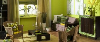
Wallpaper for furniture in the living room
The hall most often contains bulky furniture. You can dilute it with combined wallpaper, which can make one part of the room more calm and cozy, and the other rich and juicy.
If the furniture in the living room is made in light shades, you can choose a beige wall covering with bright inserts or colorful wallpaper with light inclusions. If it's a classic style, it's better to stick to neutral tones.
Wallpaper for furniture in a children's room
A room for small children most often contains furniture of interesting designs, unusual beds and bright shelves. This is an ideal place for photo wallpapers that will complement the atmosphere of joy, childhood and emotions.
A calm child will be comfortable in a bright room (beige, peach, lemon wallpaper), and an active child will be comfortable in a colorful one (photo wallpaper with cartoon characters).
To prevent the space from seeming too busy and cluttered, you can make one wall (which is behind the bed) neutral, and the rest brighter.
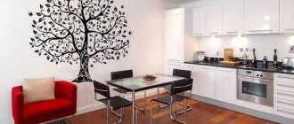
Wallpaper for furniture in the kitchen
Nowadays, rarely does anyone buy separate furniture for the kitchen. Built-in projects are becoming more and more popular. They range from dark gray to light yellow.
In this case, it is worth remembering that wallpaper can look organic if the color is chosen one or two shades lighter than dark furniture and one or two shades brighter than light furniture. You can also make furniture and walls in the same tone. It looks practical and beautiful in the kitchen.
Wallpaper for bathroom furniture
Do not forget that wallpaper should not only harmoniously emphasize the aesthetics of the room, but also meet such important criteria as moisture resistance and breathability. The ideal solution for a bathroom with any furniture is pastel colors. They are always relevant, especially in the bedroom and bathroom.
Wallpaper for furniture in the hallway
Here it would be appropriate to use not too light and not too dark tones. Dark tones of wallpaper in tandem with dark furniture will immerse the space in a gloomy atmosphere, and white surfaces will be subject to contamination.
The ideal choice for the hallway is combined wallpaper colors, patterns, ornaments and simple functional furniture without additional decoration.
Wallpaper for the hallway: 80 photos and beautiful solutions
How to combine colors in the interior: tips
Designers have long developed several unspoken rules that they use to combine different tones when decorating the interior of a house. It’s worth listening to their advice to create a unique environment yourself:
- the saturation of lighting increases the contrast and brightness of the color of the finish;
- when choosing cool shades, you can use black furniture to create accents;
- to decorate living rooms, it is better to use no more than 3 combined colors (this will avoid eye strain);
- there is a special table according to which you can combine shades yourself;
- one main color is chosen, and a less saturated tone is taken to match it - then the room will look attractive and unpretentious;
- the floor is always made darker than the walls;
- if monochrome combinations are used, they can be diluted with bright furniture or stylish photo wallpaper.
A skillful combination of colors allows you to get a functional and comfortable interior
Using the table and basic recommendations from experts, you can easily select several shades for the design of a bedroom, living room, kitchen, or office.
Combination of warm shades in the interior