The color of clear sky remained out of favor for a long time due to its widespread use in the decoration of official institutions - the walls of schools and hospitals were painted blue, because it is its shades that can pacify and calm, relieve excessive nervous tension and excitement. Psychologists recommend using these properties at home, especially since the palette is rich in nuances and halftones.
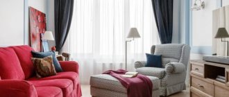
The clean, fresh color is ideal for rooms facing south, southeast or southwest. It is always sunny and warm here, because the rays enter the room most of the day. Northern or western apartments can be made lighter using this tone, but for comfort you will have to add a warm color scheme. At the same time, you can paint any room in the color of the sky - a bedroom, a nursery or a kitchen. A blue living room can become the highlight of the entire interior, where the whole family will be happy to gather to share the news of the day in a kind, calm atmosphere.
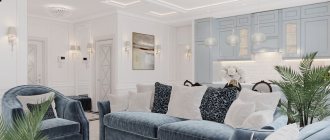
The Blue Hall is actually a traditional option for the 17th-19th centuries. This design has an aristocratic and elegant character. And even in a modern style, the color of the sky will look elegant. But no room is decorated in one color, and for blue it is especially important to find the most comfortable combinations.
The best companion colors for the blue interior of a living room or hall
Preferences in colors depend on the interior style chosen for decoration. For example, modern functionalism does not “like” variegation, like minimalism, and here there can be one color in several shades. But country music usually involves more varied tones, and in such a room you can see a variety of different ranges. An English-style living room will be quite austere, and the blue palette in such a room is often adjacent to gray and white tones.
When choosing the color of the sky as a basis, you should carefully consider the selection of companions, because a living room in blue tones may turn out to be too cold or cloudy.
But this color can work real miracles:
- visually move the walls apart;
- create optical illusions;
- visually raise the ceiling;
- refresh a hot room;
- create a friendly, peaceful atmosphere.
The choice of combinations also depends on the main tone - whether it will be the barely noticeable blue of the summer sky or the sea green color in the living room interior, saturated with green notes and depth.
An important nuance is the distribution of the shade - whether it will be the background or accents.
According to the rules of harmonious composition, the brighter the tone, the less area it should occupy in the design, and vice versa. A blue living room may be an exception, but for this it is important to find effective and comfortable combinations.
White color
The purest and most universal white color is always a good companion, and a blue living room in this combination will be bright and elegant. Snowy and heavenly tones can coexist on equal terms, transform into one another, mix and dilute each other. The light decoration of the walls in blue tones will be complemented by a ceiling in white clouds, a snow-white carpet on the floor and curtains. If such a light palette is not to your liking, there is always room for bright details.
The following would be appropriate here:
- rich blue vases;
- bright blue or turquoise lamp shades;
- chocolate wooden furniture;
- flashy yellow or orange pillows, patterns on textile elements, stained glass;
- black details - in furniture, in flooring (especially stone), in the facades of household appliances.
The proportions of such combinations and additions are determined by the style. For example, in a classic interior they use gilding, which harmonizes with both the color of the clouds and blue. In art deco, you might prefer a white and black floor combined with sky walls. In the English style, wallpaper with white and blue stripes will look organic, and in the Provence design - with a delicate small flower.
White and blue patterns that change places on different surfaces look original. A small detailed blue ornament on a white background is one of the elements of ethnic style, and it can be present in eastern or national Russian interiors.
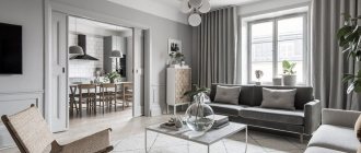
Gray shades
One of the harmonious tones can make a living room in blue tones quite gloomy, so you should use gray in doses:
- Light shades of blue, gray and blue palettes do not create excessive contrast, so the living room will be restrained, but rather strict. The design, as a rule, is calm and sophisticated.
- Blue color with a slight ashy touch looks organic in this combination. And asphalt itself can be present in different variations - more saturated in floor coverings or accent walls, in patterns, in curtains, pastel - in background decoration, in furniture upholstery, in curtains.
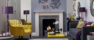
- The blue interior of the living room with such an addition can be made more dynamic with the help of a yellow palette - in ornaments, plain textile elements, in decor. The lilac color scheme with an ashy touch is also applicable.
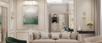
Beige colors
Another universal and neutral color will become an elegant companion for a living room in any style: the blue color of the walls in the interior will be organically diluted by beige furniture and other elements, of which there can be a lot in such a combination. The warm spectrum of the sand shade will make even a room saturated with heavenly tones more comfortable.
And variations of such a neighborhood depend on the design features:
- Modern trends usually involve the use of plain surfaces. Therefore, there can be both beige and blue walls, furniture and textiles. The floor in this case is most often covered with light wood or self-leveling material, which fits into the warm palette. Low sofas with comfortable cushions will look equally elegant in any of the companion colors. But the decor can be made more vibrant - a rich shade of sea wave, azure or coffee with milk.
- The classic interior in beige and blue tones will be complemented by dark wooden furniture with light sand upholstery. Then the heavenly color of the walls can be complemented by a blue carpet and a pair of identical pillows on the sofa. In such a trio, you can also make the floor dark - in an exquisite and expensive shade of natural wood.
- Wallpaper with stripes or ornate floral patterns will fit organically into the English style, as well as into classicism. It can be either a sky-colored coating with a beige ornament, or vice versa. You can repeat the pattern in curtains or in pillows on a plain sofa. In the Victorian direction of English design, as in its colonial variety, a chocolate leather sofa would be appropriate, the color of which can easily be complemented by a couple more items in the decor - a sideboard or a TV stand.
- In the Provence style, light beige curtains with a pastel blue pattern will look sophisticated. The combination will be complemented by a simple wooden floor in a light palette and wallpaper with a small flower.
The beige range also includes a richer range of ceramic coatings, which are suitable for both floors and walls, especially the work area if the living room is combined with a kitchen.
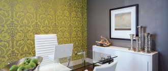
Sunny yellow shades
Bright sunny tones are organic in relation to the heavenly palette, so they are often used in modern interiors both in decorative details and in finishing. Of course, there cannot be too many rich colors, and most often yellow is included in patterns and decorative elements.
But a calmer pastel color can also be used as a full-fledged companion - in the decoration of floors, walls, and upholstery of upholstered furniture.
The duet of these shades is applicable in different styles:
- Sand and sea green are ideal for marine design.
- Acid yellow with any range of blue is an extremely modern solution, organic for glossy surfaces.
- A bright detail of a sunny shade in the living room in gray-blue tones is appropriate in the interior of art deco, minimalism, loft, Provence, neoclassical, etc.
Sun-saturated details will help make an overly bright or monochrome living room more positive. One yellow square in a frame on the wall is enough to make the room “play” completely differently.
Silver and gold
The presence of shades of precious metals in the interior instantly elevates the furnishings to the category of luxury, even if it is a rather restrained room with a minimum number of details and inexpensive finishing.
But gold and silver are combined with blue in different ways, so when deciding to decorate the living room with a touch of chic, it is important to take into account the different nature of such additions:
- Warm gold is most often present in classic, expensive interiors. Despite the fact that gilding is usually applied to white objects and decor, in a duet with blue the living room looks more gentle and sophisticated. It has solemnity, a sense of prosperity, and aristocracy. If there is an excess of gold in the decoration, the decor becomes pompous.
- Silver additions to the finish in combination with blue will look cool and even aloof. Not everyone will find this solution comfortable for their living space. Of course, a living room in similar colors will be elegant, but less solemn and pompous than with gilding. You can dilute the coolness of the duet with the help of a warm range of natural wood - in floor coverings and wooden furniture.
The design of a living room in blue tones with elements of gold or silver often includes additional shades - white, yellow, blue.
What to combine with
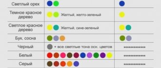
Light blue colors go well with many tones:
- a classic combination with any pastel colors;
- combinations of bluish tones with each other look fresh and creative;
- white will add light and brightness to any blue color;
- black color will clearly emphasize the advantages of blue wallpaper;
- Combinations with gold and silver look beautiful.
Creating an interior involves a harmonious combination of patterns on wallpaper, decorative elements, furniture, and textiles.
When creating a unique interior with blue wallpaper, you should not use red shades. Combinations with red look defiant. The only exception is pink.
Blue wallpaper is an excellent choice that allows you to implement various design solutions.
Surface decoration: blue wallpaper will give freshness
Sky as a background for the interior of the living room, as a rule, covers the walls and, a little less often, the ceiling, but the design can be more original, as well as monochromatic and patterned - it all depends on the style, features of the room and personal preferences.
Blue walls in the living room can be painted, plastered or wallpapered.
The finish can be combined, monochrome or multi-colored:
- Modern design trends usually use monochromatic coatings, although there is room for exceptions. The use of macro photography has become a trend in recent years: blue wallpaper in the interior of a functional living room serves as decor. This could be a photograph of a flying dandelion, a pencil sketch of a plant or birds, a large drawing of several petals. The pattern, made in a small range of one primary color, looks stylish, unobtrusive and elegant. But only one accent wall will be like this, the rest should be monochromatic - in the main shade or in the tonality of the companion.
- A living room with blue wallpaper, made in a classic design, implies the choice of a strict stripe or a solemn large pattern, located symmetrically - according to the rules of traditional composition. Here you can combine striped and patterned coatings, as well as plain ones with stripes or ornaments. You can design the classic finish differently: make the walls heavenly monochromatic, and paint the corners, partitions, and joints with the ceiling in a brighter blue tone with imitation of columns and stucco.
- The blue wallpaper in the Provence style living room, the photo of which can be seen below, will be light with a small floral pattern. The design itself may be slightly brighter than the main tone, white or beige. You should not choose contrasting solutions - in this design all surfaces remain faded, as if bleached by the sun.
- The popular styles of minimalism, functionalism, and hi-tech for decorating a living room in a city apartment usually do without patterns , but blue wallpaper in such an interior can contain abstract patterns in one accent wall. But the ornament will not be contrasting or catchy.
- The oriental style will seem more rich. There will be bright blue with flowers in the pattern, rich terracotta combined with heavenly colors, and ornamentation in the details of the living room.
To make the interior harmonious, you should also choose suitable solutions for the floor and ceiling. Wood flooring is usually chosen for residential premises, although ceramic tiles can be used in oriental, Provence and marine styles. In modern rooms, self-leveling floors in one color or with a 3D pattern are appropriate.
It is better to leave the ceiling of the blue living room white or milky, although with the help of a multi-level structure and tension covering this surface will be more original. Individual areas are decorated in the form of a sky with clouds or painted in a deep shade in a heavenly or any other harmonious palette.
How to get gray-blue wall color?
A blue-gray shade can be created by mixing orange with blue and white. If you mix yellow with purple and white, you get a gray-beige shade.
Interesting materials:
When can kittens be fed milk? When can you dye your hair in May 2022? When can you bathe your dog outside? When can laminate flooring be laid on a self-leveling floor? When can you wash your floors? When can you start catching perch? When can you start campaigning? When can you start collecting Ivan tea? When can you cancel your mortgage insurance? When can you park on the left side of the road?
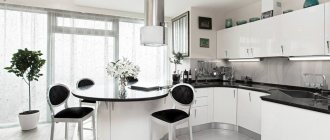
Furniture in the living room: blue sofa and other interior details
A harmonious composition is based on a successful combination of shades of both decoration and furniture. It is difficult to choose an environment for a non-standard palette without the help of specialists, especially when the interior contains bright colors. Traditional wooden furniture in natural colors can simplify the design, while several equally saturated shades will cause a feeling of excessive diversity and disharmony.
To prevent this from happening, you should take into account the features of the style and the selected background.
- Cabinet furniture is traditionally made of wood. The color depends on the style - whether it will be painted or left in the natural shade of the array. For a classic design, you should prefer the second option; in Provence it is better to paint cabinets, facades, shelves, and chairs for the living room in a light, faded tone. For a modern interior, you can choose any furniture, but the surfaces must be perfectly processed or even covered with glossy varnish. Glass and metal inserts would be appropriate here.
- If the walls are painted blue, then the upholstery of soft models should be lighter or darker - in the tone of a companion or accent. You can also choose a composition with a blue sofa in the background shade, then the living room will be translucent, weightless, free. But it’s worth thinking about the decor so that the room doesn’t turn out completely faceless.
- The background color of the sky does not exclude the choice of furniture in the same range: a blue sofa in the living room interior will be harmonious in any case, but it’s up to you to decide whether it’s background or accent. Checkered upholstery looks interesting against the background of striped walls, plain furniture in the color of the pattern on the walls, dark models in the color of appliances or flooring.
How to create a harmonious interior
The most successful way to give your apartment an interior with cool tones is blue wallpaper and matching curtains, which will be an additional decor. After the renovation, the room will acquire a modest, cozy atmosphere.
Often, experts complement the interior of the premises with a decorative element, which can be a painting, vase or photo frame in blue or gray. You definitely need to pay attention to the upholstery of the upholstered furniture in the room. It should be in harmony with the overall color scheme of the room.
Blue wallpaper goes well with a blue or gray carpet. It is better that the color of the carpet is a little brighter than the shade of the wallpaper, then a lighter atmosphere will appear. Here, a special addition will be small kitchen utensils, for example, various vases, salad bowls and other decorative items.
Lighting in the living room or hall
Lighting in any room plays an important role, and the design of a living room in blue tones largely depends on how much light there will be, how it is organized, and in what thermal spectrum the light bulbs are chosen. For a cool palette, the amount of natural light remains a significant parameter, otherwise the room will turn out to be too gloomy and uncomfortable.
Traditionally, the interior of a living room in blue tones involves the use of a central light source and several additional ones. The design of the lamps depends on the design style, and the palette of the room only affects the choice of the color of the lampshades. An important issue remains the lighting spectrum.
It should be noted that the coolness of such a room, if necessary, can be eliminated with the help of warm light bulbs, but sometimes they create a distortion of the main shade, so only some of the lamps can be made warm to create a suitable atmosphere.
In the same spectrum, it is worth choosing lighting that is appropriate in any style. It is advisable to decorate a blue room, no matter in what range of blue tones it is decorated in, with additional accents of a warm palette.
Decor: selection of curtains and accessories
Designers unanimously claim that only a few details actually make a composition harmonious - curtains, a couple of decorative elements, accessories. As a rule, these elements are assigned the role of accents in the design, so they stand out from the main palette.
That is, for the interior of a blue living room with one more companion color, you can find more saturated accessories, although the choice of curtains, decorations and other details may remain in the same range, but with other nuances.
- For a white-sky design, blue curtains in the living room with similar decor - vases, lampshades, patterns in decoration or upholstery - are suitable. In such a combination, of course, you can find many harmonious solutions - in an orange, brown, green palette. The choice should be supported by other details, the number of which depends on the design style.
- Blue curtains in the living room interior will be appropriate in any composition, but the shade depends on the main design. If the walls are painted a heavenly color, and the sofa, carpet or several other details are painted in a richer tone, then the curtains will be the same. Another background shade will cover the floors, a couple of other surfaces, and several interior items.
- In a classic room, blue wallpaper will be complemented by curtains with gold or silver threads ; you can choose canvases in the main tone or in the shade of the decor.
- Often curtains repeat the background color, and it can be white, beige, milky, gray. In a modern style, they will be monochromatic in one range or combined, and in country, neoclassical, and classicism, you can use curtains with an ornament or floral pattern. The same pattern is transferred to sofa cushions. An interesting solution would be to transfer the same pattern to walls or other surfaces, but in an inverted combination of shades.
- A living room with blue curtains can be decorated mainly in neutral colors, and in the heavenly range a sofa, vases, carpets, and paintings can be selected. One accent wall in the same color scheme or wallpaper with macro photography would look natural here. The same curtains are used in a gradient design to transition from one shade to another when painting walls in the same palette. Decor and accessories are chosen in a more saturated color from those used in the composition.
When choosing decor and curtains, you should always find similar details in the setting so that it turns out harmonious. This is the only way to achieve comfort and a sense of balance.
Blue wallpaper design for the bedroom
The main goal of renovation in the bedroom is to create a cozy environment in which it is easy to relax and have a good rest. When choosing wallpaper, take into account the characteristics of the room (for example, size and shape).
Plain
It is easiest to decorate walls with such canvases, because you do not need to select a pattern. Light blue wallpaper visually expands the space, which is very important when decorating small rooms. Coverings of different saturations will allow you to visually zone the room. In a monotonous interior, it is advisable to use wallpaper of different textures. Pastel blue canvases will perfectly set off textiles and bedroom accessories.
With print
The choice of print is influenced by the parameters of the room. In a spacious bedroom, 1-2 walls can be decorated with canvases with bright, contrasting prints (blue background and silver pattern). Small ones are suitable for decorating rooms of any size. A vertically located ornament visually makes the ceiling higher, and a horizontal one “pushes” the walls apart. Wallpaper with a diagonal pattern will distract attention from the imperfections of the room (protrusions, recesses).
Effective use of printed wallpaper
Wallpaper companions
The canvases allow a bright companion to highlight a decorative accent against the background of a neutral surface. They may differ in 1-2 parameters and have common design details. Almost all manufacturers offer collections of wallpaper companions. For the bedroom you can choose several combinations:
- blue canvases of the same texture, but different patterns;
- same shade, but varied patterns/textures;
- single products, the shade of which differs by 1-2 tones (white-blue, soft blue);
- The canvases differ in the size of the same type of ornament.
The general rule for choosing materials: in compact rooms they use 2 types of canvas, in spacious rooms - 3 (occasionally 4).
Photo wallpaper
Such material also, in a sense, refers to companion wallpaper. When decorating a bedroom, background paintings are selected according to the main color scheme or a neutral light blue shade.
Custom photo wallpaper in the bedroom
If you want to stick photo wallpaper on the entire wall, choose a blurry or calm subject (nature, flowers). The most acceptable option is to cover the part of the wall above the headboard with canvases.