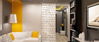
Orange wallpaper is a great way to refresh your interior and add bright notes to it.
Modern people, especially active and energetic ones, are attracted to bright colors, one of which is orange. In turn, this color has many shades, ranging from neon orange to soft peach. In addition to the fact that orange wallpapers are not only monochromatic, they also include wallpapers with embossing, patterns and designs.
In which interior styles to use
Copper, brick, honey, carrot and other shades are suitable for interior decoration in the following styles:
- Loft;
- Vanguard;
- High tech;
- Country;
- Minimalism;
- East style.
Classic, Rococo, and Empire styles do not like orange.
Children's room
A bright, cheerful and slightly “straightforward” shade of orange will inspire your child to explore. The interior of the room in orange will strengthen the child’s desire to achieve goals. Add this tone to your exercise area.
To prevent the shade from being overwhelming, combine it with yellow, white or beige. Contrasting combinations that upset the balance, for example, with bright green or black, are inappropriate in a child’s room.
In which rooms is orange appropriate?
This color suits any room:
- Orange color is often used in the kitchen interior to make the environment more homely, warm, and cozy.
- The bathroom, decorated in orange tones, energizes and invigorates. A good option for those who need an extra boost in the morning to wake up. Tangerine, pumpkin, and peach shades are a common choice for children's rooms. The color of joy, carelessness and irrepressible energy comes in handy here.
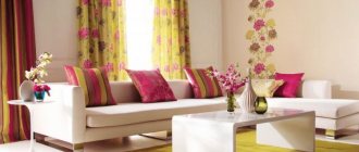
- You can use orange color in the interior of the living room to create a comfortable homely atmosphere, conducive to long gatherings and communication.
Features of orange shades
In addition to the listed properties, there are many more advantages of using orange wallpaper in the interior.
Experts say that this color and its shades have calming and relaxing properties, promote well-being, affect concentration and develop creativity.
In addition, warm tones like orange fit harmoniously into many styles, from classical to modern.
Take a look at the photo of orange wallpaper: you probably noticed that this color can be embodied in a variety of tones and, depending on the brightness and saturation, have different effects on the perception of the interior .
Soft orange shades close to peach will create a charming and delicate atmosphere in the bedroom, and bright and colorful tangerine-colored elements will emphasize the solemnity of the living room.
Tip: The perception of orange color largely depends on the degree of lighting in the room. If you want to emphasize the sunny brightness of this shade, do not cover the windows with dark curtains and try to use as many lamps as possible.
One of the interesting features of wallpaper in orange tones is their ability to displace other shades in the interior .
Bright accents of this color, no matter how many they are used in the design, will always attract all the attention. Therefore, you should not use additional bright colors in the room, otherwise it will look contradictory.
Let's find out what shades can be matched with orange wallpaper for walls.
Typical mistakes when working with color
Despite the positivity it emits, orange can cause discomfort if used incorrectly. Avoid the following mistakes:
You don't need too much orange, especially small objects and details. This color attracts attention, and if present everywhere, it creates a feeling of “accent overload.”
In sunny and hot rooms it is better to use cool shades: the orange palette will only “raise the temperature”, which can cause discomfort in the warm months of the year.
For small rooms, only light colors are suitable: carrot, brick or copper can visually “eat up” the meters in the room.
The only thing worse than the above is choosing the wrong color combination. For everything to work out, remember what colors orange goes with in the interior. Let's look at the 5 most successful combinations.
Which apron to choose?
Since orange itself, even in versions with minimal shade intensity, perfectly attracts attention, the apron should be finished in any neutral shade:
- classic snow-white;
- soft cream;
- light gray;
- creamy;
- light beige, etc.
This is provided that the fronts of your kitchen unit are painted in the typical bright orange color.
There is another way, not so common and more risky - choosing a darker and deeper shade. In this case, you can get a non-standard combination that gives your interior special expressiveness and individuality. For example, black or brown. The result is a bright combination that greatly emphasizes the extraordinary taste of the apartment owner.
What about texture? The ubiquitous marble stains do not go well with catchy orange facades, so it is better to opt for segmented tiles or skins with a thematic pattern.
If you want it to look “expensive and rich,” try glass mosaic. It is sold in construction stores in fragments of 30 by 30 cm and can be easily torn off along the grid. It will turn out really impressive, but be prepared for difficult care: washing such small pixels from grease, soot and dirt is not much fun.
With white
White is too calm compared to orange, but when two colors coexist in the same space, the result is a rich, fresh and expressive interior.
It doesn’t matter what is orange and what is white – furniture or walls. This combination is suitable for a bathroom, minimalist kitchen, or a teenager’s room.
Orange mood: wallpaper for walls
Page navigation
Orange wallpaper has many advantages: a juicy orange shade invigorates, and a delicate peach shade, on the contrary, calms. They make the apartment more comfortable.
People love to decorate their apartments with a tangerine shade. It is rich and contrasting. It is close to a natural tone, for example, to a sunset.
The orange hue promotes joy, it symbolizes the awakening of energy and helps to relax when communicating. The milky orange hue has a relaxing and calming effect and improves well-being.
With green
At first glance, the green-orange interior is associated with the holiday and lifts your spirits. But of course, this is a “New Year classic” - tangerines and a Christmas tree.
The combination is very “natural”, unobtrusive, cozy, and therefore ideal for decorating a living room or nursery.
When can it be used
- This color is universal; it is chosen when covering walls with similar wallpaper in any room. In addition, this color scheme looks harmonious in a variety of styles, from classic to modern.
How exactly the saffron shade will be perceived depends greatly on the brightness of the apartment’s lighting.
- The combination of tangerine wallpaper with cooler colors will dull its brightness. And in combination with lighter tones, tangerine will attract the eye.
An apartment with orange-colored walls will look harmonious if, in addition to this color, a lighter material is glued to the walls, this will balance the color scheme.
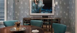
With blue
Opposites attract and together can look quite harmonious. This is a story about blue and orange, about sea and sun, about ice and fire.
Don’t be afraid of this combination; feel free to choose different shades - turquoise or indigo, amber or orange. A rich, contrasting interior of a hallway or living room will delight household members and guests.
Note!
- Olive color interior: 135 photos and video description of how to use olive color correctly
Turquoise interior - TOP-180 photos and videos of interior options in turquoise tones. A palette of combinations of shades and textures. Selection of furniture and decor
Red interior - 140 photos and videos of rules of use and subtleties of placement when decorating the interior
Start with small accents
What are the main rules for the successful use of orange, what does this tone combine with in the interior of a living space? First, you need to like the shade. If this does not happen, look for another shade. Secondly, orange is not a relaxing color, so avoid using it in interiors where you plan to relax, do concentrated work, or sleep.
However, orange is a great color if you need stimulation or motivation if you will be using the room for entertainment, fun or socializing. Pay special attention to what proportion it makes up in the overall space, its location and combination with other colors. If you really want to use it, try starting with small accent spots, such as accessories that are easy to change or move.
With black
This is the only color in combination with which orange loses some of its playfulness. The interior begins to “sound” deeper and more interesting, it looks strict, graphic, and solid.
This brutal combination is suitable for decorating a “bachelor” apartment, a modern bedroom, a kitchen, or a bathroom.
Basic psychological properties of color
Knowing how a certain shade of orange can affect a room is key to using that color. When done right, color can give you the dose of enthusiasm and motivation you need. When used poorly - too much, too frivolously and overly aggressive. The tone of bright orange is fun, joyful and playful. The yellow-orange interior promotes social interaction and communication.
It is also a shade that stimulates the appetite. Although the property is often attributed to red, it has more to do with different cultural perceptions of color. The color orange represents physical comfort and abundance.
What is contraindicated to combine
The combination of orange with other colors in the interior can be extremely unsuccessful - because of this, the atmosphere of the room can be “sweet,” put pressure on the psyche, be associated with aggression, and cause feelings of discomfort.
Such combinations are still sometimes used, but they are classified as “not for everyone.”
We are talking about combining orange with:
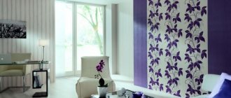
- Violet (the problem is excessive contrast);
- Pink (difficult to choose the optimal shades);
- Other shades of orange (it turns out to be “oil”).
Note!
- Black interior: 160 photos of interesting options on how to use black correctly
Dark interior: 140 photos and video description of how to create a unique style in dark colors and shades
Brown interior - interesting ideas and beautiful uses of brown (130 photos)
What about fashion collections? After all, the listed combinations can be seen on the catwalks! The answer is simple: do not confuse clothes with interior design.
A trendy item carries a message of challenge: you must stand out from the crowd. These things are not worn every day.
Your home interior should surround you with coziness, give you comfort, and create an environment for relaxation: you are in it every day.
Good color combination
Orange color is bright and warm. It doesn’t go well with all the other shades in the palette. So, it is not recommended to combine it with similar tones, otherwise the kitchen will turn out tasteless and too flashy. Also, you should not use combinations with cold shades, such as blue, cyan, purple. However, there are good options.
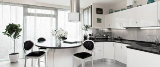
Orange and white
One of the best combinations. When choosing it, the kitchen will not be oversaturated with bright details and will look fresh and stylish. It is better to pay attention to delicate shades: honey, pumpkin, tangerine. The second shade should be true white, without impurities. Orange is best used for details and accents.
Orange with black
This combination looks stylish, modern and sophisticated. As a rule, it is liked by people with leadership qualities. Tones of gray and black will help complement and balance the brightness of orange and create pleasant contrasts in the kitchen interior.
ATTENTION! To prevent the orange-black interior from looking too gloomy, it is recommended to dilute it with white or beige. You can decorate the walls, floor or ceiling with it, and also add several accessories. This will help balance the color scheme of the kitchen.
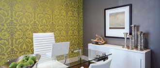
Orange and green
These colors combine well with each other, as evidenced by nature itself. You can combine both delicate shades and very bright ones. It is best to choose 3-4 shades of the palette of these colors and decorate the entire kitchen in them, from the walls and ceiling to the upholstery.
One color should dominate. For example, rich orange against a background of pastel shades of green, or vice versa. This will make the kitchen environment harmonious and relaxing.
Orange and gray
This is not a very popular solution, however, it can be considered as an option. The gray color will mute the orange a little, which will make it less gloomy. It is recommended to make gray the main color, complementing it with orange accents.
Orange with brown
Both colors are warm and go well together. With this combination, the amount of orange should not be large. For example, the main finish can be made brown, and the countertop and a few other small details can be decorated in orange.
This combination is suitable for a kitchen in the classic, empire, or rococo style, especially if dark brown wood is used, which looks very harmonious and expensive. Orange will complement it perfectly, and the darker the brown, the brighter the second color can be.
REFERENCE. In this combination you can use a corner orange kitchen. This solution looks stylish and harmonious, in addition, it will help to avoid an excess of bright colors.
Orange with red
This combination will make the kitchen very warm. Both colors are quite bright and active, so it is important to dilute them with a neutral light shade, for example, milky, white, ivory, or gray tones. If this is not done, the kitchen will turn out to be too loud, and it will be difficult to stay in it for a long time.
In addition, when planning interior color design, you need to consider the following points:
- Much depends on the level of natural light in the kitchen. If the side is sunny, you can complement the orange with cool light tones: light gray, white, silver, soft blue.
- Do not use other bright warm colors, which will enhance the effect of orange and make the interior too provocative.
- Steel color, especially if used on shiny surfaces, can depersonalize a kitchen. But together with orange and terracotta, it can sparkle with new colors, become softer and harmoniously complement the design of the room. You can use a glossy steel coating for the walls. They will beautifully set off the bright orange set.
- A kitchen set in this color scheme looks great against a background of white, brown, and green colors.
- If it was decided to make the walls orange, then the set could be coffee, beige, or creamy shades. This kitchen will look very soft and cozy.
- Orange goes well with natural wood.
- The already mentioned combination of orange and black can make the interior more strict and orderly. In this case, it is recommended that black be located below: on the podiums of kitchen furniture, on the floor, in the lower part of the back in the form of a thin strip.
- You can make your kitchen feel fresher by adding just a small amount of fuchsia or chili pepper.
- Orange has the property of displacing other colors. Therefore, the correct placement of accents and choice of decor is important. A good choice would be white details: dishes, tablecloth, curtains.
- The rich orange color itself can not be used as the main color, but only complement the overall design with it, adding accents. So, it can be decorated with an apron, tabletop, blinds or curtains and other details.
- A good combination is orange, rich green and snow-white.
- If you plan to use orange wallpaper, it is important to carefully choose its material. You should not use finishing made of paper, acrylic, fabric, or liquid wallpaper. They are not suitable for kitchen conditions. But vinyl and non-woven wallpaper are a good solution. They are easy to clean and also retain their rich color for a long time.
- The best styles for decorating a kitchen in orange are minimalism, hi-tech, ethnic. You can also choose successful color combinations for the Art Nouveau style. But the orange color scheme does not go well with the classics.
- To make the ceiling visually higher, it is recommended to use orange only for one wall. When decorating several walls or parts of them with this color, you can visually expand the space.
Decorating a kitchen in orange is suitable if the kitchen is spacious and lacks coziness. This solution will also be appropriate if the room has windows facing north and there is not enough light. Despite the fact that this shade seems very capricious, it can be successfully used in a kitchen interior. However, it is important to choose the right color combinations and balance the rich tone. In this case, the kitchen will look stylish, bright, but not too provocative.
Base or accent?
Recommendations for those who want to see orange in the interior, but are unsure whether to use it as a base or accents:
If the room has a small area, to visually increase the space, choose a lighter and cooler base, and make the accents orange, or choose a light, delicate shade, such as peach, as the base.
If you previously lived in a calm or “cold” interior, then getting used to tangerine or carrot may be difficult. When choosing a dominant tone, you should consider calm shades.
Light shades of orange are suitable as the dominant color for the bedroom, children's room, rich and bright shades - for the kitchen, living room.
When using orange in design, it is important to maintain balance and not lose a sense of proportion. But the most important thing is something else: your home is your personal comfort zone, so when decorating it, you can break the rules, because taste is individual.
The effect of orange on humans
All colors of the spectrum can influence a person’s psycho-emotional state, and orange is no exception. Since ancient times, people have noticed that the color orange increases appetite, improves digestion and stimulates brain activity. And in some countries it is the color of love.
In the interior of premises, orange shades can:
- Give a feeling of vigor or relieve fatigue;
- Cheer up, overcome depression;
- Diversify gray everyday life with bright colors;
- Reminds you of sunny days and warms you up on long winter evenings.
In everything you need to know when to stop and try not to overload the room with these colors, because... Too much orange can cause aggression and irritation.
Orange color is chosen by purposeful, active and cheerful people endowed with leadership qualities. Children also adore him, because... it gives room for imagination to their inquisitive minds.
Photo of orange interior
Features of color combinations: useful methods for selecting tones
Of course, the main thing when selecting colors for a future interior is the taste and preferences of the person who will live or work surrounded by these colors. But still, you should not neglect some of the recommendations of designers and psychologists.
To correctly combine wallpaper by shade, a so-called color wheel was developed. This model conveniently suggests how certain color combinations can affect a person. The wheel includes 12 primary colors. Those colors that are next to each other in adjacent sectors are called related. If you choose a combination of them, the decor of the room will give you a relaxed state. Combinations with a color that is in opposite sectors have the opposite effect. These colors are called complementary and bring a boost of energy and a tonic effect. According to this wheel, to create peace, orange is best combined with shades of yellow, and in order to excite your guests, it is enough to arrange them in a room where orange is adjacent to shades of blue.