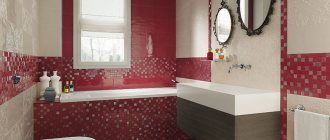
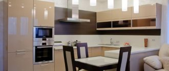
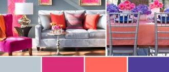
Usually, when choosing a kitchen color, a person chooses certain room design options that he liked in a magazine, on a themed website, in a furniture showroom, or even while visiting. But very rarely the first opinion becomes final. There are dozens and hundreds of options, the vision changes every day, and numerous factors influence it. It is important to go through this path and settle on a single combination of colors and shades that will be in harmony with each other and your perception. Therefore, I suggest that you familiarize yourself with the information that promises to be useful!
Color perception in the kitchen
Color in our culture is not just a marker of mood. This is an element that embodies the main points of the chosen style and furnishings for the kitchen. And also a tool for managing the perception of space. Its volume and dynamics.
We perceive color as a symbol. Every culture has an accepted meaning for a particular shade, not always related to its actual physical effect on the brain.
For example, for a typical European, white is a symbol of lightness, beginning, purity, and powerful, purposeful potential. This is a “loud” color that puts a serious strain on the psyche. It is unpleasant and difficult to be in a completely white room. The effect is similar to complete soundproofing or loneliness. But everything will change if you add accents.
Gray-green kitchen with upholstered furniture
Emerald kitchen with glossy facades
Light pistachio kitchen with island
This is interesting! There are countries where white is not a solemn color, but a mourning one. Therefore, its perception in the interior will be different.
Another example: if the walls in an adult man’s apartment are bright pink, other people’s perception of the design will not always be positive. Moreover, the negative opinion is not based on the properties of color. And the stereotype is that “pink” is for girls.
Turquoise kitchen with white
Pink kitchen
Kitchens with rich and pastel pink facades
Blue-black brutal kitchen
Table of the most popular combinations
If basic tones are combined with almost all colors, then there are more complex combinations. But no less beautiful.
| Color | Combinations | Example |
| Red | Snowy, milky, black, bright blue, graphite. | |
| Orange | Emerald, lemon, snow-white, blue-black, azure. | |
| Blue | Turquoise, sea green, lilac, scarlet, pearl. | |
| Violet | Yellow, lilac, sea green, fuchsia, white. | |
| Pink | Snowy, indigo, plum, raspberry. | |
| Green | Lemon, coffee, sand, indigo, purple. | |
| Yellow | Malachite, chocolate, black, lavender. |
Color and the human nervous system
The second important point is the direct effect of color on the human nervous system and the reflection of this process in the brain. Depending on the functionality of the room, psychologists recommend certain shades. The kitchen is the most trafficked place in the house. Most of the activities in this room involve activity. Therefore, the interior of the kitchen is determined by its functionality, and the choice of shades is huge.
Emerald kitchen with horns
The kitchen is a place for bold experiments. Combinations of bright colors or harmonies of calm tones are possible here. Playing with light, different textures of walls, kitchen aprons, and cooking areas are encouraged.
In addition to finishing, dishes, built-in and stationary appliances, green “plantings” in flowerpots and pots, and textiles help add color saturation. The role of accents will be played by rugs, paths, pillows, tablecloths and napkins, blinds or curtains. The main thing is that the shades do not conflict with each other and do not cause fatigue.
Color wheel and color combination rules
Itten's circle and how to combine colors using a circle
Harmonious combinations of bright accents
Before creating bright accents in the kitchen, you need to decide on a general palette. The color accent in the interior is the decor, which is contrastingly different from the main color scheme of the room. Accents must be introduced carefully so that they do not spoil the overall impression or make the kitchen flashy and tasteless.
Apron
The kitchen apron is often the brightest accent of the entire space. It is advisable to decorate it in colors opposite to the kitchen set and other furniture. The game of contrasts helps to place the right accents.
Tabletop
It is better to choose a countertop color that is contrasting with the main color scheme.
A contrasting tabletop is a stylish addition to any design.
Furniture
When choosing the colors of furniture in the kitchen, you should give preference to rich natural shades that will harmoniously blend into the interior without causing a feeling of dissonance.
Colors such as orange, red, blue, bright green, and purple will help add a touch of freshness.
Furniture in rich colors looks especially advantageous against a pastel background.
Curtains
Bright curtains allow you to add more color to any kitchen interior. Curtains or drapes can be plain or decorated with a pattern (floral, geometric, floral patterns).
The choice of color should take into account the overall color palette of the kitchen interior and the chosen stylistic direction.
Rules of the color wheel when choosing shades for the kitchen
To choose the right shades, you can be a professional or enjoy design, painting, or other visual art. Or take the simple route and use color templates. One of the most convenient is a circle of shades.
Kitchen palette with a classic triad of colors
Color mixing color scheme
The first color wheel appeared in the 17th century. Its author was the famous physicist Isaac Newton. The essence of the spectral circle is that all the colors in it are combined through certain combinations.
The modern version of the circle was created by Johannes Itten already in the 19th century. This template is used today by illustrators, designers and other visual professionals.
The Itten circle represents colors of three orders: primary, secondary and tertiary. The main ones are in the center. These are blue, red and yellow. The second level of the circle includes shades and combinations formed from any two primary colors. Tertiary is obtained by combining secondary colors. Moreover, the colors are located in the same sequence as in a rainbow or spectrum.
In any color wheel, similar colors are nearby, and contrasting colors are farther apart. This arrangement allows you to use universal formulas for working with the template. It is not necessary to know any schemes - to get a harmonious combination of tones, you just need to apply the projection of any simple geometric figure.
Airy kitchen with orange, blue and white
Application of primary colors of the palette in the interior
Stylish kitchen-living room with terrace
How to navigate the mass of colors for kitchen decoration
The easiest way to choose a color for your kitchen is to enlist the help of a professional designer. But future kitchen owners will easily find their way around the variety of shades and textures.
In order not to go wrong in creating your dream kitchen, you need to:
- Prepare a visual selection. Practice shows that we compile the optimal option from what we like.
- Use color combination schemes.
- Correlate the lighting of the room and the choice of shade. If the kitchen is located on the south side, cool colors will be appropriate. But for an apartment located on the north side, warm colors will add sun.
- Distribute the color load. In the kitchen, where people are present occasionally, you can use bright colors in greater quantities than in the culinary areas, where family members are often and for a long time. In the second case, it is more appropriate to introduce accents and contrasts.
Advice! Before creating a design project, study the guide to organizing a comfortable dining area in the kitchen.
Cheat sheets when purchasing finishing materials, furniture or decor
Choosing the right color scheme for kitchen decoration is quite difficult. It is almost impossible to remember the correct shades. Often, a well-designed room design is ruined by the purchase of furniture, finishing materials or decor of the wrong tone. To avoid getting into trouble, you can use special cheat sheets, which can be collages, samples or programs in the gadget.
A ready-made palette of color solutions can be found using special applications or programs for a mobile device. An alternative can be a graphic editor on your phone, with which you can easily recreate the desired design in the room. Using this tip, you can go shopping without worrying about choosing the right color scheme for finishing materials, furniture or decor.
When searching for the necessary interior elements on the Internet, you can create the required design in a graphic editor, using ready-made photos from product suppliers. They must be placed in one row. The collage will tell you where correction is needed so that all the furniture meets the specified parameters.
A board with samples of finishing materials will help you choose the right materials for finishing walls, floors or ceilings. At the same time, you can find not only the ideal tone for the kitchen space, but also choose a harmonious combination of textures.
Color with special filling
Sometimes the space is filled with “living” color or dynamic functionality, which sets a new bar for shading work. It is important to reflect and emphasize the already existing uniqueness of the room.
Gray sink and facades in the kitchen
Gray kitchen-living room in the attic
Wooden kitchen on the terrace with gray floor
Black and white kitchen with flowers in pots
Kitchens with plants in different styles with brickwork and living room
Wooden greenhouse kitchens with wooden ceilings and brick
Kitchen among palm trees under a glass roof
Grapes and other plants in the kitchen
Kitchen-living room
A kitchen equipped with areas for games or relaxation, as well as a guest sleeping area, looks different than a separate culinary area. Therefore, you can safely use rich, bright shades in your design.
Kitchen-living room with flower and gray sofa
Kitchen-living room with green velvet chairs and yellow sofa
Kitchen-living rooms with blue furniture
Gray kitchen-living room with a large window and a bar counter
Advice! If you want to create something harmonious in the brutal, design a kitchen in the loft style.
Style dictates the rules
There are many restrictions and selection criteria. First of all, it is compliance with a certain style. Each of the directions has its own main features.
| Style | Predominant tones | Note |
| High tech | Metal surfaces are complemented by gray and white | |
| Minimalism | White solo or a combination of black with white and gray | |
| Scandinavian | White | |
| Pop Art | Bright | Neon colors are acceptable |
| Kitsch | Bright | Neon colors are acceptable |
| Shabby chic | Pastel | |
| Provence | Pastel | Complemented with lavender |
| Country | Pastel | |
| Classical | Natural and pastel |
Simple tips will help you avoid mistakes when decorating and create a beautiful interior.
Retro style
Recommendations:
- Do not use several bright shades at the same time;
- It’s best to limit yourself to three primary colors;
- if bright wallpaper is chosen, then it is advisable to make furniture facades in calm colors;
- It is better to use trendy bright colors for wallpaper, rather than for facades, since it will be much easier to replace wallpaper later;
- if family members spend a lot of time in the kitchen, then it is best to choose neutral colors for decoration;
- for older families, light colors are preferable, as bright colors can be tiring;
- pink and gray, combined together, reduce appetite;
- horizontal contrasting stripes on the walls allow you to “expand” the space;
- the most universal are calm natural tones;
- it is easier to add dynamism to a calm interior using bright accessories than to try to dim the brightness of the main tone colors;
- vertical stripes – “raise” the ceiling;
- It is better to choose a neutral color as the main color for the headset - gray or white.
VIDEO: Beautiful interiors in different colors
What color to choose for the kitchen?
Creating a good mood in the kitchen
Kitchen in a two-story loft
The character of such a room will be determined by the overall dynamics of the loft. Since the culinary area is not separated by walls, zoning occurs due to the number of floors, color schemes, and finishing materials.
Kitchen-living room in a two-story loft
Kitchen-living room in a two-story loft
Two-story lofts with kitchen-living rooms of white and red brick
Spacious gray kitchen in a two-story loft
Small kitchen in a two-story loft apartment
Large two-story loft with chandeliers
Stairs, love and kitchen in a two-story loft apartment
Brick loft with red refrigerator and bedroom on the second floor
Loft with spiral staircase and island in the kitchen
Black and blue loft with concrete wall
Take into account the area
When discussing color combinations in the kitchen, apartment owners need to take into account the size of the room being finished.
It must be remembered that small spaces can be visually expanded by using light colors in the decoration. In this case, white or light beige color is optimal, and contrasting accents should be abandoned in the design.
When furnishing large spaces, you can use any color, from pure white to black. But if the task is to visually reduce the area, it is recommended to cover the walls with warm, rich tones.


