This is the story of the personal experience of one UX designer who fell in love with lettering.
still vaguely knowing what it is. I will talk about what lettering is in modern design using the example of my work on an art object; about the difficulties I encountered and how I solved them; about slate paint and chalk markers. And also why it’s “good for business.” And there will be a little motivation for designers who would like to get out of their chairs, but don't know how.
It all started with the fact that our department had the task of making huge letters FU N. From floor to ceiling, so that maximum fun was guaranteed to our guests from the very threshold of the office, and employees received a boost of energy when passing by every day.
What does a designer do in such cases? Nothing.
How is it that the designer does nothing?
With your own hands - nothing.
We - graphic, product and interface designers - sit down in our chair (or more often we are already sitting in it), open Adobe Illustrator and type FUN in a corporate or any eye-pleasing font and send the file to an advertising and production company...
And we wait.
The guys will arrive soon and implement our design in real life. They will paste what should be pasted, paint what should be painted... or whatever they do, these advertisers. The designer usually can only evaluate the result and either rejoice or cry.
So I, an interface designer, opened Adobe Illustrator and typed this:
Very corporate, considering that the base color of the brand is black. This was essentially the end of my work, but to ease my conscience (and the management team), I made a mockup. Like this:
And this:
And it became obvious that huge black letters are not fun at all.
Looking at them, you don’t want to rush to work furiously and develop as a specialist. They do not motivate, but even depress a little with their mournful appearance.
This means that the problem has not been solved by me as a designer. Realizing this, our department gathered for a brainstorming session, the result of which was the decision to fully realize the mission of FUN letters, filling them with bright content. Bright, interesting, daring and, of course, corporate. This meant developing a unique 3 by 5 meter illustration. Illustration implies the need for an illustrator, and God knows why I decided that this challenge was up to me.
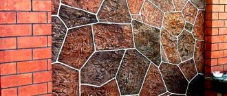
Unusual interior items with slate coating
Chalk or marker painting is used not only on walls. Slate material can be found in the most unexpected places: on the table, on the chest of drawers, on the closet door and on the flower pot.
Furniture with a similar finish looks non-trivial and easily fits into a modern interior. Graphite, as a base, is used to decorate jars, candlesticks, watches and mugs. His creative influence extends to the widest areas. The main thing is that the designer’s imagination does not dry out.
The whole world chooses lettering, and we also chose
Lettering (English lettering - drawing letters) gives the artist the freedom to turn text into a drawing, supporting and enhancing its semantic content.
Jay Roeder
This is probably why lettering is so popular all over the world, because it combines the strengths of two expressive means: drawing and text. Handwritten lettering and fonts have been one of the biggest trends in illustration this past year, and you can be sure that lettering will continue to gain popularity this year. After all, while digital technologies are taking over more and more of our lives, creative people are looking for ways to make design personal again, to return the human element to it.
Timothy Goodman
You know, there was one interesting study (alas, I don’t remember which company was conducted) where product labels were shown to consumers so that they would choose the most pleasant options. Back then, marketers were quite surprised to see that printed text had won by a large margin over hand-drawn labels. People unconsciously rated hand-drawn designs higher.
Chris Piascik
And if we see few examples of lettering in everyday life and on the streets of our hometown, the reason for this is the low popularization of this trend among large and medium-sized businesses in Russia (at the moment). But this is an amazing thing, just take a look:
Jason Naylor
Chris Piascik
Business giants such as Google, Coca-Cola, Nickelodeon, Reebok, Converse, Nike, McDonalds, Facebook, Xbox, Forbes, Vogue, etc. boldly use lettering at a wide variety of events and in their products. And the work of Russian and foreign lettering artists can be found on Instagram and Behance by searching #lettering
. We got acquainted, were impressed and realized that we had found a fresh stream and an ideal means for conveying our ideas.
What type of slate coating is there?
The slate coating is made using special paint. There are options on sale when the finished coating can be purchased in the form of adhesive tape. You can find ready-made options in Ikea, as well as in other similar stores.
The paint that creates the layer for chalk painting comes in more than just graphite, brown and green. Today you can find dyes of any shade, and you can apply drawings and inscriptions with crayons on them.
There are even stickers that imitate a slate surface. They are glued to refrigerators and other interior items to give them an unusual look.
For walls, manufacturers produce not only paint, but also ready-made slate wallpaper. A slate wall in a room is a new fashion trend that is used by many famous designers.
Doodling is another new word and a cool illustrative style
In the world of Instagram, Behance and Dribble, you can now find many illustrators with their own unique styles, but if you (like me) are not one of them yet, don’t worry.
Our own style is born from daily practice, and at first we all look at the “greats”, analyze their work, and are charged with their energy and ideas. One of the fresh illustration trends in 2017–2018 is doodling (from the English doodle, which can be translated as “doodle,” and doodling is unconscious drawing).
A doodle is something that our hand draws while our brain is busy with something else (for example, talking on the phone or listening to lectures). If you connect consciousness to doodling, you get a very original, incredibly free illustrative style that has captivated many.
When choosing which direction to move, we involuntarily came to the use of doodling. Its advantage is that in one canvas you can organically place many messages, images, phrases, slogans (and Easter eggs), uniting them in a single stylistic space. It’s interesting to look at it, reading it like a book, only in any order: from top to bottom, from right to left...
Chris Piascik
Illustrators @timothygoodman, @andyjpizza, @chrispiascik will be excellent sources of inspiration and demonstration of how diverse and interesting doodle art can be.
Well, what are we going to draw?
So, we have decided on the style, all that remains is to generate the content, i.e.
content of our illustration. This was the second big reason why I, as a product designer, took on the task. No one knows and loves your company as much as you do. A guest illustrator may bring his own style, but he will not be familiar with your brand, and a brand is a living thing. He has a certain collective personality with a set of individual qualities that managers love to list in technical assignments for logo development in the column “Describe your brand”: young, innovative, reliable, stable, friendly... Absorb all these 50 shades of the brand, rethink and it’s quite difficult to translate it in the form of a clear design solution if you don’t cook in this saucepan yourself. Therefore, working with a third-party specialist often requires long synchronization between the customer and the performer, which includes fortune telling with a magic ball, mind reading sessions and endless edits, equally painful for both parties.
We decided that no one knows better than us how much we value good fun, courage and thinking beyond the task, hooliganism on the verge of trash, informality for the sake of productivity... everything that FunCorp creates.
And so the design and administration teams met to brainstorm and decided on the topic of the content. It looked something like this:
What emerged was a hodgepodge of corporate slogans, mottos, ideas, simply funny and congenial phrases, lightly peppered with inside jokes from Slack.
This was followed by weeks of individual work in combination with iPad Pro+Apple Pencil+Adobe Draw, which I recommend to all interested parties for mastering due to its high technological capabilities, incredible performance and convenience. As a result, the illustration layout was ready to be transferred to the letters FUN, which by this time had been produced and mounted (I'll talk about them a little more in the chapter on chalk markers).
Drawing in real life is better than in print
Of course, it is much faster and easier to print illustrations on self-adhesive film.
Faster and cheaper. Cheaper and more boring. And Facebook would never do that, and Facebook knows a lot about creatively revitalizing the space of its offices! In Europe and America there is a profession that does not exist in Russia, it is called signpainter. Translated, this is probably a "sign" artist. These are the people who, in our digital era, use brush and paint to create signs, storefronts and building walls. Foreign artists were also greatly displaced by the invention of plotter cutting, but this profession still exists and is now perhaps experiencing its own Renaissance (the documentary film SignPainters (2014) will introduce you to it).
Mike Meyer
@copenhagensigns
So why will something drawn or made by hand always be valued over something stamped, even if the plotter produces a smoother cut? Because that's how our brain works. We feel that behind this there is a real person, his living work and talent, his vision of things, and we appreciate the opportunity to touch what enriches our visual culture.
Stefan Kunz
We really wanted our FUN letters to be alive, so that they would speak to the viewer, attract the eye and captivate their imagination, so we decided that the illustrations should be drawn on the surface of the letters in the most classic way - by the hands of an illustrator. Inexperienced, but loving.
Is it wise to draw if you are not an artist?
The designers of ancient Rome also knew: ubi nihil vales, ibi nihil velis (lat.) - “where you can’t do anything, there you shouldn’t want anything.”
A reasonable question: why go into an area where you are unprofessional? That is, perhaps as a child you drew horses well, and now you draw interfaces well, and your grandmother calls you an artist, but when it comes to a task within the framework of brand design, is it wise to take responsibility for a task that you don’t even know how to do? how to approach? At the risk of revealing unknown nonsense as a result, for which, at best, you will be deprived of a quarterly bonus?
I don't have an answer to this question. But I think this is how we get out of our comfort zone. And the comfort zone in the creative profession is professional death.
I believe that, contrary to the prevailing stereotype, every designer is an artist. Even if he draws not with his hands, but with his head, working exclusively on the trackpad of his laptop. And when a product challenge (and the blessing of management) gives us designers a chance to step into a brave new world, we have to grab it.
Getting to know the works of modern illustrators broke the stereotype in me that everyone should do their own work, and the destiny of a designer is the Adobe package. All these extraordinarily talented artists unanimously say: don’t be afraid to start, don’t be embarrassed to look unprofessional, just go ahead and do it! And have fun with it!
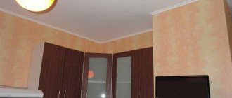
In the hall
Slate wallpaper combined with photo wallpaper looks great in the hallway. You can stick just one roll of chalkboard on the wall, and your writing board is ready. Using this interior technique, you don’t have to worry about the shopping list. It is also possible to leave notes for loved ones in a very visible place.
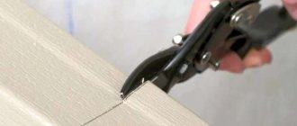
Chalk markers and what they are eaten with
Chalk markers are what baristas all over the world use to write “Cappuccino - 250 rubles” on their boards.
We chose chalk markers to transfer the image onto our rather large black letters. “But they are erased!” - you say. "Exactly!" - we will answer. This means the freedom to change the content of the illustration in the future. “If the baristas can do it, then I can do it too!” — with this slogan I began to study lettering with chalk markers.
Let me make a reservation right away:
chalk lettering
and
lettering with chalk markers
are not exactly the same thing. The main difference between chalk markers and chalk is that chalk leaves a looser, more heterogeneous mark; markers give a clean, dense line, do not crumble and are stable after drying. These are two similar, but different tools, and it would be ignorant to say that one is better than the other, since each solves its own problems. Chalk markers were the perfect solution to our problem.
Chalk marker is also called paint marker, chalk ink, chalk pen, bistro marker, glass pen, liquid chalk, but more often chalk marker.
It's funny that this name does not correspond to reality, since, contrary to the stereotype, chalk markers do not contain liquid chalk inside, but special water-based pigment ink. This pigment has several advantages: it is resistant to ultraviolet radiation and does not fade in the sun, and it also has very good “hiding power,” that is, it covers the color of the surface it is applied to well. Due to this, a very rich color of the picture is achieved. Chalk markers can be used on glass, plastic, metal, LED boards, chalkboard paint and other hard, non-porous surfaces. The drawing is easily washed off with a sponge and water (or better yet, a sponge with a special product for washing off chalk markers).
You yourself are most likely already familiar with chalk markers as a tool for children's or office creativity. You may have seen chalk signs on boards in restaurants, stores, weddings or banquets. Meanwhile, they undoubtedly deserve more attention.
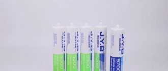
How to choose good chalk markers?
We personally tested the markers of these brands and were satisfied: Edding, Uni Chalk
.
And these are other leading brands on the market: Zig, Molotow, VersaChalk
.
The market is now flooded with chalk markers from a variety of companies (including Chinese), but it is better to trust well-known manufacturers. The average price of one marker varies from approximately 200 to 400 rubles, depending on the size of the tip and the amount of ink in the tank.
How to choose quality chalk markers? The following criteria will help you:
- the marker has a double-sided tip (when one side fails, it can be turned over and reused; also, one side is oval and the other is beveled);
- a large palette of colors in the line, the presence of fluorescent colors, the presence of a line of tips of different diameters and shapes;
- refillable ink tank (this is very rare: I found refill only for Molotow CHALK markers).
One could say that the quality of a chalk marker is primarily indicated by the density and brightness of the line, but these properties are difficult to evaluate when buying a marker in an online store, and most likely it will be more convenient for you to buy them there, like any highly specialized art product.
Chalkboard paint
Chalkboard paint is usually used to restore school boards. This is a fairly cheap and reliable way to restore the surface of a scratched board.
The following paint options are used in the design of the room:
- Magnetic coatings;
- Spray paint;
- Alkyd paint for application with brushes or rollers;
Magnetic paintwork materials allow you to use the treated surface as a magnetic board, on which you can also write with chalk. Their secret lies in iron particles added to the main composition. Spray paints are easy to apply to the wall. They can only be used in a ventilated area, having previously covered all surfaces that cannot be treated.
Simple slate paint is applied in the traditional way. Its drying time is slightly longer than that of the above options, but large areas can be covered with this paint.
You can also find marker paints on sale. They are called analogues of paintwork materials. The composition of such paints is environmentally friendly and has an undeniable advantage: after the coating dries, you can write on it with “water-based” markers of different colors. The price of these dyes is quite high, for example, one liter of paint can cost about 8,000 rubles, and it is enough to paint an area of 6 square meters.
This type of decor has its pros and cons. Let's look at them in more detail:
| Advantages | Flaws |
| High wear resistance of the coating. | Increased price compared to other options. |
| Environmentally friendly, odorless. | Use only for interior work. |
| Beautiful surface. | |
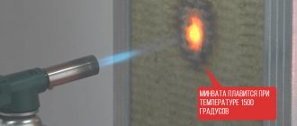
| Fire resistance. |
Among the unobvious advantages are those that relate to living with young children under the same roof. One slate wall will save the entire renovation of an apartment or house from the riot of little artists. After all, they can draw on it, painting the surface from floor to ceiling with new paintings.
It is also convenient to take notes on a slate board or wall. You can always depict something outlandish to diversify the appearance of the room.
The approximate consumption of this paint is 125 ml per square meter of area. More accurate indicators are available on each bank.
Slate paint dries in about 24 hours. Afterwards, its hardness and strength can be safely tested with crayons and sponges. This type of coating is not afraid of scratches, but does not tolerate low temperatures.
You can simply buy this type of dye in a store, or you can make it yourself. The coating recipe includes paint, water and plaster. The proportions of the ingredients are 3:1:2. In addition, there is another recipe for such paint - this is a glass of acrylic substance and two tablespoons of cement. Any color can be added to these mixtures.
Home-made paint will differ from factory-made analogues in the absence of marble chips in it. Manufacturers make their products strong and durable by adding various additives and stabilizers.
What can you draw on with chalk markers?
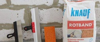
We chose eco-friendly and lightweight plywood for the letters, high-quality primed and coated with special slate paint Blackboard paint. Chalkboard paints are not uncommon now, and if you follow the painting technology, you will certainly get a good result, no matter which one you choose. I'll give you just a few tips:
- choose a surface that primes well, and do not neglect a high-quality primer;
- Before purchasing paint, contact the manufacturer and check the properties. Slate paints come in matte and glossy (it’s better to choose in advance what effect you want to get);
- make a sample of the product, and if necessary, more than one.
We made about 7 small test letters, experimenting with different combinations of materials, until we finally came up with a combination of plywood and matte slate paint. This combo passed the test with flying colors (we draw - evaluate the brightness and consistency of the stroke - wash with a wet cloth - dry - evaluate the cleanliness of the canvas - pick with a fingernail, scratch - evaluate the strength).
But you can use chalk markers not only on surfaces with slate paint. There are many other options where you can use them to your business advantage:
- on glass
(design of glass showcases and windows. Drawings can be changed at least every week, however, you will have to get hold of an artist on staff); - on the mirror
(for interior decoration or other non-trivial ideas); - on metal and plastic
(for temporary branding of products or to write a joke on a colleague’s favorite mug or instructions for a coffee maker); - on marker and magnetic boards
of all types (to make your presentation or report more vivid and lively).
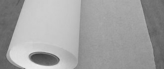
Slate wallpaper
The slate wallpaper is based on high quality waterproof vinyl. In the West, this type of finishing has been used for a long time. In other countries, slate wallpaper is just beginning its rise to the top of interior trends.
Wallpaper with slate coating is self-adhesive. To place wallpaper on the wall, simply separate the film from the main material and stick it on the selected surface.
The environmentally friendly and high-tech coating can withstand up to 10,000 erasing and chalking cycles. There are also films on sale that you can draw on with markers.
The porous coating perfectly imitates stylus. It is pleasant to the touch, quite resistant to scratches, and does not leave dirty marks after removal from the surface.
This wallpaper is used in the interior of the living room, kitchen, and children's room. They can be seen in the bathroom and hallway. This type of finish is also placed above work surfaces so that space for writing is always at hand.
FUN letters are ready
Our letters began to fulfill a fun mission already in the process of drawing, as all the employees passing along the corridor were amused by the contemplation of the UX designer, either hanging on a stepladder under the ceiling, or lying on a rug on the floor and diligently painting certain areas of the letters. 
We also decided to give our colleagues room for daily creativity, so the middle letter U was given away for the use of everyone who wanted to relieve stress and draw freely.
In the kitchen
In the kitchen, you can decorate the refrigerator using this decor. It is also possible to make a slate wall behind the dining area, like in a cafe, or turn a simple interior door into a writing board.
Since, most often, such a coating is quite dark, it is worth considering the effect of darkening in the overall interior concept. Small slate areas are suitable for small kitchens; large areas can be decorated with slate coverings from floor to ceiling.
Life hacks for the beginning chalk marker artist
I want to share my experience with those who will be inspired by the idea of chalk-marker drawing. The following tips will hopefully save you from making newbie mistakes.
- Have a supply of markers, as they tend to run out quite quickly during intensive drawing. Buy more at once than you need, so that later you don’t have to re-order and interrupt the work process (as happened with us).
- Prepare a stepladder, various sponges and cotton swabs for correcting mistakes, microfiber cloths, washing liquid - you will need all this.
- Make and approve a layout before you apply your design to a surface (unless your design involves free-form, meditative doodle-making, like Shantell Martin does. Then just “follow the line”).
- A projector will be a great help for transferring the layout onto a real surface. This is a “cheat code” for the amateur artist and a guarantee that the result will be one hundred percent consistent with your layout. The projector helps to maintain precise proportions and, undoubtedly, significantly speeds up the work.
- Test your markers before you begin. Get used to the shape and thickness of the tips, learn from your own experience how to saturate the tip with ink when drawing, how to maintain its integrity, avoiding strong pressure and “rubbing.” Some inks are brighter and more opaque than others, some can only be applied in 1 layer and then they start to scrape off the layers below. All this can be learned only by making a few trial drawings.
- For super rich color, wait until the first coat dries and apply a second and third where possible.
- Colors mix! You can go over the purple layer with yellow and you get khaki, or over the white with crimson and you get pink. You can also create gradients, and it's very beautiful. Mixing colors of chalk markers is not very practical because you will smudge the tip of the marker with another color. The good news is that you can take it out and wash it with water.
- Colors mix-2! Keep this in mind when you decide to paint one color over another. You may get an unexpected result, since the wet top stroke will dissolve the undried bottom stroke.
- And finally, a nice nuance: markers that have the word neon in their description, as well as a white marker, fluoresce quite well under UV light.
PS It’s hard to say why I wrote this article: either to inspire designers to get up from their chairs more often and not be afraid to do something with their own hands, or to convince brand managers of the creative potential of live lettering, doodle illustration, non-standard materials... But if at least someone, after reading it, will decide to pick up a marker and write something - this will undoubtedly be an excellent result!
In the nursery
A nursery is the perfect place for a chalkboard or wall. All children, without exception, love to draw on any surface. To provide them with a place for creativity, the wall near the window can be made of slate.
Many children's institutions are decorated with slate wallpaper and other coverings. This type of decor is especially popular there. All drawings on the stylus can be stored for several days, and then washed off when the spectacle becomes boring.