Detailed color mixing table paints with examples and mixing instructions.
For many artists, especially beginners, the problem of mixing paints can be very pressing.
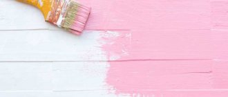
How to get a color that you don't have on hand? Of course, mix paints on the palette! And the color mixing table below will help you get the most necessary colors for painting with oil, acrylic or watercolor. The table describes in detail how and what paints to mix to get different colors. The table will expand your horizons and add courage to beginning artists in mixing paints, because to obtain a color you need to mix several paints of 2-3 and 4 types to obtain one shade.
| Color | Required Color | Base Color + Mixing Instructions |
| How to get pink | White + add a little red | |
| How to get chestnut | Red + add black or brown | |
| How to get royal red | Red + add blue | |
| How to get red | Red + white to brighten, yellow to get orange-red | |
| How to get orange | Yellow + add red | |
| How to get gold | Yellow + a drop of red or brown | |
| How to get yellow | Yellow + white for lightening, red or brown for a dark shade | |
| How to get pale green | Yellow + add blue/black for depth | |
| How to get grassy green | Yellow + add blue and green | |
| How to get olive | Green + add yellow | |
| How to get light green | Green + add white/yellow | |
| How to get turquoise green | Green + add blue | |
| How to get bottle green | Yellow + add blue | |
| How to get coniferous | Green + add yellow and black | |
| How to get turquoise blue | Blue + add a little green | |
| How to get white and blue | White + add blue | |
| How to get Wedgwood Blue | White + add blue and a drop of black | |
| How to get royal blue | Blue + add black and a drop of green | |
| How to get dark blue | Blue + add black and a drop of green | |
| How to get gray | White + add a little black | |
| Get Pearl Gray | White + add black, a little blue | |
| How to get medium brown | Yellow + add red and blue, white for lightening, black for dark. | |
| How to get red-brown | Red and yellow + add blue and white to brighten | |
| How to get golden brown | Yellow + add red, blue, white. More yellow for contrast | |
| How to get mustard | Yellow + add red, black and a little green | |
| How to get beige | Take brown and gradually add white until you get a beige color. Add yellow for brightness. | |
| How to get off-white | White + add brown or black | |
| How to get pink-gray | White + a drop of red or black | |
| How to get blue-gray | White + add light gray plus a drop of blue | |
| How to get green-gray | White + add light gray plus a drop of green | |
| How to get gray coal | White + add black | |
| How to get lemon yellow | Yellow + add white, a little green | |
| How to get light brown | Yellow + add white, black, brown | |
| How to get fern green color | White + add green, black and white | |
| How to get forest green color | Green + add black | |
| How to get emerald green | Yellow + add green and white | |
| How to get light green | Yellow + add white and green | |
| How to get sea green color | White + add green and black | |
| How to get an avocado | Yellow + add brown and black | |
| How to get royal purple | Red + add blue and yellow | |
| How to get dark purple | Red + add blue and black | |
| How to get tomato red | Red + add yellow and brown | |
| How to get tangerine, orange | Yellow + add red and brown | |
| How to get reddish brown | Red + add brown and black | |
| How to get orange | White + add orange and brown | |
| How to get red burgundy color | Red + add brown, black and yellow | |
| How to get raspberry | Blue + add white, red and brown | |
| How to get plum | Red + add white, blue and black | |
| How to get light chestnut | Yellow + red, black and white | |
| How to get honey color (honey) | White, yellow and dark brown | |
| How to get dark brown | Yellow + red, black and white | |
| How to get copper gray | Black + add white and red | |
| How to get eggshell color | White + yellow, a little brown | |
| How to get black | blue + burgundy + brown |
The color mixing table will always tell you how to mix oil paints for painting. Every artist should have this table at hand! What colors to mix to make the third, I think this question will no longer arise for you.
Color Basics
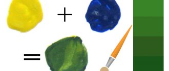
The science called coloristics studies colors, their features and combinations. Any artist, even a beginner, has an idea of how to get a particular shade by mixing paints, and, naturally, knows how to get green.
You may not believe it, but all the objects around you are painted in only 3 colors. They are called basic. These are red, yellow and blue. By mixing these colors and using black and white, thousands of shades can be created: brown, purple, pink, orange and many more. By learning these basics, future artists will also learn how to produce the color green.
The color ring is used to visually study color. It is convenient to use it to determine which color needs to be mixed with which in order to obtain more complex shades. Moreover, changing the proportions of the initial colors also changes the final one. Paints from different companies may differ slightly in color - this also needs to be taken into account when mixing.
Table for obtaining green shades by mixing it with different tones
However, if you put aside the brightness and quality of the colors and imagine a graphical map of mixing colors to obtain shades of green, you will be able to navigate any palette.
Where in the center is the main paint for mixing. The first circle is the shades to be mixed with the main paint, the second circle is what happened when mixing green paint and one adjacent tone. The third circle is the shades of the previous circle mixed with the main one, white and black.
How to get other colors and their shades: theory and practice. Click on the icon.
One comment on “How to get green by mixing paints”
- Rafaelen
August 24, 2016, 3:26 am
How to achieve a gray-beige color, in the style of concrete... does anyone have any idea how to get uneven paint coverage, streaks?
Yellow and orange
Summer landscapes cannot be imagined without these shades.
Eggshell color
It can be conveyed if you add yellow and a drop of brown to white paint;
Interesting Facts
How can you miss such an interesting section:
- Ocher is the oldest red pigment. It was 100% used in Ancient Greece, Ancient Egypt. But this is not very long ago and interesting. What’s more interesting is that all the red and yellow cave paintings, up to 40 thousand years old, are painted with ocher. We can say that this is one of the most ancient paints. It was even called “red gold” because it was so important in the culture.
- In Ancient Greece, it was believed that you could draw anything if you had black, white and red paints. Guess what the red paint was made from?
- The pure pigment is similar to talc, it is completely airy.
- The deposits are usually small, so the low cost of production is partly offset by the need to move frequently. However, not too far from the previous deposit.
- The best ocher is Italian. There, excellent deposits of the purest ocher are combined with high-tech processing.
Light green
So we know what colors to mix to make green. But how to clarify the result? Just add white. For classic light green, the proportions are 2:1:1. That is, there is 2 times more white. The resulting warm shade can be varied. More white – the paint becomes lighter. Less - it is juicier. This produces different shades, from soft pastel to cheerful bright green.
You can do it differently and replace blue with light blue. As a result, we have the same light green paint. In this case, you can change the brightness by varying the proportions of blue.
DIY blue food coloring
Would you like to learn how to make food coloring from simple and affordable ingredients? To achieve a beautiful blue or sky blue tone, the following is suitable for the dye base:
- red cabbage;
- eggplant (peel);
- blueberry;
- blueberry;
- blackberry;
- dark grapes.
Berry ingredients are best used as a dye when you need to give a deep blue color to cream, cake layers, and puddings.
Berries for making blue natural dye: Pixabay
Step-by-step instructions for creating berry dye are as follows:
- Rinse the berries (blueberries, grapes, blackberries, blueberries) thoroughly.
- Place the berries in a blender, add a little water (the more water, the lighter the shade).
- Whisk to obtain a homogeneous mixture.
Blue dye can be obtained from red cabbage. To do this, boil the vegetable in water. Water colored by cabbage is used to create an original shade of products.
Variety of green
The original green is usually presented in all sets; if the required dye is not available, there are no problems obtaining it. Pairing yellow with blue gives the desired green background. But any direction of creativity, be it painting, interior design or another option for decorating objects, requires a wide palette of green. The basic principle of all experiments is to change the proportions of the base colors; white or black dye is used to lighten or darken the background.
Next we will talk about mixing options and the results of the experiment:
- The combination of blue and yellow with a small addition of brown represents khaki. Green with a small amount of yellow forms olive.
- Traditional light green is the result of mixing green and white.
Adding yellow or blue will help regulate warmth. ?Attention! The quality of the starting components affects the saturation of the green color. The more intense the base tones, the brighter the blending result will be. - A yellow-green effect can be achieved by combining yellow and blue in a 2:1 ratio. The inverse proportion will result in a blue-green tone.
- Dark green color is achieved by adding half the amount of black.
- A warm light green background is formed from a mixture of white, blue and yellow paint in a 2:1:1 ratio.
The circle demonstrates a variety of green colors. The base dye is located in the center, followed by the additional component, and then the result of mixing. The last circle is experiments of the resulting tone with the addition of white and black dye.
The next table will become an assistant when conducting experiments.
Color mixing: table
The process of obtaining one color or another is, in principle, always the same. You need to take all the colors you need, arm yourself with a brush and palette, and then, gradually mixing the paints, achieve the desired color and shade. But immediately remembering which colors need to be mixed to get the desired result is not always so easy. Therefore, we present to your attention a table that will definitely help you quickly cope with this process.
| Desired shade | Color | Color | Color | Ratio |
| light turquoise | blue | green | Yellow, cream | 100% +5%+2% |
| soft turquoise | blue | green | white | 100%+10%+5% |
| dark turquoise | blue-green (cyan) | green | 100%+40% | |
| aquamarine | green | blue | white | 100%+50%+10% |
| turquoise | blue | green | 100%+10% |
As you can see, getting such a beautiful turquoise color and its different shades is not so difficult. To achieve the desired result, you just need to arm yourself with paints of suitable colors, a brush, a palette, and, of course, add a little imagination to all this.
How to get olive and khaki colors by mixing paints
A huge layer of complex olive shades can be obtained in several ways. The first way is to mix medium green and brown. In this case, the tones will turn out muted, dusty with a marshy undertone. This is the sum of several colors (yellow, blue, red), so all shades will have a gray, dull tint.
The second way is to mix yellow with black. The resulting paint will have a golden tint; it will be brighter, since it is the sum of the primary shades.
Turquoise color in nature, its meaning
Turquoise is one of the most beautiful shades; it is widespread in the world around us. This tone can be seen on the sea near resort shores; the water in the area of sea lagoons, various oases and water quarries is colored turquoise. Different shades of turquoise are seen in the sky in the early hours of the morning. This color is not present in the main palette; it must be obtained by combining paints.
Psychologists call turquoise cold and mysterious, although people associate it with intimate conversations with friends. In the countries of the East, the color symbolizes faith, healing, compassion, and in Europe it was previously considered a talisman that bestows good luck.
Alternative medicine uses turquoise in color therapy: this shade is good for the eyes, can strengthen the immune system, and reduces the risk of overload, depression and stress. It is believed that this tone is very harmonious, designed to add calmness and balance to a person, and helps control emotions.
Variety of shades of red
Red consists of a trio of original colors that make up the base. Therefore, even a minimal set of paints cannot do without it. However, the question of how to get a red color when mixing paints sometimes still arises. This happens because magenta is involved in printing, so creative searches for how to get red are natural. Everything is solved extremely simply: to obtain natural red, yellow is mixed with magenta in 1:1 volumes.
The color scheme of red is diverse, so there are many combination options:
- An extremely popular question is how to get a crimson color. The initial colors for the mixture are red and blue in equal proportions; introducing small amounts of black or white color will help to vary the shade of crimson.
- There are several answers to how to get brown. The easiest way is to combine red and green. Since green itself is the result of mixing yellow and blue, then, accordingly, a combination of three primary colors will help to achieve a brown background. More detailed ways to achieve shades of brown are presented in the diagram:
- Pink can be obtained by combining red with white.
- If you mix 2 portions of red color with 1 part of yellow paint, you will get scarlet. To get orange, you need to increase the volume of yellow. Depending on the desired shade, orange is created by mixing pink paint and yellow dye.
- You can achieve burgundy in different ways. The easiest one is to add a drop of blue paint, because red itself is dark. A similar result will be obtained by introducing a little yellow and a drop of black paint into the red color.
- Mixing red and pink dye allows you to achieve a softened red undertone; white color will help increase the result.
- Combining red with violet in a 3:1 ratio results in a dark red tone.
Comment!
A beautiful purple color cannot be obtained by combining violet with red. The only way to achieve a bright shade is to find red paint without yellow impurities and mix it with blue. The variety of shades of red is demonstrated by the next circle. It is worth noting that adding white colors to any mixture leads to lightening of the tone, and black ones to darkening.
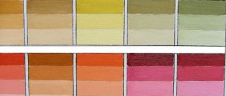
The table below will help you understand the names of shades of red:
Color wheel rules
It turns out that any color (and there are tens of thousands of them in the world) consists of three main ones. It is impossible to obtain them by ordinary mixing. These three colors are taken ready-made. That is why in any set of colors red, yellow and blue are always present. The remaining shades are the result of their mixing.
For convenience, we will use Itten’s color wheel. This term refers to a conventional scale in the form of sectors, on which, according to the laws of color, 6 primary colors are located. Moreover, they are arranged in such an order that as a result of mixing two adjacent ones, a third is obtained.
Take, for example, the green we need. It is located in the Itten circle between blue and yellow, so it is the result of their combination. Moreover, if you take more dark blue, you will get green with a hint of turquoise. The pale green color is the result of adding white.
When mixed, does yellow predominate? The resulting light green is called chartreuse. Need a shade closer to lemon? You need to add even more yellow and a little white.
To get grey-green you need a drop of grey. Khaki is the result of combining classic green and brown. You can make a light green color by combining green with bright yellow.
How to change color correctly?
Often, artists are faced with a more difficult task - how to get a green color that is much more interesting than the standard one. To do this, you can experiment. For example, add black - it will make the green darker, like a swamp or coniferous, but in some cases this is necessary. You need to work with black very carefully. Even the smallest drop can make the color look muddy, so add it a little at a time. And white will make the shade lighter. At the same time, the brightness will decrease - the green will appear as if in a fog. The same recommendations apply to other colors.
In pursuit of interesting shades, some begin to add all the colors in a row to green. This is not worth doing. Colors located on the other side of the color wheel can easily ruin everything. That is, if you mix yellow and blue, try not to add red and its shades. Only those who have sufficient painting skills can do this correctly.
Features of black color
Natural black (charcoal) is, in fact, the absence of color - that's what scientists say. This achromatic tone is the complete opposite of white. If the latter reflects an overwhelming amount of light rays, then black, on the contrary, tends to absorb them. There is no absolutely black color in the world, but the darkest vantablack carbon is very close to the “ideal” - it absorbs 99.965% of the rays of the sun, microwaves, and radio waves. That is, this material reflects the minimum possible amount of light, and therefore is considered the blackest on Earth.
Black dye is made from various carbons; it is these substances that make it possible to obtain all types of paints of the desired tone. The most commonly used materials are carbon black and graphite. Previously, artists obtained matte black from burnt bone, and there was no darker tone. Today, production from minerals has been put on stream, so in any art store you can buy paint, pencil, plasticine or a dark-colored felt-tip pen.
That's all
Today we met such an interesting color. We can say that we made a mini-trip 300 thousand years ago, because archaeologists find this pigment even at Homo erectus and Neanderthal sites. Today it is a cheap and very diverse pigment, which has very wide applications in everyday life and art.
By the way, there are also other unusual colors, for example, coral. Write your impressions and ideas in the comments, it’s always interesting to read them! See you later!
Alla was with you, a lover of strange queries on Google.