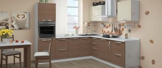
Coffee is associated with cheerfulness, “good morning,” which is why coffee-themed kitchen wallpaper is so popular in many modern interiors. The color scheme of the wall covering is chosen to best suit the room furnishings and decor. Stylish prints allow you to create both a calm and dynamic mood in the room.
Features of the color of coffee with milk
Why is cappuccino one of the most successful colors in interior design? There are several reasons for this.
- Compatibility. Cappuccino, or coffee with milk as it is also called, goes well with many colors, so it is easy to work with in design.
- Versatility. Suitable for both background and accents. It all depends on the degree of its saturation. Cappuccino color can be used both in the design of finishing materials and in the design of furniture.
- Neutrality. It does not irritate or cause negative emotions, therefore, from a psychological point of view, it can be considered one of the most favorable for interior decoration.
- Suitable for all styles.
- It compensates for the lack of solar heat in the room, so it is an excellent option for kitchens with north-facing windows.
- Suitable for both small and large kitchens.
Shades of coffee color
All coffee tones will look great in the hallway. But in this case, an unmistakable level of lighting should be arranged. Milk can look good even in low light, but darker shades will require a good light source or even steam. The colors of café au lait, peach and beige will look just great in the bathroom.
According to the recommendations of the designers, this design can be complemented with dark accents, which will be in the form of independent details. The main advantage of this color is its fidelity. Café au lait can be the perfect backdrop for any room, and pairing it with other color schemes can create a truly cozy design.
What to combine with coffee-style wallpaper?
The optimal combination for dark wallpaper is light, sometimes even white, furniture.
“Coffee wallpaper” is usually dominated by dark brown tones. To prevent the room from becoming overly dark, the product is combined with light furniture, preferably wooden or imitating wood texture. Small coffee ornament looks good with plain furniture, ceramic tiles or wall panels in beige, light olive, vanilla, brownish-golden tones.
Black and brown macro images of coffee beans will beautifully highlight the dining area; it is advisable to paint the remaining surfaces in any one color. Separate decorative elements in green tones are also appropriate - furniture fittings and live indoor plants are suitable.
Designers do not recommend the combination of dark furniture and coffee wallpaper.
Wooden, rattan, veneered furniture, door and window draperies made of natural fabrics look great in the “coffee kitchen”. It is not recommended to combine coffee wallpaper with dark furniture in the color of stained oak, wenge, amaranth, or ebony, but flooring, baseboards, and doors of this color are quite appropriate.
Coffee wall color: features, ideas and materials
The beige color scheme is the basis of the basic interior. The coffee-milky shade is included in the beige-beige range. This is a complex color that is achieved through a combination of brown (coffee range) and white (milky shade). These two colors combine harmoniously and form the perfect shade for any interior.
Coffee with milk on walls, furniture and fabrics is cozy, but with a strict and elegant design. The undeniable advantage of warm cinematic colors in the interior is the optical expansion of the room.
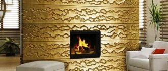
The combination of two shades of coffee - dark and light - makes the room accessible, and the presence of a fireplace adds a feeling of coziness
Other advantages of beige gamma decor:
- There are dozens of crimson and beige shades in combination. Everything fits perfectly in the interior.
- Bejei's accents hide the lack of space.
- There is no visible dirt or dust on the surface of the coffee.
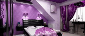
- Coffee with milk goes not only with neutral colors, but also with bright contrasting colors. Inside you can see a coffee-milky hue with orange, red and even sophisticated purple hues.
- Pastel beige tones are warm, beautiful and cozy. A calming and calming room in a coffee-with-milk shade: it is often used in the living room, bedroom, and bathroom.
There are no uniform rules for interior design in popular colors. Here are some tips on how to arrange your space and furniture:
- for large sunny rooms, use a darker format, for example, for chocolate - they level out too much space;
- small rooms with a slight convexity, format them in light shades of milky coffee - these tones visually increase the space;
- Contrasting ones will help to dissolve the monotony of coffee beige, but they are closer to the color scheme: orange, seductive, earthy;
- for a variety of decorations, play with the facts: count wood and stone, silk and cotton, leather and plastic inside.
- collect the same accessories, decorations and fabrics: wooden furniture, boxes, photo frames;
- neutral color of coffee latte and a good background for natural decor: decorate the walls of the cafe with paintings, mirrors, installations;
- Take narrow coffee rods with you to the coffee shop - they will protect you from too bright daylight and create a warm background.
If you are creating a latte interior, do it in several layers. Decorate the walls with paintings, move the grilles, create a rug and decorate the room with gold accessories. The more coffee and milky shades, the more varied the room looks. Incorporate nearby shades of beige and brown into your design, and the room will no longer feel dull and unhappy.
The ideal furniture for a coffee and dairy room is leather and wood. These materials emphasize the elegance of the cafe interior. The floor is also wooden: use light weather to expand the space, dark weather to level it out. The ceiling is made neutral - white or light beige.
The main emphasis in beige interior design is on the walls. To decorate the walls, use paint, wallpaper or facing materials.
Coffee walls
Paint and wallpaper are not the only options for modeling walls. For wooden, Scandinavian interiors and halls there is stone decor - cladding with artificial or natural wood, wood.
Delicate materials in a coffee-with-milk shade look natural and imitate natural materials. These elements perform not only a decorative function, but also a practical one: stone and ceramic fabrics are resistant to damage, wear and abrasion. Where to use natural decor in the shade of coffee with milk:
- in the kitchen work area, the walls are finished with tiles, stone or porcelain stoneware;
- in the bathroom the walls and floor are tiled and mosaic;
- in the living room, the accent wall is decorated with a fireplace, country brick or wood panels;
- Decorative stone and wood are used in the bedroom;
- in the corridor and in the window the walls look like artificial stone.
Stone furniture protects walls from scratches and damage and further insulates the room. Selected materials in natural shades will complement painted or green café au lait walls.
Bathroom tiles are placed on both walls and floors: coffee, beige and chocolate - this is a great combination
Cafe au lait paint for walls
Milky color is a suitable option for painting - it goes on smoothly and hides imperfections in preparing the walls for painting. Added bonus: the perfect coffee shade doesn't require many layers.
Coffee-milky color is slightly darker than beige. To paint your walls a coffee color, choose text matte anti-reflective paint. You can paint the walls a neutral coffee shade and add bright accents. Accompaniment cakes suitable for coffee with milk:
- revenge;
- blue and white;
- dark crimson;
- chocolate;
- orange;
- lemon;
- apple;
- hooligan;
- creamy;
- cane;
- lavender.
Milk coffee belongs to the gourmet category and goes with all edible flowers. But you don’t have to get carried away with contrasts - the atmosphere of warmth and comfort will disappear from the room and a feeling of solidity will appear.
Milk coffee paint visually aligns walls and expands space due to its maturity and anti-glare effect
Coffee wallpaper in the interior
If you don't want to sit on the wall, add coffee with milk. This popular shade is found in almost every collection: with different bases, facts, models. Add chocolate wallpaper as a coffee pot - it will break the neutrality of the room.
For the kitchen, you can use washable non-woven wallpaper with a themed pin or slip ring. In the warm half, combine coffee with milk with other shades and decorations: stucco, beads, fabric.
In the bedroom, plaster beige wallpaper and combine it with a coffee wall at the head of the bed or in a niche with shelves. Darker shades are ideally combined with the task of zoning a room.
Coffee wallpaper is also used for other rooms. The calm palette of coffee and milk will fit perfectly into the room - the main color of the walls does not distract from work. If the booth is small, reduce space constraints by using a heavy wallpaper combination—a vertical opnum visually elongates the room and adds
The latte top, chocolate bottom and beige border on the butt create a small room of space and volume.
Transit zones - the exterior and the building - are covered with neutral wallpaper in beige and coffee tones. Light shades of coffee are combined with brown furniture: garadero, chest of drawers, chest of drawers. If you need to adjust a room, use these basic guidelines:
- vertical height - raise a low ceiling;
- horizontal angle - expands the frame;
- light walls and mirror surfaces create the effect of additional volume.
If you need to make an emphasis on the interior and image, stick a light, warm photo wallpaper of a coffee maker to the focal wall. This decor can be used for additional wall coverings with artificial or natural stone.
For an accent wall, choose funky coffee-and-milk wallpaper—it's part of the focal point of the entire room.
Types of coffee-themed wallpapers
Such products are produced mainly in the following versions:
- wallpaper with large coffee beans for the kitchen;
- aromatic drink or grain in a cup and saucer;
- images of all kinds of coffee cans;
- “coffee” inscriptions, names of varieties in different languages;
- utensils for preparing coffee drinks;
- impulsive photos – a drink spilling from a cup, grains falling apart, etc.;
- “coffee ceremony” - a picture where coffee is complemented with seasonings, chocolate, fruits, flower bouquets, textiles, hearts made of smoke rising above the cup.
Today, of the existing wallpapers, vinyl coverings are most suitable for kitchen walls.
The materials used are also varied:
- paper and acrylic - are inexpensive, but do not tolerate even the most gentle methods of washing and removing dirt, quickly losing their appearance;
- vinyl is the best option for covering a kitchen area. They are not afraid of dirt, moisture, do not absorb odors, and are considered a soundproofing material;
- natural - made from jute or bamboo with non-woven fabric. The product is environmentally friendly and beautifully emphasizes the texture of the design.
Coffee color: combination with other colors
If the main background of the room is coffee with milk, it must be diluted with other shades, but at the same time maintain a single decor palette - brown. Milk and coffee have many characteristics: basic, light, spicy. Use them when choosing a corporate color.
For a delicate palette, choose the same soft shades: pastel, cream, cream. The combination is suitable for a bedroom, bathroom, nursery. Shades of coffee, chocolate and cocoa are suitable for interiors with a cinematic atmosphere. This combination is ideal for a classic guest bedroom - it will decorate the interior and give it an elegant look.
Cocoa shade combines with shades of coffee and beige in a classic bedroom with a modern twist
The basic shade of coffee with milk makes the interior restrained and simple, unpretentious and excessive. But this does not mean that brightness should be avoided in decor. Add pops of color in fabrics and accents to transform the room visually.
The perfect combination of coffee colors:
- Monox - with shades of body type. Single room with different coffee shades is not suitable for all rooms due to its silence. It is better to decorate a bedroom or kitchen in a coffee shop. They relieve boredom in a monochromatic interior due to various fabrics, individual materials and accessories.
- Bronze. FURNITURE AND BRONZE FURNITURE, BRONZE AND DECORATION: All these details complete the neutral coffee-milk color.
- Grey. Shades of gray go with all colors. The combination of hot and cold gray coffee milk is especially successful - the combination will speed up the lack of space. Cool tones provide a visual increase in space, and warm light brown tones provide additional volume. The combination of gray and coffee is often used in small kitchens in a modern style.
In the color scheme of a room, a balance between architecture and decor is important. When choosing a color company for the coffee base, select the size of the room and the style of the interior. Don't overload a small room with bright colors and lots of details. In simple rooms, it is also not necessary to paint with one color - the volume and variety of shades will add subtlety to its display.
White
White plus café au lait is the perfect base for any space. This kind of interior always wins: cool colors, fresh palette, unobtrusive decor. Collect different facts to dissolve the dominance of white and white: leatherette furniture, glossy surfaces, wood texture.
Olive
It is easier to work with such a duet if both colors are of low intensity. With rich colors (and not only in a combination of cappuccino and olive, but also in combination with other tones), you can experiment with modern design, but add a neutral third that will balance the bright colors of the interior, for example, white, light gray, light beige , vanilla or ivory.
Pale olive and cappuccino create a beautiful combination that is typically found in Provence style kitchen projects.
In a modern interior, this combination occurs if you want to create an interior with a combination of natural and natural colors.
Beige
The beige color associated with the cappuccino shade can act as a base on which individual parts of the chocolate color can be highlighted. For example, the interior of a kitchen will look beautiful if the walls and kitchen units are made in beige or vanilla, and the chairs and curtains are the color of milk chocolate.
Nautical inspirations
The golden hue of latte often appears in nautical settings. Beige is a great counterbalance to shades of blue and white, as well as unpainted wood elements. The rough texture of the walls looks beautiful. Coffee and milk look great in combination with blue, cool and warm shades balance each other, making the environment fresh and cozy at the same time.
Orange
Light coffee and orange are a bright combination, especially suitable for rooms designed in ethno, modern and high-tech styles.
You have two options: apply these tones in equal proportions or make the milk predominant.
Yellow
The color of coffee combines with yellow, but not brightly, but plays. This room looks unusual, but very modest.
Bright colors
A modern interior is a great opportunity to combine beige with expressive colors:
- red,
- turquoise
- orange.
Contrasting bold colors combined with a cream background will create a harmonious and original composition. An interesting effect is achieved by the combination of beige and black colors. This combination can decorate a large living room or office.
Stylish examples from designers
Coffee-themed wallpaper can be combined well with plain wallpaper and furniture that is similar in color.
Designers recommend choosing wallpapers for the kitchen with a pattern in the form of coffee beans, coffee cups and other similar prints that are not too dark. This is especially important if the coating is not placed on one wall, but covers almost all vertical surfaces of the room. In the photo, the kitchen apron covered with coffee vinyl wallpaper looks great.
A coffee-themed kitchen apron looks very nice.
Coffee prints vary greatly between styles:
- classic - the drawing is not too bright, not excessive, it is something like neat repeating still lifes on a coffee theme;
- minimalism – photo wallpaper with a cup of coffee on the accent wall, no additional room decor;
- retro – “coffee” motifs are interspersed with yellowish “newspaper” fragments; coffee jars, an old coffee mill, a Turk, etc. are present as decorative additions;
- colonial - associated with hot Africa, there are many “warm” contrasts in reddish-brown tones, coffee beans inscribed in a rough abstraction are ideal;
- modern - inscriptions, geographical maps, and plot paintings are “laid out” on the wallpaper from coffee beans;
Tip: huge coffee beans covering an entire wall look good on the far wall of an elongated room - in a small room there is not enough perspective to contemplate them.
Style selection
The shade of cappuccino will harmoniously fit into any style. Classically, it can be used in mixtures with beige, brown, sand, champagne, etc.
In modern trends, it can become an excellent background or complement to rich and bright colors.
Provence
Cappuccino is a shade that creates a Provencal style, as it perfectly emphasizes the romantic and calm atmosphere in a rustic spirit.
Pairs perfectly with other shades characteristic of Provence: lavender, sand, ocher, olive, pistachio, blue and blue, khaki.
Scandi and eco
Interiors in Scandinavian or eco-style, in their concept, strive to be closer to nature, and coffee shades only emphasize the calm atmosphere. This design involves the use of predominantly natural materials, especially wood.
Classic and neoclassical
Cappuccino can be an excellent alternative to the beige and brown tones of a classic interior. In such a complex shade, the classic can reveal itself in a new way - elegant, expensive and festive, and at the same time more interesting due to its complex undertone.
Cappuccino, diluted with a light gray, milky or white shade, can add a modern touch to a traditional classic interior. Therefore, the use of this shade is an excellent field for experimentation when creating interiors in the style of eclecticism and neoclassicism.
Modern
For modern and technological trends such as minimalism and high-tech, cappuccino is ideal due to its neutrality and restraint. At the same time, its complex undertone will smooth out the severity and visual asceticism of these styles, adding softness and comfort.
When designing surfaces with complex textures and pronounced textures, the shade of coffee with milk will reveal its full aesthetics.
Using glossy colors in the kitchen interior
As mentioned above, the use of coffee bean color is strongly encouraged in the kitchen. This tradition has been around for many years. Modern subtleties of professional design suggest the possibility of using noble colors in any interior. It can be a romantic style, rustic, ultra-modern high-tech with metal elements, etc. Decorating the decor with the help of original accessories can well complement a glossy furniture set. Mirror surfaces visually increase the area. Harmonious combinations may imply the following set:
- A combination of milk wall racks and brown floor stools is used to create a lighter ambiance in the kitchen space;
- If you need to increase your appetite, then you should use a combination of brown and red elements on the cabinets;
- The use of gold fittings contributes to the atmosphere of luxury in the Byzantine style;
- The use of frosted glass in combination with the brown texture of dark wood allows you to create a sophisticated modern decor;
- The feminine form of the design involves mixing milk chocolate with pink elements. However, Switzerland has already begun to produce a pink product. Therefore, soon the shade will be called pink chocolate.
A coffee tone will also look good on glossy tiles. However, it is important to complement it with light shades so that the contrast neutralizes the slightest manifestation of a depressing impression. If a corner sofa is made in this range, then local lighting will be the way out of the situation.
Advice from psychologists
Many professional psychologists claim that coffee-colored wallpaper stabilizes the nervous system. Such a welcoming space allows people to talk and discuss pressing issues.
Considering that the milk line assumes the absence of cold shades, the winter period is characterized by a warmer environment. In addition, the absence of pressure on the psychological state allows you to completely relax. Inside, the coffee palette is often called chocolate. And, as you know, this particular product is the best antidepressant.
Main aspects of using the coffee line:
- A room decorated in coffee tones allows you to forget about your worries for a while. Such an interior does not have a painful effect on the guests - the owners, in turn, are committed to intellectual and creative work. Therefore, such a popular color scheme is often found in workshops.
- Brown wallpaper will be useful for people leading an active lifestyle, because they need a corner of the house where they can truly retire and relax.
- Previously, coffee shades were used in palaces where aristocratic nobility lived. Therefore, they were recognized as elite and privileged. Decorating the room with chocolate shades significantly adds solidity to the room. This effect can be enhanced with the help of expensive furniture made of quality wood and genuine leather.
