Designers and psychologists say that chocolate color in the interior is very ambiguous. This is an excellent alternative to black and dark blue when you want to get away from sharp contrasts with white or milky tones. It is warmer, “tastier”, cozy and pleasant to perceive. But overloading the decor with such a palette is depressing and can make the living room and bedroom uninviting. For those who don’t know what to combine dark chocolate with in the interior, here are our designers’ recommendations with photos.
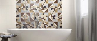
Bathroom in chocolate color
Room in chocolate color
- 1 The uniqueness of color and its psychological perception 1.1 Help
- 6.1 See also
The uniqueness of color and its psychological perception
An elite delicacy made from cocoa beans - black, white and milk chocolate. There are coffee, beige, reddish and caramel shades. This entire palette is widely used in modern and classic “chocolate interiors”. This is the subconscious choice of those who value the comfort of home. Oddly enough, this setting is gaining the greatest popularity in tropical countries and northern regions. But they perceive and associate color differently. For southerners, terracotta is a natural material; for northerners, it is a “tasty” color.
Room design in chocolate color
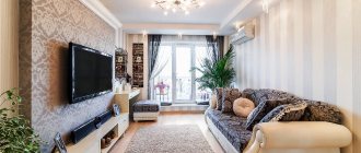
Living room interior in chocolate color
Wooden furniture and floors of the listed color variations in the hallway, living room and kitchen are preferred by lovers:
- classics;
- ethno;
- colonial style;
- eclecticism;
- eco style.
This range is favorably perceived by conservative middle-aged and older people. Among young people there are many adherents of modern living room design in chocolate tones. In such an environment, many feel protected and confident in the future; the outside world seems to them more stable in the political and economic aspects.
Large beautiful living room in chocolate color
Chic room design in chocolate color
Bedroom in chocolate color
Chocolate color in the interior of the room
See alsoBrown sofa in the interior
Reference
Wenge wood is an elite material for the manufacture of expensive furniture due to its special texture of shimmering tones of chocolate, pomegranate and chestnut with reddish tints. To reduce the cost, manufacturers mainly use natural veneer. This is a thin section of natural material applied to the coating of cabinet furniture facades made of cheaper wood. Laminate and parquet boards are the basis of lumber with wenge wood decor, which does not differ from the natural texture.
A work office or home environment, with a reasonable balance of contrasting shades, looks most comfortable. But under one condition - if the dark color is no more than one third on a light background. And it is important to choose one thing - cold or warm range of the spectrum. Based on examples from photos, it is easier to use leather furniture in this palette to advantage. Other people's experiences will help you choose a role model in arranging your home.
Advice. Professional designers help you choose the right combination of chocolate color with other tones in the interior. They work with classic style and fashion trends, balance and contrast, shape and configuration of objects. Their ideas are the best examples of how to decorate the living room and dining room, bedroom and bathroom in chocolate tones.
Dark bedroom in chocolate color
Chocolate color in the interior
See alsoTerracotta color - what is it? Photo
A little about the disadvantages
Along with the advantages, we also want to talk about the disadvantages. Not even about the disadvantages, but about those cases when it is better not to use it or, at least, not to focus on it.
- There is a category of people who do not have positive emotions towards confectionery products. To avoid negative associations, it is better to give preference to a different range.
- A person who is on a diet or who is contraindicated for sweets is unlikely to want to see hints of a delicacy in the environment.
- In rooms where there is little light, dark surfaces will make the atmosphere even gloomier. In this case, use the lightest colors, perhaps with a milky tint.
Basic rules of interior design
“Tasty” shades are varied, but you should not burden your perception with them. No more than 3 related tones would be optimal, but it is advisable to choose a light background. The preference is not crystal white, but milky or delicate beige with a chocolate color in the living room interior.
The brown color scheme looks better in contrasts of walls and furniture. A luxurious leather sofa or dark sofa with armchairs will look advantageous against the background of light wall decoration. White furniture with expensive upholstery looks even richer against the background of “milk chocolate” wallpaper in a reddish wenge tone on the floor. It is desirable that this noble texture be duplicated in interior doors and cabinet furniture if the walls are white.
Chocolate color in the interior of the room
Beautiful room design in chocolate color
Room interior in chocolate color
Beautiful living room design in chocolate color
The brown palette is heavy and belongs to the element of earth. Therefore, you should not overload the top of the room with it, otherwise there will be a feeling of hanging ceilings.
It is advisable to lighten bulky furniture and heavy design with a light veil of window decoration and white accessories. A light fluffy rug and a glass coffee table near the sofas will ideally complement the interior of the room in milk chocolate color.
Many people are interested in what chocolate color goes with in the interior. He has proven “companions”:
- lactic;
- golden;
- beige;
- yellow;
- sand;
- soft pink (marshmallow);
- mint (pale green).
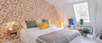
Chocolate color in the bedroom interior
Room design in chocolate color
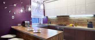
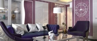
Living room in chocolate color
Chocolate color in the interior of the room
The following are acceptable as separate accents or unexpected combinations:
- red or crimson;
- blue or turquoise;
- orange or orange;
- green or emerald (living greenery).
If the monochromatic interior of light shades in a large living room turns out faded and nondescript, add a few dark chocolate-colored accessories. The same principle works if you want to modernize a room without major renovation costs. Just add:
- dark pillows on a white sofa;
- a large picture in contrasting colors;
- thread curtains with original decor in golden and caramel variations;
- a pair of elegant armchairs with gilded armrests and brown velvet.
In a classic interior, a combination of chocolate color with the texture of natural wood is appropriate. For a modern apartment, it is better to choose this color as the basis for white furniture or light textiles.
Living room in chocolate color
Beautiful bedroom design in chocolate color
See alsoZoning a room into a bedroom and living room
The perfect home for a chocolate lover
Finally, I want to show you a house that, by my personal standards, I consider ideal for “chocolate” lovers. Why him? Its design is bright, unusual and even a little surreal. At first glance, it brings to mind the house of Salvador Dali in Figueres.
Ethnics, art deco and minimalism - a friendly family of styles
The main rooms are dominated by autumn colors - chocolate, burgundy and gold.
The living-dining room is filled with the spirit and elements of ethnicity, art deco and minimalism. I think an artist, sculptor, or simply a wizard would be very comfortable in such a house.
The furniture in the living room not only performs a functional task, but is also an art object, just like a table with tentacle legs. The ethnic theme continues in the wicker round mirror and two bone flowerpots-lights.
When every design item is a work of art
In the dining room, special attention is deserved by the paintings, which on the one hand are an abstraction, and on the other - an engraving.
The kitchen is made in the best traditions of an eclectic interior: light, neutral and as spacious as possible.
A rather interesting technique was used - covering the floor and tabletop in the same color. This move is relevant for both large areas and small kitchens. It allows you not to visually split up the space.
Kitchen decoration
The hall resembles an art gallery, filled with photographs and graphics. Just one painting in an ocher tone allows you to combine the black and white corridor with the rest of the rooms in a warm “autumn” color scheme.
Here, the most varied items come together in an amazing way: an African couch, Asian chairs and a pair of lamps with root legs.
A little art gallery in the hall
Remember, I said that chocolate goes well with gold. In most cases, the role of the first violin is given to dark brown, and golden is reflected only in decor and accessories. But there are also reverse combinations.
Gold and chocolate in the office
Thanks to the special texture of the flooring and wallpaper, the surfaces appear golden at a certain incidence of light rays. Why not, especially if we are talking about a spacious office.
"Chocolate" for guests
Guests of the house will also be treated to “chocolate”; this particular shade was chosen as the main one for decorating the walls in the guest room. A bright accent is a sofa in ultramarine shade. A cabinet with a glossy surface can slightly increase the modest area of the room.
Bedroom design
The main style of the bedroom is ethnic, made in a pleasant coffee-beige color. This light tone of the walls became an excellent backdrop for contrasting light furniture: bedside tables, sofas, table lamps. The accent role was taken on by a fur blanket, a carved wooden headboard and a stone mask on the wall.
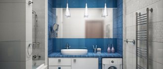
Combination of graphite and chocolate in bathroom wall decoration
Rich chocolate-graphite walls highlight the sophistication of the natural white marble used in the sink and bathtub.
Decoration of walls, floors and ceilings in chocolate tones
Not everyone can competently decorate an entire apartment in extraordinary colors without a designer’s advice. If you follow the listed principles and examples in the photo, everything will work out. For example, if you don’t make completely brown walls, but insert panels of painted wallpaper and highlight them with furniture. The option with chocolate walls in the interior is suitable only for the southern room; the northern side will be dark.
Advice. Use expensive chocolate-colored wallpaper with a golden background in the interior when zoning a large room. As an option, a dark base for decorating a niche for a cabinet such as a showcase with lighting or a background for the noble tone of leather furniture.
Chocolate color in the interior
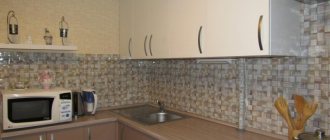
Kitchen design in chocolate color
Floors in the hall, living room with laminate or wenge-colored parquet boards look chic. But don’t overload the entire design with these shades. It is better to highlight furniture and accessories in the form of interesting contrasts with bright accents.
A multi-level ceiling will not be “overhanging” if it is supplemented with LED lighting. The stretch fabric should be glossy, almost mirror-like, then the “thickness of chocolate” can be diluted by the light reflected from the surface.
Golden Rule. The more dark the design of the floor, walls and ceiling, the greater the need to balance the overall color of the room with light shades.
Low ceilings should not be made dark; no design techniques will “raise” them. But if you use wenge-colored decor in a classic setting and make the ceiling light blue, you will have a visual feeling of “open sky.”
The modern interior looks noble with linear contrast (plinths and ceiling cornices, panels on the door, laminated PVC windows in a “dark wood” look).
Chocolate color in the interior of the room
Bedroom interior in chocolate color
Room design in chocolate color
See also: Lining in the interior: types, photos, tips
Chocolate and creamy bedroom
| Square | 12 m² |
| Location | Moscow |
| For whom | married couple |
General view of the bedroom
- A special feature of the room allocated for the bedroom was an extremely modest amount of natural daylight. That is why the design emphasized subdued artificial lighting.
- Chocolate was chosen as the main shade; the color duo was creamy. The choice is not accidental and is dictated by the fact that dark shades of brown do not require a lot of light and can start an amazing game even in dim lighting.
View from the bedroom to the loggia
- Another feature of the room layout is low ceilings. The problem was solved by using moldings, vertical picture frames and clear lines of curtains. In addition, painting the ceiling cornices in the same tone as the walls had a positive effect.
- What helps create the illusion of spaciousness in a small room? Of course, this is the measured use of large objects. So, a floor lamp, a leather chair and a bed with a large pattern at the headboard appeared in the room.
To prevent the interior from being boring, add bright accessories. Who said blue doesn't go well with orange?
- The location of the door and window did not allow me to radically change the layout, but I worked on the functionality. In addition to two spacious built-in wardrobes, storage space was created in the bed, equipped with a lifting mechanism.
- The panels that frame the niche located behind the bed are made of chipboard; synthetic padding is “hidden” under the fabric with a geometric print.
TV mounted in a niche
- Parquet modules with the Versailles ornament, an original chandelier on the ceiling and, of course, reproductions of paintings gave the room a special mood.
- If you are arranging the interior in a small area, choose built-in appliances. In this project, I “recessed” the TV into the wall, after moving the niche forward a few centimeters.
Design in detail
- A separate area was a loggia-office with a heated floor system. The same shades were used for its design - chocolate and cream.
Used:
- fabric – “Artik” Fabricut;
- wall paint – Vinyl Matt Dulux;
- moldings – Axxent PX144, Orac;
- decorative panel – “Toris”;
- built-in wardrobes – “Capital Carpentry Company”;
- parquet – Marco Ferutti;
- built-in ventilation – Ventmachine.
Tips for decorating individual rooms
- The shades of the Earth elements are rarely used in the bathroom, but in combination with gold and white, this interior looks very elegant. Brown plumbing fixtures and expensive patterned tiles with gold on the floor or walls will add nobility.
- A dark hallway with a natural wood look is a classic, especially if you choose the right shade for the façade of cabinet furniture, curtain fabric and accessories.
- The dining room and kitchen, decorated in “delicious” shades, also look very harmonious. Give preference to beautiful gilded dishes and furniture with curved elegant legs - this will add aristocracy to the balanced interior.
- In a classic bedroom there can be a lot of brown color - walls, furniture, bedspreads and curtains. But at the same time, choose a light pink or lemon background, a white ceiling and decor with pink and lilac tones. Brilliant and shimmering additions with original lighting will add beauty and nobility to a modern style.
- If you decorate a room according to all the rules of Feng Shui, then earth tones are practiced mainly in the eastern zone. It is believed that this will bring health and solidity to the family.
See our photo gallery for many interesting examples on the topic of decorating a home with this palette.
See alsoHigh-tech in the interior: principles, materials, photos
Combinations
- The best combination of a dark shade with bright turquoise or blue or light green. Such an interior will feel cheerful. Looks well-groomed and elegant. Other colors successfully dilute the main one and the room is perceived as more cheerful. Designers recommend 3 primary colors in the design, for example brown with white and blue or brown with white and light green.
- A delicious combination of dark or light chocolate with pink. Associations arise with chocolate-covered strawberries. The room looks noble, beautiful, stylish. Using a nice pink from light to deeper, this is easy to achieve.
- Most often this color is combined with traditional white. Fruit salad, whipped cream and delicious dark chocolate crumbs - the first association, the second about a sundae sprinkled with chocolate in a cafe. This is an excellent and often used color combination in the interior. You should avoid gray or black objects and decor in the room; there are more interesting options that increase vitality.
In what styles is it used?
In Art Nouveau, chocolate is considered one of the color “pillars” of the style. It is used in premises of any type in various variations. The ornate floral pattern that classics love so much looks impressive against a dark background. The technique is used not only in wallpaper, but also in textiles, curtains, tablecloths and furniture upholstery.
This color allows you to achieve the effect of that very “heavy” luxury that has become the hallmark of the direction. Loved the shades of chocolate and modern styles. A brick or slate wall done in this color looks great when combined with the rest of the decor in an industrial loft.
Art Nouveau, captivating with its sophistication, widely uses chocolate-colored wood to create an interior for connoisseurs of beauty. The color is used a little less often in high-tech, as it works well together with the tone - gray. Many designer design projects for luxury apartments use shades of chocolate.
In combination with different surface textures, a unique “truffle box” effect is created, where each element evokes dessert associations and becomes visually “delicious”.
Furniture
If all or most of the walls are light, then, of course, buy dark furniture. If on the contrary, then creamy, creamy, delicate yellow or light green, blue. Now they will make to order not only the standard one, but also original tones and shades.
Many people try to make the walls light, but the furniture is in chic coffee and chocolate tones. Good wooden furniture. She is natural and good. Against a light background of walls and ceilings, such furniture looks great.
Shades
It is difficult to consider a color boring, the number of shades of which has exceeded a hundred. The palette consists of warm and cold shades, formed by mixing black, red, yellow and blue tones in different proportions. Some shades have natural names: walnut, wenge, terracotta. Others are associated with food and drinks: caramel, chocolate, coffee with milk, cognac.
- The brown palette is common for finishing walls and floors, furniture and textiles. The ceiling is the only surface where it should be avoided. It is customary to choose shades of chocolate based on the size and purpose of the room:
- Spacious rooms with good lighting. Any shade of brown will work, including rich, cool shades of dark chocolate or black coffee.
- Small rooms. It is worth paying attention to warm and lighter colors: reddish brown, almond, coffee with milk.
- In the nursery, shades of cocoa, cinnamon or milk chocolate dessert will bring maximum benefit - they will lift your spirits and set you in a calm mood. Majestic dark wood in the office will help you concentrate and increase your productivity.
The nuances of creating ceiling structures
Many experts believe that they should be strictly light. However, modern masters manage to make the ceiling dark, and at the same time it looks more than impressive. A glossy tension type coating with light walls and gold elements is best suited. To ensure maximum contrast, the walls are decorated in milky or white tones, but to be effective, they need to be diluted with inserts in a third tone.
It is the glossy finish that makes this solution a winner. The decor will be quite simple to perceive, and it will also look fresh and relaxed. The lighting is spot and strip, it is central. Reflection will be most effective if you use a dark ceiling.