One of the important aspects of any woman’s life is her beauty and grooming.
Every girl tries to take care of herself so that others notice the uniqueness and nobility of her appearance.
Therefore, hair care is not a tribute to fashion, but a necessary condition for an attractive appearance.
Hair dyeing is a rather complicated but interesting procedure. Here you can create various variations by mixing several shades. Especially if you want to achieve a natural color, you will have to work hard.
How to mix paints correctly is a question that every woman has asked at least once. Let's try to highlight the main points.
The color mixing procedure is based on the science of coloristics. It talks about how to correctly, in what proportion and with what shades it is better to combine colors.
If your goal is to change a little, then basic knowledge is quite enough.
But there are also cases when you should not be an experimenter yourself, for example:
- If your hair color is blond, but you want to dye it dark straight away.
- If your hair color is dark and you want to dye your hair light.
- If you haven't exactly decided on the color concept.
- If you are not confident in your abilities and are not aware of the basic concepts of mixing and applying paints.
I would like to give an example of professional hair dye “Estelle”, which is suitable for permanent application or tinting. After it, the hair structure itself becomes more pliable, and the color becomes brighter.
The manufacturer provides more than 109 shades, but despite this, there is still a need to mix Estelle hair dyes .
First, you should understand that the palette has a three-digit designation for each color, where:
- the first number is the depth of tone;
- the second number is the nuance of color;
- the third number is an additional nuance of color.
As for permanent coloring, you should adhere to the following rules:
- The paint consumption should be on average for hair of medium thickness, up to 15 cm long - 60 grams.
- Paints with intensity levels up to 10 should be mixed in the following ratio: 1:1 paint and oxygen. Here it is appropriate to talk about an exposure time of 35 minutes.
- Oxygen should be selected depending on the desired outcome. If we are talking about coloring the same tone or darker (no more than 2 tones), then you need to use three percent oxygen.
- If coloring with a lightening effect of up to 2 tones is achieved - six percent oxygen, up to 3 tones - nine percent oxygen, up to 4 - twelve percent oxygen.
Primary and secondary colors
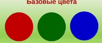
As you know, there are three primary colors (red, blue, yellow) and three additional colors (purple, orange, green). These are the basic colors. By combining them, you can get all the other colors and their shades (in theory, yes, in practice the situation is a little different). In the figure, the primary colors are represented by circles, and additional colors are formed at the intersection of the pairs. These pairs show how mixing the colors of the main row produces additional ones.
Read also: What is PCB in the army decoding
Primary and secondary colors of the palette
In practice, mixing colors is an interesting process, but often the result is difficult to predict. We work with paints, and they are a mixture of a coloring pigment and a binder base. That is, they have their own properties due to the presence of that very base. After all, paints come in different types - oil, acrylic, aniline, etc. Accordingly, the result will be slightly different. When you work with paints from the same company for a long time, you can almost accurately predict what will happen if you add this or that component.
It is also worth remembering that if you mix light rather than paint, the result will be different. Paints are only a reflection of light and not all laws work with them in the same way.
Obtaining additional colors: orange, purple, green, their shades and brown
Pairwise combination of primary colors gives us additional shades:
Basics of Color Combinations
There are two ways to get the desired shade. The well-known standard way suggests using the color wheel (divided into three basic tones and their three derivatives).
The circle clearly demonstrates three basic colors:
- red;
- blue;
- yellow.
Basic colors (including blue and yellow) form derivatives when mixed:
- violet;
- green;
- orange.
At the beginning of their creative career, painters choose the path of achieving color using the color wheel. After the master gets his hands on it, the desire to select the color scheme grows in him much more scrupulously.
Beginning artists often end up with dirt using the combination principle described above. For example, deep purple is a rarity when combining red and blue paint.
At the same level of complexity are saturated green and orange, as well as brown. In fact, the scheme does not guarantee a positive result and does not describe the nuances for achieving it.
Scientific research claims that the primary colors are not limited to three - there are six. Expanded list of basic colors:
- A pigment with the ability to reflect red is strongly orange.
- A pigment with the ability to reflect red is strongly violet.
- The paint reflects yellow, and additionally green.
- The paint reflects yellow, and additionally orange.
- The component reflects blue and to some extent violet.
- The component reflects blue, and to some extent green.
Grey
It is found in works and interiors at least blue. Many natural phenomena, shadows and unobtrusive wall coverings in the apartment are created using these neutral shades.
Regular gray
Black and white in equal quantities;
Black with a dash of white will make the gray darker. White and a little black - lighter.
Green
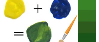
Created by adding yellow and blue paint. The saturation of the resulting tone depends on the amount of the first or second shade.
Khaki
Khaki is based on green and brown. And you can get it by mixing yellow-orange with blue-green or blue-violet tone.
How to get juicy green
The brightness of the final green color directly depends on how clearly the purity of the bases is expressed when yellow and blue are mixed. As their saturation increases, the brightness of the green tone increases.
However, it will never eclipse the purity of the original colors - it will remain a little dimmer. For this reason, kits are available with a green tube included.
When blue and sand turn into green, it is called secondary. Tertiary shades will be obtained by mixing secondary green with black or brown (dark), or white (light); they cannot be brighter than green, which means they will be faded in comparison.
Examples of artistic combinations of acrylic paints (yellow and blue):
- Yellow 1 part + blue 1 part = grass green.
- Yellow 2 parts + blue 1 part = green with a yellow tint.
- Yellow 1 part + blue 2 parts = green with a blue tint.
- Yellow 1 part + blue 2 parts + black ½ part = dark green.
- Yellow 1 part + blue 1 part + white 2 parts = soft light green.
- Yellow 1 part + blue 2 parts + white 2 parts = cold light green, not blue at all.
- Yellow 1 part + blue 1 part + brown 1 part = dark olive.
- Yellow 1 part + blue 2 parts + brown ½ part = brown with a gray tint.
If the saturation of green depends on the basic components mixed, then the saturation of the undertones is directly dependent on the purity of the grassy color itself. In this regard, derivative halftones will appear brighter if they are the result of manipulations with ready-made green rather than with mixed ones. The standard watercolor set of 12 colors includes two grass colors: bright and emerald.
How to mix yellow and blue correctly (1 video)
Basics of color (20 photos)
Brown
Depending on what base color you need, combine:
- Green with red pigment;
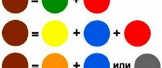
- The same bright red shade with yellow and blue;
- Yellow paint with white, black and red;
- Mix orange with blue or gray.
Variations of brown are created as follows:
Mustard
A yellow paint pigment combined with red, green and a small amount of black;
Medium brown
Add red and blue to yellow paint, lighten with white, and darken with black;
Beige tone
It works if you gradually add white to brown, and then create brightness using yellow;
What color will you get if you mix blue and yellow?
What color will you get if you mix blue and yellow?
- We probably all already know from school that if you mix blue and yellow, the output will be green. But the thing is that everything depends on the pigment of the paint palette and green can have different shades.
And a lot will depend on the proportions of paints used.
If more blue color is used, the result may be a shade in the form of a sea wave.
And if you add white to this range, you can even get a light green color as a result. And in this way you can play with paints, which is what artists do in their creativity when painting pictures.
After all, basically they always mix the palette to get their own individual and desired color to express what they intended in the picture.
- Green is already the main color. But, of course, if you mix blue and yellow paint, you get green. There may be variations in shades depending on which paint you add more - yellow or blue.
- What color will you get if you mix yellow and blue?
Mixing these colors will result in a green color and therefore few people will want to mix blue and yellow, since green paint is found in any paint composition.
- Long story short: if you mix blue and yellow, you get green. Everyone knows this. But with different ratios of components (ready-made paints, colors or pigments), you can get different shades.
Color catalog
- If you mix two colors - yellow and blue, you get green paint. Depending on the proportions mixed, you can get different shades of green, so if there is more yellow, then the green range will be light, and if there is blue, then it will be dark.
Also, if you need to dilute the color a little, then add water to watercolor, and white to gouache.
- From drawing lessons at school, we know that when you mix yellow and blue, you get green. There are hundreds of shades of this color. Green can be emerald and grassy and lemon. The leaves on the trees and the grass are green.
- The color mixing scheme looks like this:
It clearly shows that yellow can give both an orange tint when mixed with red and green when mixed with blue.
The same results can be presented in the form of the following quot;arithmetic operationsquot;:
The shades of green depend on the mixing proportions. For example, if blue predominates, then the color is aqua, but this is a rather unstable shade, gravitating either to blue or to green shades, and if both colors are sort of whitened, then a light green color will come out. In paints you can find various shades of green; these are quite complex mixtures with many pigments presented in different proportions.
In the process of working on a painting, the artist mixes paints in such a way that he often obtains shades that cannot be repeated not only by his fellow painters, but also by the author himself on his other canvases.
- If you mix blue and yellow, you get green. And depending on the proportions of the colors mixed, different shades of green will be obtained. If there is more blue, the color will be dark green. Well, if you add more yellow, you will get a light green color.
- It turns out green. Interestingly, I once bought very soft plasticine for modeling and there were only three colors: yellow, red and blue. So, when I mixed blue plasticine with yellow, it turned out green. Such miracles.
- Well, this is a very easy question, the answer to which any student knows. Of course, when you mix blue and yellow, you get green. To make sure of this, just mix watercolor or gouache paints of these colors. Here is a visual picture:
- If you mix blue and yellow you get green
- I remember from school that if you mix blue and yellow, you get green
In drawing class, we often did experiments out of nothing to do.
You can also use colored pencils to make the color green, draw with one color and then a second color on top, the same result will be achieved.
The principle of flower formation
According to the above diagram, the algorithm for the formation of shades is simplified: you will need to take a portion of yellow (step 3), mix it with blue (step 6). The celestial element interacts with the color pair, neutralizing its yellow light, while yellow will absorb the blue tone.
As a result of the reaction, we get a new shade - green! The resulting color will not be dull and faded, but lively and rich.
By analogy mixing blue (item 5) with red (item 2), it is easy to develop a deep violet color after the mutual absorption of the basic components.
The palette suggests another obvious combination: yellow (item 4) plus red (item 1). The pigments will absorb the mutual reflection of each other's surfaces, showing the world a noble orange color.
As a result of all the manipulations, the traditional circle was transformed into a new one, consisting of six color vectors. The entire spectrum of colors available to the artist’s hand is generated by variations in the composition of six basic tones; when composing them, it is important to understand what color will be obtained.
Combination nuances
- False pairs form dull tones (for example, blue item 6 and red item 1 will merge into dirty purple).
- The tandem of the correct color with the incorrect one forms much more pronounced tones (blue point 6 and red point 2 will make the purple brighter).
- The combination of two ideal colors generates a pure, rich tone (blue item 5 and red item 2 will generate a catchy, juicy purple).
In the video: mixing blue and yellow.
Yellow and orange
Summer landscapes cannot be imagined without these shades.
Eggshell color
It can be conveyed if you add yellow and a drop of brown to white paint;
A realistic skin color is achieved by a yellow-brown tint with the addition of a large amount of white.
Red
The red palette has a wide variety - from soft pink to dark purple.
You can play with shades of red by adding white to the main paint.
Regular purple tone
It is obtained by adding a couple of drops of bright blue and bright yellow to the red paint;
Apricot
We get by mixing white, ocher and red;
another option: red plus yellow, brown and white;
Orange-red
Combine bright red and a little yellow. The more yellow, the lighter the tone;
Crimson
Mix bright red with a white tone in combination with brown and blue. The more generously you add white pigment, the pinker the color you will get;
Rich burgundy
We make it using red-violet and a small amount of blue-violet paints;
You can depict blood realistically by mixing a red-orange base with yellow-orange and blue-violet.
Is it possible to mix dye with tinted shampoo?
Not new is the offer of tinted shampoos in the fashion and beauty industry, which are those that contain a coloring pigment. They are loved by those who want to constantly maintain a certain hair color without exposure to dyes. But we are not talking about permanent coloring here.
The main advantage of such shampoos is that they add color to the hair gradually, in a gentle manner, but tinted shampoos are not suitable for achieving the effect of covering gray hair. And here the question arises: what if you mix shampoo with paint? The answer will be unequivocal - it’s not worth it!
The result will not be predictable. The simplest outcome is to roll up the components before application. But it may also happen that when you apply this composition to your hair, the color will turn out to be radically different, for example, green. This occurs due to a change in the coloring structure and, accordingly, the shade.
How to mix hair dye with developer
I would like to provide instructions for mixing paints with oxidizing agents, describing the steps point by point.
- Carefully read the instructions for use on the packaging of the oxidizing agent and paint. There are professional and household paints that cannot be combined with peroxide, for example, oil-based paints. Here you can carry out preliminary testing (mixing) and if the composition is curtailed, such material cannot be used.
- It should be remembered that mixing is carried out in special containers that come in sets or are purchased in specialized stores. They come in both glass and plastic. This will allow you to avoid changes in the composition of the paint.
- The surest way is to add paint to the oxidizing agent, and not vice versa. The oxidation process itself occurs quickly and begins immediately after the components are combined. Here you need to remember that you need to mix quickly and intensively.
- It is necessary to take into account your wishes, namely the expected color. If we are talking about lightening by three tones, then it is better to choose a nine percent oxidizing agent; if by four tones, then a twelve percent oxidizer will work well.
And finally, the following advice - start your experiments with a small strand of hair in order to make sure that the actions are correct!
Red and its variations
Red is a color of “natural origin”. By mixing it with others you can achieve different shades, for example:
- pink - add a small amount of red to white;
- to get chestnut – red plus black or brown;
- tomato – red plus yellow plus brown.
Using red as a base and adding other tones, you can achieve shades such as raspberry, plum, burgundy red and others.
The burgundy shade is obtained by combining red, blue and yellow. Depending on the amount of one or another component, you can get the desired shade of burgundy - coral, red orchid, strawberry jam, marsala, mahogany or another.
Color Mixing Chart
The color mixing table allows you to learn how to get the right one when mixing two or more colors and shades. This table is used in various fields of art - fine art, modeling, and others.
Can also be used in construction when mixing paints and plasters.
Example Required Color Base Color + Mixing Instructions
| Pink | White + add a little red |
| Chestnut | Red + add black or brown |
| Royal red | Red + add blue |
| Red | Red + White to brighten, yellow to get orange-red |
| Orange | Yellow + add red |
| Gold | Yellow + a drop of red or brown |
| Yellow | Yellow + white for lightening, red or brown for a dark shade |
| Pale green | Yellow + add blue/black for depth |
| Grass green | Yellow + add blue and green |
| Olive | Green + add yellow |
| Light green | Green + add white/yellow |
| Turquoise green | Green + add blue |
| Bottle green | Yellow + add blue |
| Coniferous | Green + add yellow and black |
| Turquoise blue | Blue + add a little green |
| White-blue | White + add blue |
| Wedgwood blue | White + add blue and a drop of black |
| Royal blue | Blue + add black and a drop of green |
| Dark blue | Blue + add black and a drop of green |
| Grey | White + Add a little black |
| Pearl gray | White + Add black, a little blue |
| Medium brown | Yellow + Add red and blue, white for lightening, black for dark. |
| Red-brown | Red & yellow + Add blue and white to brighten |
| Golden brown | Yellow + Add red, blue, white. More yellow for contrast |
| Mustard | Yellow + Add red, black and a little green |
| Beige | Take brown and gradually add white until you get a beige color. Add yellow for brightness. |
| Off white | White + Add brown or black |
| Pink gray | White + Drop of red or black |
| Gray-blue | White + Add light gray plus a drop of blue |
| Green-gray | White + Add light gray plus a drop of green |
| Gray coal | White + add black |
| Lemon yellow | Yellow + add white, a little green |
| Light brown | Yellow + add white, black, brown |
| Fern green color | White + add green, black and white |
| Forest green color | Green + add black |
| Emerald green | Yellow + add green and white |
| Light green | Yellow + add white and green |
| Aquamarine | White + add green and black |
| Avocado | Yellow + add brown and black |
| Royal purple | Red + add blue and yellow |
| Dark purple | Red + add blue and black |
| Tomato red | Red + add yellow and brown |
| Mandarin, orange | Yellow + add red and brown |
| Reddish chestnut | Red + add brown and black |
| Orange | White + add orange and brown |
| Burgundy red color | Red + add brown, black and yellow |
| Crimson | Blue + add white, red and brown |
| Plum | Red + add white, blue and black |
| Chestnut | Yellow + red, black and white |
| Honey color | White, yellow and dark brown |
| Dark brown | Yellow + red, black and white |
| Copper gray | Black + add white and red |
| Eggshell color | White + yellow, a little brown |
| Black | Black Use pitch black |
Page 2
Few Russians have not tried dates; for the residents of our country, these sweet fruits are primarily a delicacy. But in hot countries they are considered “bread of the desert.” Read more
People at all times have valued thyme for its amazing healing properties. Using this herb, they got rid of many diseases, including serious and even fatal ones. Even today, thyme herb is quite actively used by traditional healers. Read more
For us Russians, pomelo is an exotic fruit. Having appeared quite recently on the shelves of our stores, it has firmly established itself both on them and on the dining tables of the country’s residents. Many who love this fruit are interested in where it grows and where it was brought to our region from. Read more
Why do they shout “bitterly” at a wedding? Where did this tradition come from? In fact, this annoying ritual is very ancient... Read more
You can determine what size sock you should buy like this: place your foot on a piece of paper and, distributing your body weight evenly, outline it with a pencil. Read more
Children should choose socks especially carefully: if the hosiery is smaller in size, it will be extremely uncomfortable for the baby to conquer the new world. And if the socks turn out to be larger, this, of course, is not scary (the child is growing), but it is extremely ugly - the excess fabric will go down the leg like an accordion. Read more
The chord chart will help beginners quickly and easily learn to play the guitar on their own. Read more
The traffic police fine table shows the extent of financial liability for violating traffic rules. Read more
ASCII is an American code for information interchange. Read more
The table of measures and weights of products allows you to determine how many different products are contained in each of the containers - a teaspoon, a tablespoon, a cut glass and a thin glass.
Read more
Multifaceted brown
Medium brown is made by combining red, yellow and blue. By the way, this color cannot be classified as either warm or cold. Shades of brown are obtained by mixing different colors. For example, orange and blue give a reddish tint. The color of honey is white plus yellow plus dark brown. Copper – black plus white plus red. Another way to achieve different shades of brown is to increase the amount of any of the main color components.
needmaterialsbackreplyauthortoolarticlecommenttablescarletlinksproductstipstotalsharevkontakteproportionsyearsfurniturefacebookdoorsclassmatesequipment
