Are you planning a small renovation, but don't know how to paint the room to make it look stylish and fashionable? The dilemma of choosing a wall color keeps many people up at night. Choosing the right shade of paint that looks good and matches the rest of the apartment is a real challenge. Find out what's fashionable now and create an interior that perfectly matches the latest trends for 2022.
Before you start changing the color of the walls in the room
Without proper preparation of the walls for renovation, even the most beautiful colors of the rooms will look sloppy, and most importantly, they will not be durable. So before you decide how to paint your room, prepare the walls and the rest of the room for this complex process.
You need a lot of free space for painting. Additionally, paint dripping from a brush can damage furniture or other items in the room. Therefore, at the very beginning, make sure that all things in the room are removed from the room . If for some reason you can't do everything, take care of the rest. All objects, including the floor, should be covered with a special painting film to protect the room from possible paint splashes.
Preparing the wall for painting
A very important element is proper preparation of the wall for painting. Without this, even the most beautiful wall colors in the room will not be aesthetically pleasing or durable. To make sure the base is suitable for painting, touch the walls you want to paint. If you hear the characteristic "empty wall" sound, this means you need to apply new plaster to ensure that the colors chosen for the room stay on the walls for as long as possible.
If the walls of your room are covered with wallpaper, be sure to get rid of it before you start painting. Otherwise, applying paint to the wallpaper will cause it to get wet. As a result, the wallpaper will begin to peel off from the wall, bend and roll off. Even the most fashionable colors of the walls in the room will not save you from this situation .
How to paint a room whose walls were previously covered with opaque paint? It won't be easy to get rid of it, but it is possible. However, such a process will require a lot of effort and patience. In this case, it is better not to scrape off the paint with force, as this may damage the plaster. To make your work easier, you can use special preparations available on the market.
Features of the type of finish
Each material has its own paint application technology. Regardless of the type of surface, it is recommended to first clean it of dust, dirt and flaking old coatings. A mandatory stage of work is applying two layers of primer and drying.
Paint and varnish compositions are used to cover dry walls at a temperature of +5-25 degrees and normal humidity of 65-75%.
Application of compositions for different base materials:
- wood and brick - alkyd, acrylic and oil paint are used;
- concrete - epoxy and latex compounds are used;
- drywall - silicone and acrylic paint are suitable;
- wallpaper - water-based compounds are used;
- plaster - any composition is suitable, regardless of the basis of manufacture.
Under normal conditions, the painted surface will serve for a long time, will not lose color saturation and will retain its protective functions for 10-15 years.
Wall colors - inspiration from interior design stores
Every year, paint manufacturers choose one of the shades as the most fashionable wall color for a room . If you're wondering how to paint a room to follow the latest trends, it's worth checking out the combinations prepared by paint manufacturers or interior design companies before making a decision.
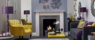
The Pantone Institute has also already announced the color of 2021, choosing a classic blue hue, which is a traditional and calm color. This choice confirms a trend that has been present in the market for many years. It is a reflection of peace, security and stability, but also wisdom. It is a versatile color that is both relaxing and inspiring. For this reason, it is perfect for any type of interior.
The second leading color that has long dominated the interior design market is bottle green , announced by British paint manufacturer Graham & Brown as its Color of the Year for 2021. According to the manufacturer, the rich bottle green color is a reference to British gardens and is intended to create the illusion of bringing the green color from outside into the room.
Dorian Gray
This is another fantastic neutral warm gray from the mid-tone range. I used it on my client's kitchen hood hood and it looks beautiful. Dorian Gray also works great as a neutral color for furniture.
Pros : Found on the same card (244) of the color fan as Repose Gray, but only two shades darker. A very versatile color for walls and cabinets.
Cons : Too much natural light can cause Dorian Gray to become cooler and no longer look like a warm gray.
How to paint your living room to make it look bigger?
Small rooms have a certain charm and can be really cozy. However, if you have a small living room, you should be especially careful because a small space, unlike large, spacious rooms, is much more difficult to arrange . However, the room can be optically enlarged by choosing the appropriate wall color.
The most effective way to paint your living room to make it appear larger is to choose a solid, light shade . Some of the most commonly chosen colors include beige, soft grey, powder pink or blue.
When choosing a wall color for a room, pay close attention to the temperature of the shade. This is especially important in small rooms because warm colors visually pull the walls closer together, making the room appear smaller.
However, different room colors can't compare to the unbeatable pure white , which is by far the most popular shade in interior design. This is an ideal color for small spaces, most often used in minimalist interiors. Although there are many shades of white available in the market, classic crisp white is the preferred choice.
Crushed Ice
I met Crushed Ice for the first time recently when I was redecorating my living room. I chose this as a replacement for Repose Gray (our number one), which looked a little lighter than I would have liked in this space. And in the end, I just fell in love with it, so I can confidently recommend that you try this color too. It's a little lighter, a little cooler, and has a little more pigment than Repose Gray.
Pros : Crushed Ice is a stunning warm light gray that falls between light (with subtle color) and mid tone. A rare gem in the range of intermediate neutral colors.
Cons : Crushed Ice looks better in areas with moderate natural light. Not the best choice for rooms without windows.
How to paint a room in several colors? Color combinations that always work
The walls of the room do not have to be painted the same color. However, the art of combining them is not the simplest. To be able to experiment with shades without worrying about the effects, you should learn the basic principles of color combinations. Only by knowing these dependencies can you choose bold combinations and adapt the various shades of the palette to your needs.
The color wheel is a very useful element when choosing colors. It has 12 flowers. These are three primary colors, three derivative colors and shades resulting from a combination of primary and secondary colors, that is, the so-called third-order colors. How to paint a room so that it looks aesthetically pleasing and has the desired character? It is enough to select shades using the colors on the circle.
Monochrome room wall colors
There are several color combination options. One of them is a combination of monochrome colors , that is, a combination of several tones of the same color. For example, using brown or green from lightest to medium to darkest. Such combinations are perfect, for example, in the bedroom.
Opposite room colors
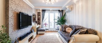
Another option is to combine opposite colors with each other. These are the so-called complementary colors, that is, those that are always opposite to each other on the color wheel. This method of combining colors is perfect for large rooms, such as a living room. It is also a great solution for events and public spaces. Bold color combinations through contrast create a desire to take action and awaken layers of positive energy.
Sea Salt
This color is almost as popular as the previous one. The vast majority in the survey named it their favorite Sherwin-Williams color. Feel free to go for it if you are looking for a calming and serene spa color.
Pros : Calmness and serenity. In the right light, Sea Salt is one of the most beautiful shades of blue-green-gray.
Cons : Has a chameleon effect and can be finicky in certain lighting (usually in areas with a lot of natural light). It is very important to do test colors first. This color looks best in rooms with little or no natural light (bathrooms, bedrooms, etc.).
Do the colors of the walls in a room affect the mood?
The color of the walls usually serves a decorative function. The combination of specific shades gives the interior character , so the colors of the walls in the room acquire important symbolic value in a person’s life. In addition, they can affect the psyche, enhance positive or negative emotions, and even cause permanent mood changes.
What wall colors in a room evoke a positive mood?
Green is a color that will surprise no one. This color is associated with peace and relaxation . Dark green colors, such as bottle green, subconsciously relieve tension and stress. All shades of green, from light to dark, are suitable for both the living room and the bedroom, which should be a place of relaxation and tranquility.
Gray color would also be a good choice , as it calms and relaxes the human body . For this reason, it can be successfully used in any home room, with the exception of the office, where yellow can be much better in inspiring and stimulating creativity. In addition, yellow revives a sense of organization and adds self-confidence.
Blue is the perfect color for a bedroom . Cool shades are good for sleep and can help with insomnia. After all, it is most often used in bathrooms, most likely due to its involuntary association with water.
Although the color blue has a positive effect on well-being, when choosing it as a color for a room, you must be careful not to overdo it with the amount and intensity because too much of it can have a depressing effect, which will be counterproductive.
Room colors to avoid
A color that should definitely be avoided in large quantities is black. Although it is versatile in itself and may be liked by many, in most cases it is better not to use it. But black lovers shouldn't give it up completely. By choosing slightly more muted tones of the walls in the room, it can be successfully used in accessories.
The second color of this type is red . Although it is associated with positive emotions such as love and passion, it can also cause great frustration . Staying in a room with such an intense hue is overwhelming and makes the human body get tired much faster than usual.
Worldly Gray
This is another trustworthy warm light gray color that is quite close to Repose Gray but is a little warmer and darker. I often recommend it to clients over Repose Gray as an overall color for the entire interior if there is a lot of natural light in the room, as the former can look too white in such conditions.
Pros : In rooms with lots of natural light, Worldly Gray is ideal and versatile.
Cons : This color will appear darker in areas with little natural light, and may look a little heavier than a traditional warm light gray.
Painting walls and ceilings step by step, or how to paint a room
For painting it is best to use a large paint roller. Unlike a brush, it does not require special skills and guarantees a good effect. The paint will be evenly distributed, and after several applications, streaks will not be visible. However, be sure to spread the paint evenly over it once the roller is wet in the tray (using the "grater" on the tray) and remove any excess.
Dovetail
If you want something darker than a neutral mid-tone warm gray, Dovetail is a great choice. It is well suited for interior doors and cabinets. It is unlikely to be suitable for painting all the walls in the room, but an accent wall of this color will look beautiful.
Pros : Dovetail is a win-win option when you want to add contrast to a room, but don't want to use very dark tones so as not to lose the overall lightness.
Cons : Dovetail may take on a warmer tone in rooms with artificial lighting. Although this does not harm him too much, he remains beautiful.
Tricorn Black
Of the black colors, I most often prefer Tricorn black in my projects. First of all, because it really looks like black. And small brown-gray undertones relieve it of excessive roughness and harshness.
Pros : This is a very versatile and reliable color for both interior and exterior use. If you are in search of the best black color, you can go for this one as it is really beautiful.
Cons : I've never had a problem with this color. He won't let you down. The taupe shade complements almost any color when used as an exterior trim or accent color.
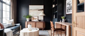
Cabinet
Photo: bright office
Photo: cozy office
An office is a place where owners sometimes spend a lot of time. The interior of the office should be comfortable, not overload the nervous system and set in a working mood. The choice of style and colors depends on the size of the room, as well as the taste and work activity of the owner. Designers prefer white, beige, yellow, blue and blue, gray and brown tones for office decoration. The rules are the same: if for the south and east sides - cold and neutral tones, for the north and west - warm colors.
Photo: small offices
Black Fox
Another fantastic dark color from the best seller list, very similar to the previous one is Black Fox. But while Iron Ore tends to lean towards dark grey, Black Fox is more of a very dark brown.
Pros : Very rich dark, ideal accent color for walls, interior elements and facade decoration. Very versatile.
Cons : In windowless rooms under artificial light, Black Fox can have a rather warm tone but still be beautiful.
Peppercorn
It's no surprise that Peppercorn from Sherwin-Williams made the bestseller list because this color is unheard of good! This cloudy taupe has tremendous depth and is perfect for an accent wall, closets, and some very small spaces.
Pros : Peppercorn is one of the most trustworthy taupes. It always looks good on walls, cabinets and accent pieces.
Cons : I can't think of a single problem with this color. He always looks great.
Iron Ore
The next example is a beautiful very dark gray with a brown undertone that has become a popular choice for finishing interior doors, cabinets and façade features. Really amazing color!
Pros : Iron Ore is a stunning deep and heavy color. It adds instant contrast to a space when used sparingly.
Cons : When using this color to decorate exterior elements, be careful: make sure that it harmonizes with the overall color of the facade, even if it is almost white. This is less true indoors, but bright sunlight outside really brings out the Iron Ore tones.
Characteristic stylistic palettes
- Contemporary. Modern style allows you to use more bright colors such as blue, turquoise, emerald, lilac, etc. A combination of several contrasting colors in one room is typical.
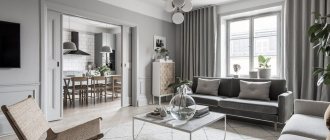
- Scandinavian. The style is characterized by the use of beige, gray and white tones, as well as shades of blue. The color should be harmonious and maintain spaciousness.
- Classic solutions. These directions are characterized by muted, calm colors of brown, green, and blue. Only one shade is used in the interior; patterned wallpaper is used for accents.
- Loft. A modern solution for decorating a living room. Mainly cold, calm tones are used for the interior. Gray and white go well with brick. For such an “industrial” idea, you can use black.
- Country. A rustic theme is impossible without natural shades such as brown, green, soft yellow, blue, peach, olive, etc.
- Provence. The base is pastel colors such as olive, beige, lavender, etc. It has a natural, restrained palette.
The palette of each style may vary depending on the functional purpose of the color, the area of the room, and personal preferences. If, according to the design project, the implementation of non-standard tones is appropriate, there are no restrictions for bringing such an idea to life.
Stages of applying decorative coating
To work, you will need a brush with natural bristles, a spatula, a scraper, a foam roller, a container for the roller, and a wet cloth to remove drips.
When preparing the surface for painting, uneven surfaces are smoothed out using a spatula, and sagging and drips are removed with a metal scraper. Cracks, chips, potholes are carefully sealed with cement mortar, alabaster, and after drying, the areas are treated with sandpaper.
- Sockets, switches, lighting fixtures must be removed and wires insulated.
- Cover the prepared and even surface with a primer, the shade of which matches the color of the paint.
- Painting begins with hard-to-reach places, corners, sockets, batteries. These areas are carefully passed with a brush.
- A flat section of the wall is painted with a roller or spray gun. After applying the base layer, after it dries, re-painting is carried out.
Paints with organic fillers, textured and decorative ones must be thoroughly mixed, as the fillers settle to the bottom. When painting large spaces, use a construction mixer.
Among the variety of paints and varnishes, preference should be given to trusted manufacturers. Among the sales leaders on the European market is the Tikkurila brand.
Tikkurila interior paint is of high quality and affordable prices.
Mindful
I have been using Mindful Gray for many years, both on client projects and for myself. I think Mindful Gray is one of the nicest and safest warm gray colors out there and is great specifically for furniture.
Pros : An extremely versatile warm gray that looks best on cabinets and other furniture, as well as fronts. It's a little heavy to get a warm gray on your walls, but it's fine if you're looking for a warmer, mid-tone gray.
Cons : In rooms with plenty of natural light, Mindful Gray can look cold without losing its brilliance. However, if you want a warm gray that stays warm in these lighting conditions, then Mindful Gray is not the best color here.
Most of the Sherwin Williams colors featured on the most popular list are simply gorgeous. I haven't worked with many yellow/beige tones so I haven't given them any rating in this review.
And further. Before using any of the colors that I have given excellent ratings, be sure to test them in the room and lighting where they are intended. Lighting can change color dramatically and I really want you not to be disappointed!
You can learn about how light changes color in the article Warm and cool lighting in the interior. Color temperature of light.
To learn how to choose a light bulb with good color rendering, read the material Quality of lighting in the interior. Choosing the best lamps.
You can order paints in the colors you like right now on this website.
Articles about paints, color and design (opens in a new tab)
View products
Style solutions: color choice
There is a wide range of paint and varnish products that help create any design project. Many style options have been invented; they can be repeated correctly, but careful preparation will be required.
Many style options have been invented; they can be repeated correctly, but careful preparation will be required.
Calm shades: beige, light gray, peach, milky, ivory
These options are good when residents love peace. To prevent the design from being bland for medium-sized products, brighter colors are selected. Such use of shades will help to obtain an updated renovation where you can stay for a long time.
These options are good when residents love peace.
Elegant colors: turquoise, matte black, grey, café au lait, chocolate
To complement the interior elements, other options from this list are selected. Then accents will be placed, but the comfort will not be lost. Variations were not so popular before, but now they are being chosen more and more often. Wall paint colors help to obtain this coloring.
To complement the interior elements, other options from this list are selected.
Bright style in the apartment: blue, green, light blue, pink, purple paint
People who love bright accents can use a combination of two types of colors. They will complement and dampen each other a little. For ease of selection, opposite colors are selected from a circular palette with color options. It should be borne in mind that not everyone can stay in such conditions for a long time; if a person likes richness, then this update will be acceptable for him, and guests will be amazed by the uniqueness.
People who love bright accents can use a combination of two types of colors.