A well-chosen interior of apartments turns homes into cozy and stylish ones. It’s pleasant to be in such rooms; it seems that even the walls feed the owner with positive energy. After all, everything in the house, from wallpaper to furniture, is selected taking into account the individual characteristics of a person and his color preferences.
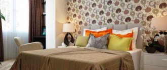
One of the coziest places, according to decorators, should be the bedroom. This is the holy of holies, the place where a person gains strength. Therefore, you should approach the interior of this room with special care. The color palette used is of great importance, because it is known that colors can have a psychological impact on a person. Therefore, one of the most serious decisions in bedroom design is the right choice of wallpaper.
view album in new window
Non-woven wallpaper
Such canvases, made from cellulose fibers, have the properties necessary for decorating bedroom walls:
- environmental friendliness;
- abrasion resistance;
- breathability;
- durability.
Non-woven wallpaper perfectly masks uneven walls, with the exception of especially large cracks and bulges, does not tear when the house shrinks, and can be easily removed if necessary. Paintable wallpaper can withstand multi-layer painting.
Issues of environmental safety of the material
The advantages of vinyl wallpaper are well known. At the same time, they have some disadvantages. In particular, many have a fair question about how safe they are in terms of the environment. Indeed, a layer consisting of PVC (polyvinyl chloride) may pose some potential danger.
In this regard, the following can be said. In order to be sure that you are buying high-quality and safe products, you need to make a choice in favor of reputable manufacturers, and not chase the cheapest, putting your health, as well as the health of your loved ones and relatives, at risk.
Using vinyl wallpaper in the bedroom is a completely reasonable and deliberate move, since this finishing material is environmentally friendly, has a wide range of colors and is quite affordable.
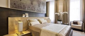
Cozy bedroom decoration
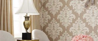
Fabric or textile wallpaper
Textile fabrics, which are fabric glued to a paper or non-woven base, look especially advantageous in the bedroom interior. In the manufacture of such wallpaper, silk, chintz, brocade, velor, velvet, jute, linen, and felt are used. This causes their high cost. Finishing the bedroom with textiles adds sophistication and aristocratic gloss to the design, and impregnation with compounds that prevent fading and dust settling greatly simplifies the care of surfaces.
Types of coatings
The vinyl covering of the canvas itself can be one of the following types:
- Hard vinyl - they have a non-woven backing and can be repainted;
- Compact coatings (silk-screen printing) - first, vinyl is applied to paper, and then heated, and the silk coating beloved by many is obtained;
- Foamed vinyl is a favorite material of many designers, since thanks to a huge range of textures, each interior can be made unusual and unique.
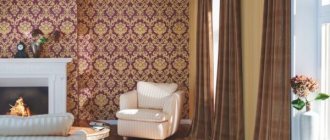
Vinyl wallpapers
Canvases, which are a layer of polyvinyl chloride applied to a paper or non-woven base. Differ:
- variety of colors and designs;
- durability;
- high performance characteristics - they can be washed with any detergent.
The disadvantage of such wallpaper is its airtightness, which limits the scope of its application. It is not recommended to completely cover the bedroom with them, however, you can use vinyl wallpaper in combination with other materials to decorate one wall or a fragment of a room when zoning.
For complete or partial decoration of bedroom walls, you can use glass wallpaper or liquid wallpaper.
Photo wallpaper
Harmony is the most important rule for arranging photo wallpapers! It is recommended to use only one wall for the location of the photograph, otherwise the room will look overloaded.
Principles for arranging photo wallpapers:
- "One wall." The classic option is to place the pattern behind the bed.
- Minimum decor. The wall with the image does not need to be crowded with furniture, this will ruin the overall impression.
- Harmony with the rest of the walls. Since the photo wallpaper will be the brightest element of the walls, the rest of the room can be in one tone (they must be combined with each other!)
You should take the choice of image very seriously. Think about what you are willing to see on your bedroom wall every day.
What shades to choose for the bedroom
The quality of rest and proper sleep depend on color perception. In the bedroom, it is better not to use rich warm or cold colors, which attract attention, excite the nerve centers and interfere with relaxation. It is advisable to focus on soft undertones and shades that have a beneficial effect on the psyche and do not irritate the eyesight.
In small rooms in Khrushchev, light colors are especially relevant, soothing and relaxing - cream, beige, soft green, turquoise, coffee with milk, smoky gray.
White
Shades of this color visually enlarge the space and add a touch of freshness and cleanliness. White goes with all tones, so it’s easy to get rid of the feeling of sterility: just add bright accents.
USEFUL INFORMATION: How to glue wallpaper so that the joints are not visible
Beige
A warmer and more relaxing color, just like white, which can “pull apart” walls. Shades of beige look great in combination with coral, smoky blue, light green, turquoise, and lilac. Wallpaper in cream tones harmonizes with light furniture, floors finished in light brown shades, and milky white ceiling covering.
Grey
Dangerous color if chosen incorrectly. When in excess, it can cause despondency and apathy. However, in combination with other tones, such as pearl, silver, blue, it looks sophisticated and noble.
Brown
Wallpaper in chocolate tones brings a touch of calm and tranquility to the bedroom interior, especially in combination with light beige, white, soft blue or light green shades.
In a small room, it is better to accent a fragment of the wall with decoration in rich brown tones.
Yellow
This color is suitable for a cold northern bedroom and will give cheerfulness on a cloudy morning. The main thing is not to choose flashy yellow, choosing calm shades. Blends well with green, blue, brown, orange, and gold.
Orange
A bright color is not suitable for a bedroom, but more delicate, diluted apricot shades will “warm” a room with windows facing north. Not the best choice for a small room, as a warm, bright color will narrow the space.
Orange in the orange version can be used as accents.
Green
This color calms, refreshes, relieves stress, and relaxes. A variety of shades, from light green to malachite, allows you to experiment with finishing. It goes best with natural tones - brown, yellow, blue.
Blue
Deep color makes the interior strict, looks great with white and silver, but can put pressure on the psyche. For the bedroom, soft blue and azure shades are better suited.
Red
The color is too irritating and should be used with great caution in the bedroom. However, burgundy shades are still acceptable. They will allow you to create a rich, elite interior. The main thing is not to combine them with colors other than gold and black.
Pink
A completely different matter is pink, which creates a romantic mood, a cheerful, pleasant atmosphere. In addition, this color helps you wake up in the morning, energizes you, and activates vital energy. Goes well with white, gray, pistachio, beige, wenge.
Lilac
A calm, delicate color that creates an atmosphere of mystery. It is a shade of purple, but, unlike it, it has softness and warmth. Goes well with white, beige, milky, blue, purple, light green. Suitable for sensitive people, but may cause anxiety for some people.
USEFUL INFORMATION: Variety of wallpaper for painting: types, texture, features
Important! Don't blindly follow the advice of interior designers. Color combinations that are quite harmonious from the point of view of experts sometimes cause rejection, reaching the point of irritation. Choosing the main tone and shades of wallpaper for decorating a bedroom is an individual decision.
Recommendations for choosing colors by cardinal directions
When choosing a color palette for wallpaper for the bedroom, it would be wise to focus on the cardinal directions and the degree of illumination of the room.
North
If the windows face north, northwest, northeast, it is better to give preference to warm warming shades:
- light pink,
- beige,
- sandy,
- peach,
- golden,
- tea rose.
By adding light and warmth, they have a beneficial effect on the psyche and relieve stress.
If photo wallpaper is used, it is better to choose a calm summer landscape, a sunlit forest, or a waterfall in tropical greenery.
South
Cool shades of wallpaper would be appropriate here:
- sky blue,
- pearl gray,
- soft green,
- lavender,
- silver,
- snow-white.
Cool, fresh colors calm and reduce tension in a bedroom located on the rays of the south side, helping you fall asleep faster.
West
For a bedroom illuminated by the evening sun, tones that promote relaxation and comfort are suitable. Soft shades of the following colors are suitable:
- red,
- pink,
- beige,
- chocolate.
East
The bedroom is brightly lit by the sun even at dawn, which contributes to a quick awakening in an excellent mood. In the evenings it gets dark early, creating a special relaxing atmosphere. An excellent solution is wallpaper in the following tones:
- light green,
- turquoise,
- blue,
- smoky gray
- silver.
They will go well with mountain and sea landscapes, jungles at sunset, and images of the underwater world on photo wallpapers.
Feng Shui colors
Interestingly, according to Feng Shui, the predominant colors in the room should be different. From the point of view of Eastern teaching, they must correspond to the elements.
- Southwest, northeast are the colors of the earth elements. Brown, beige, golden.
- South – fiery colors. Red, orange, pink.
- West, northwest – element of metal. Silver, white, gray.
- North is the element of water. Shades of blue.
- East and southeast - wood. All shades of green.
As you can see, cold blue color is recommended to be used in the northern room, which will make it even colder and darker, “hot” red - in the southern one, where, on the contrary, you want coolness. Therefore, there is no need to blindly follow these recommendations.
Perhaps it is worth finding a compromise between the opinions of adherents of Eastern teachings, psychologists and designers. They all agree on one thing: calm, muted, soothing shades are suitable for the bedroom; there should not be too many different colors.
Which drawing to choose
When choosing wallpaper with a pattern, you need to consider:
- footage of the room;
- location relative to cardinal directions;
- natural light.
One of the most popular types of images on wallpaper is a floral print, typical for interior design in Oriental, English, Scandinavian, Provencal, and rustic styles.
- In a spacious, well-lit bedroom, a large floral print on a light background looks great. For a small room, it is better to choose a medium-sized pattern, since excessively small details of the pattern, scattered in abundance on the walls, irritate the eyes and get on the nerves.
USEFUL INFORMATION: How to properly glue wallpaper in corners: join the pattern
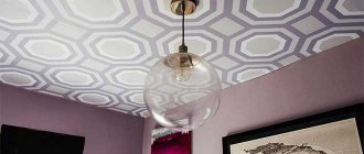
- A vertical geometric pattern increases the height of the room, while a horizontal one helps to visually expand the space. Vertical and horizontal stripes also change the geometry of the room.
- Large leaves, interlacing branches, and foliage patterns soothe and promote rapid sleep. Floral designs have a beneficial effect on the psyche.
Combining wallpaper
Plain wallpaper in the bedroom goes well with similar canvases of a different color and with patterned material. Wall decoration in shades of one primary color with accents on certain fragments is extremely popular. Let's look at the most common combination finishing options.
Vertical arrangement
Performs a zoning function and is characterized by the insertion of a strip of wallpaper with a floral print, ornament, pattern or plain color.
- If the wall is decorated with wallpaper with a pattern, the insert should be plain, but of the same shade.
- When decorating a wall in one color, a stripe with a pattern is inserted, strictly consistent with the tones of the base finish.
Horizontal combining
The same principle of room zoning is followed here, only the stripes are located horizontally.
Inserts
Fragments of plain wallpaper or canvases with a pattern of a different shade are pasted in a vertical or horizontal direction.
It is important to adhere to the same principle as for a vertical or horizontal arrangement: an insert with a pattern is placed on a plain background, and without a pattern on a motley background.
Niche design
Pasting niches with lighter or darker wallpaper is an extremely effective technique. When placing a recess in the wall on the unlit side, use light shades of the base color, and dark shades on the sunny side.
- When decorating the walls in a single color, you can decorate a niche with plain canvases and wallpaper with a pattern.
- If canvases with patterns or floral prints were used as the basic design of the walls, the niche should be covered only with a plain material.
Bedroom interior design is a complex and exciting process that requires attention and concentration. It is important not to overdo it with the shades, texture and texture of the wallpaper. It is advisable to limit yourself to one basic color, not to use more than three shades and not to overload the room with unnecessary details.
How to combine different designs?
In order not to worry during the selection whether the textures and shades will “make friends”, choose combinations from the same collection. Here are some win-win combinations:
- Accent wall + monochromatic companion + neutral furniture. Usually the accent is the wall at the head, less often the wall opposite.
Photo: de Gournay
Photo: de Gournay
- Catchy wallpaper + neutral furniture.
Design: Anna Vorobyova
Design: Anna Vorobyova
- Neutral wallpaper + accent furniture. Another option: choose neutral furniture and wallpaper, and bright textiles and decor.
Design: Lyudmila Uzikova
Design: Lyudmila Uzikova