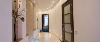
Features of the color scheme
Proper color design can solve many problems: visually expand the space, hide some defects, visually increase the height of the room. Considering that hallways are often small and dark, it is better to choose light and warm colors for them. Otherwise, there is a risk of getting the effect of non-residential premises.
Photo: Instagram idesing_spb
It’s better not to get carried away with dark tones; they visually make the room smaller. There shouldn’t be a lot of saturated and bright colors. They are best used as accents. It is better to select the color of furniture based on the walls and floor. Its tone should be combined with the shade of the flooring or walls or be contrasting.
Photo: Instagram mebelbos.by
What influences the choice of color in the hallway
The corridor is a place for light colors, unless otherwise provided by the overall design or original design. Due to the lack of windows (which is typical for almost all hallways) and compact size, it is customary to brighten corridors with the help of walls and rich artificial lighting. Searching for objects in a dark room is not very pleasant, so some people simply leave the light on all day long. If everything is clear with the ceiling - it should be light, then the color scheme of the walls depends on the lighting, textures, the presence of textured surfaces, and the need for combining shades. Size, of course, has its influence. In narrow spaces, light cannot spread well due to the darkness created by the walls. Pieces of furniture will cast shadows. So all these nuances should be considered along with the definition of the pros and cons of light or dark design.
Previous design experience is not always objective, because materials are constantly being improved, but it will definitely help you decide whether to use a particular color.
Hallway size
The shape of the entrance space tends either to be rectangular, as in two- and three-room apartments in Brezhnevka apartments, or it is square, as in most Khrushchev-era apartments. The optimal minimum width is 1.4 meters, and length - from 2.5. In such a corridor you can install modular systems and open storage. Hallways that are already 1 meter wide are almost always expanded, all that is needed is technical capability. Building codes provide for a width of 1.2 meters for places where the hallway opens into other rooms, and sections that are already a meter long are no more than one and a half meters long. All hallways consist of 2 parts - a reception area and an area for arranging communications. It wouldn’t hurt to find a place for a sofa, and in the spacious corridor of a multi-room apartment - for a large guest area similar to the hall. In locks with a height reduction of up to 2 meters, mezzanines are made.
Combination of materials
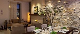
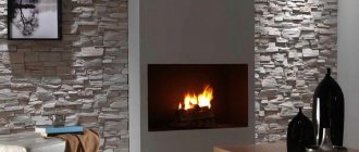
The hallway is decorated with one material or nice combinations. The first of these should be noted is the combination of wall panels and wallpaper. The walls of the loft hallway are decorated with whitewash and textured coverings, and sometimes bare walls with remnants of torn wallpaper are added to this ensemble. The technique of abruptly interrupting the brickwork has become traditional. In the classic version, elegant combinations are created with wallpaper, plaster, tiles and stone surfaces. Interiors in a modern style are made with the combined use of glossy, matte and satin finishes. The walls combine materials with a pleasant texture. Wood is combined with plastic and mirror polystyrene. Bamboo panels can be seen next to stone surfaces. The hallways are also finished with different types of wood coverings. Heterogeneous finishes, among other things, are used for zoning.
Texture and print of finishing
Some types of textures:
- Flat;
- Rough;
- Patterned;
- Geometric.
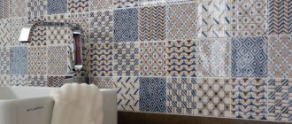
The corridor is usually left without a pattern if it is finished with panels. Oblong and compact planks are smooth and faceted in texture. Patterns usually cover glossy surfaces. Drawings and prints “get” into the corridors on regular and photo wallpapers, 3D compositions, panel films and painted walls. Fans of texture and color variety on surfaces should take a closer look at plastic. Imitations are made from the material, copying any raw material and repeating any colors. At first glance, natural wood, metal and stone cannot be distinguished from their plastic counterparts. Natural and synthetic materials are often painted white, creating solid monotonous surfaces. All those who like to personally participate in the design of their home should pay attention to paintable wallpaper.
Hallway illumination
A lack of light means a dull and unclear environment. Therefore, the corridor is either illuminated with several modern lamp options or with huge chandeliers. The main and additional devices of the modern type are mounted mainly on the ceiling, but extended versions such as linear ones are also installed on the walls. Wall sconces, which have recently appeared in any form, are also hung there. Products in a modern style look like boxes. They are assembled into compositions, directing light in different directions and using square and elongated devices. Grilyato ceiling systems have proven to be effective. Then a few spotlights on the walls are enough. Horizontal surfaces provide the best location for bendable strip lights with LED sources. In turn, the natural flow of light is organized through transparent doors or the absence of curtains in the interior passages.
Finishing styles and their inherent tones
The following interior styles are popular:
- classic;
- modern;
- retro and vintage;
- scandi;
- high tech;
- country/provincial.
Hallways usually do not have a lot of furniture, so maintaining the style will be easier than it seems at first glance. In the corridor, they usually try to enhance natural and artificial lighting. It is logical that white color dominates in most decisions. Pale yellow, orange, brown and gray come in second place. As for individual styles, in almost all cases additional colors should be used. In the classic design, simple white and some inexpressive light shade will suffice to emphasize individual elements. It’s hard to imagine high-tech and modern style without gray walls. Various options are possible, including solid, multi-colored and combining several walls in different colors. Light shades of different colors are typical for country, but in retro style they use all the variety.
Classic style
The entrance room in the spirit of classics is always made light. Combinations of white, cream, beige, silver, lemon, light green and other colors that logically fit into this range are used to the fullest. The walls are made in white or cream color - this is almost a mandatory technique if some kind of pattern is not provided. Structural elements of classic decoration and interior items usually represent a tonal range. The classic style allows for patterns in dirty tones. This emphasizes the nobility of classic shades. In an expensive interior, the palette can be formed around gold and silver colors. Mirrors, crystal, and precious stones harmonize perfectly with them. The interior should play with colors in the eyes of a person moving along the corridor. Furniture for the hallway is bought a little darker than the walls. The reverse contrast is adhered to much less frequently. The lighting is made saturated, but technological devices are completely ignored.
Modern style
Modern design principles give complete freedom of action. At the same time, trends are moving deeper into technology. There is a “demand” for an abundance of colorful lines and transitions. Wide and narrow, long and short, straight and curved, continuous and intermittent. Creative people and designers form masterpieces from them in one copy. A special color geometry is placed on the walls. The ceiling and floor are made simple to separate these compositions. But sometimes the finish “transitions” from the walls to other surfaces. It is better to diversify non-standard housing with dark walls. In other cases, they opt for a light finish with a gray tint. A modern style hallway usually contains noticeable color contrasts. For example, walls and doors, several different walls, furniture and decoration. Color inserts and several paintings representing past eras in painting will not be superfluous.
Retro style
Retro is a conventional cultural philosophy of using out-of-date items and color palettes. Designers play on the inconsistency with modern trends. Sometimes according to the principle “the new is the forgotten old.” The walls are given color using old faded wallpaper. They choose authentic products from the 80s and 90s. The color scheme usually includes grey, pink and blue. Retro, as the embodiment of old avant-gardeism, welcomes a variegated multi-colored range, and at the same time it can only be done in white or gray. If something happens, you can go with the win-win striped option. Striped walls look good against the background of a checkerboard floor. Painted walls in one color look good with vintage items. Simple modern finishes will go unnoticed behind antique pieces. The color of the walls in the hallway can be contrasted with the design of the apartment.
Scandinavian style
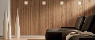
The referral leaves residents without most options. Not only is white required, but the shade must also be pure. For this reason, they make a slight deviation and add cream color and pale tones of the spectral circle. An all-white Scandi-style hallway will look like a hospital hallway if you don't add some colorful pieces. In general, surfaces are freed from everything superfluous, by analogy with a minimalist setting, but the walls of a Scandinavian interior are decorated with anything. These are bicycles, and lonely hangers with suits, and anything else. The style allows the use of wooden materials. Wood-trimmed walls will become a natural part of the interior. These are almost all alternatives to the “snow-white” design. Thus, the corridor in the spirit of Scandinavia is either painted or trimmed with white or brown panels.
High tech
The style of high technology is conveyed using:
- smooth surfaces;
- glass and mirrors;
- metal and plastic.
Bright colors should not be used. At the same time, you cannot absurdly throw white, gray and brown into a heap. Colorful combinations will deprive the interior of its technology. In turn, solid white and gray walls look great together with technological furnishing elements. Sometimes the color is diluted with even stripes located without geometric patterns. The walls are given a striped structure using panels. The high-tech style in the interior is associated with complex architectural forms. These include a variety of partition walls in an unusual geometric design. Elements of partitions can be painted in any shade, even acidic. It is enough to collect something interesting and designer once, and it will decorate the house for a long time. High-tech can be developed into more specific directions, for example, into a space style with a dominance of blue and purple.
Country style
The walls are made in soft shades of any color, and any materials and textures are suitable for finishing. The shades are mostly pastel to match the furniture - slightly shabby and simple. Country style provides opportunities to create a beautiful, subtle environment without components that look presentable on their own. For example, careless or aged furniture is placed against a wall with an unremarkable or even unpleasant color. The composition will ultimately look harmonious and attractive. There is no need to rack your brains over what to do with neat finishing in a modern style if the hallway originally looked like this. There are many furniture options, and their light colors mean a wide range of textures. Traditional country colors include brown, gray, olive, turquoise, lilac, blue, pink and ivory. The provincial setting allows for finishing with wallpaper, clinker bricks, and relief plaster.
Other shades that are suitable for country:
- cocoa;
- lavender flowers;
- lime;
- nut
Types of finishing work for hallway walls
There are several types of wall decoration for the hallway. These include:
- painting;
- decorative plaster;
- microcement technique;
- wallpaper;
- decorative rock;
- plastic panels;
- MDF panels.
Let's consider each option separately. Each type of finishing work has both advantages and disadvantages.
Decorative plaster
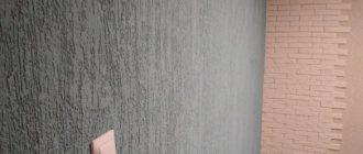
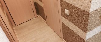
This method for decorating an interior space, as a rule, takes place in several stages. The applied composition takes a long time to dry and requires special skills when performing this type of work. Thanks to decorative plaster, it is possible to correct minor imperfections in the surface of the walls.
A large selection of building compositions allows you to choose the best option based on the cost and complexity of application.
Today there are several types of decorative coatings. These include:
- latex;
- silicone;
- cement;
- plaster.
These materials are easily applied using a special tool. On the surface of wet plaster, you can apply original patterns, which will later be decorated using decorative spraying.
The main advantages of this coating include:
- environmental friendliness;
- durability;
- easy care;
- beautiful view.

